

Brief
Taulia is a leading provider in working capital solutions, with their headquarters based in San Francisco. Through their AI-powered platform, Taulia assists companies in freeing-up value within supply chains.
Taulias corporate website plays a vital role in lead generation. However, prior to our solution implementation, their previous site was outdated, slow and cumbersome. Messaging was confusing and service offerings were not aligned with their business strategy.
Solution
Simplr worked closely with the Taulia marketing team to rebuild the businesses online experience. The site has an organised site structure including a Content Management System with customisable content templates and an easy to deliver content framework.
UI/UX Design
Creative Direction
Front-end Development
Back-end Development
Content Management System
Clarifying the experience
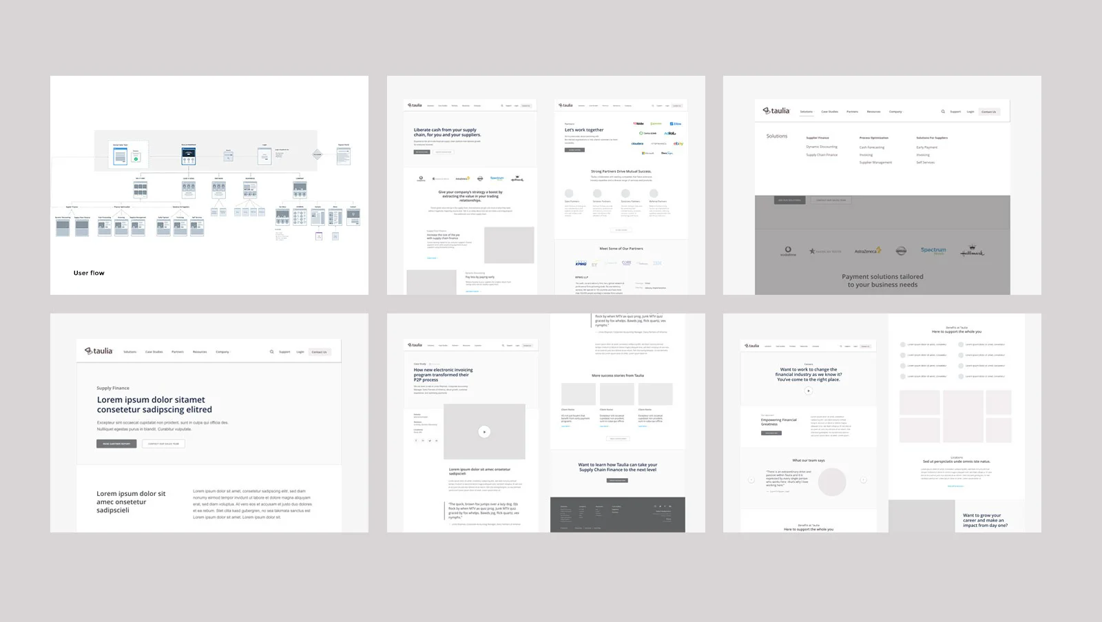
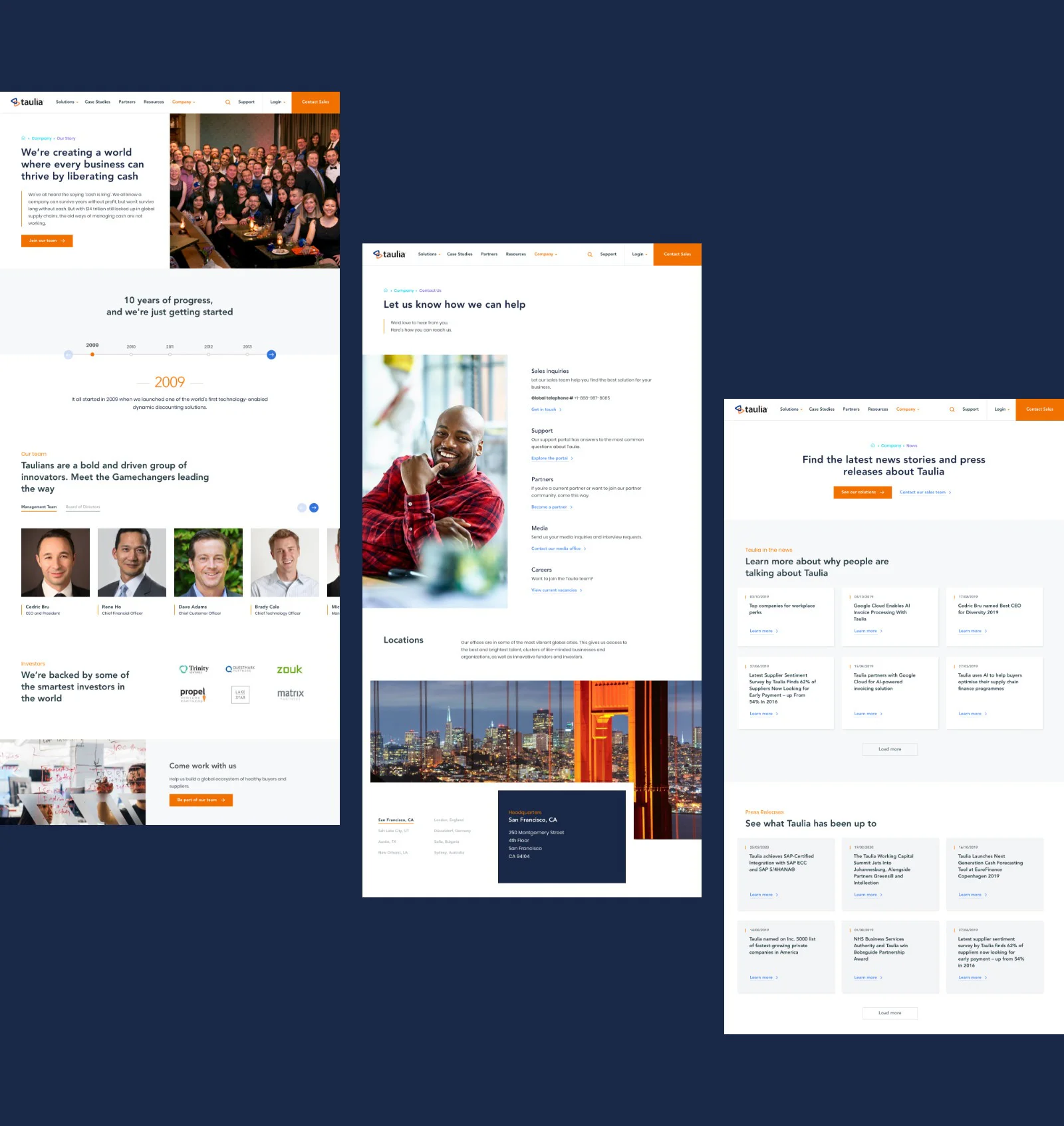
After initial workshops and in-depth research and discovery, we set out to design a global corporate website that is easily accessible to a specific target audience, while delivering content that showcases Taulia's service offering and success stories through case studies. Initial wireframes and prototypes helped to simplify the structure and give us a clear road map to deliver content in a meaningful way.
Typeface & colours
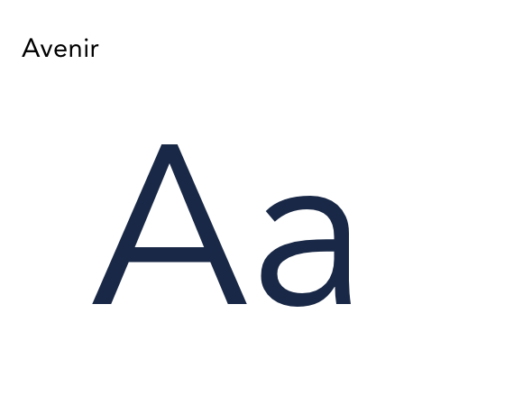
The Avenir and Poppins font families were chosen for good legibility and a clean modern feel. The colour palette also had a refresh. We streamlined the colour palette and brightened it up.

Iconography
Photography
We moved away from the over-use of quirky illustrations from the old site and looked to rather use photography that brings out the human element of the messaging.

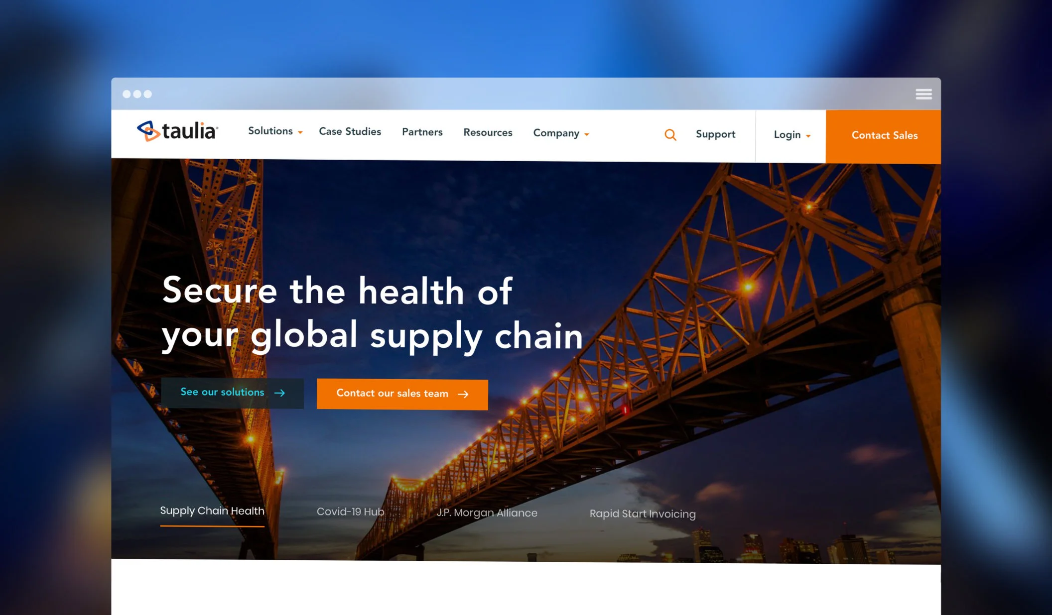
Simplifying the conversion process
Increasing the overall conversion rate on the site was done by making sure the user clearly understands what Taulia does and what value they can help unlock for potential customers within their supply chain. The new homepage showcases not only Taulia’s newly defined solutions, but allows quick accesses to featured case studies and rich content like webinars and blog resources. The tone and imagery plays a vital role in building trust with a user.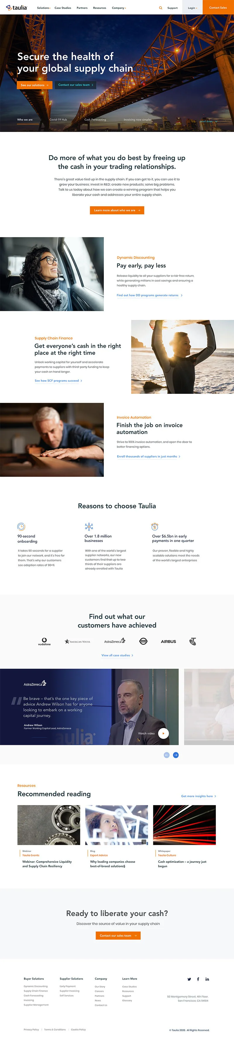
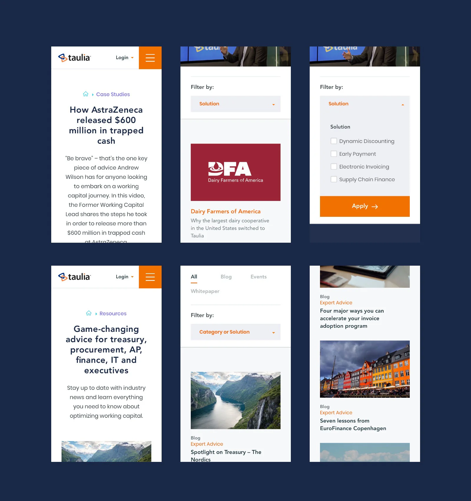
A refined mobile framework
The responsive framework was built giving users access to a rich hub of valuable resources and industry insights. While still being able to access supporting content like case studies and press releases.
"Working with Simplr was very easy, they combined excellent technical knowledge, great design and a simple to navigate UX. The new Taulia website has resulted in high-quality leads and more visitors spending longer on our site."


