Brief
Intellinexus—experts in data insights—approached Simplr to help align their brand with their company’s growth. Our task was to evolve the Intellinexus brand, creating a refreshed positioning that signals a new era of opportunity.
Solution
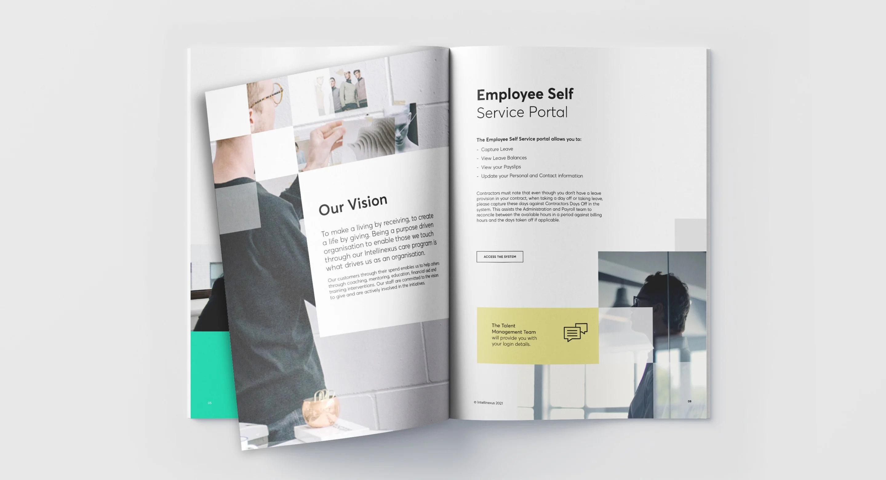
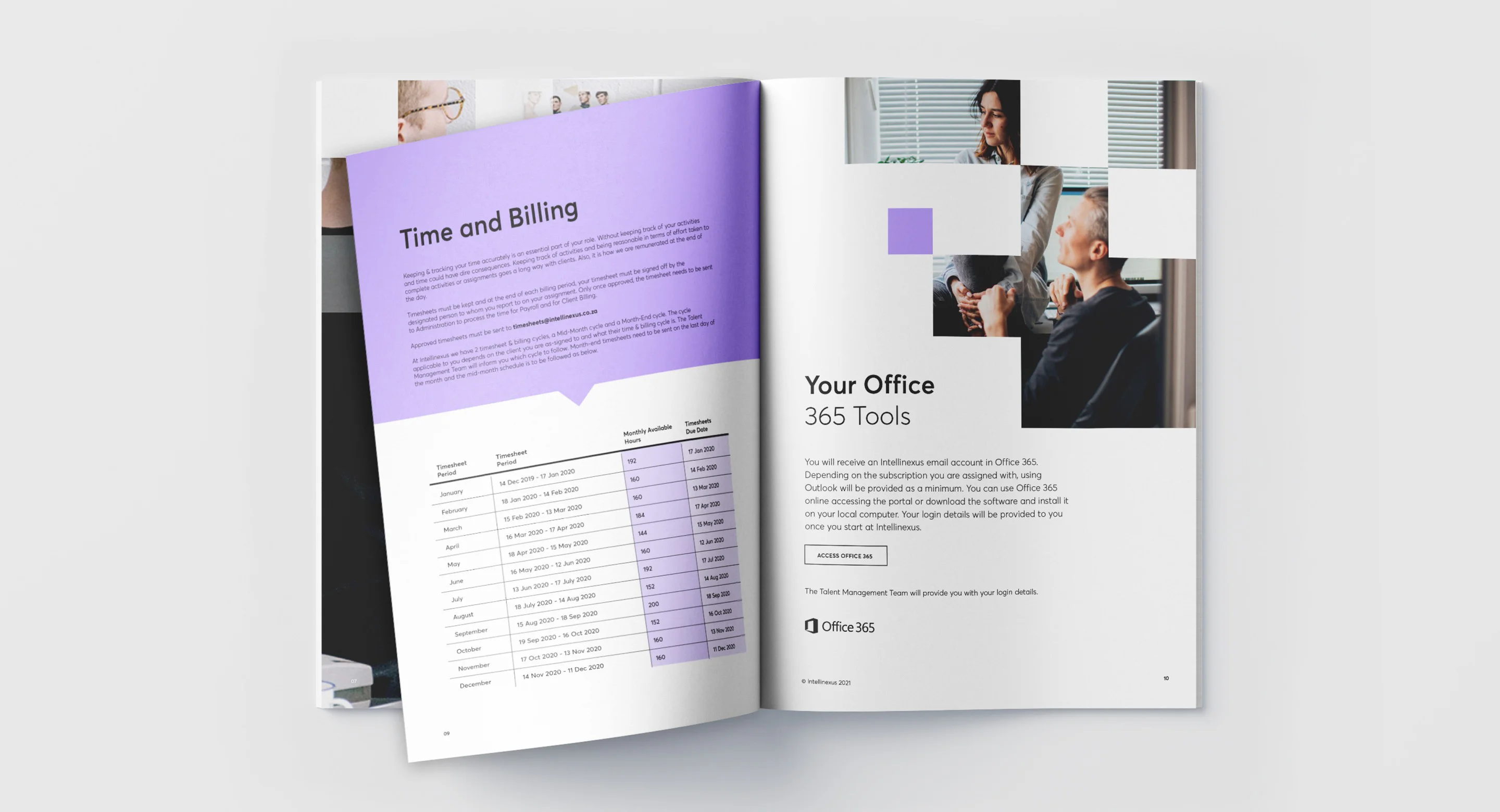
Using our signature, strategically led approach to research and discovery, we repositioned and rebranded Intellinexus with a bold new identity. The result was a reimagined, distinctive visual system—both modular and adaptable. The outcome? A crisp, impactful brand that sets Intellinexus apart from its peers.
Identity Design
Visual Language Development
Web Design & Development


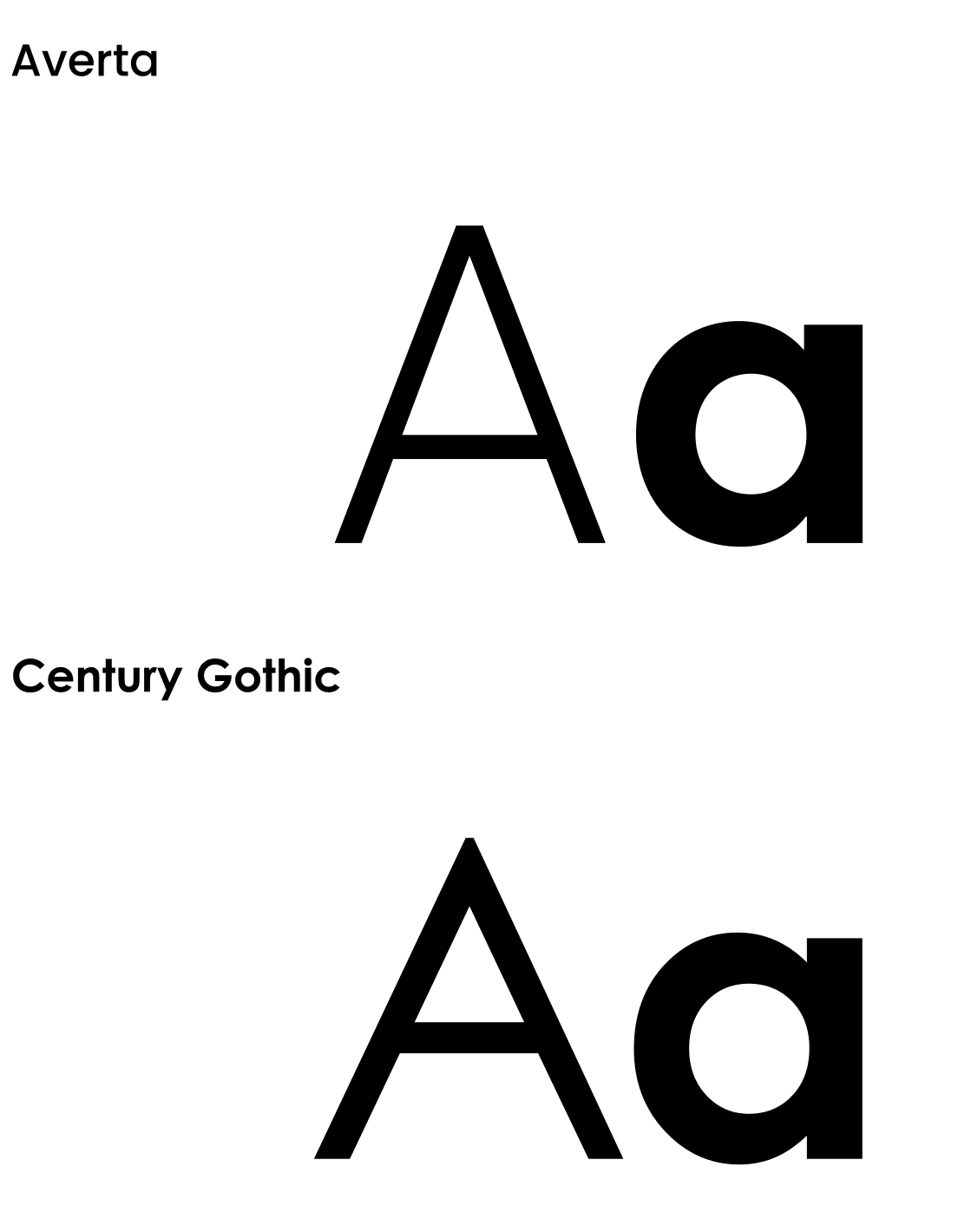
A consistent visual language through typography and colour
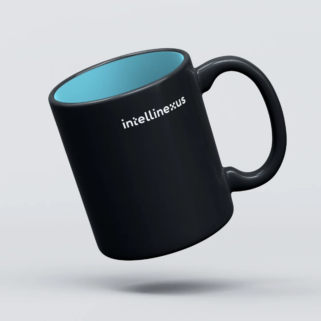
Before our involvement, the brand made use of one font with a simple, monochromatic colour palette of blues. We refreshed it with the introduction of two similar Sans Serif fonts for print, online and their external-facing communications. To accentuate the single chosen colour – black – we introduces a few bright colours to give the brand a vibrant look and feel.


Introducing a super graphic
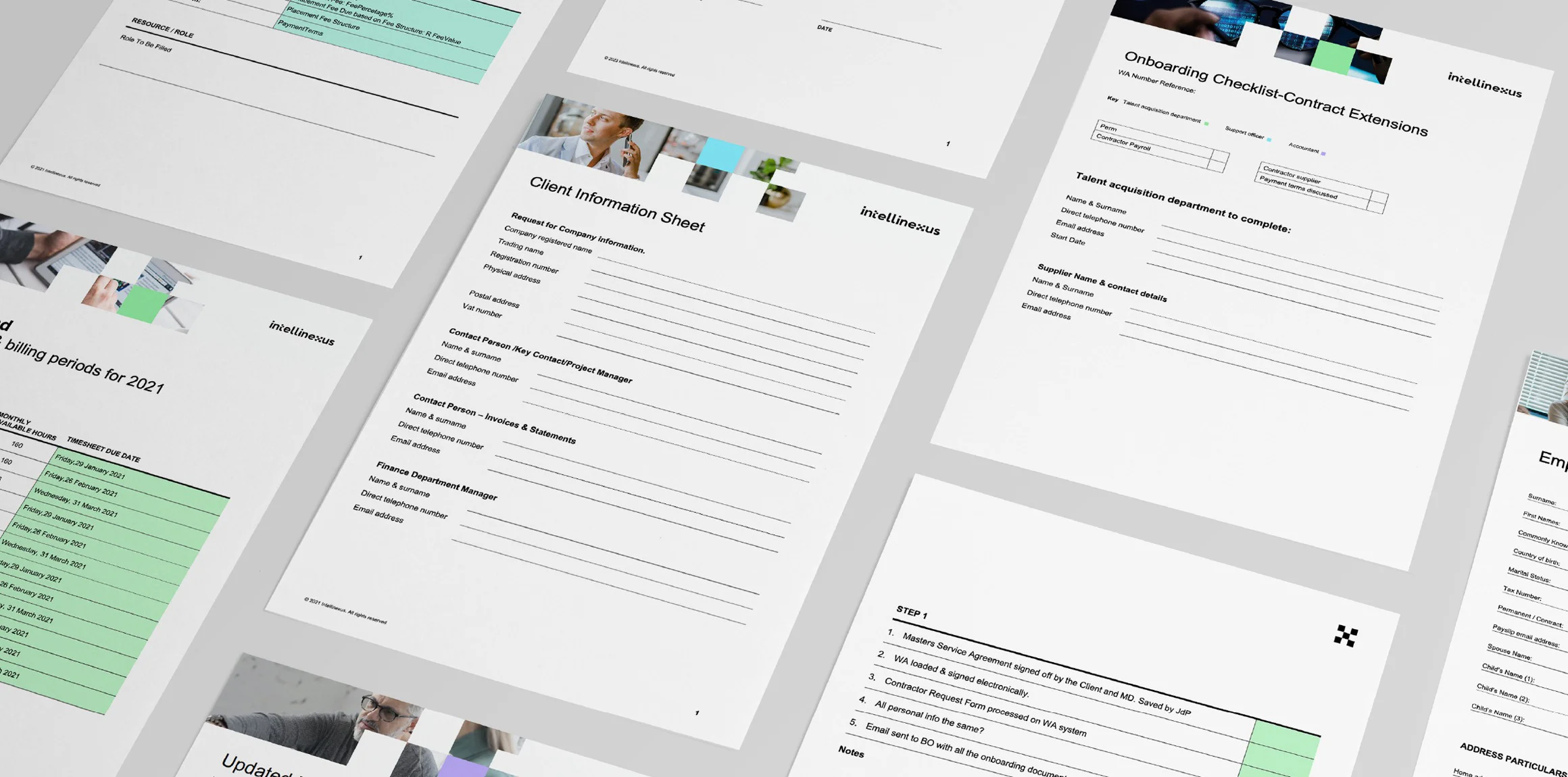
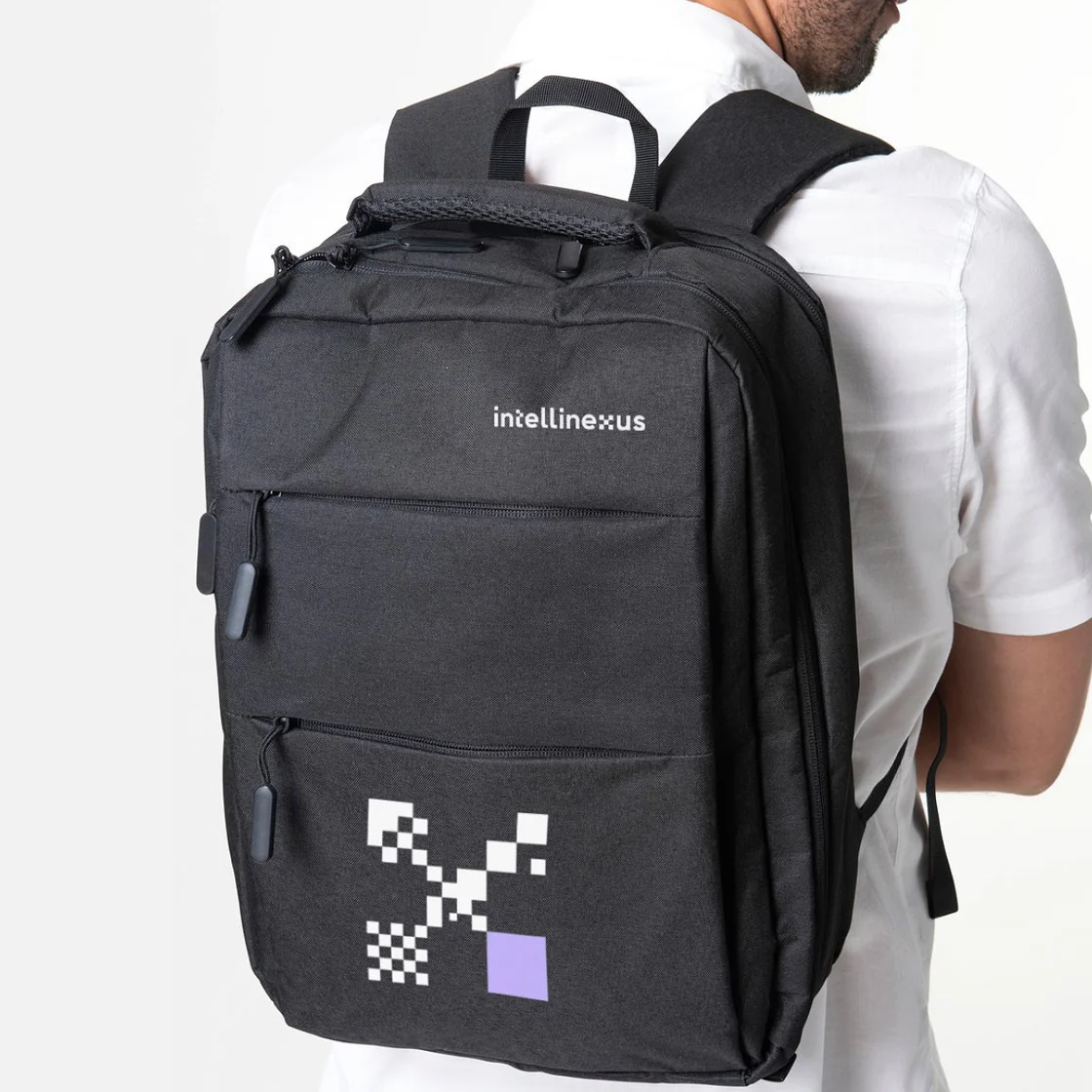
To give the brand a stunning yet simple new identity, we created a super graphic from the ‘x’ in the logotype. This more detailed element morphed and changed to create interesting geometric patterns. The visual identity took further cues from the super graphic in the form of close-up, alternating crops of a chequered pattern system.


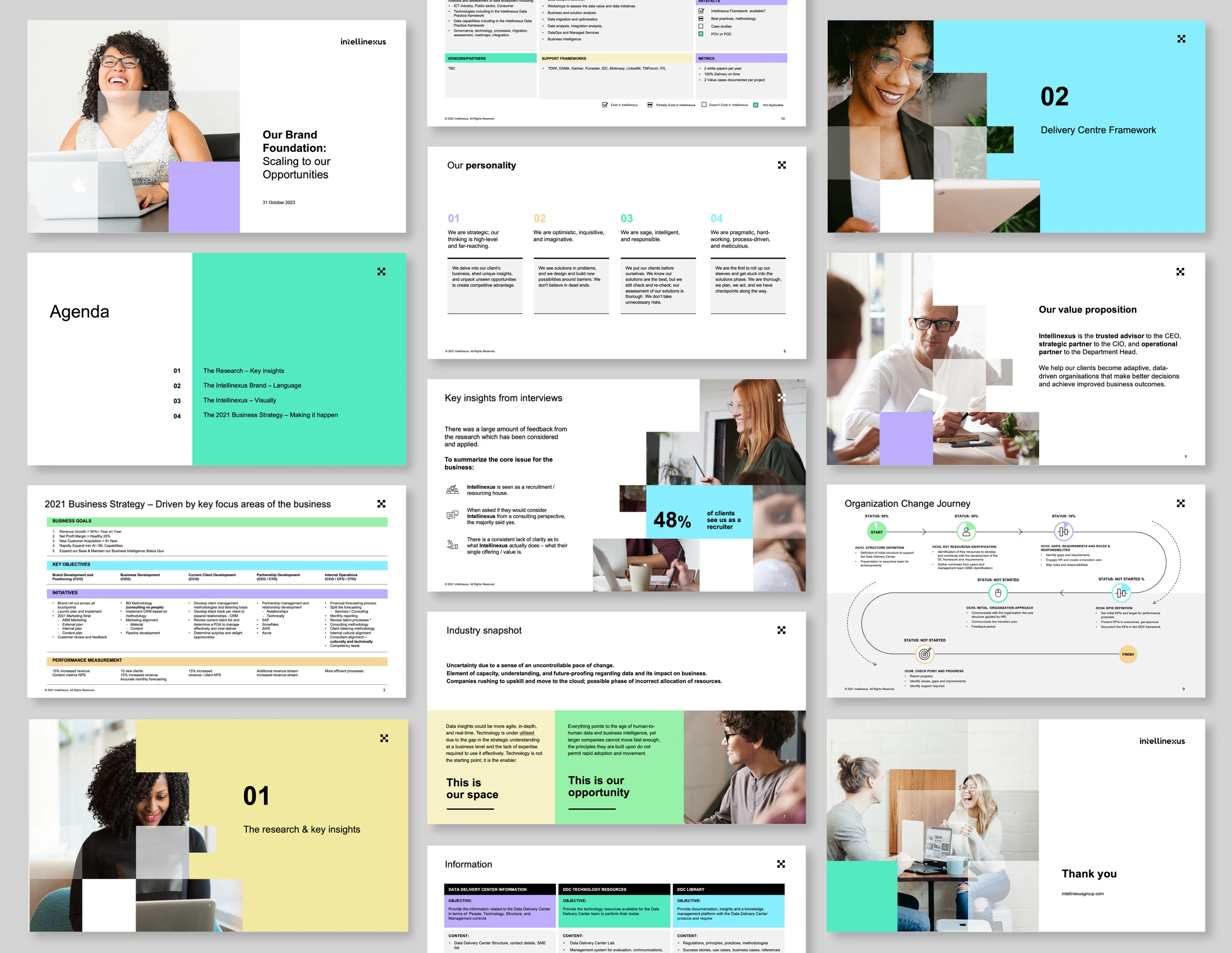
Presentation templates that make a statement
As presentations are an essential tool for the company to showcase progress and share vital information relevant to client engagements, we needed to create templates that were both adaptable and impactful. Our templates did just that. The use of white as a primary backdrop colour worked well with the brand colours. Simple yet effective.

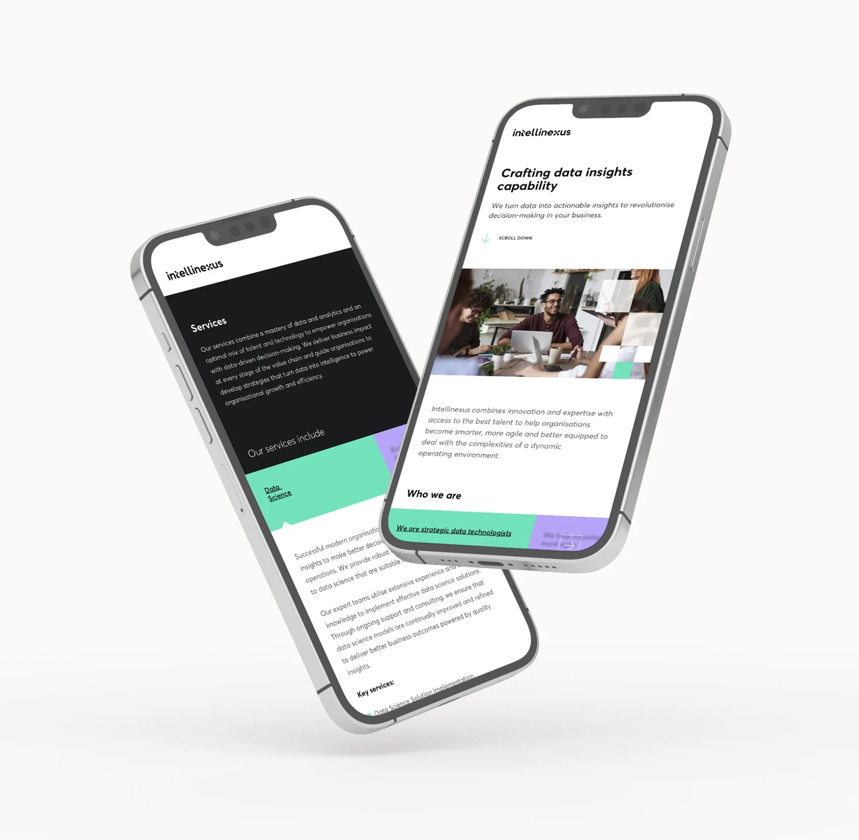
Creating an informative digital experience
Intellinexus utilises their website as a reference point for who they are and what they do, and not necessarily as a primary driver for new business. As such, we focused on creating an engaging one-page website that is easy to navigate and is supported by a well thought-out user experience.


