

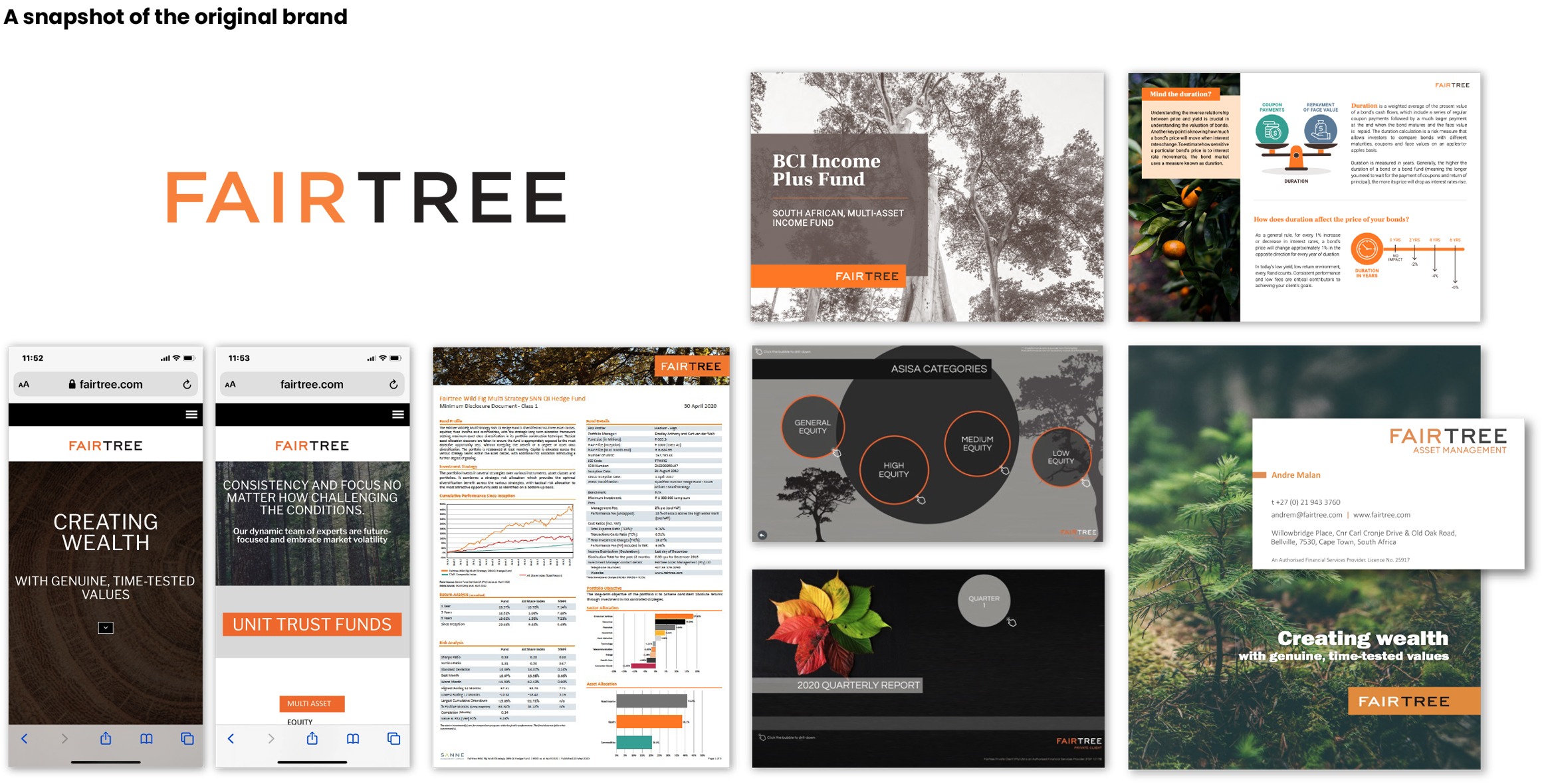
Brief
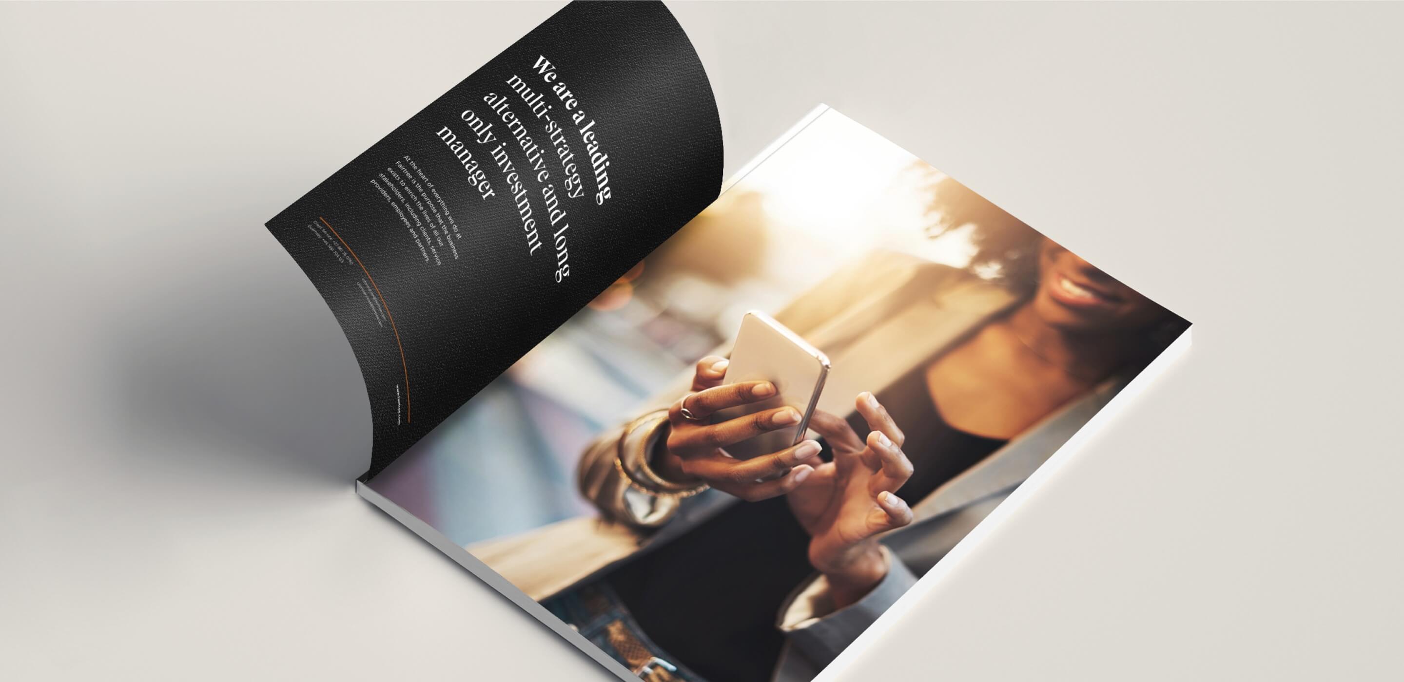
Fairtree is an international investment company with office in The Netherlands, United Kingdom, Luxembourg, Namibia and South Africa. They entrusted us with the task of strategically repositioning whilst bringing to life their, already established brand. Rooted in strong values of Integrity, Excellence, Growth, and Family it was important that we communicated the purpose at the heart of their business; to enrich the lives of their clients and shareholders.
Solution
An elevated brand positioning, creating a sophisticated presence that inspires trust and confidence in the new brand look.
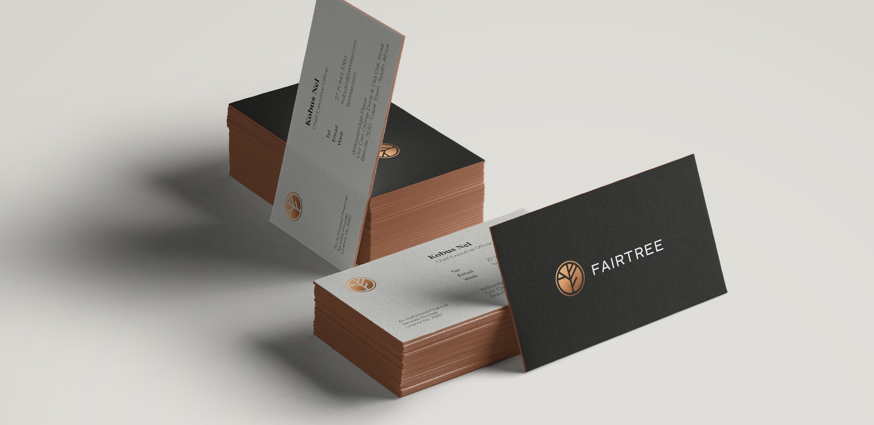
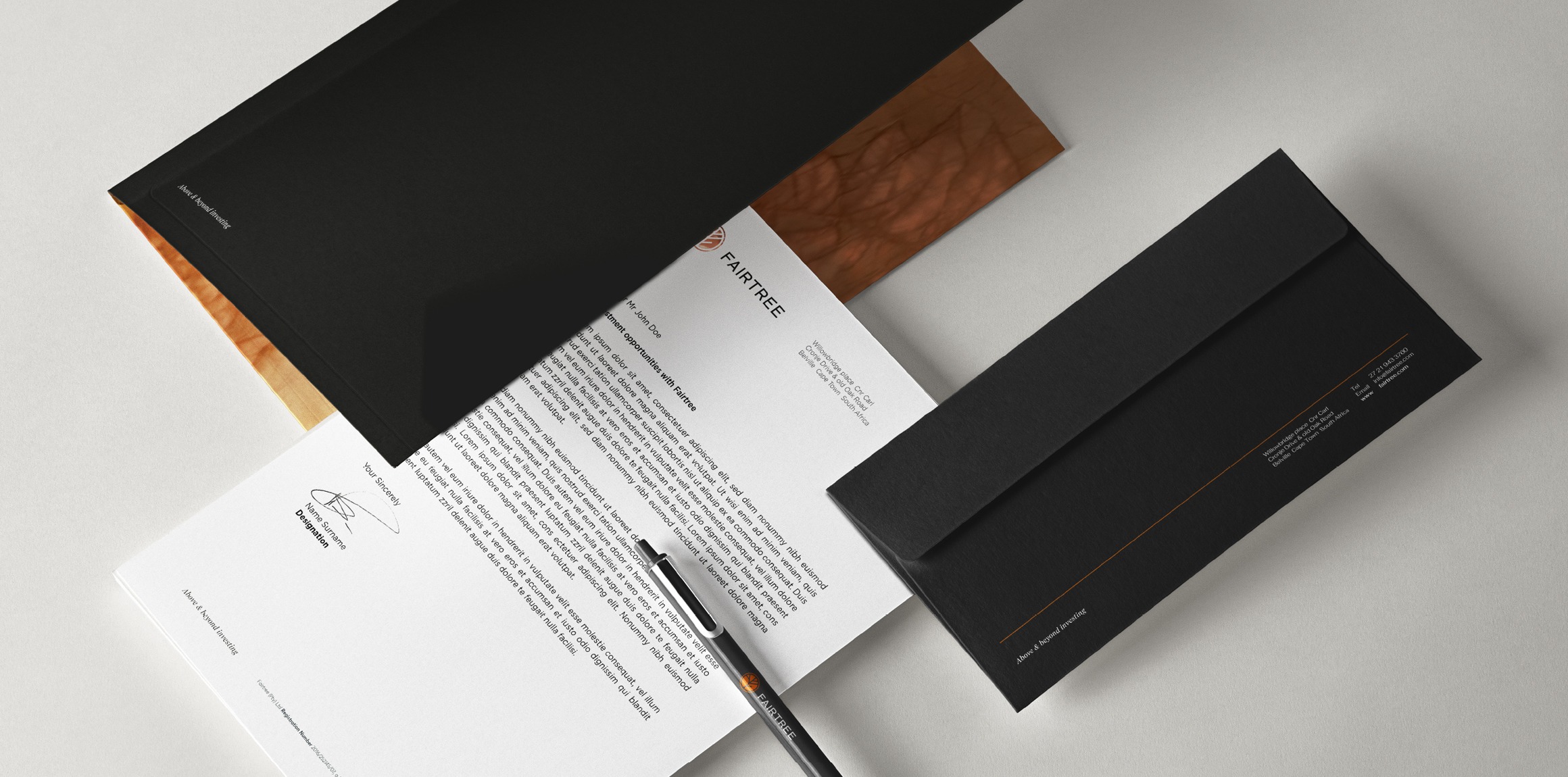
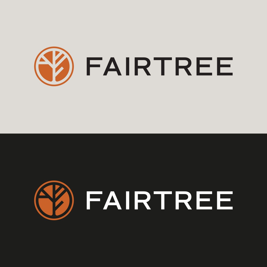
This evolution was achieved by creating a recognisable brand icon supporting an evolved logotype to create a renewed brand mark. We created a single brand organisational structure whilst maintaining consistency across all business units.
Brand Strategy
Identity Design
Visual Identity System Design
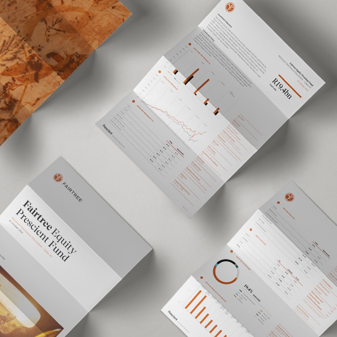
Monthly MDD Reporting Templates
Social Media and Mailer Templates
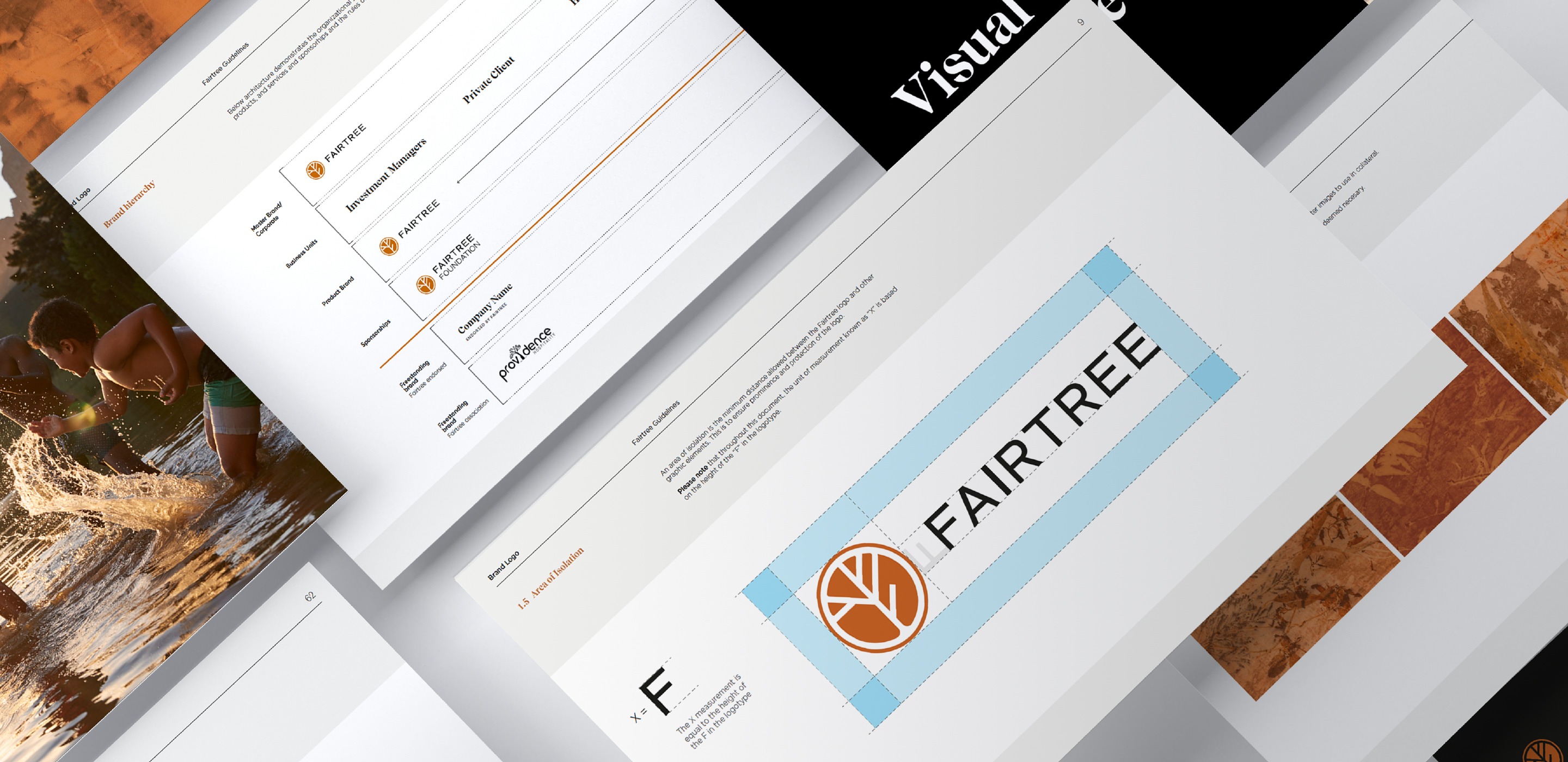
Brand Guidelines
PPT and Word Template Design
Identity design
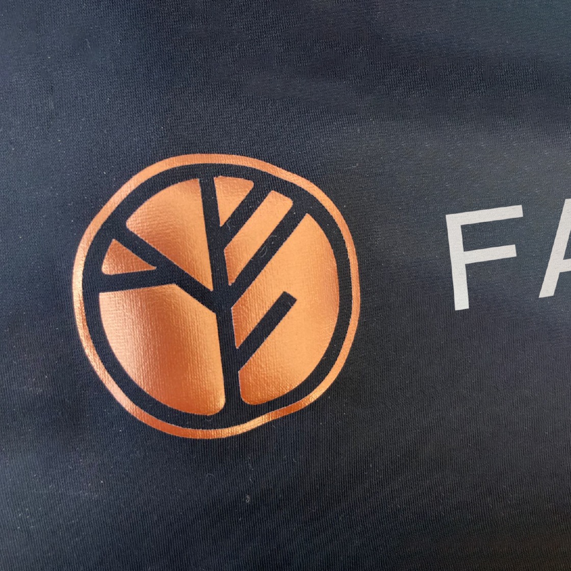
The Fairtree icon design took inspiration from the companies name, creating a symbol that encapsulated the ‘F’ from Fairtree along with graceful patterns found in the intricate structure of a leaf, using the veins within the leaf to highlight the five company values. The structure of the icon is also reminiscent of a tree silhouette, against a morning sunrise, neatly contained within a completed circle outline.


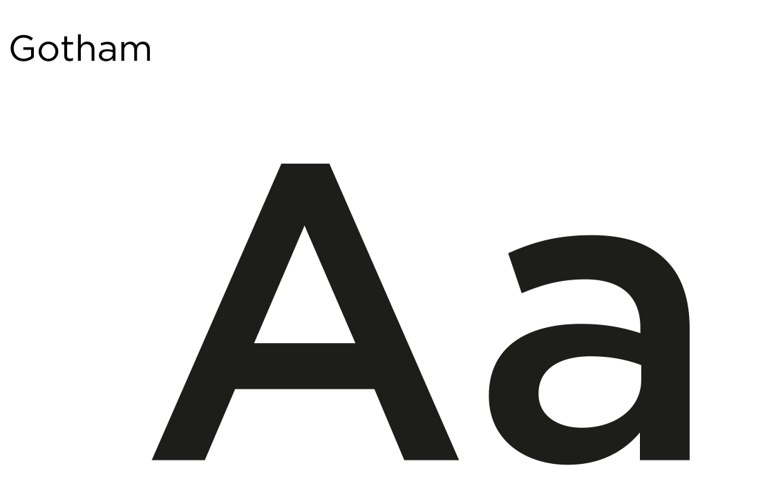
Typography
We chose Recife as Fairtree's primary typeface for its understated sophistication and elegance. Gotham is a fantastic complimentary font used for all body copy within their brand collateral. Aleo was chosen to help differentiate the company tagline from the rest of the copy used throughout their brand.
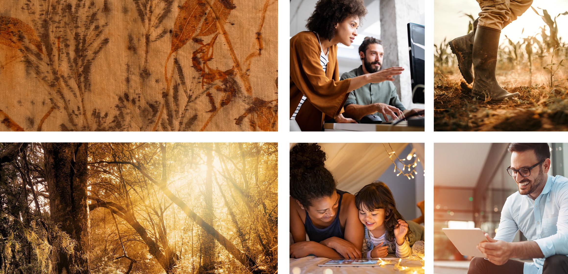
Bespoke yellowwood ecoprint
Eco-printing is a technique where plants, leaves and flowers leave their shapes, color, and marks on fabric. Plant material bundled inside of cloth is steamed or boiled to release the dye found naturally inside the plant, creating a contact print in the shape of the leaf or flower used.
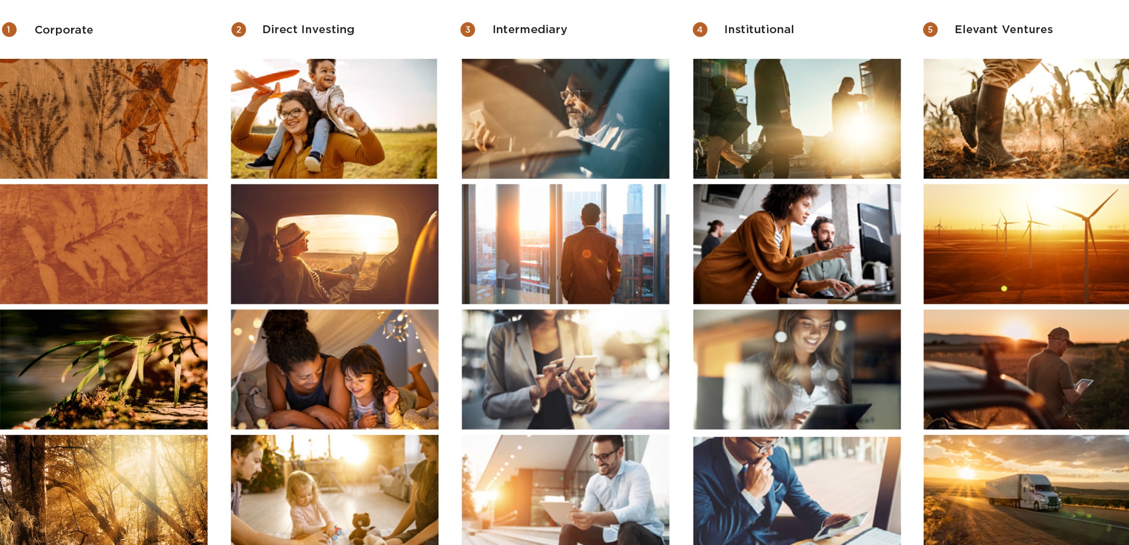
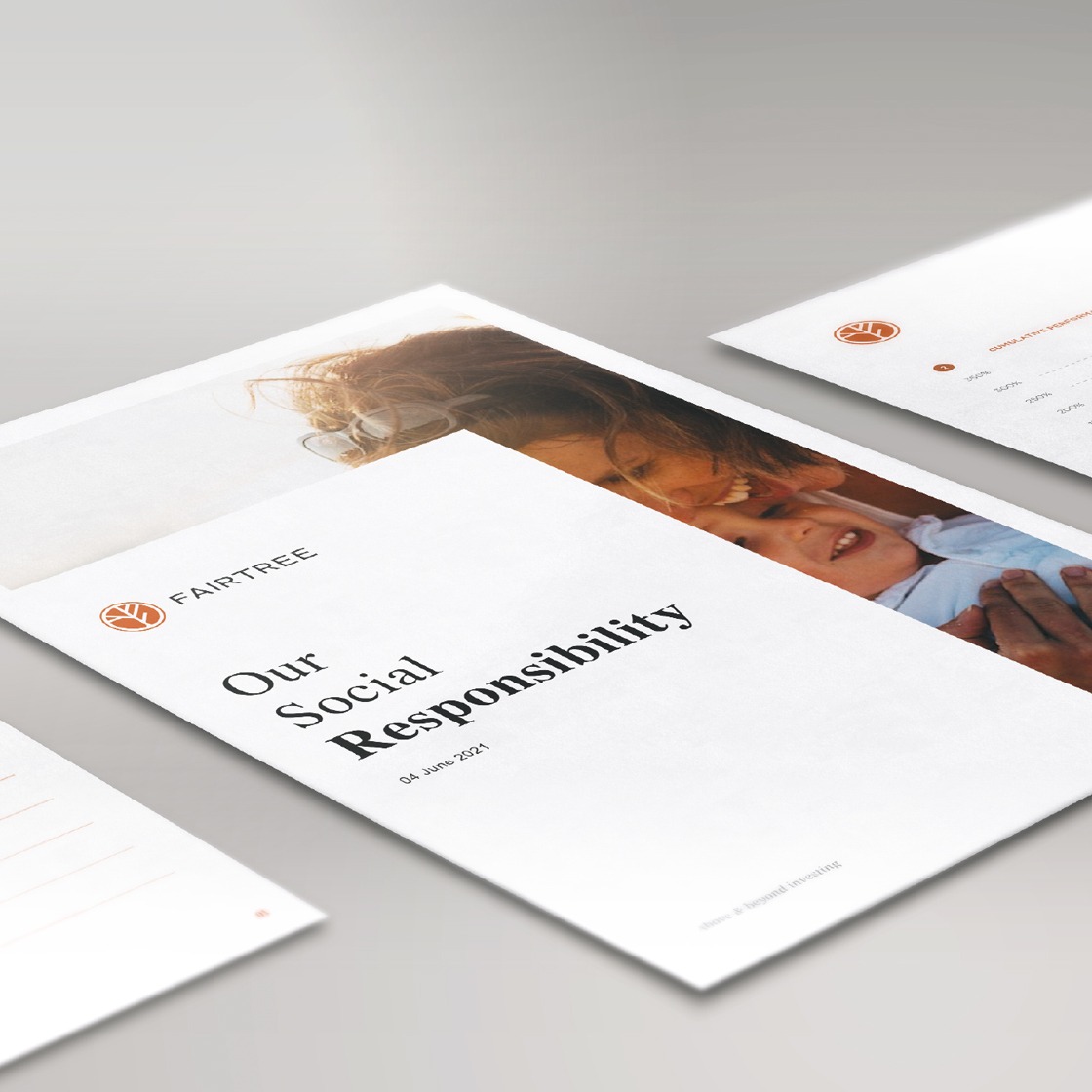
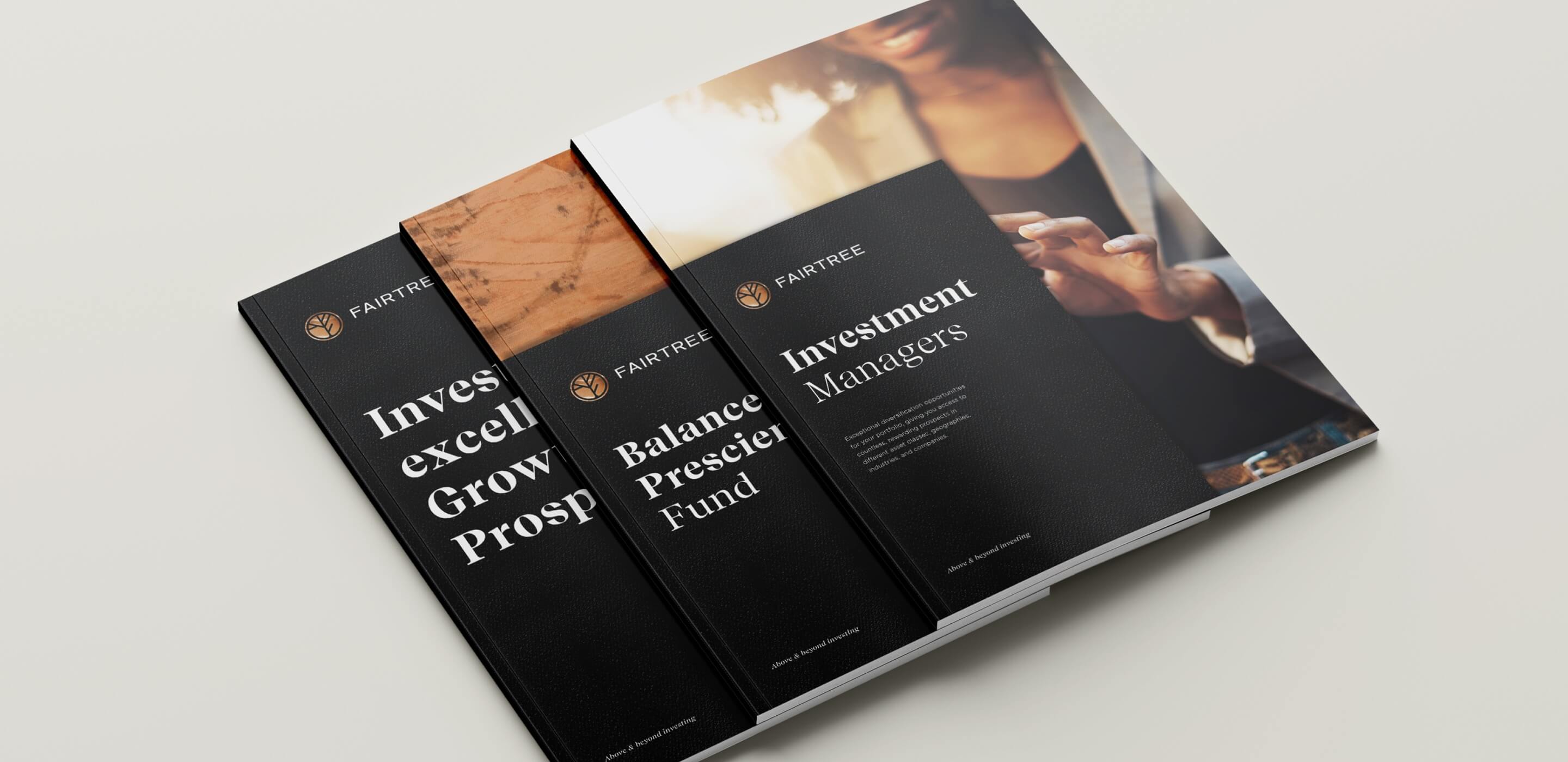
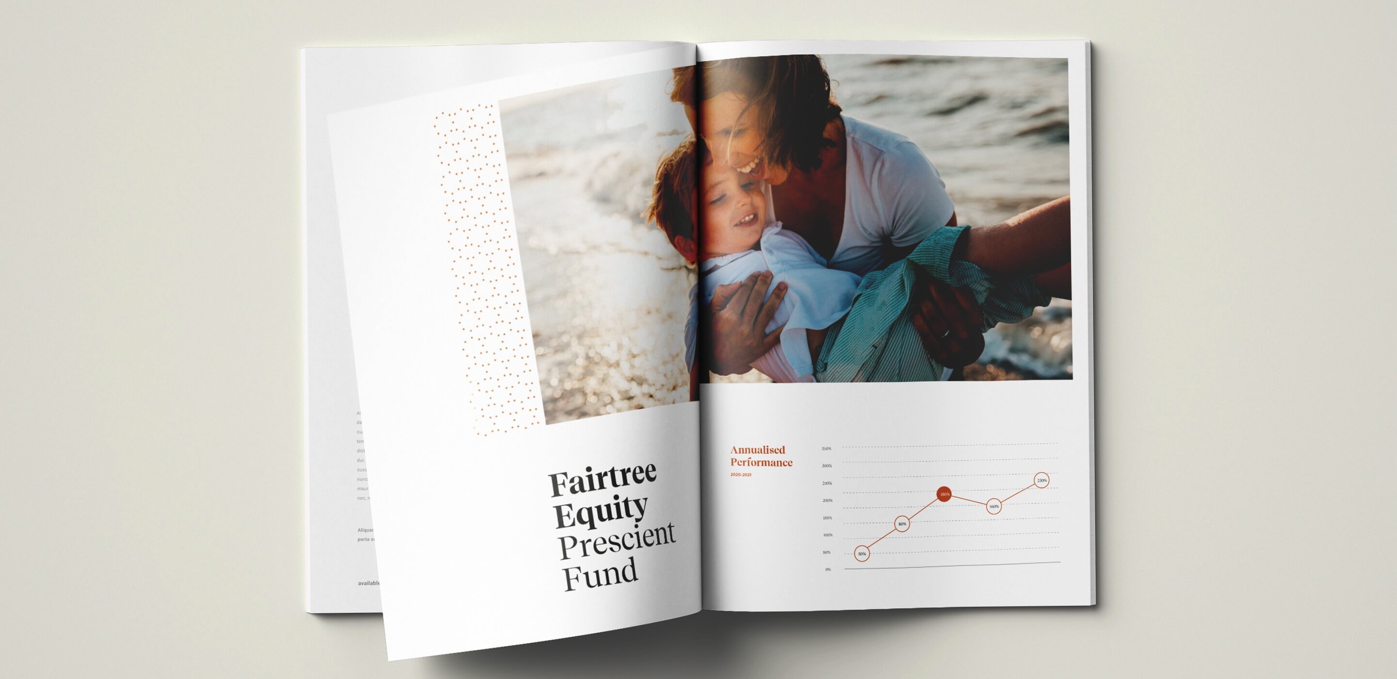
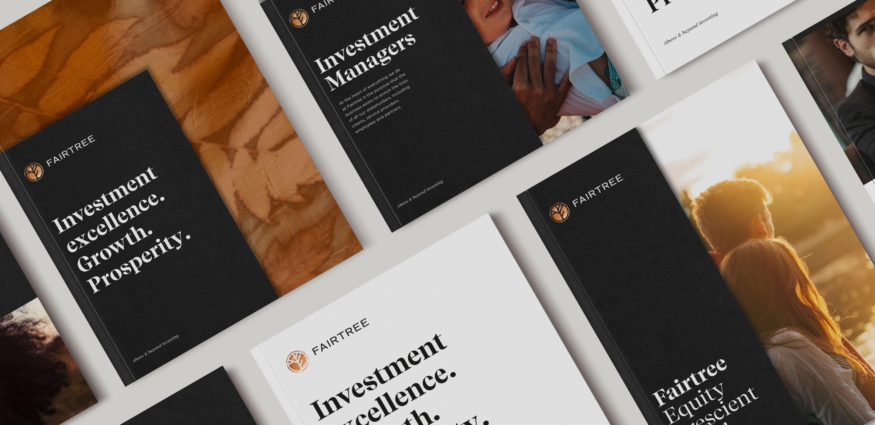
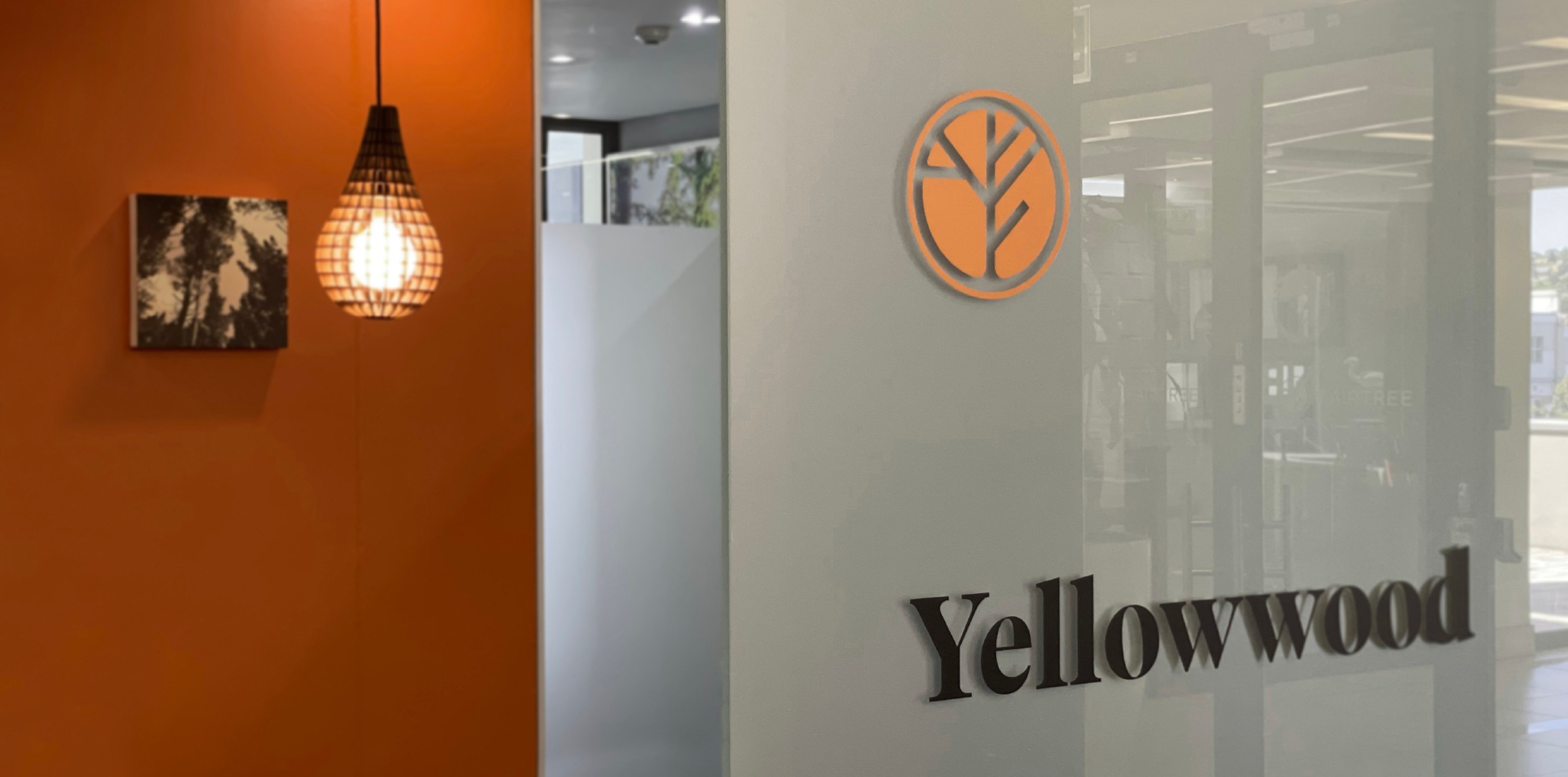
We differentiate between the corporate brand and business units within Fairtree through the use of carefully selected imagery. All corporate elements use the bespoke Yellowwood Eco Print while the business units use photography specifically chosen to suite the specific divisions within Fairtree. The images all have a soft golden glow that sets the tone for a consistent visual style.
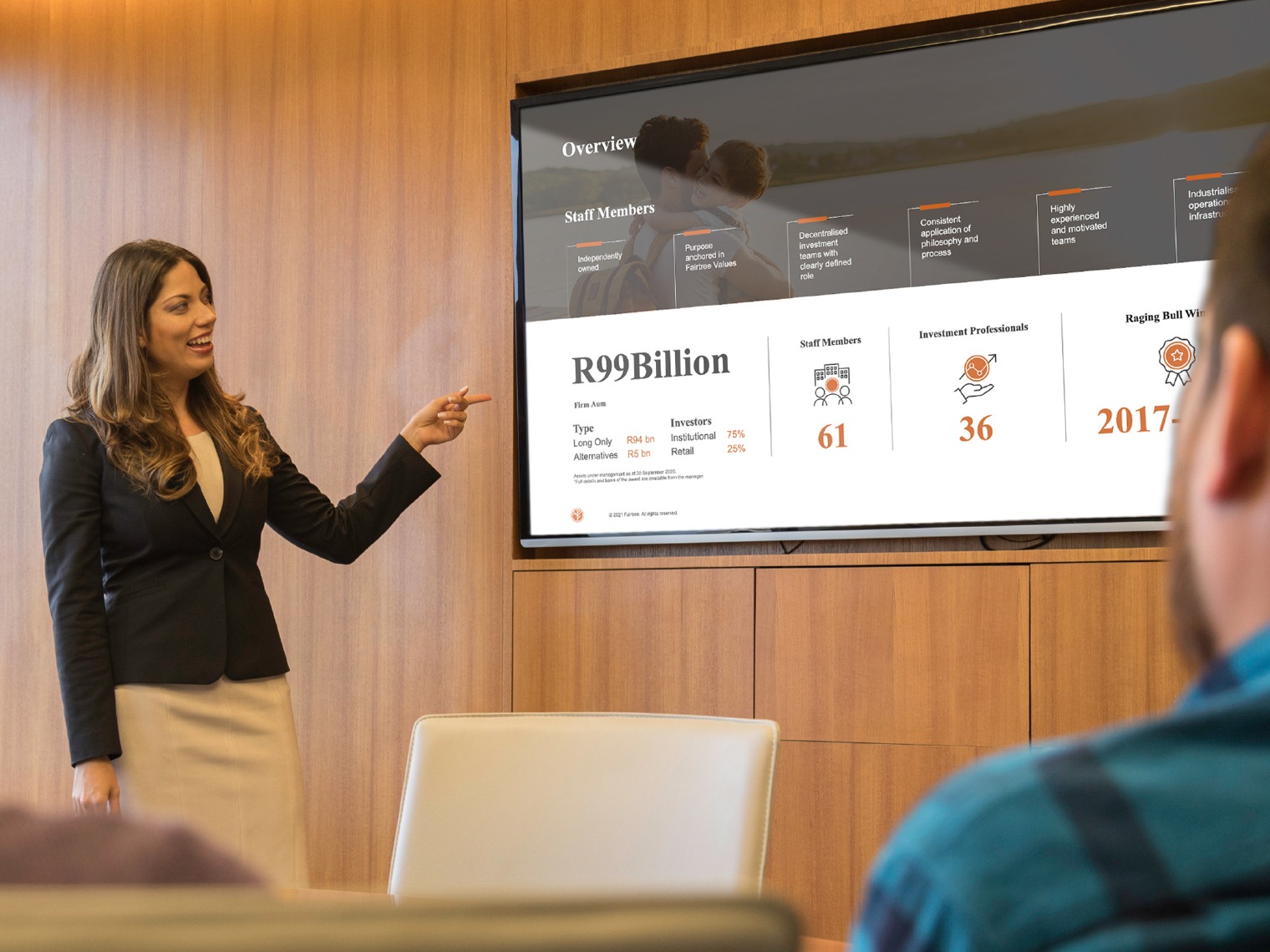
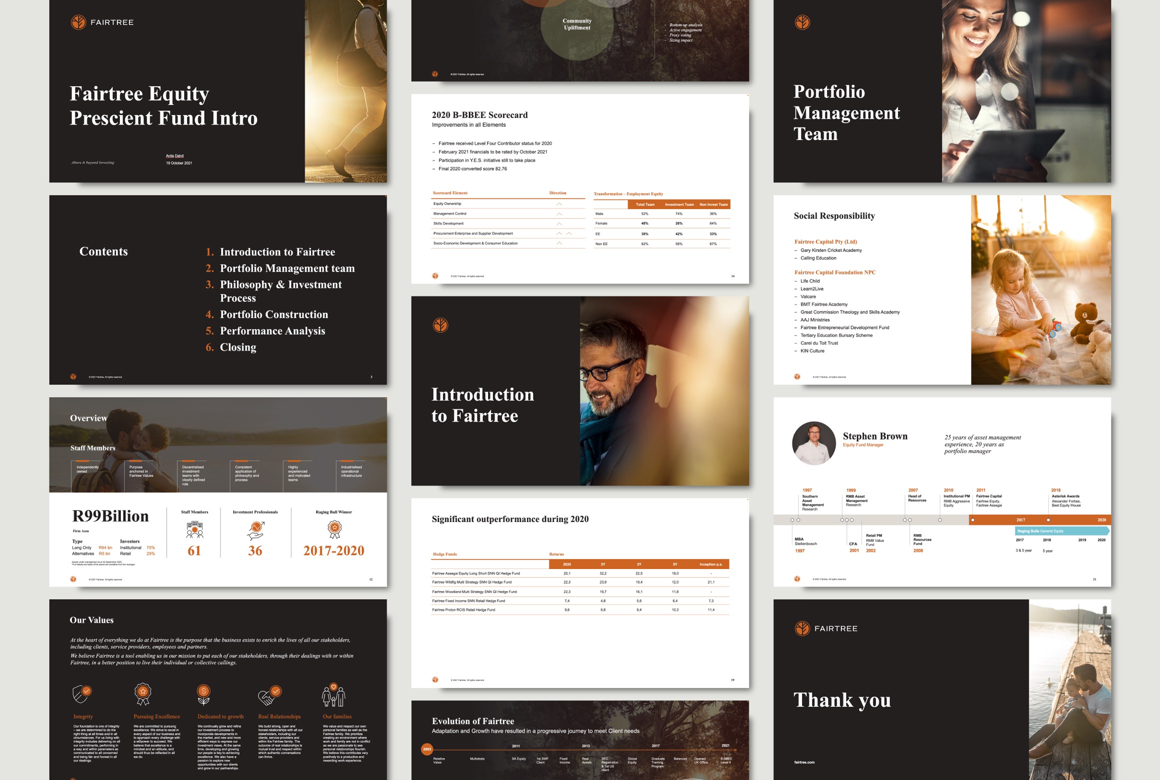
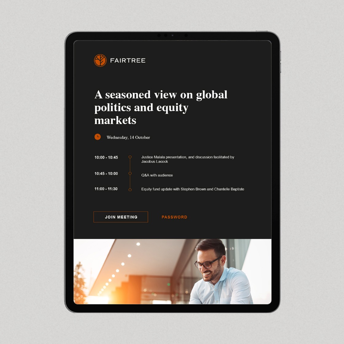
PPT template design
PowerPoint is an important reporting and sales tool for the Fairtree team, they required a robust yet customisable template that allowed for flexibility in image usage and content change.
We created a user-friendly, easy to use template that integrated with their reporting data program allowing for quick updates on finance stats and figures from source.
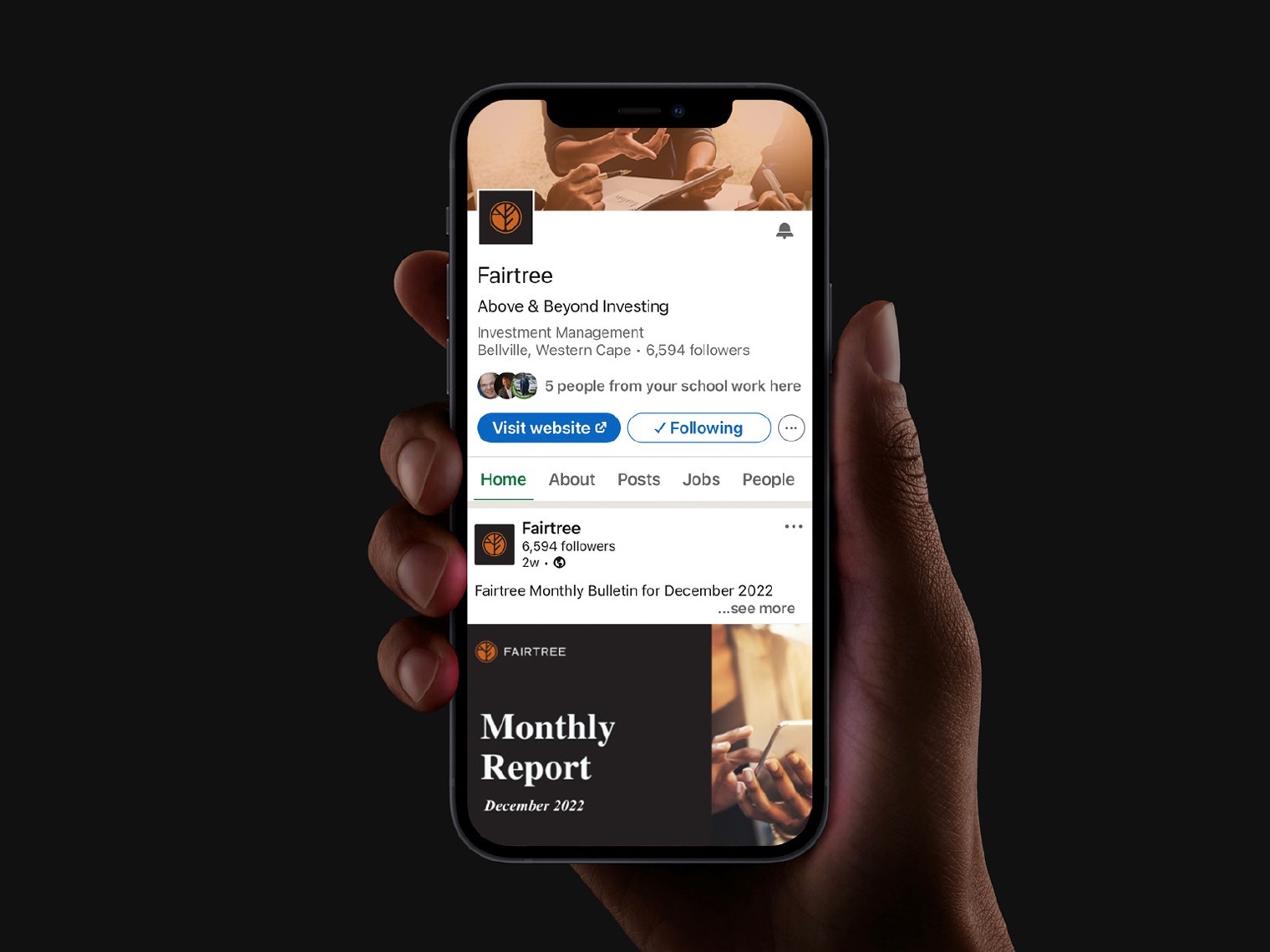
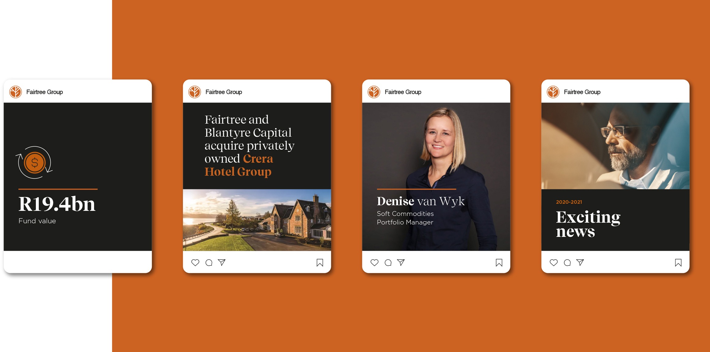
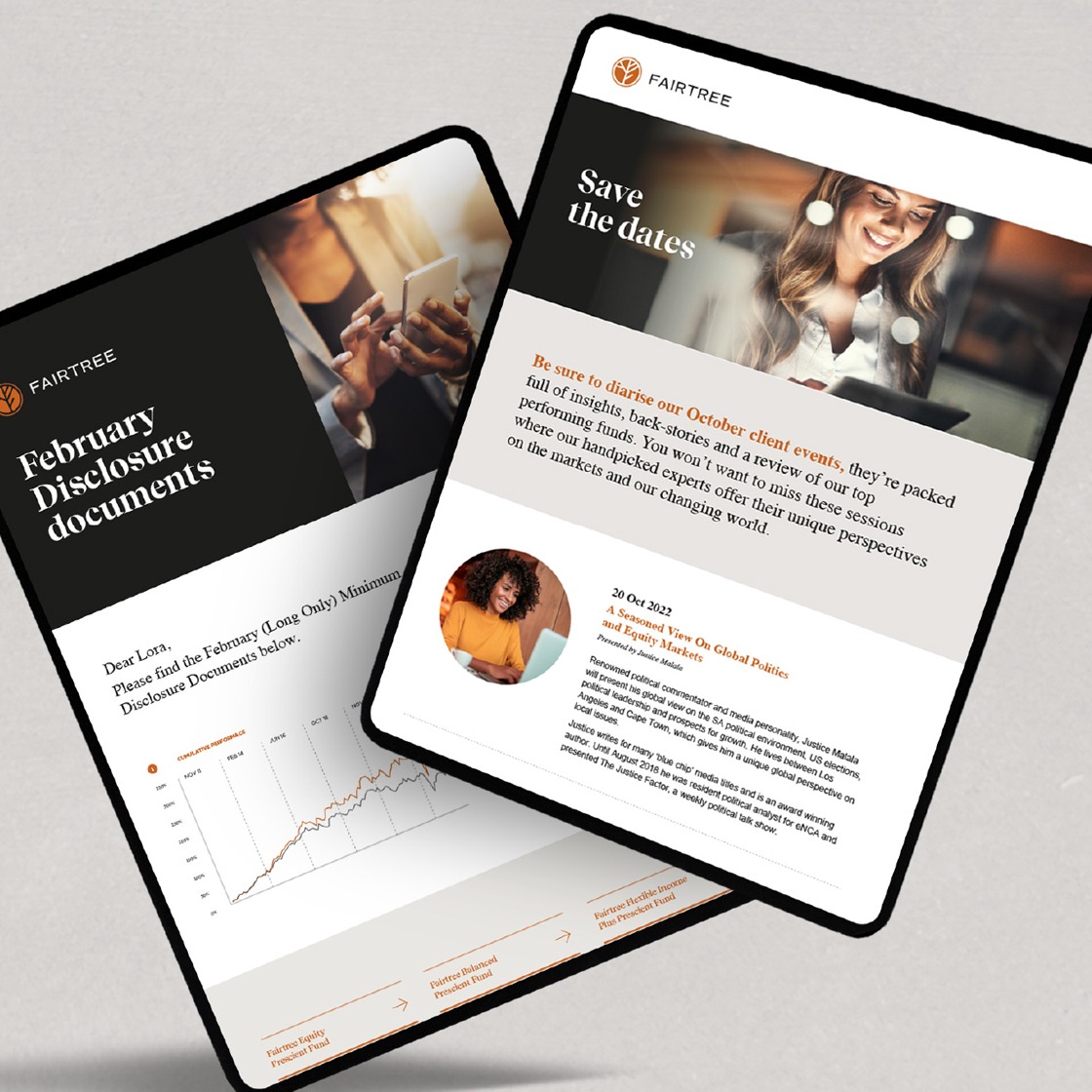
Social media
Social media is important for Fairtree to enable them to showcase many aspects of the business from growth, new acquisitions and keeping people up to date on their accessible monthly reports.
To this end, we created the social media template styles allowing for customisation and ease of update of content. We also developed all the mailer templates with various style applications.

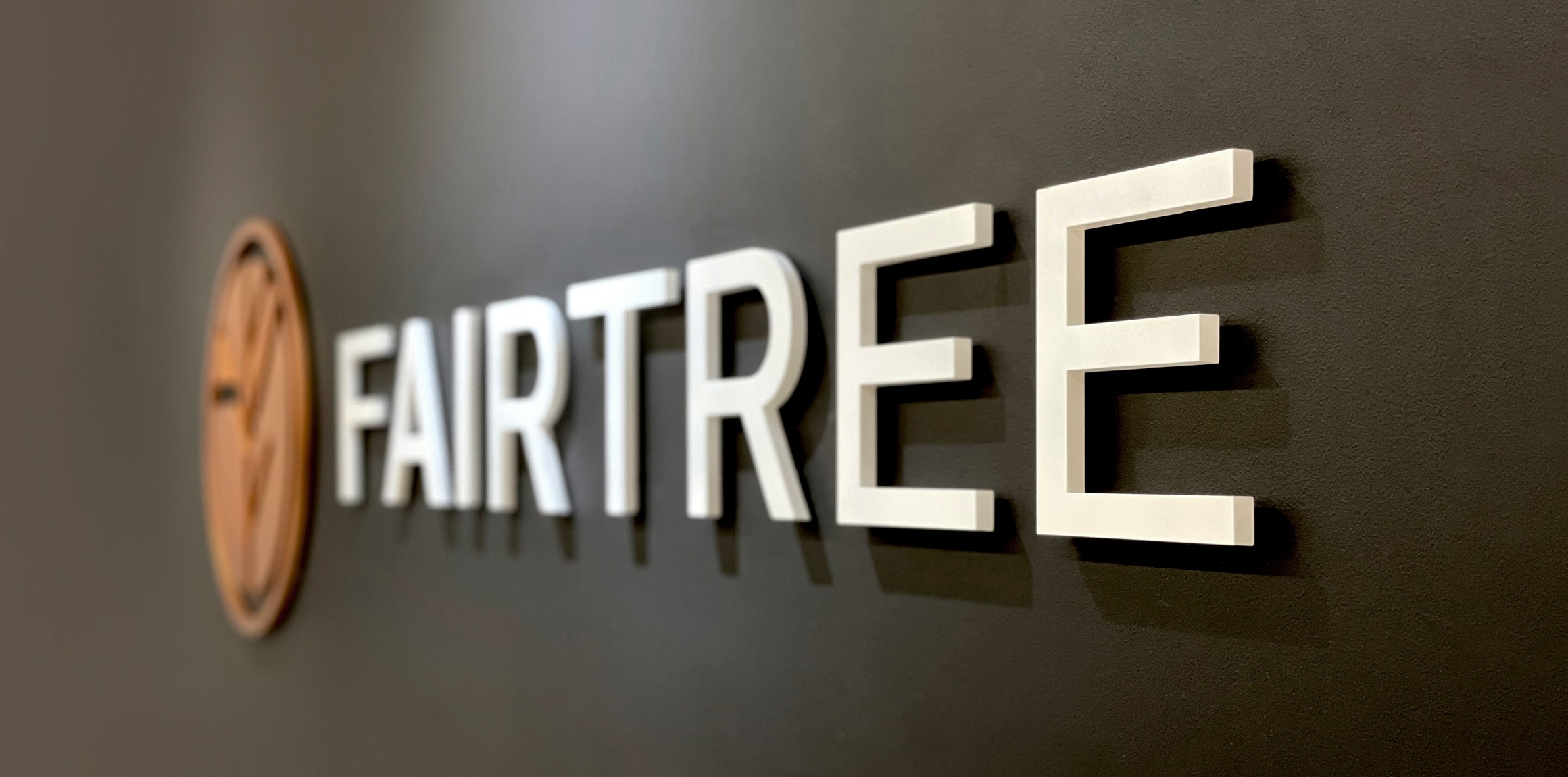
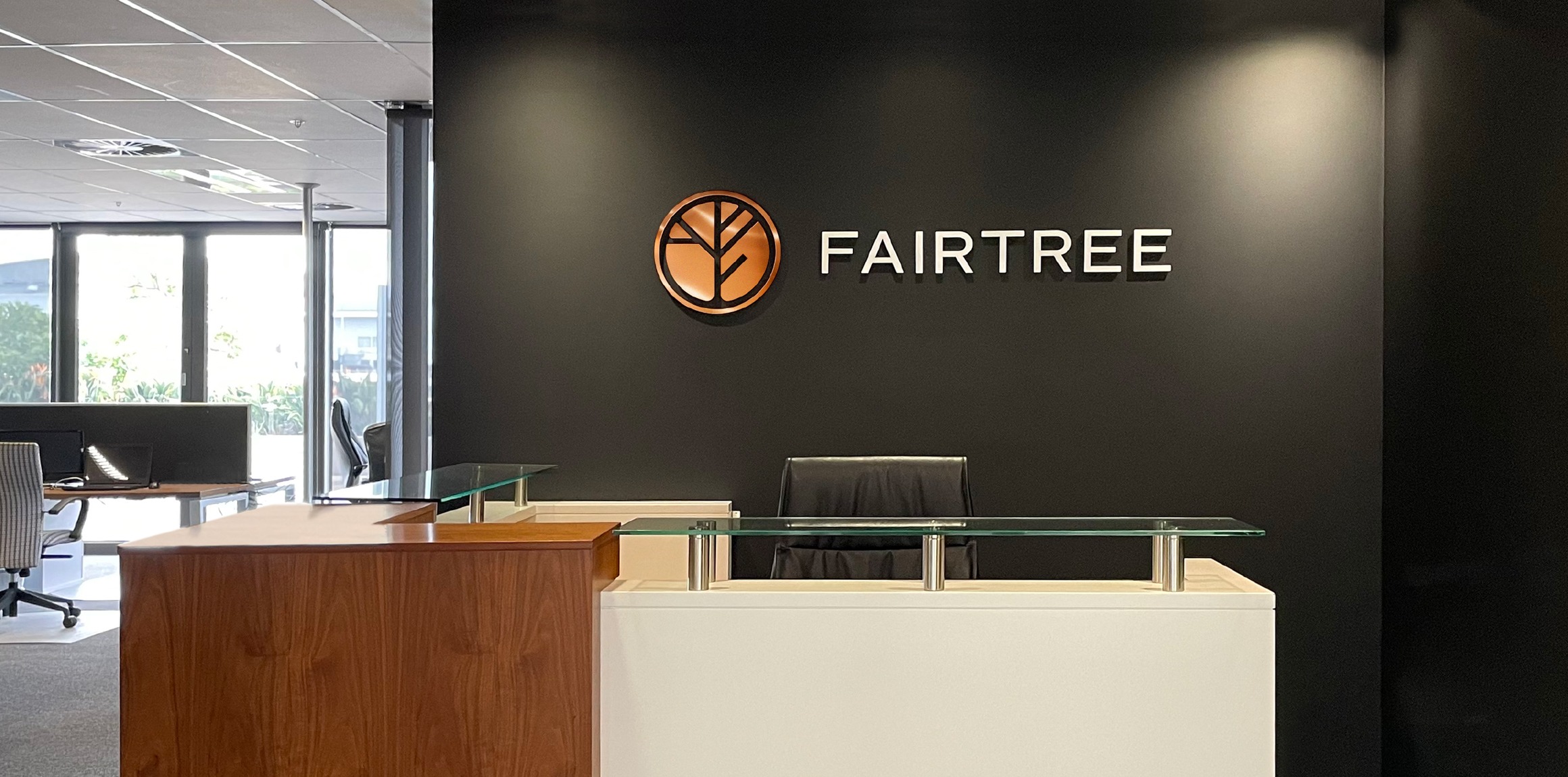
Office signage
Along with a new brand repositioning comes the need to re-look the signage within the office environment.
Here we were able to play with various materials to emphasise the gravitas of the new brand personality. We addresses the main office entrance signage, office receptions and meeting room graphics.
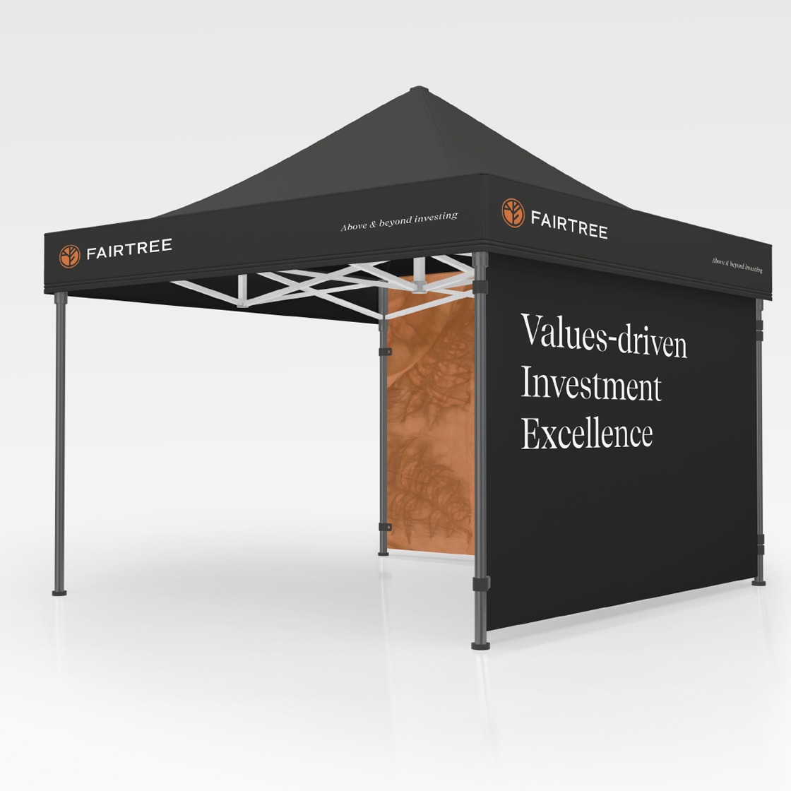
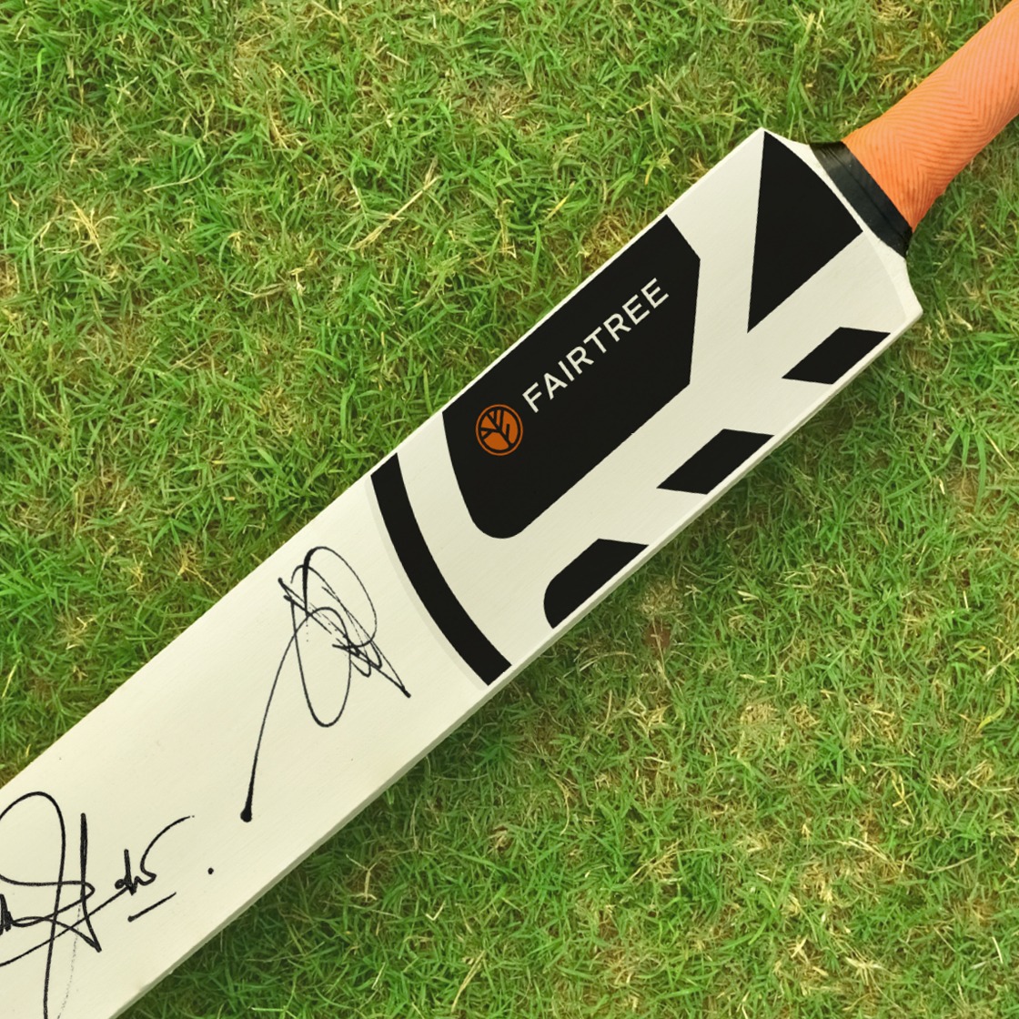
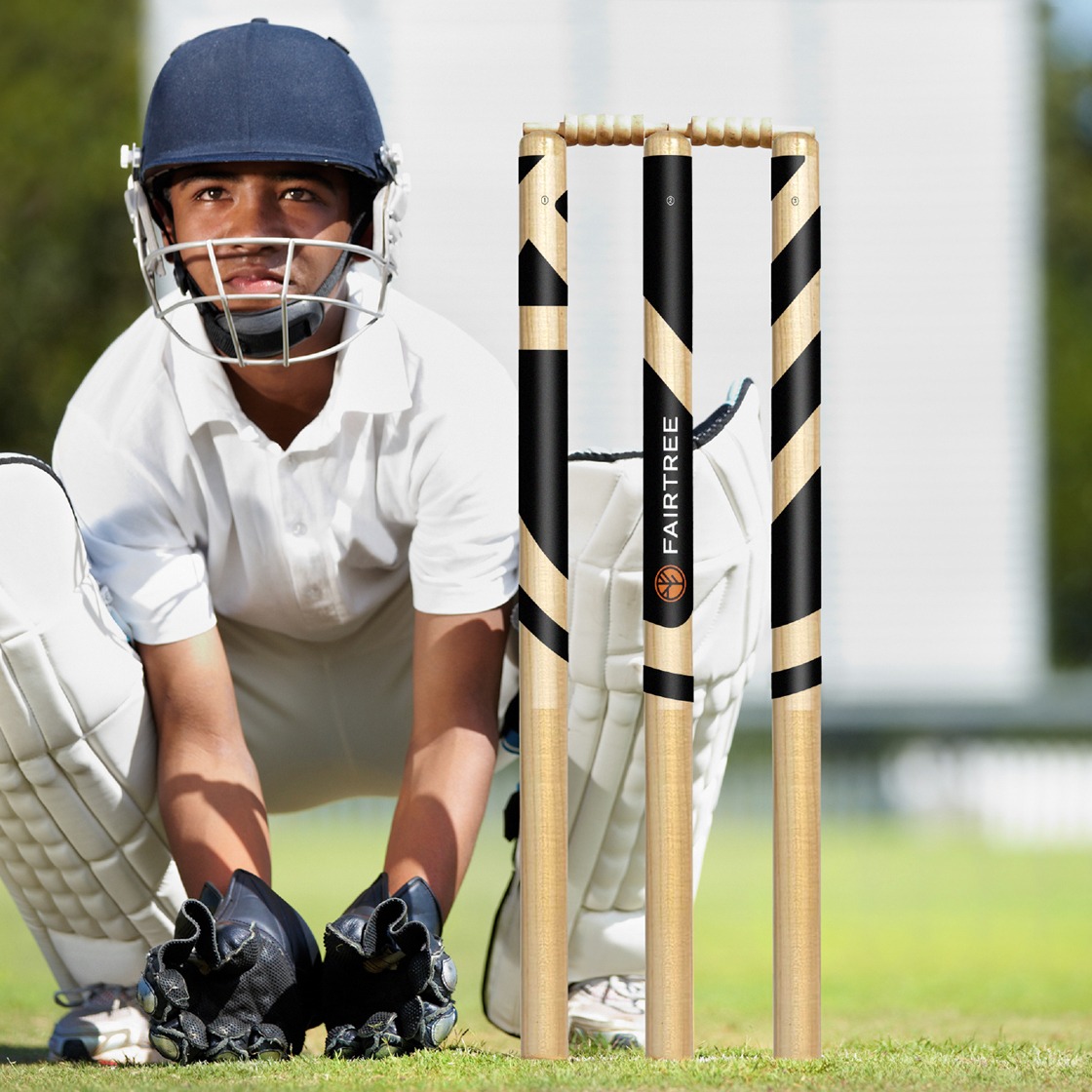
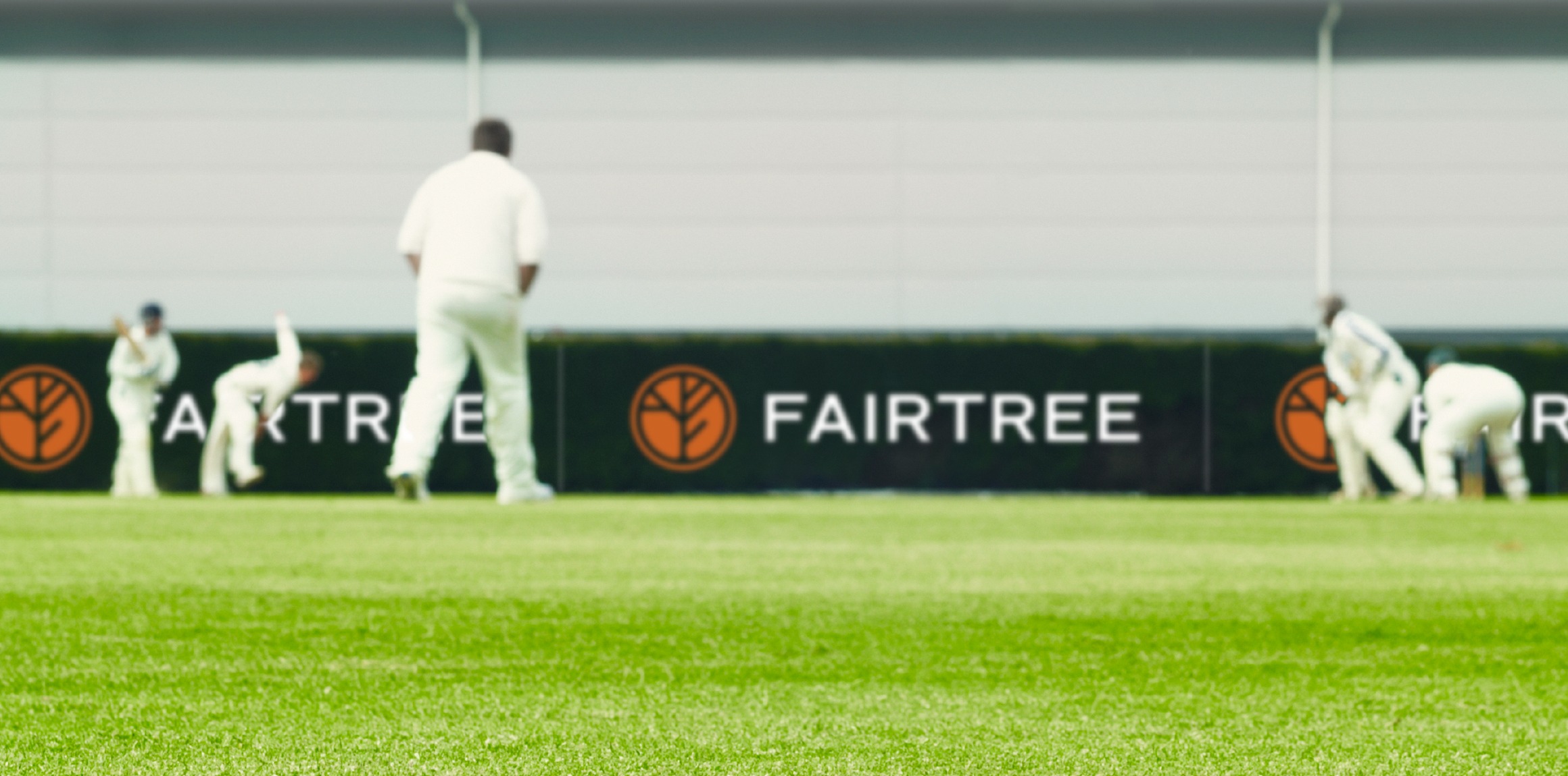
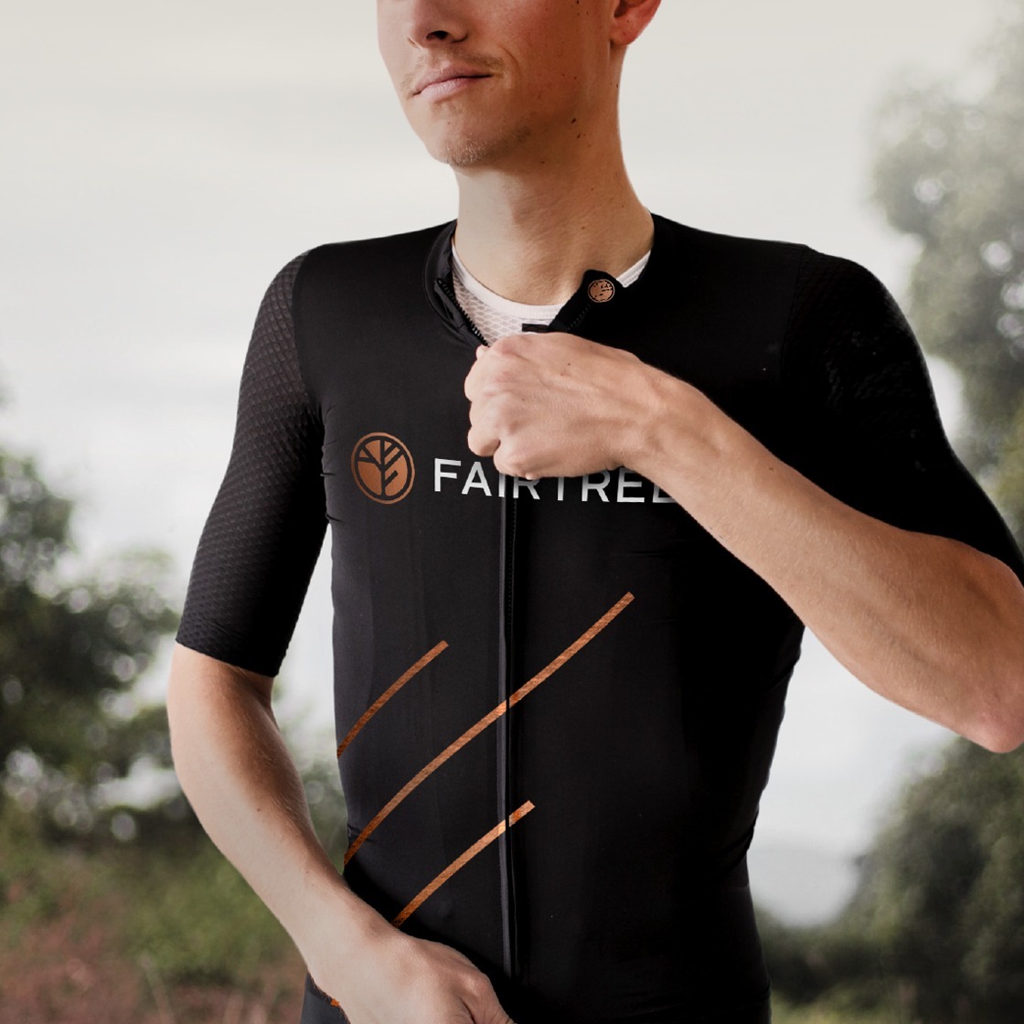
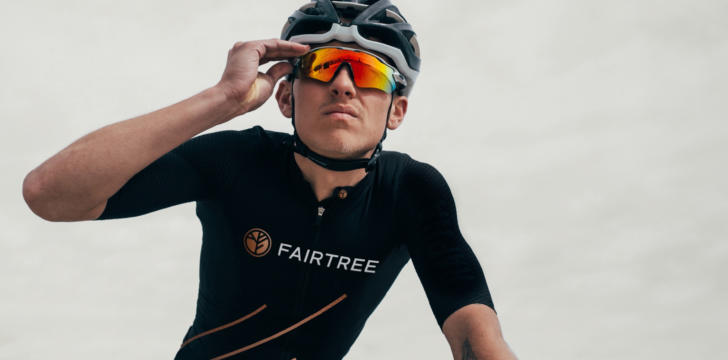
Sports sponsorship and collateral
For all sporting related elements the emphasis is always on elegance and visibility. To ensure the Fairtree identity is always visible, a bolder identity has been created for use only on outdoor elements that get a lot of attention from near and far.
"The work we did with Simplr on the Fairtree project involved a company re-brand informed by an organisational and marketing strategy and culture development. The rebrand and subsequent brand roll-out encapsulated the company spirit and had a high internal staff resonance and liking. Working with the Simplr team was an absolute pleasure. Creativity and efficiency rolled into a well-rounded, talented and skillful team. We look forward to continuing our brand evolution with Simplr for years to come.”


