Brief
Eight Feet is a sub-brand within Kloovenburg wine farm that produces wine, sells coffee and offers a unique entertainment facility where you can enjoy everything Eight Feet and Kloovenburg has to offer.
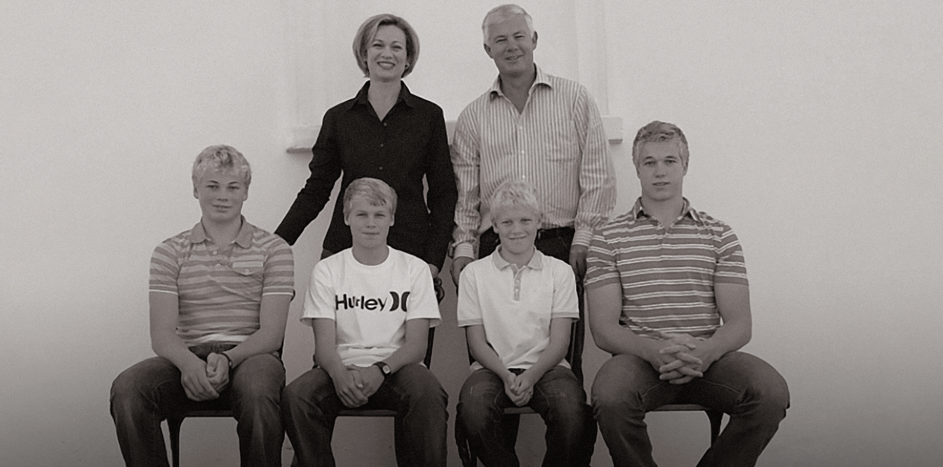
Uplifting the Kloovenburg brand also involved creating a distinct look for Eight Feet, owned by the four boys who grew up on the Kloovenburg farm. The challenge was to maintain a connection with the Kloovenburg family brand while establishing a separate identity for Eight Feet.
Solution
By utilising Kloovenburg's brand structures, we mirrored the construction and layout for Eight Feet while giving it a separate, dark and sophisticated look. This contrasts with the light and friendly Kloovenburg brand.
Brand Strategy
Identity Design
Packaging Design
Illustration
Wayfinding
Signage
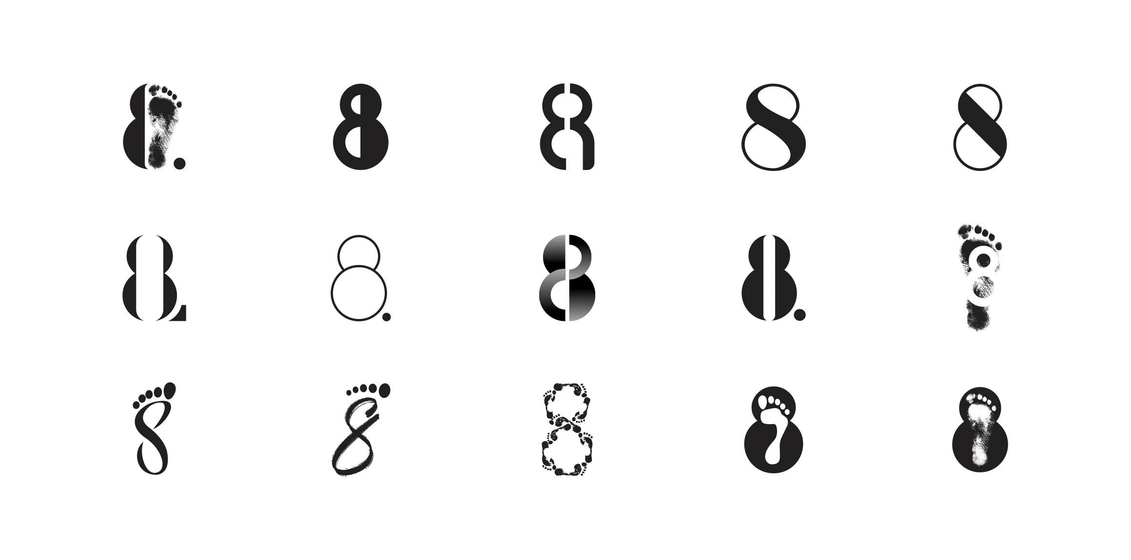
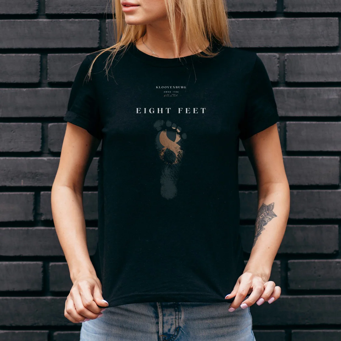
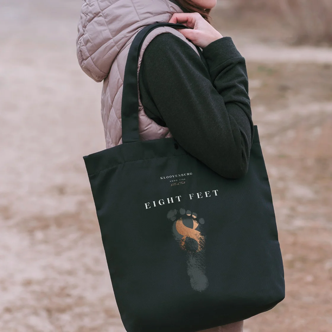
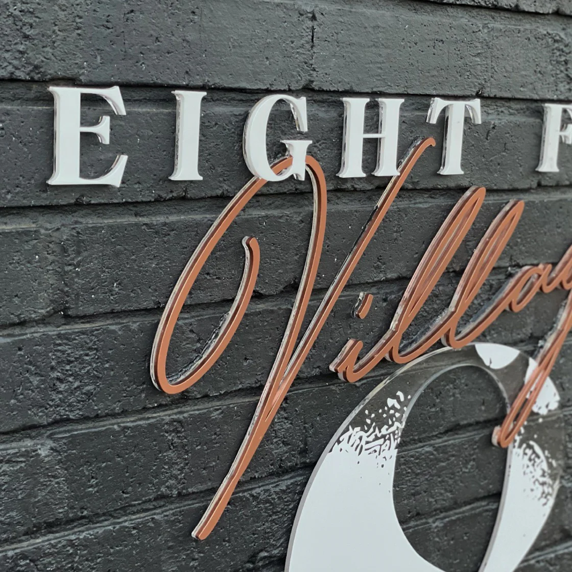
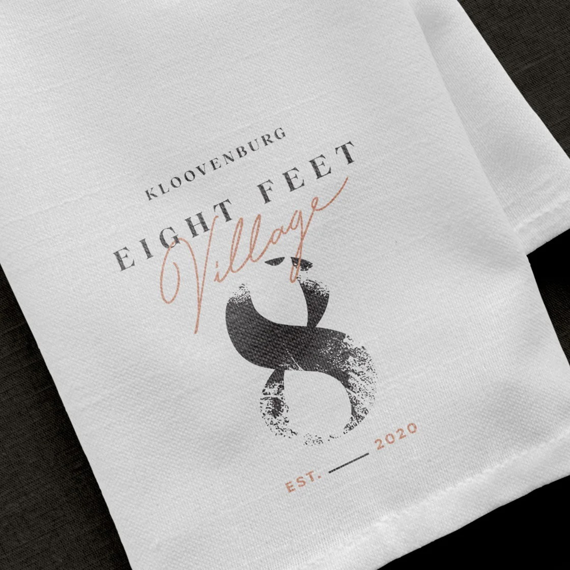
The Eight Feet Identity
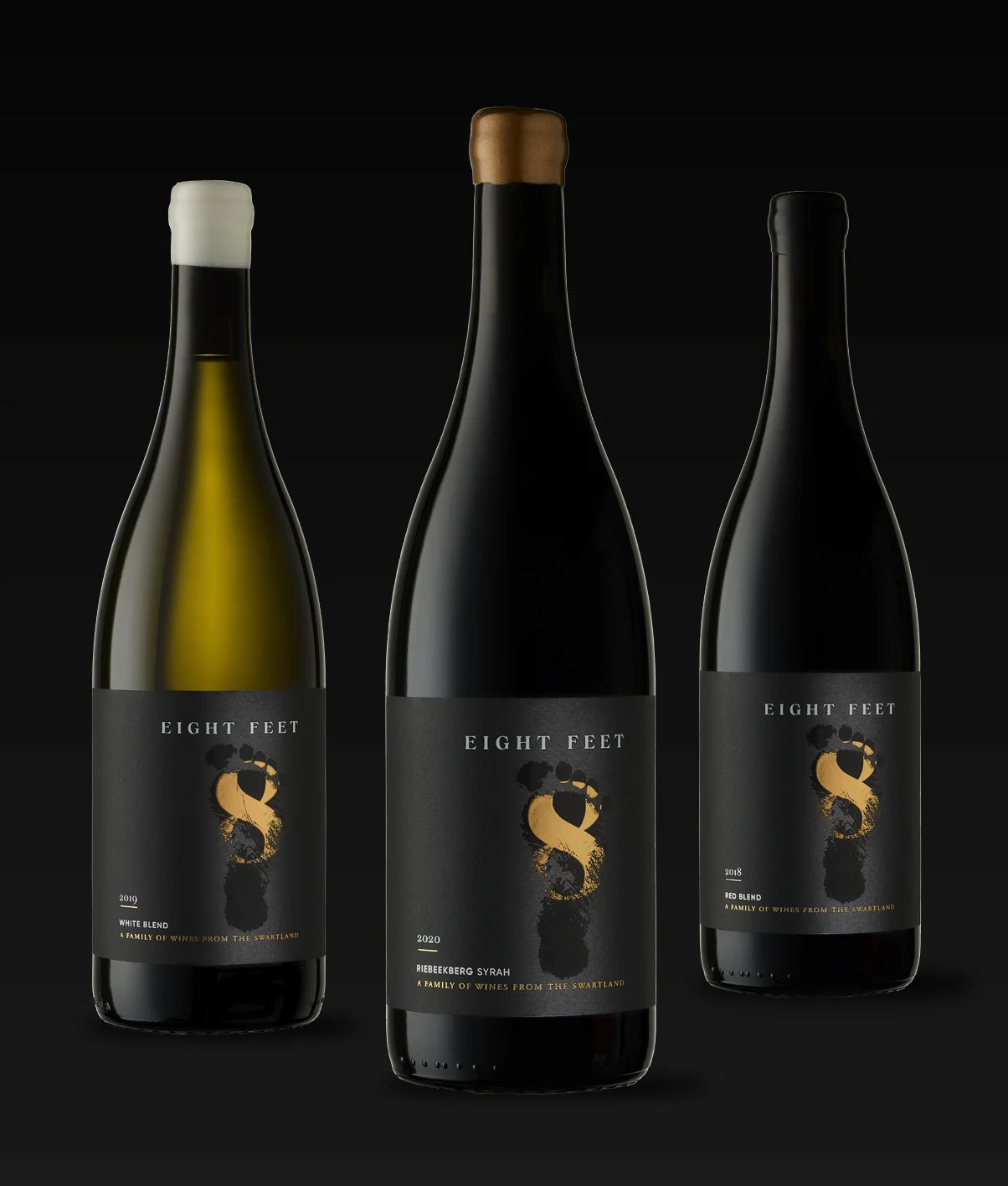
In support of the Kloovenburg brand we wanted to create a similar brand architecture with the Eight Feet identity. We achieved this with the same, clean logo type placement and usage combined with a focused icon like the ‘K’, this being the ‘8’ graphic, combined with the graphic of the ‘footprint’. The use of the footprint gives the identity an element of mystique in asking “Whose footprint is this?” as well as hinting to the idea of the boys’ desires to leave a mark of their own in the Kloovenburg legacy.
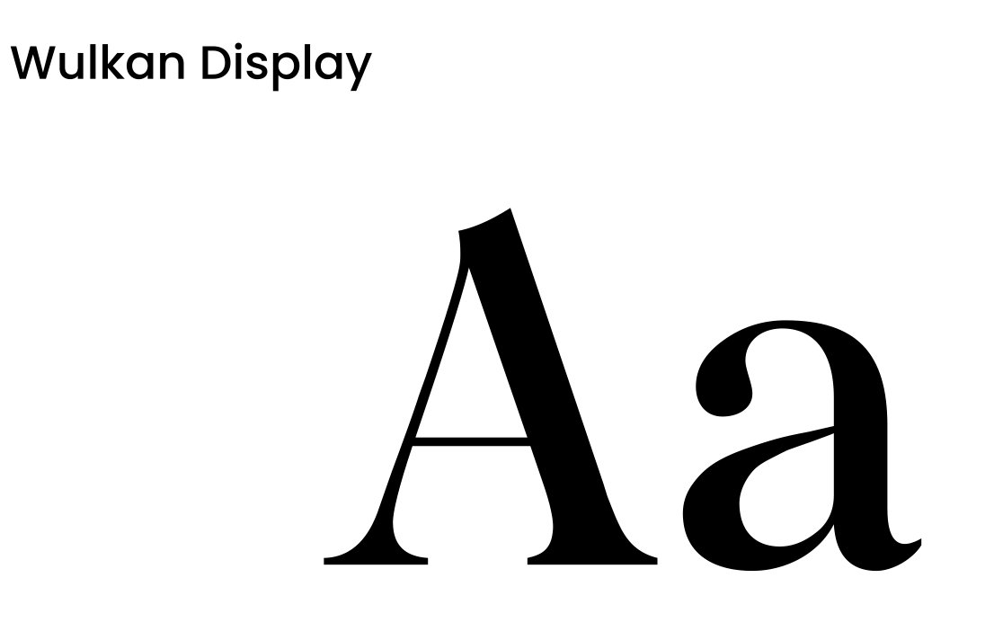
Typography
To maintain brand continuity with the Kloovenburg brand we utilised the same font families for Eight Feet in the timeless elegance of the Adobe Garamond Pro family, paired it with the contemporary flair of the Averta font family. These two fonts beautifully complemented the brand font, Wulkan, resulting in an aesthetically pleasing combination.
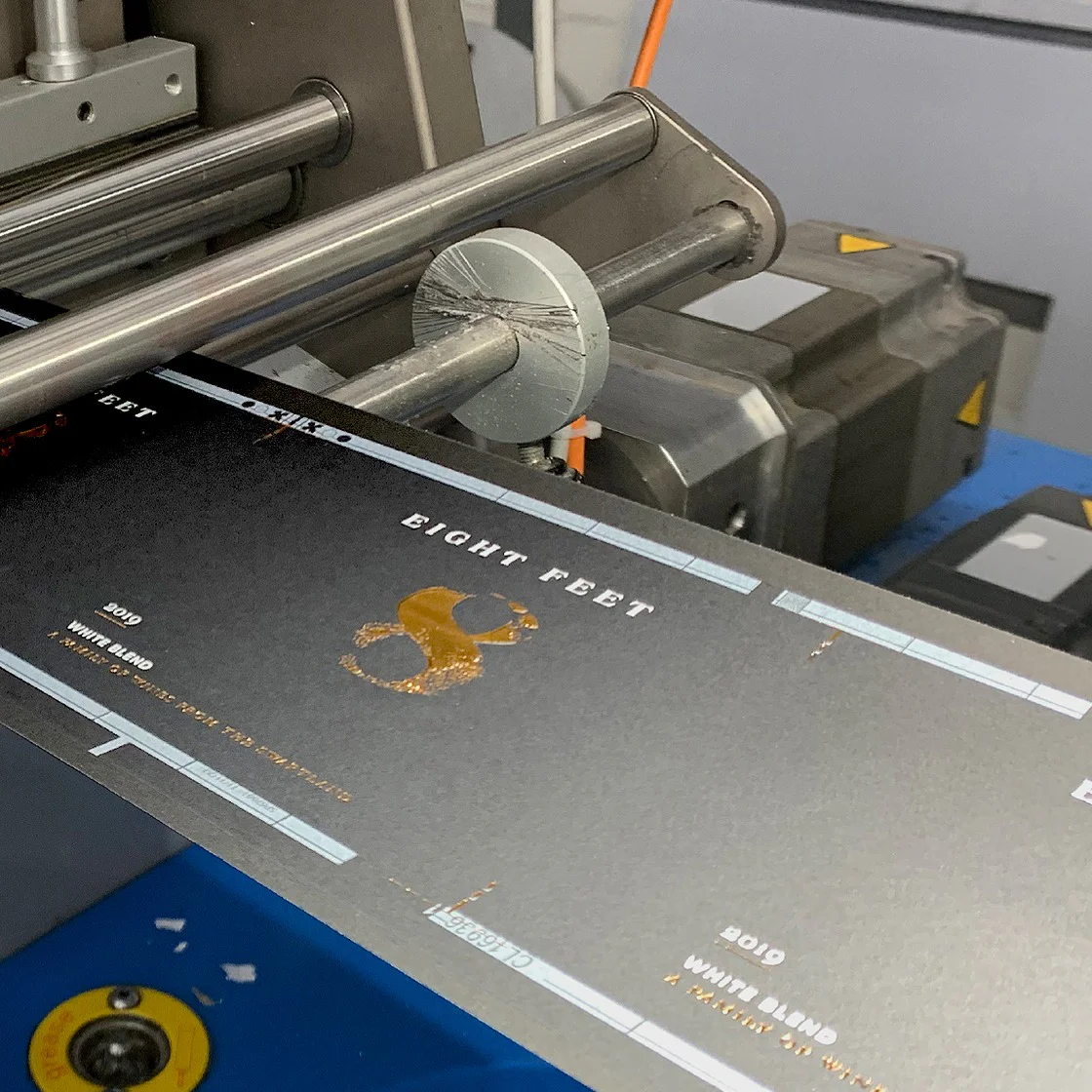
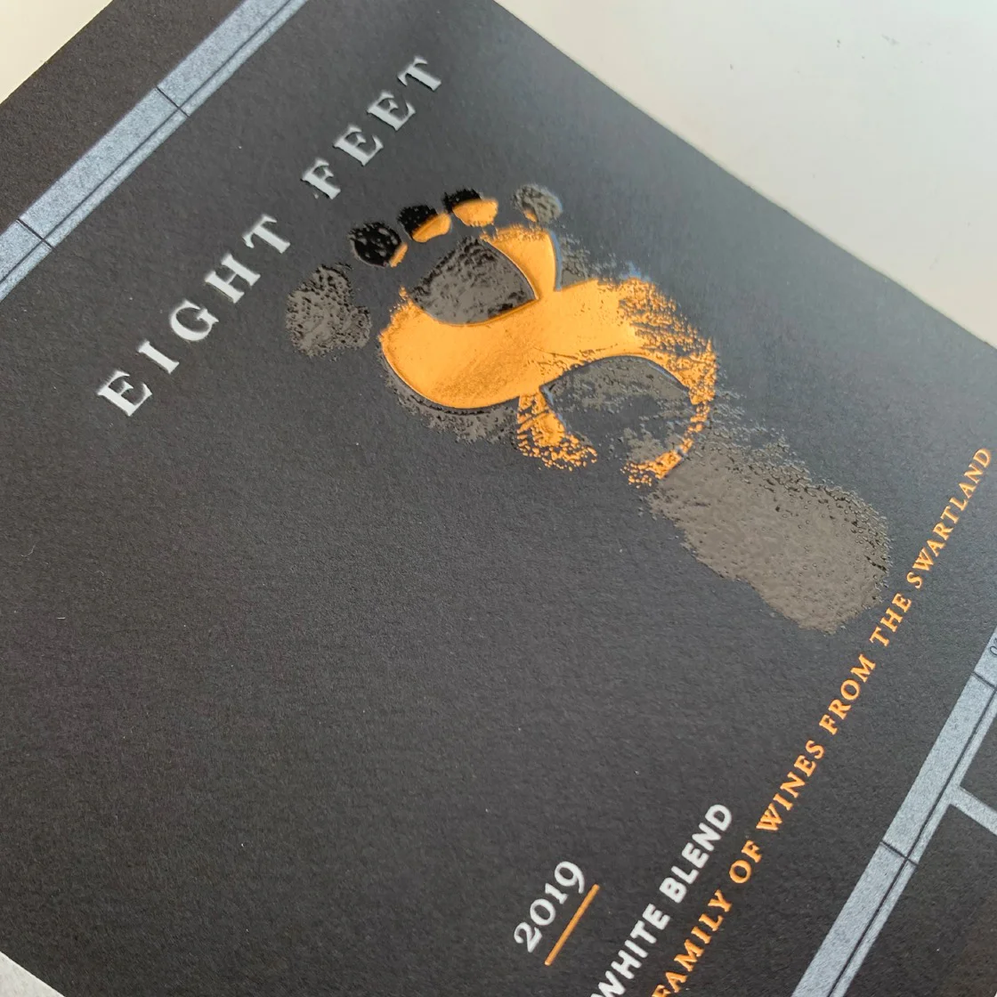
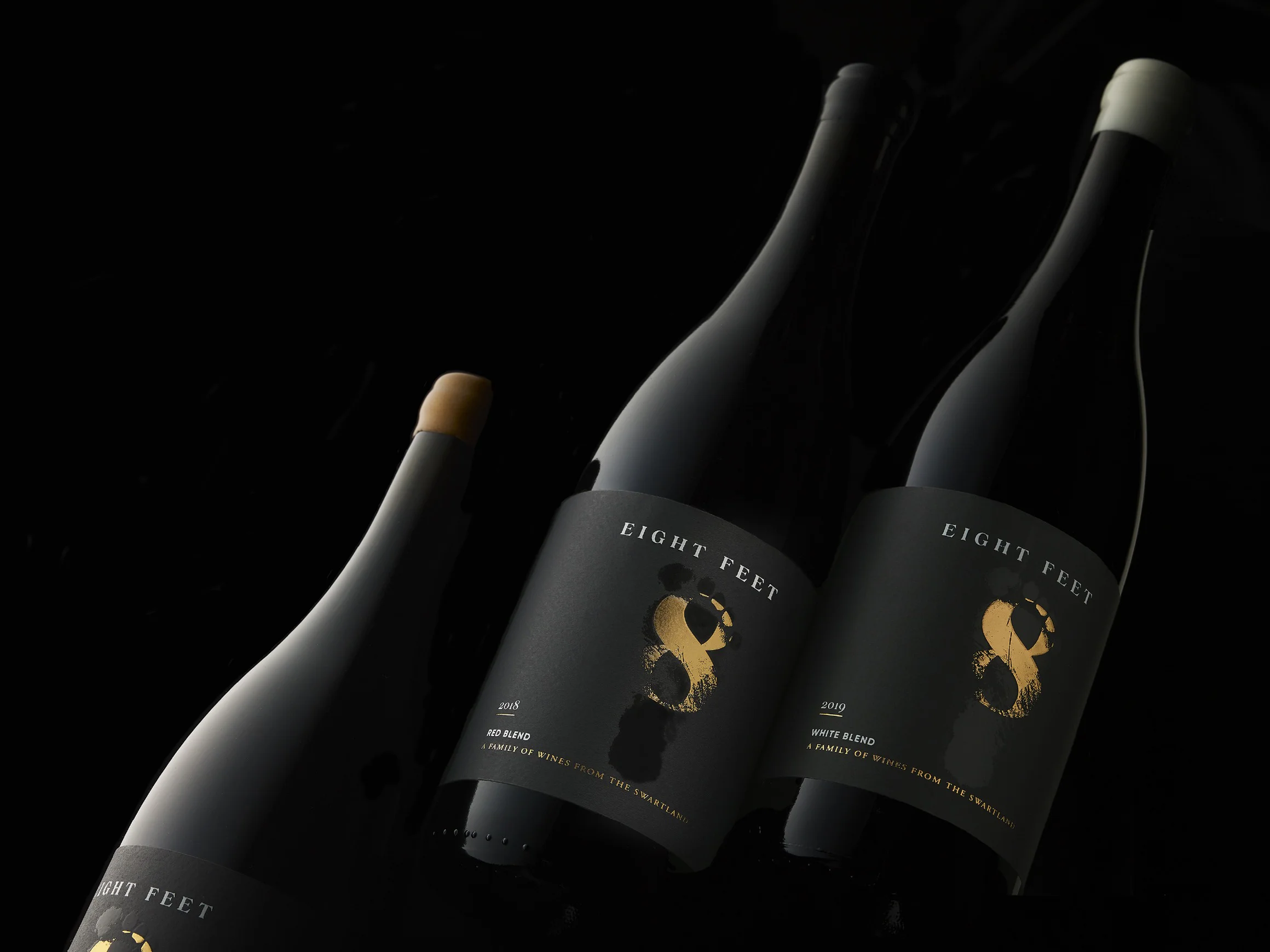
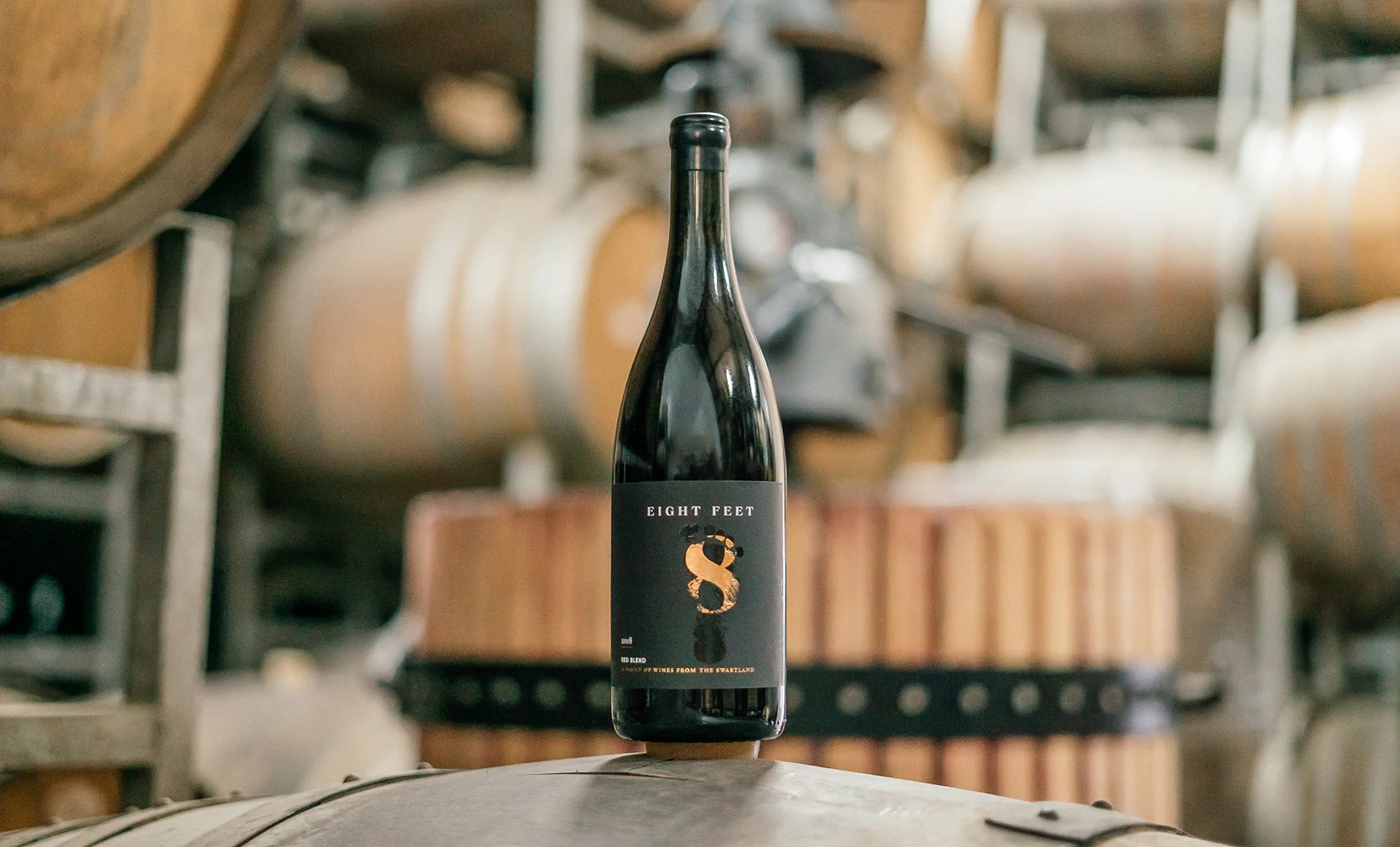
Eight Feet Packaging
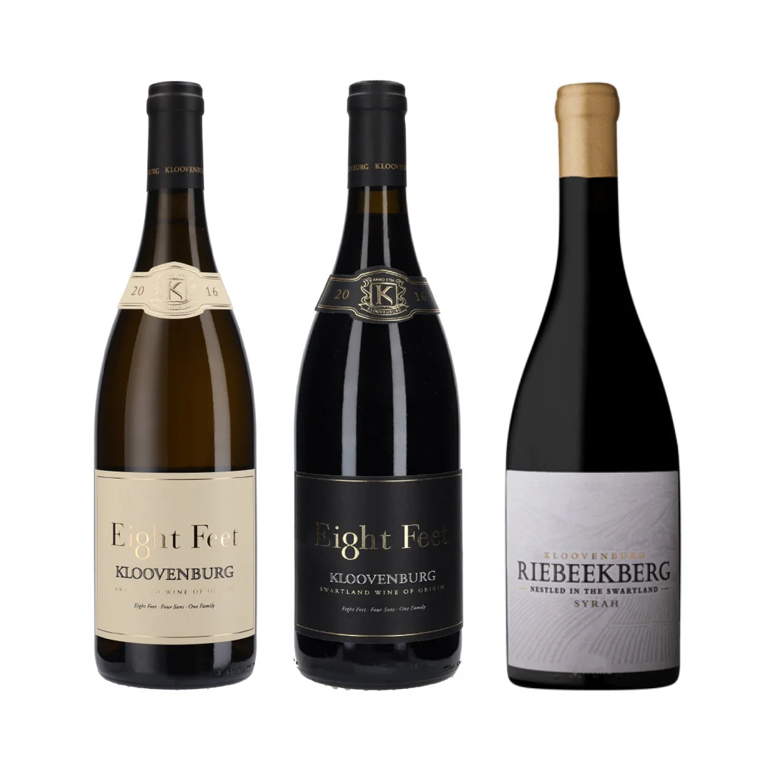
The Eight Feet wine collection includes three offerings: a white and red blend, each crafted from four separate cultivars, and the flagship Riebeekberg Syrah, a distinctive red from the farm's highest block. To simplify the label design, we adopted a layout similar to Kloovenburg's labels, positioning the '8' graphic where the 'K' is on Kloovenburg labels. To distinguish the cultivars, we changed the wax seal colors to avoid confusion.
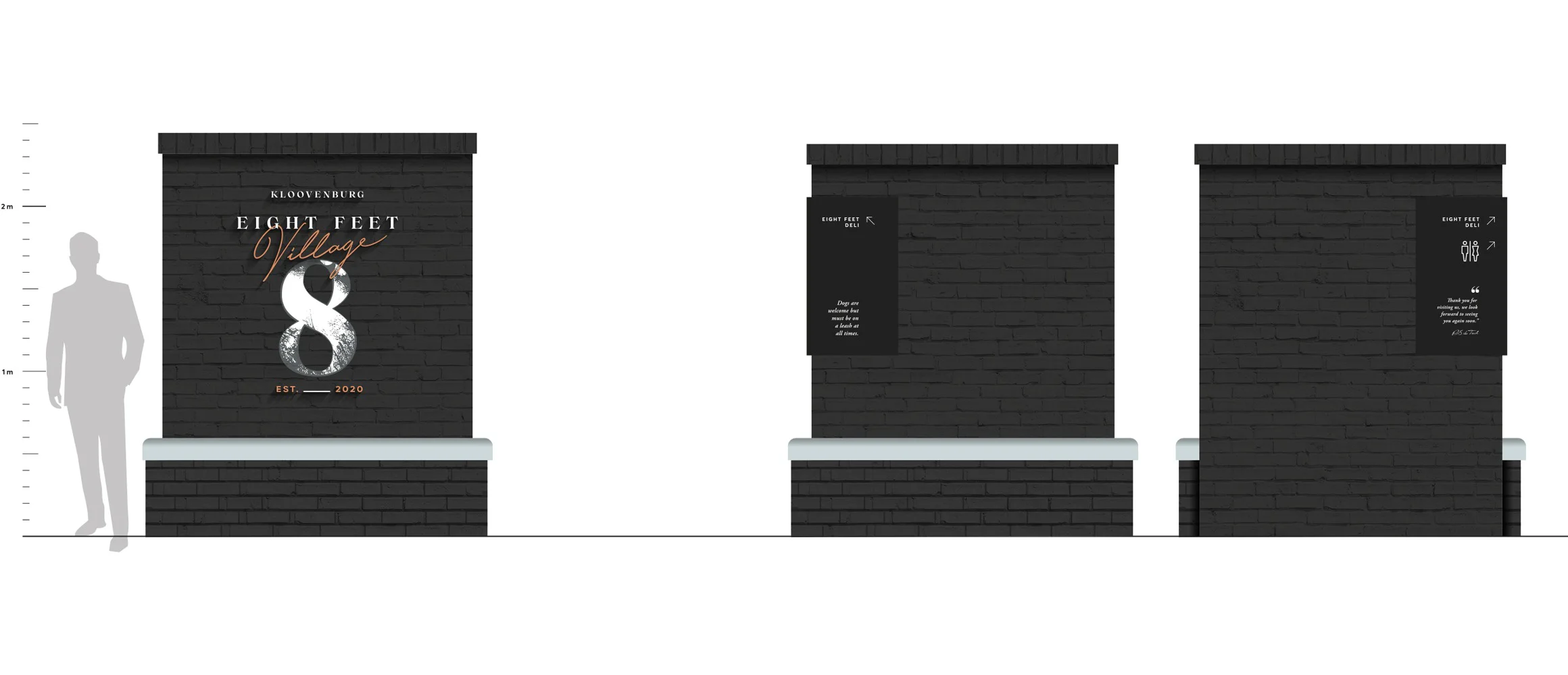
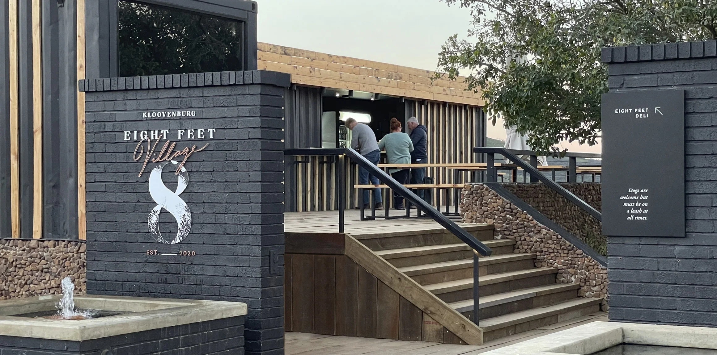
Eight Feet Village
After completing the Eight Feet brand, the next project was to develop the "Eight Feet Village." Situated on a prime open piece of land overlooking the Swartland valley at Kloovenburg farm, this destination was envisioned as a place for people to come, enjoy food, sample a variety of wines from the farm, and unwind. The village, a charming collection of refurbished containers, includes a drinks bar, restaurant, gift shop, and Olive room.
For the Eight Feet Village brand, we derived inspiration directly from the Eight Feet identity. The footprint graphic was replaced with a newly incorporated script font for the word "Village."
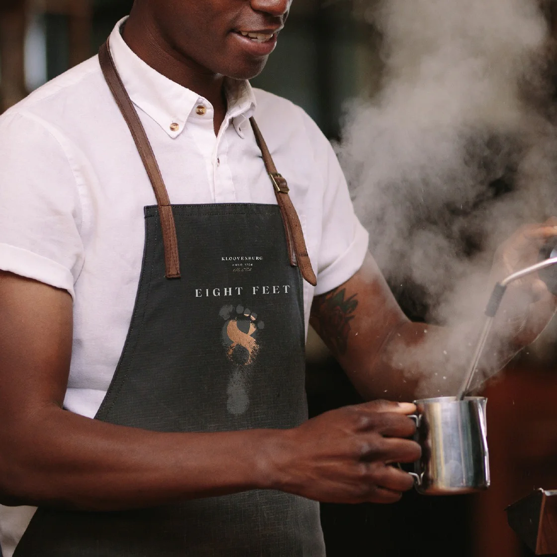
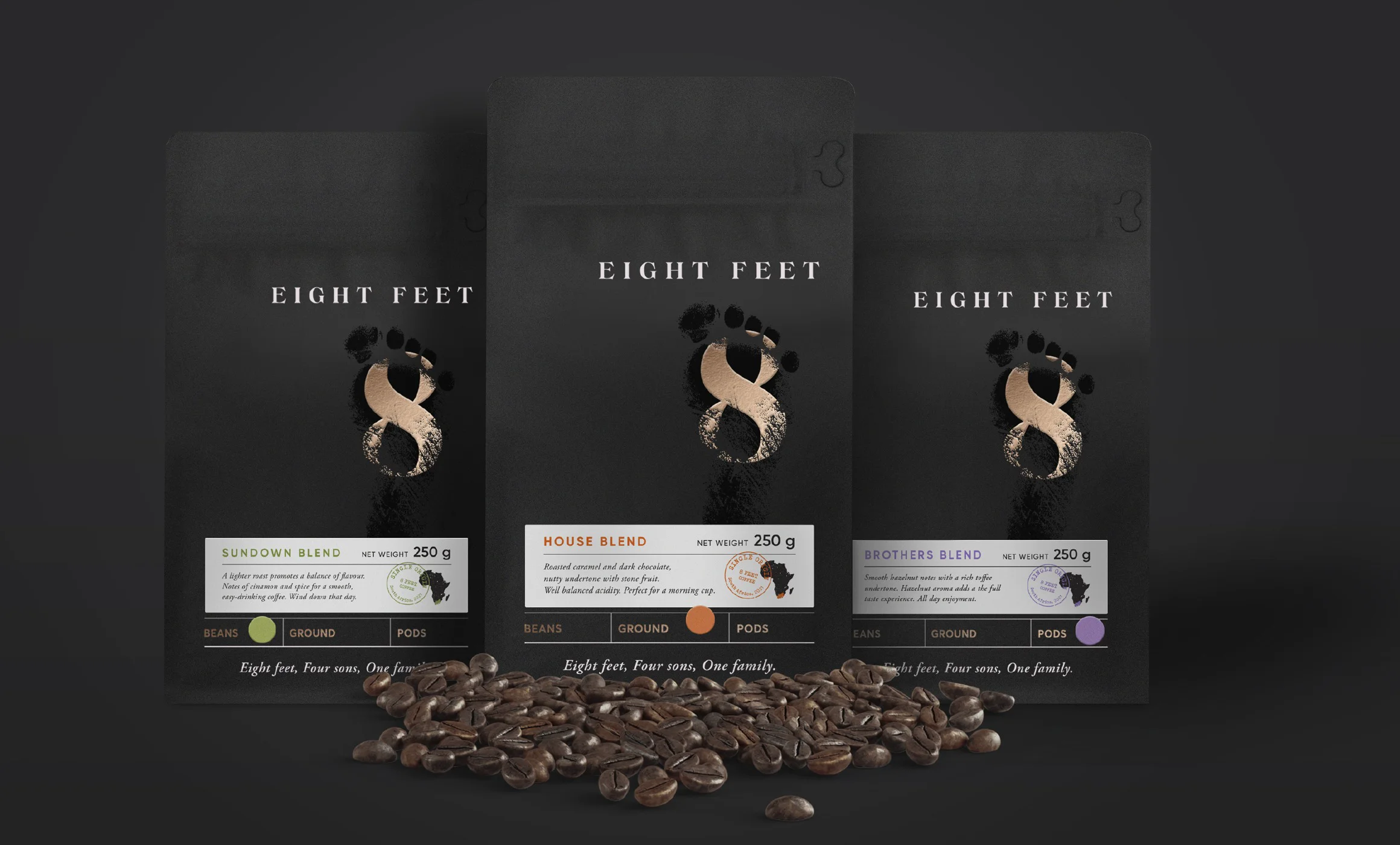
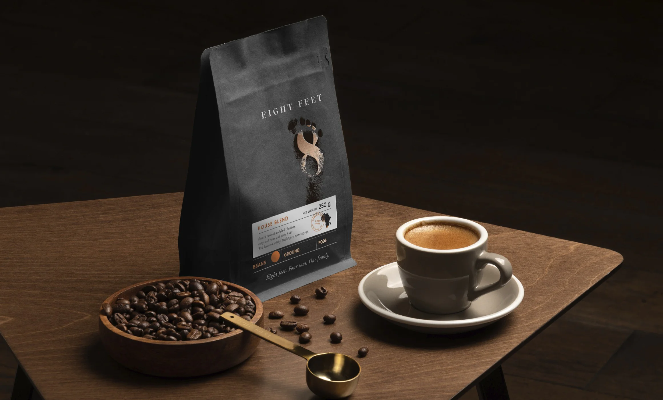
Eight Feet Coffee
Never resting on their laurels, the four brothers, who have always had a passion for coffee decided to add a coffee brand to their portfolio.
To build awareness for both the wines and coffee, they kept the packaging consistent, creating a simple yet elegant design. The packaging features a basic label structure for easy identification of different coffee products, including grinds, beans, and pods.