Brief
As a proudly South African institution, Retail Capital offers businesses unrestricted and flexible online funding that is safe and facilitated by in-house specialists. With the increase and advances in their online funding process Retail Capital saw the need to refresh their brand and re-engage with their clients and stakeholders.
The brief was to evolve the brand identity and develop a unique brand visual style that links back to the heritage of the identity ‘gyroscope’. The original identity gyroscope resonated well within the internal organisation and thus became the inspiration for the new visual style.
Solution
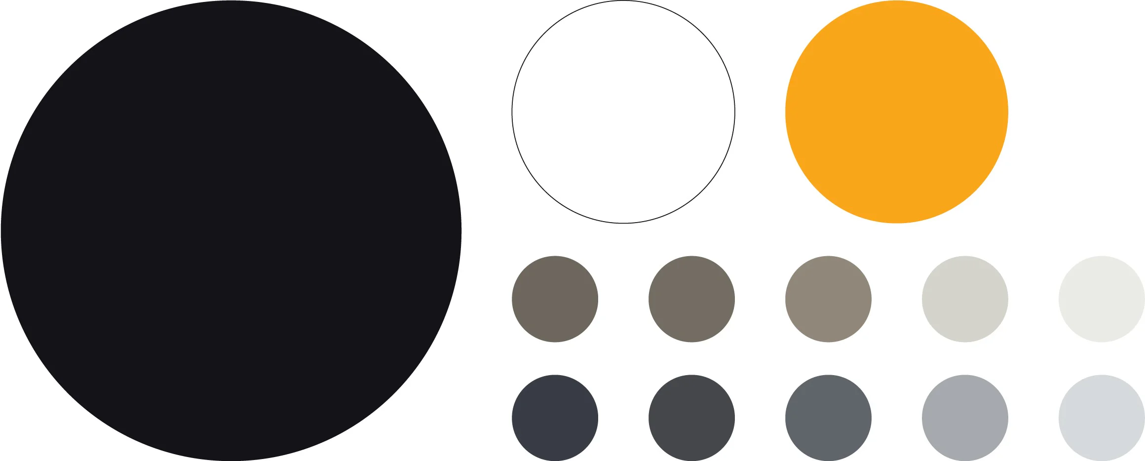
After a thorough competitor analysis and internal audit of the brand, we moved forward by focusing on an evolution of the colour palette leaning into strong black and white visual style with a refreshed yellow as an accent colour with a supporting palette of warm and cool greys.
Leveraging the concept of the brand's gyroscope, we developed a distinctive visual element that can be seamlessly integrated into various brand materials and assets.
Strategy
Identity Evolution
Visual Language
Collateral Design
Video Production
UI/UX Design
Website Development
Brand Guidelines
Social Media Guidelines
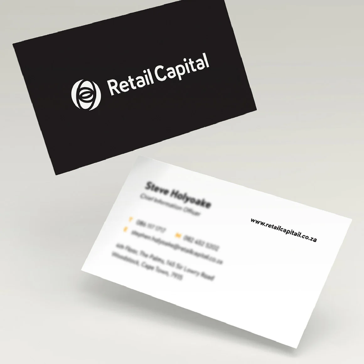
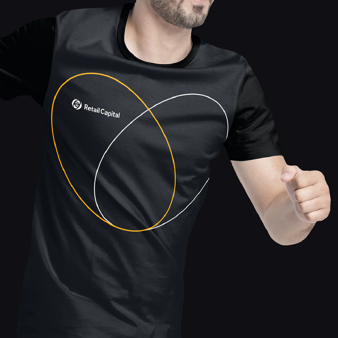
Identity design
Change happens, it's the only constant. For entrepreneurs there are constant curve balls, constant worries and constant sleepless nights.
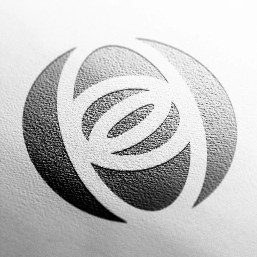
The gyroscope is an age-old device used to provide orientation and assist users through the course of navigation. Retail Capital has made use of this device as an icon in its logo as a reminder of its purpose in steering vision, maintaining course, and providing stability and guidance in business. The inter-connected rings are represented as elliptical circles indicating collaboration, movement, and dynamism.
We re-aligned the existing gyroscopes balance and line weight and introduced a refreshed single line logotype.
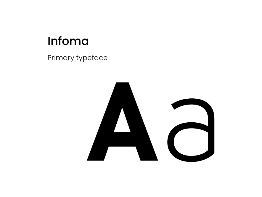
Typography
We use two functional font families to represent the Retail Capital brand. Infoma has been selected for its versatility and is showcased in the following variations: Light, Regular, Medium and Bold weights. The Verdana font is the substitute font in instances where Infoma is not available or cannot be used such as Microsoft related templates.
Photography
The photographic style is geared towards capturing customers in the moment and in the process of achieving their dreams. The imagery shows authentic real-life scenarios of our customers going about their business, capturing the essence of those that believe in themselves. All images contain an element of an accent yellow.

Visual language evolution
A gyroscope is a tool that has a spinning wheel held by movable supports. These supports can move in different directions, allowing the wheel to spin around a single line. This movement inspired the evolution of the gyrographic.
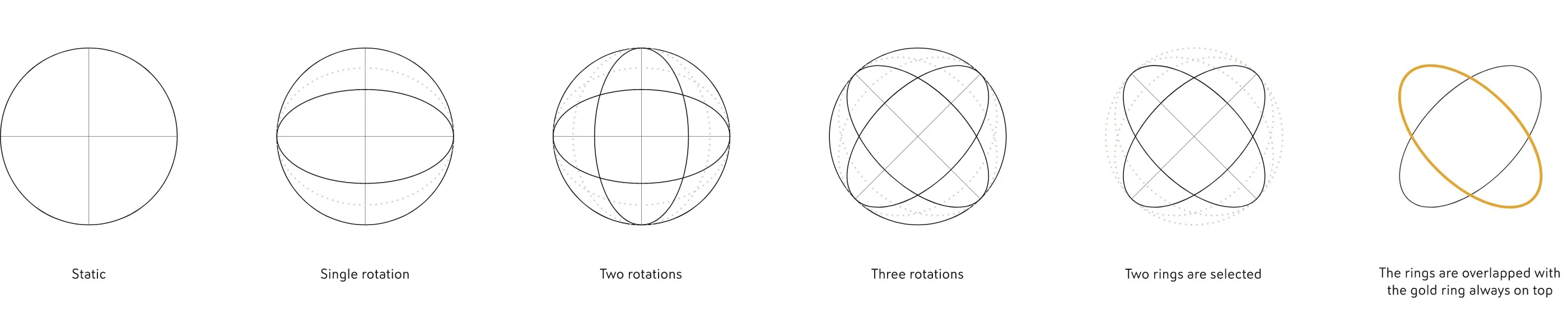
The Gyrographic
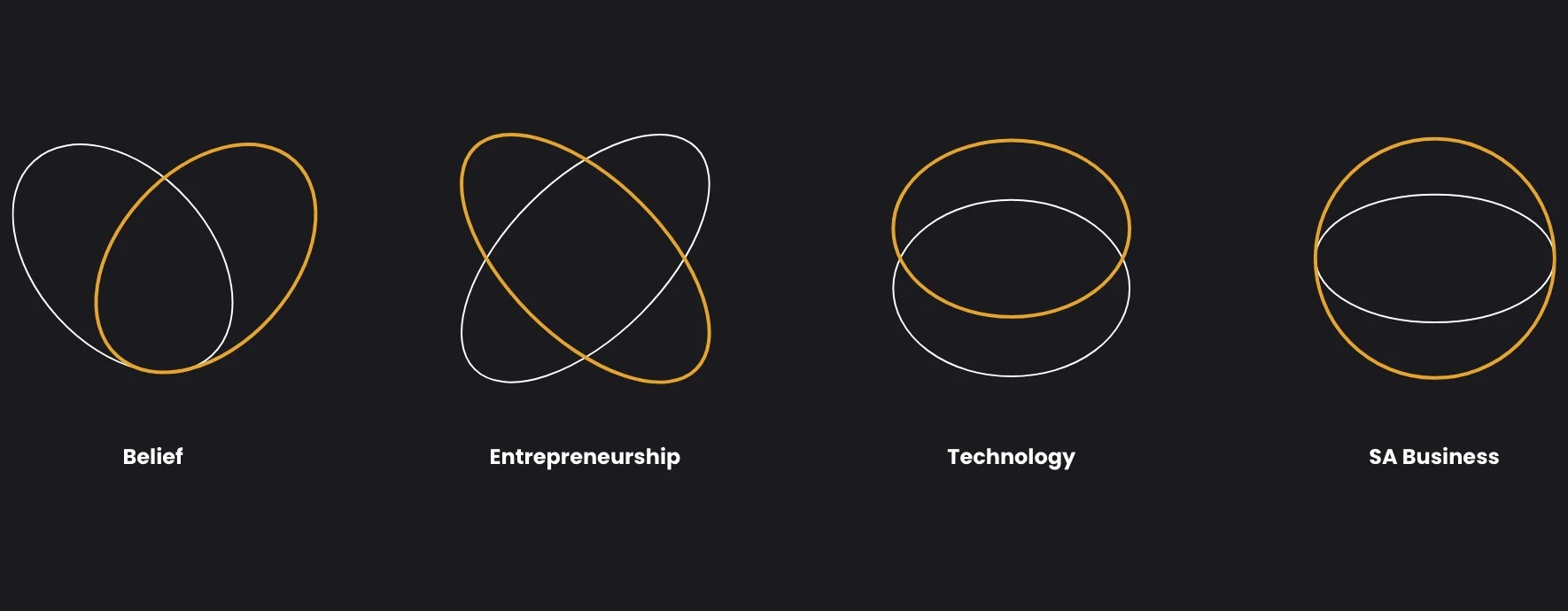
We stylised the rotational axis of a gyroscope down to two dynamic rings one symbolising the client which is represented by the white line or may be filled with imagery whilst the yellow ‘thicker’ line represents Retail Capital. The two rings represent the harmonious balance and interaction between Retail Capital and their clients. Four gyrographic visuals have been created with each representing one of the four Retail Capital brand pillars. The four brand pillars are: Belief Technology Entrepreneurship SA Business

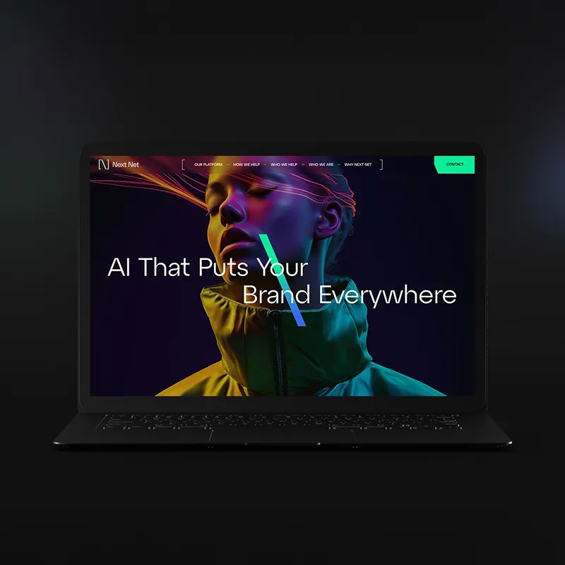
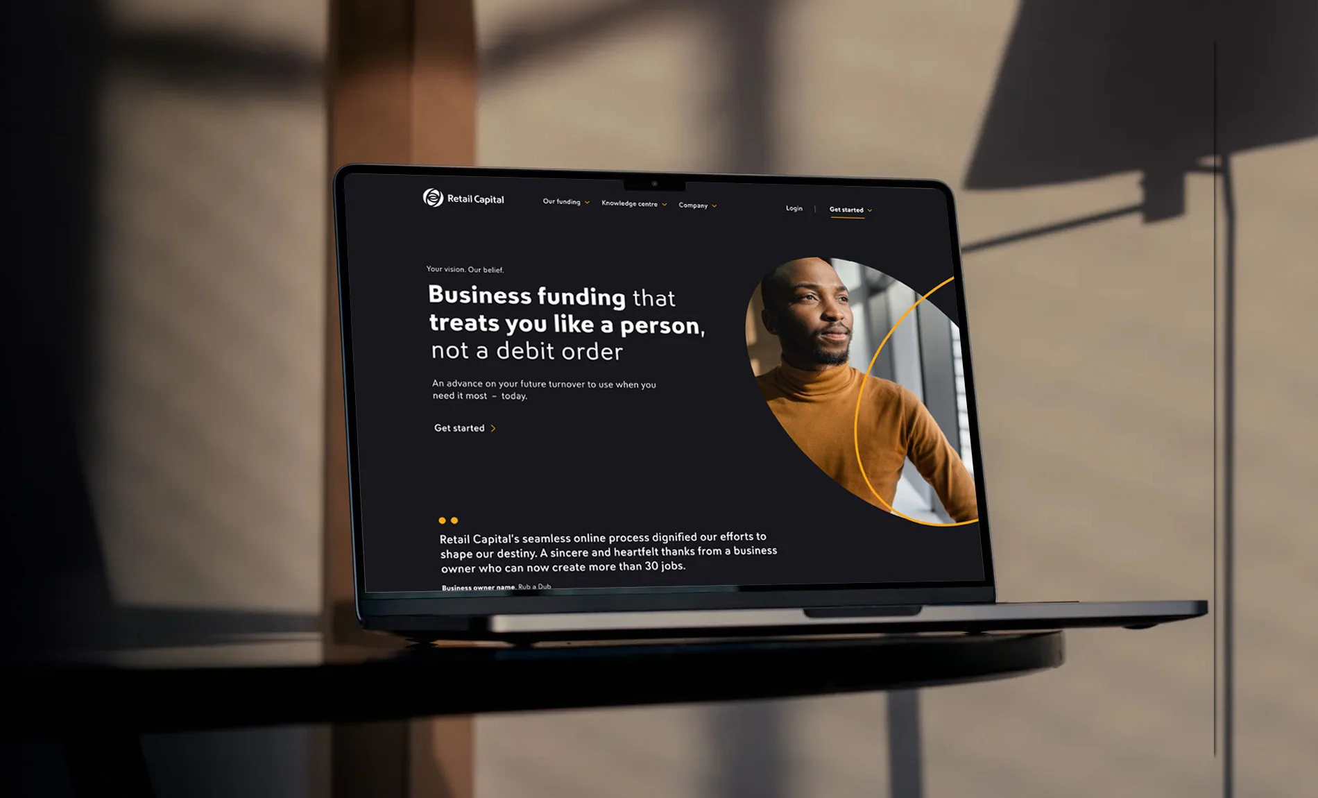
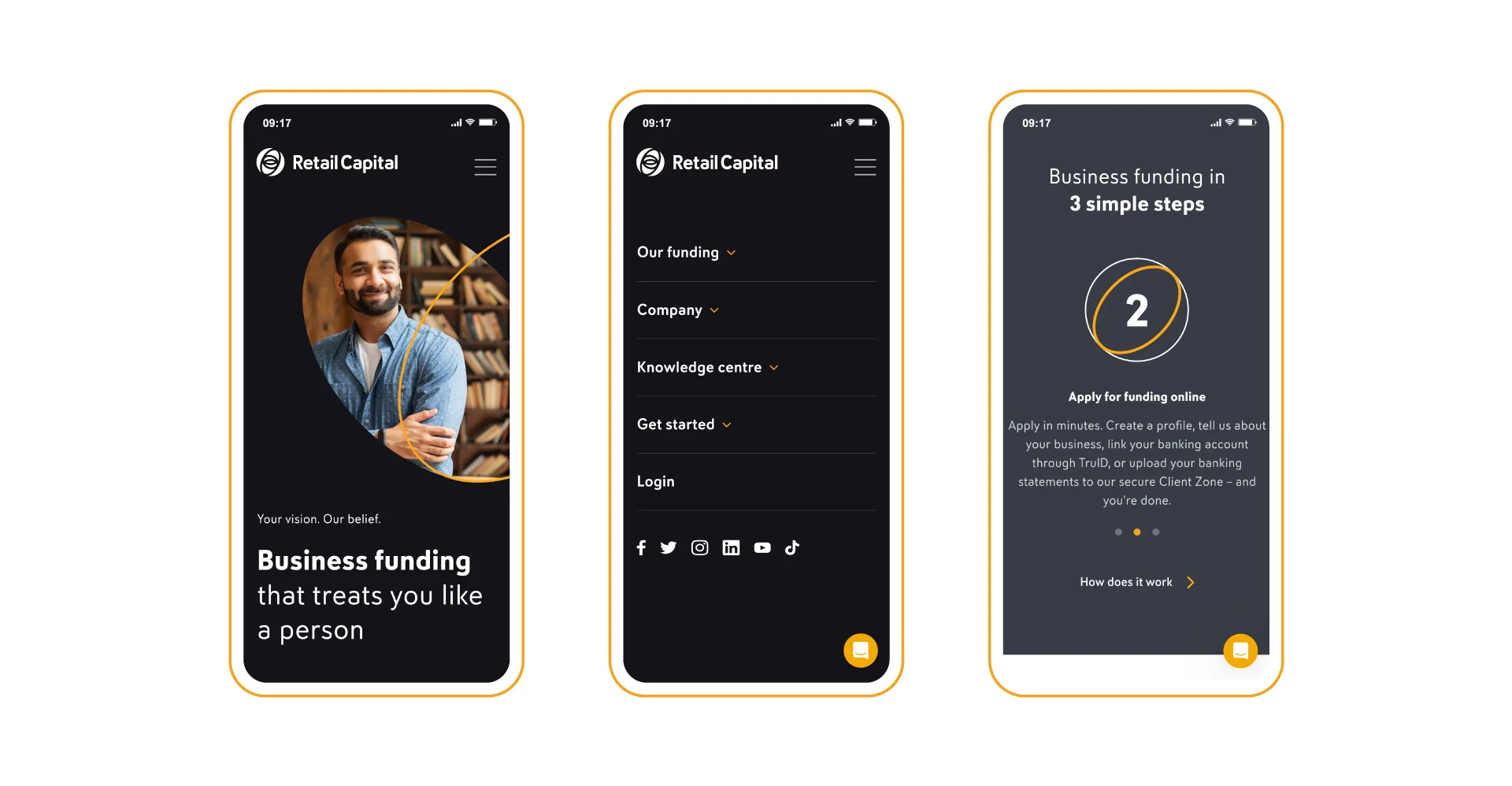
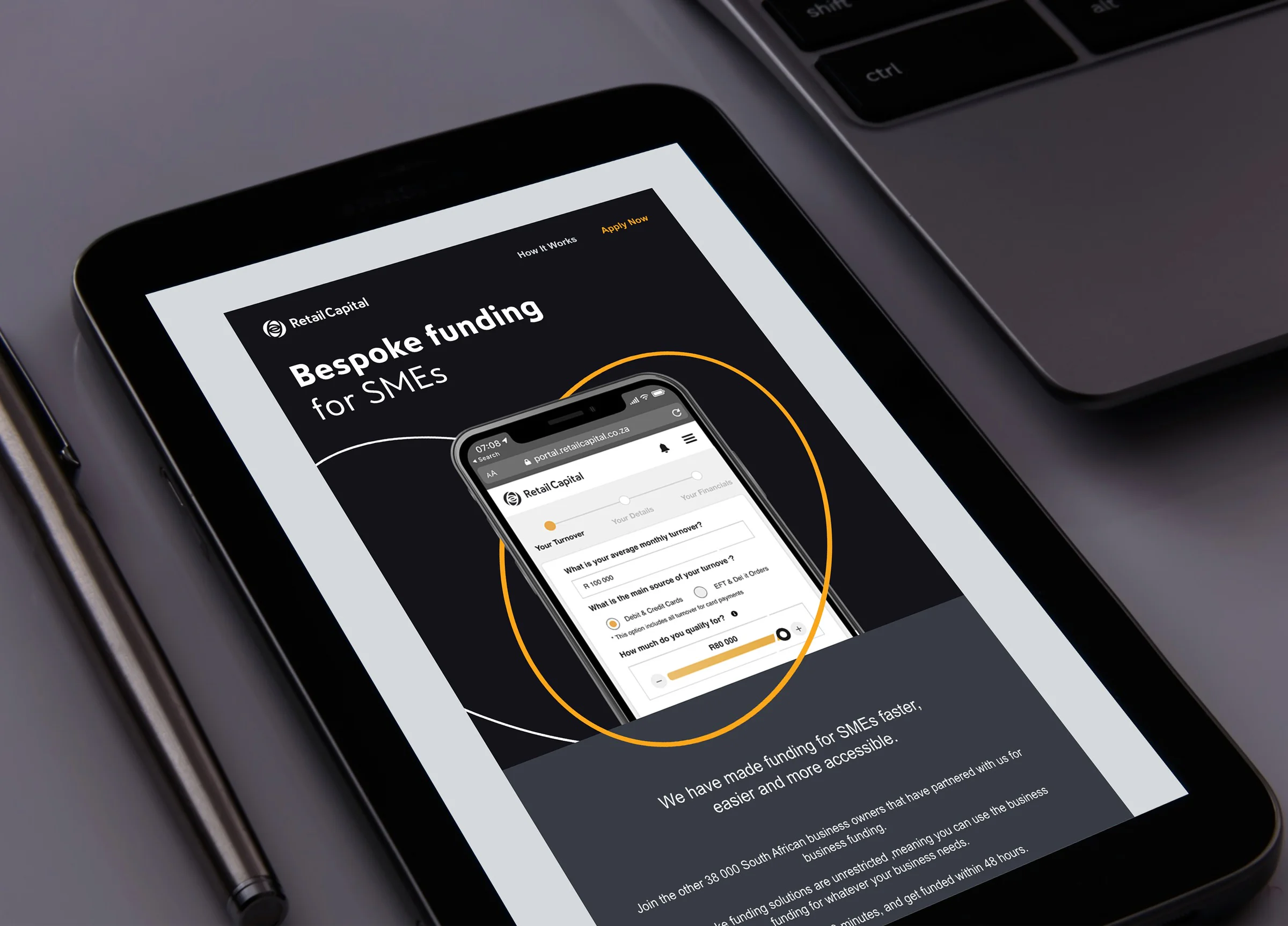
Website
The website was designed with a predominant black and white palette to achieve a contemporary aesthetic and draw attention to the vibrant color photography. We selectively incorporated the corporate gold colour, primarily for navigational elements, strategically guiding users' gaze and enhancing the website's overall user-friendliness.
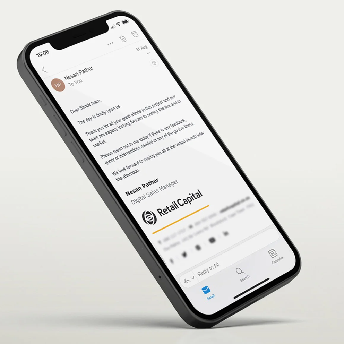
Emailer templates and digital marketing collateral
We developed a diverse collection of email templates suitable for various purposes, including marketing campaigns, newsletters, announcements, and more.
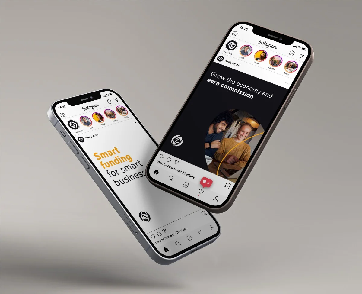
Social Media
We developed an extensive selection of highly customisable social media templates, catering to a diverse range of needs and preferences.
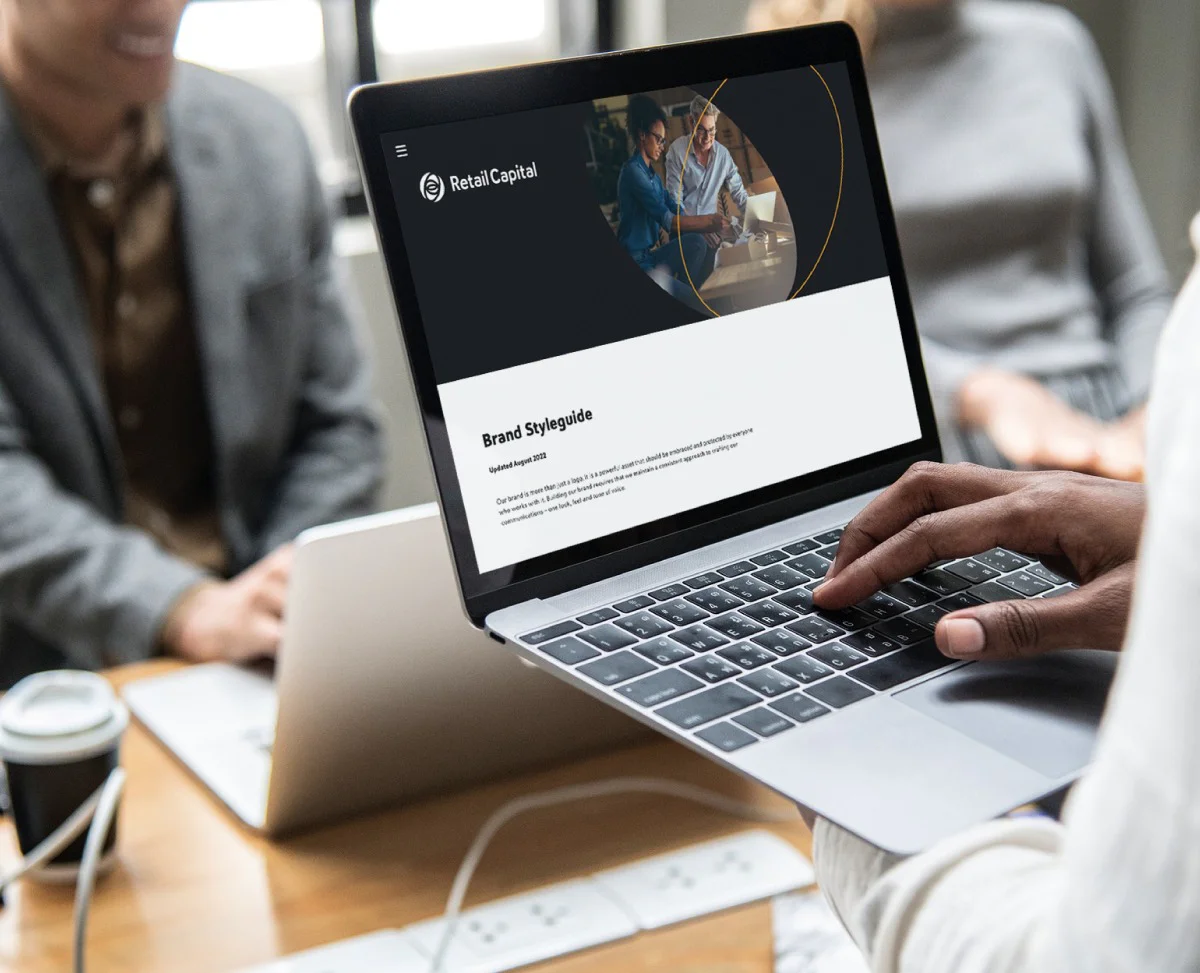
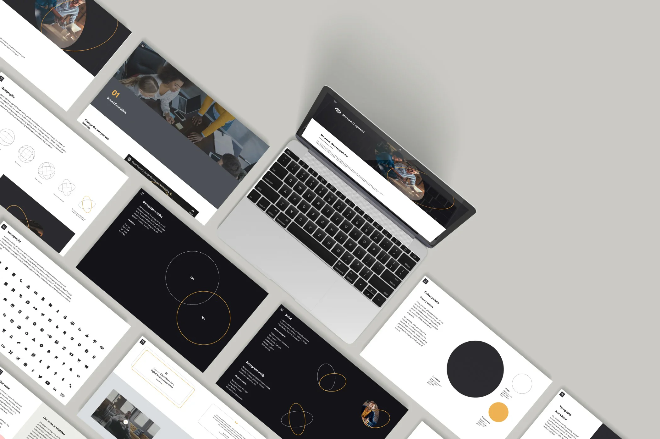
Digital brand guidelines
A full digital set of brand guidelines was developed for client to distribute to their respective suppliers/clients.
The brand guidelines covered all aspects of the brand from identity make-up and usage through to the visual style construction and application across the various brand touchpoints.
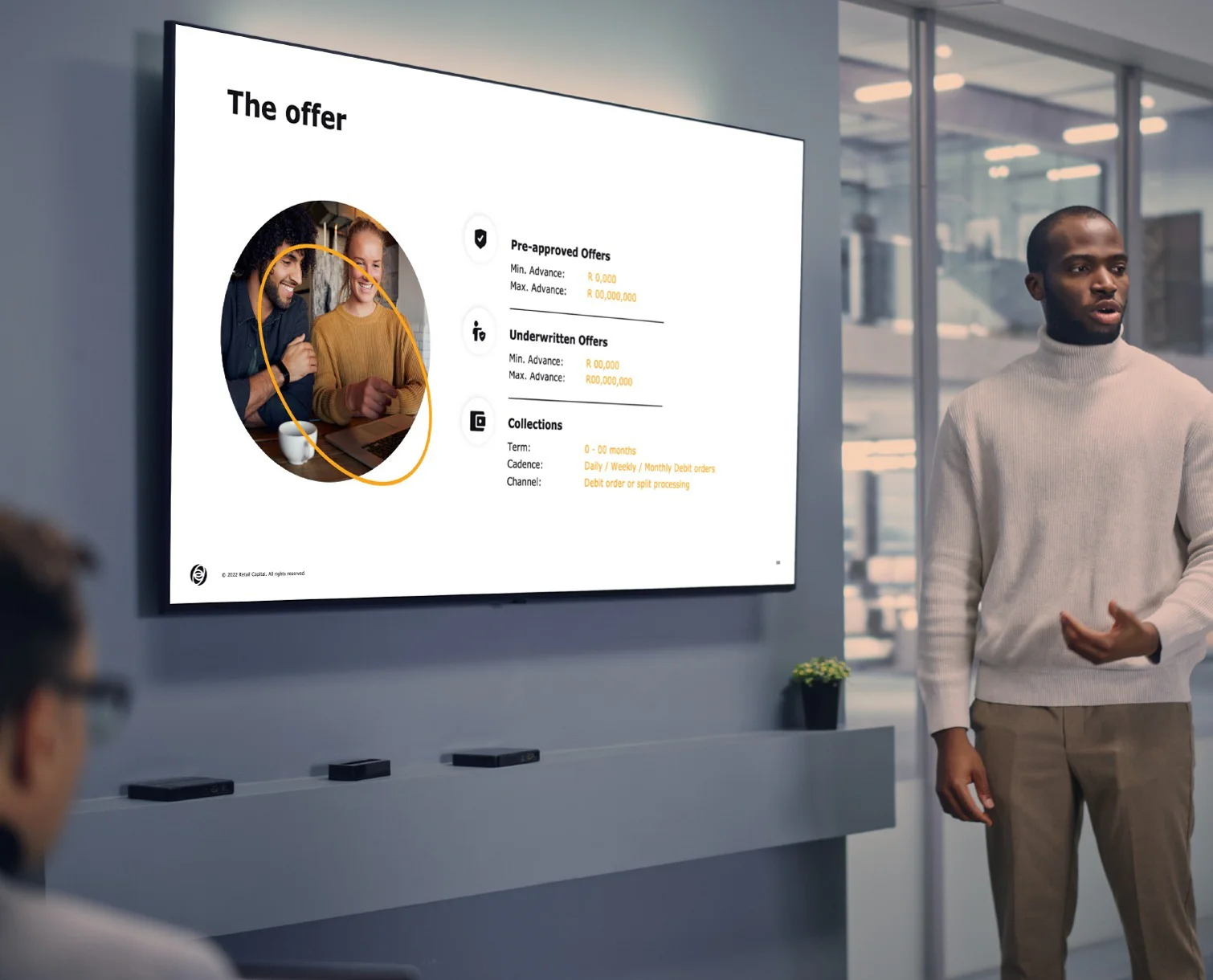
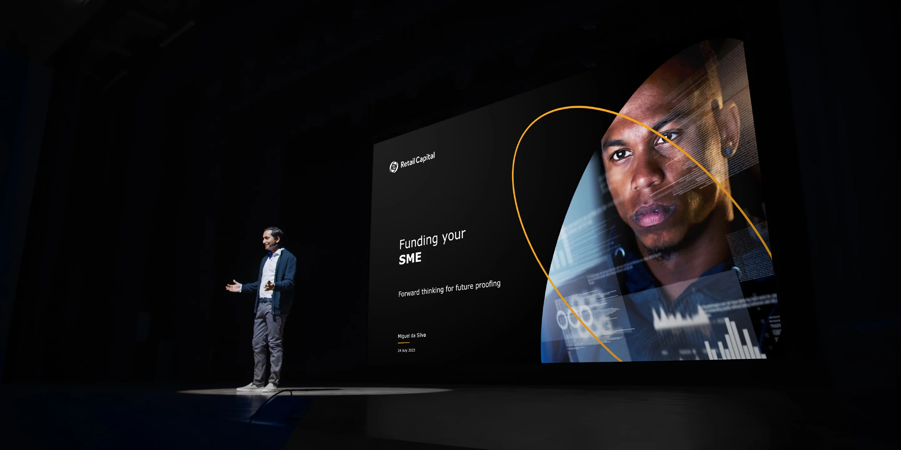
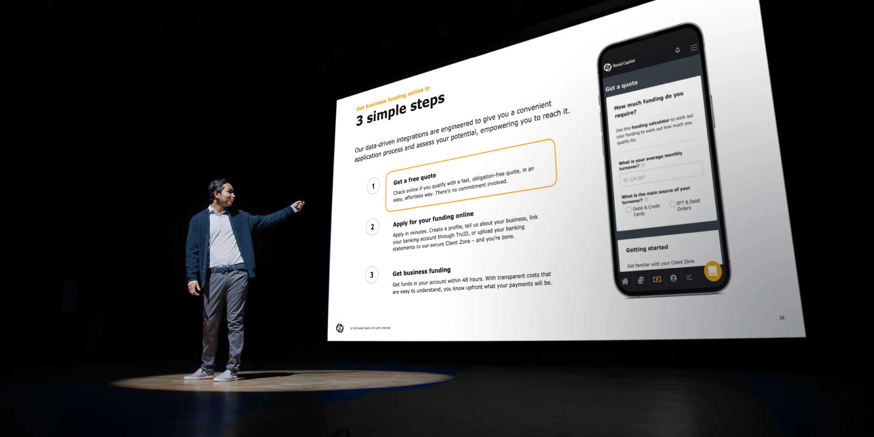
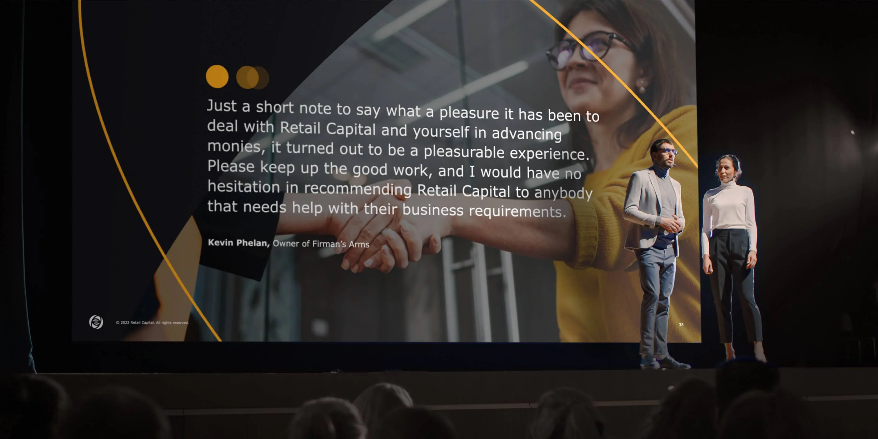
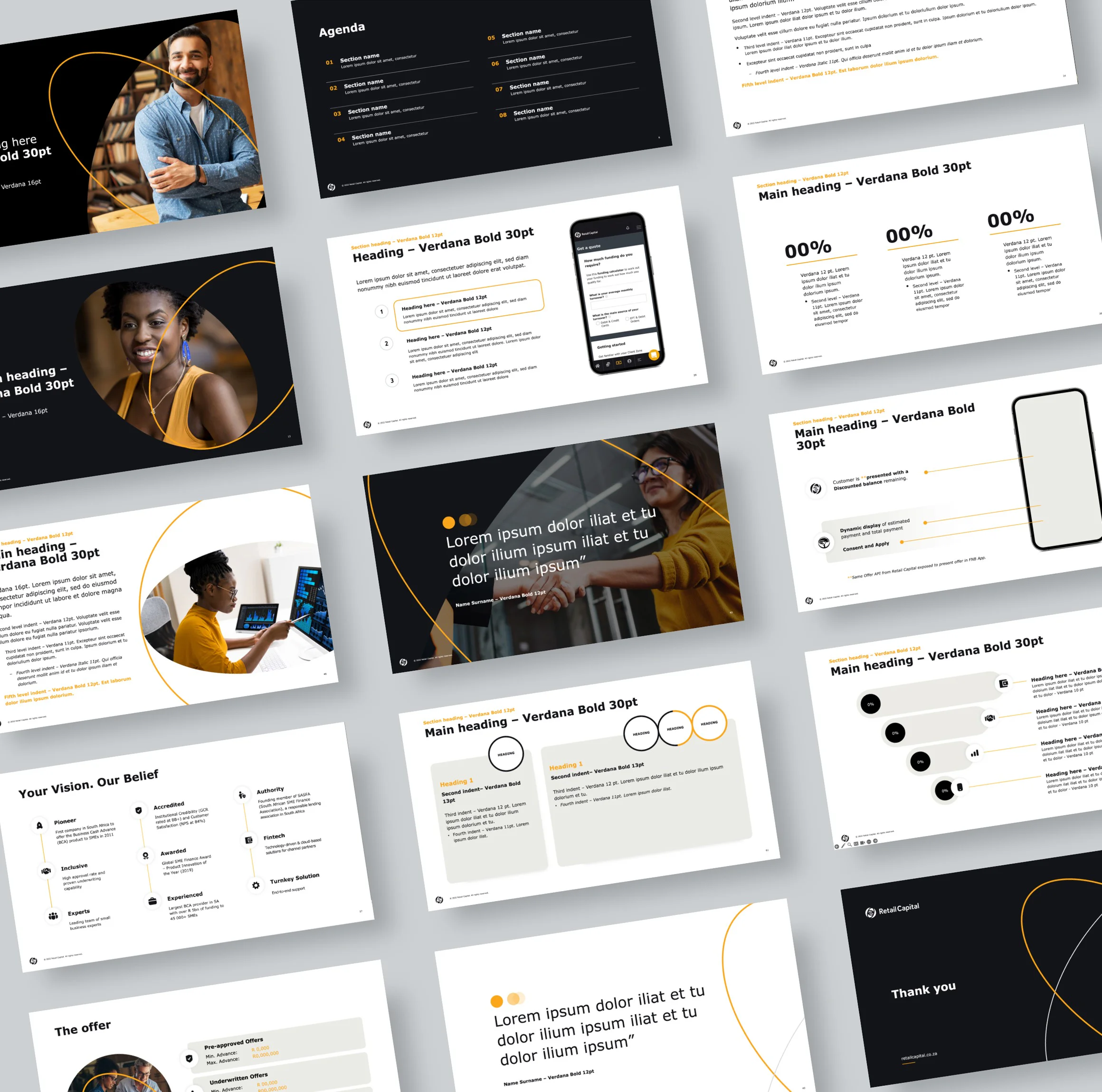
Powerpoint Template
Having a strong, on-brand Powerpoint template is like having a superpower for your business!
We created a custom-made template for Retail Capital that was specific for their needs. It was versatile and user-friendly, so they could stay true to their brand while also letting their creativity shine.
Whether they were presenting one-on-one, in a small meeting room, or in a big auditorium, the template allowed them to engage with their audience while staying on-brand and focusing on the content of their presentations.