
Brief
CTG enables humanitarian and development projects, providing employment and logistic services in fragile and conflict-affected countries. CTG stands for ‘Committed to Good’. They approached us with a fairly open brief, to create a conceptually strong brand identity that supports their ethical approach to operating in the world’s most challenging environments.
Solution
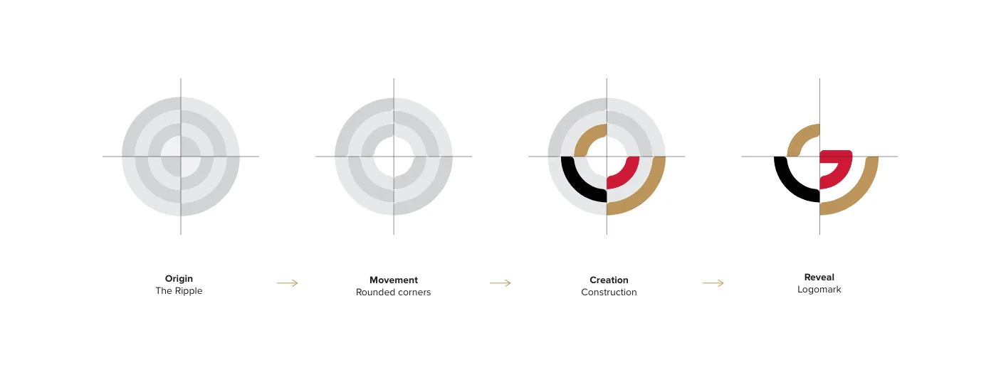
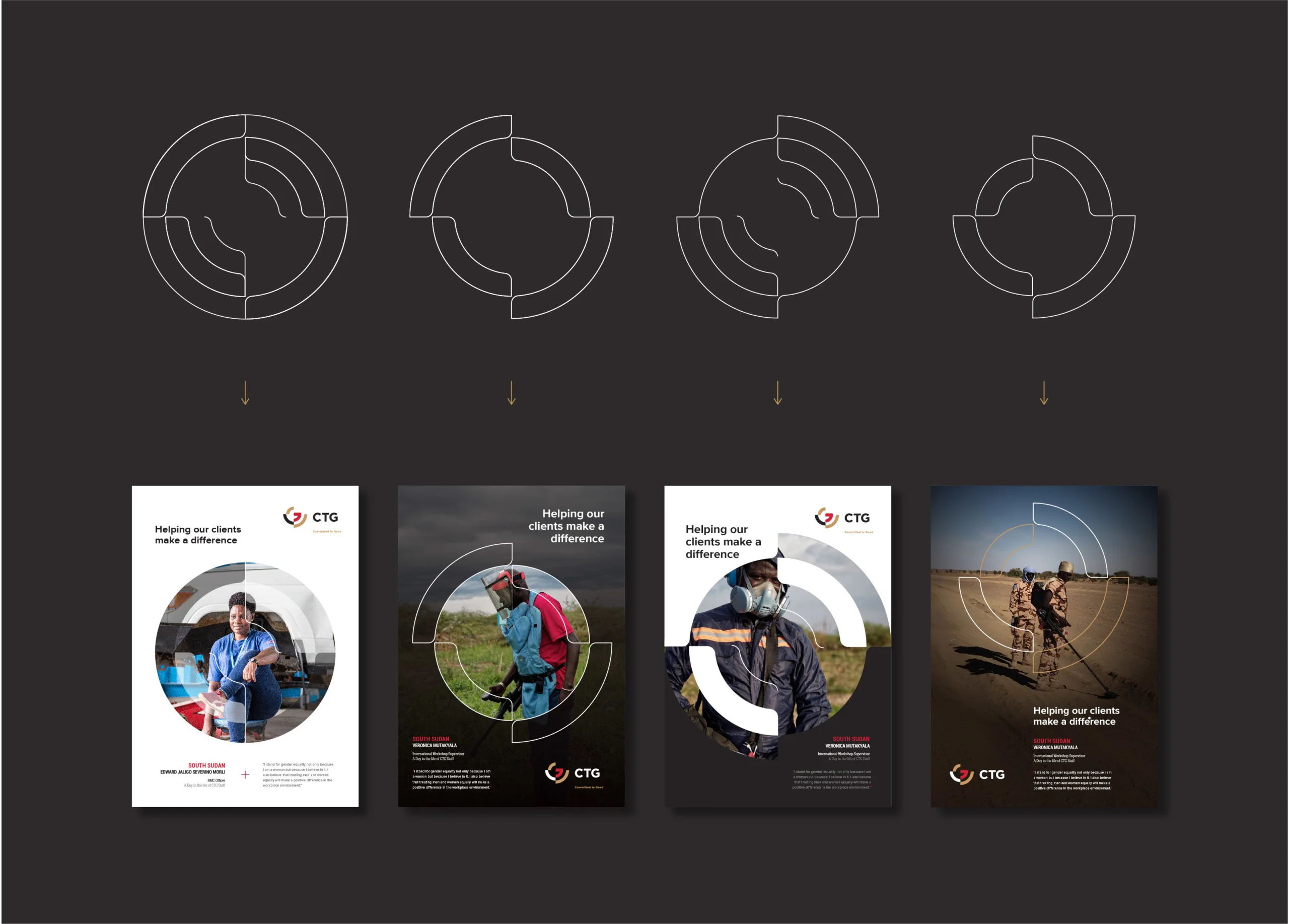
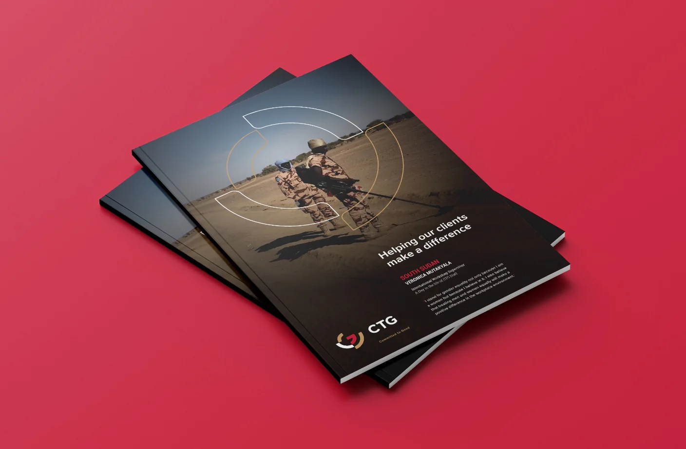
We strategically designed and developed a logomark and graphic elements that supported our conceptual thinking – to compare CTGs ‘action’ to that of a ripple effect, where the results have a lasting positive effect on the people and communities they support.
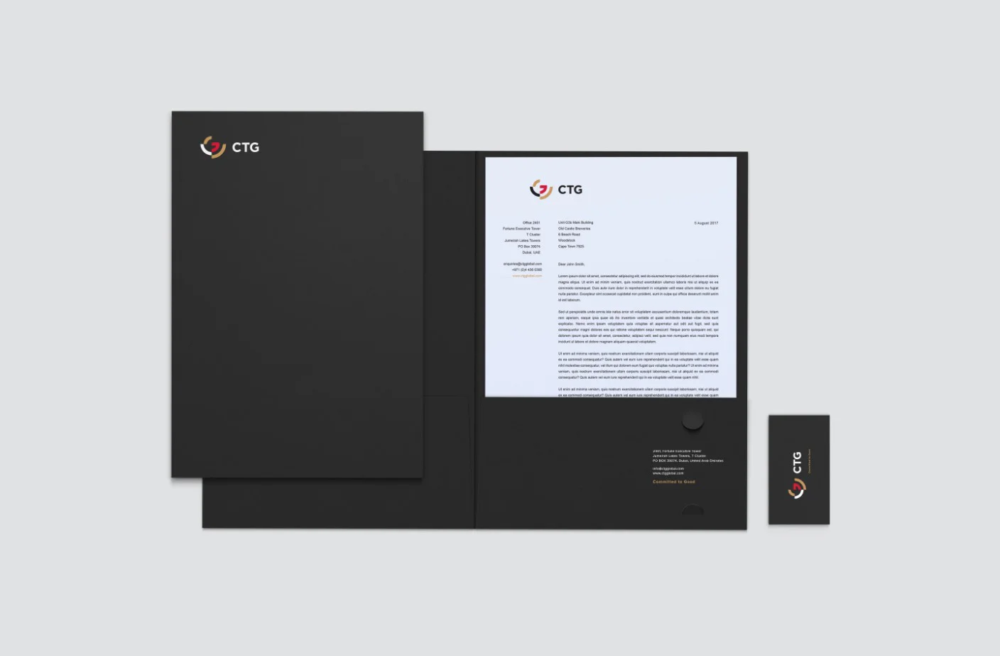
Identity Design
Visual Language
Brand Rollout
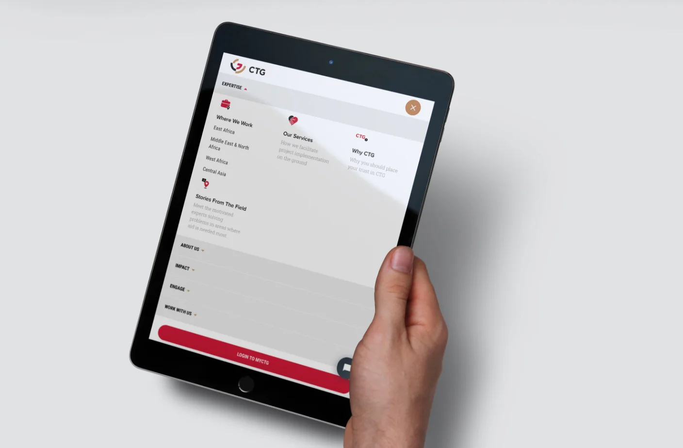
UI/UX Design
Front-end Development
Back-end Development
Content Management System
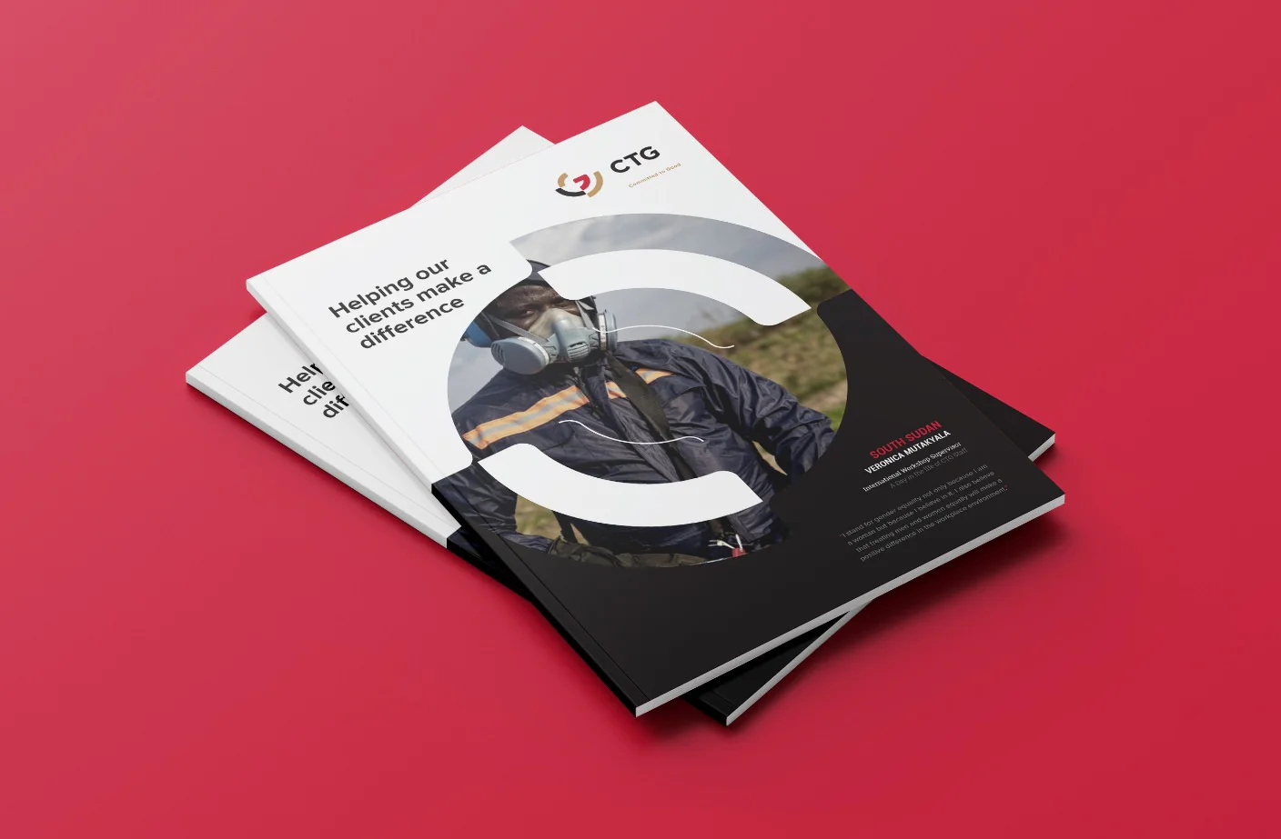
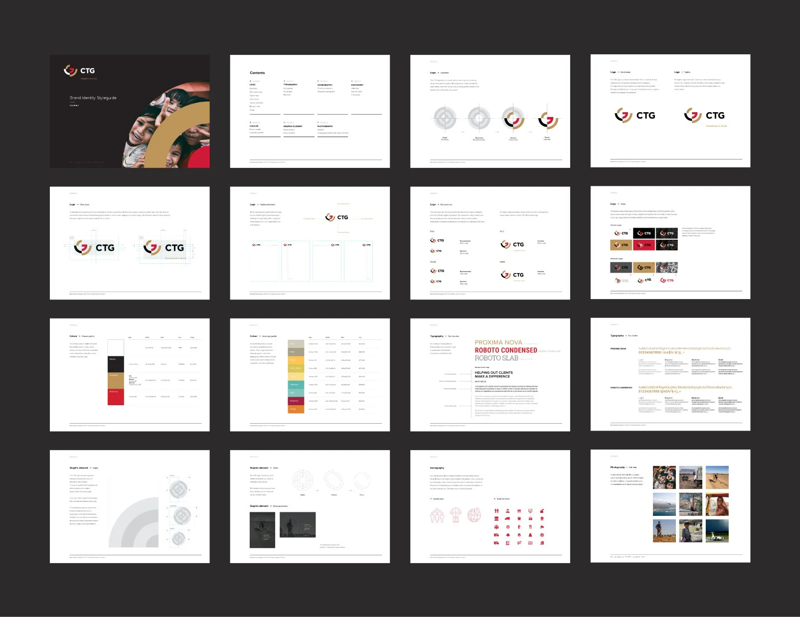
Logo
The CTG brand identity was inspired by the continuing and spreading results of an event or action.
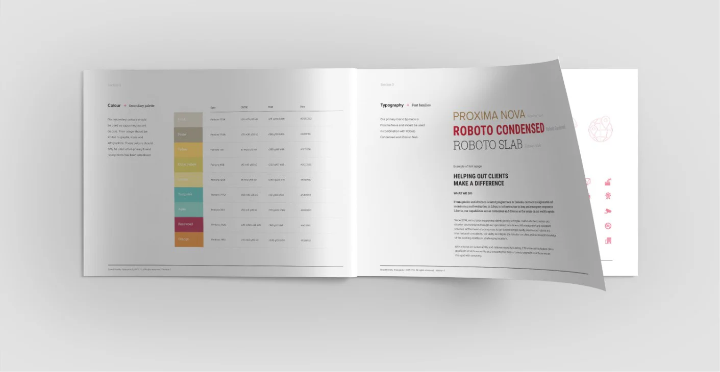
Type and colour
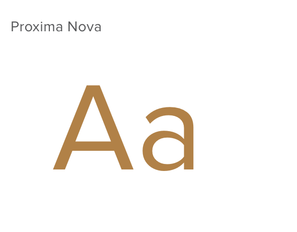
To create typographic balance we selected three typefaces with varrying impact in order to create visually powerful communications.
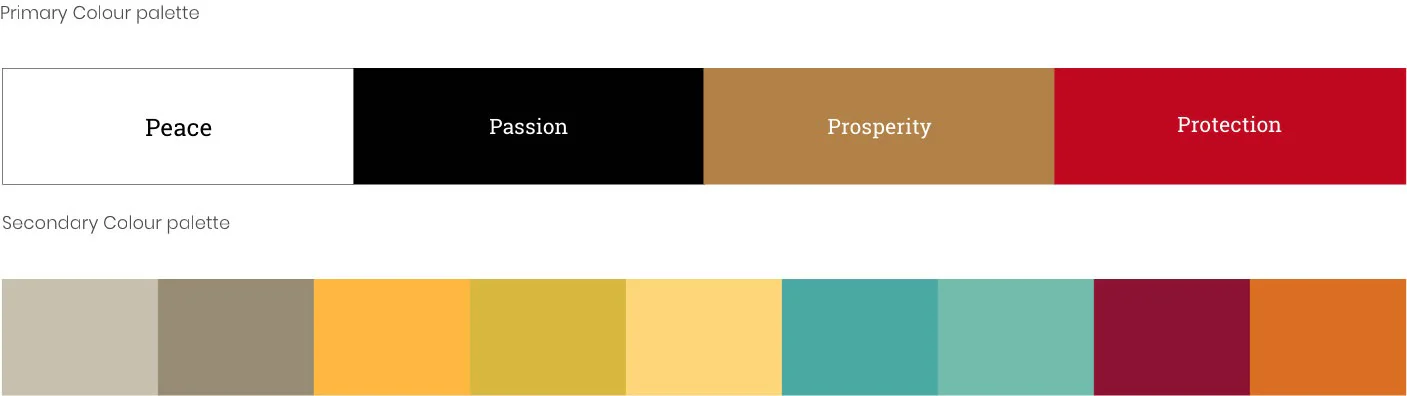
We selected core colours that respresent Peace, Passion, Prosperity and Protection - the four pillars that drives the brand forward.
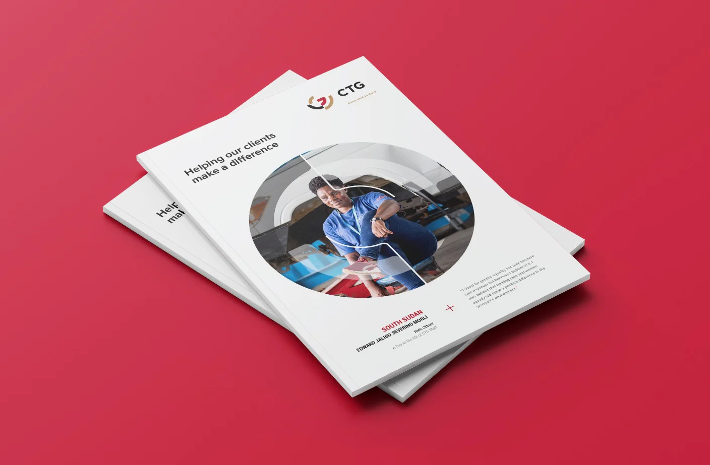
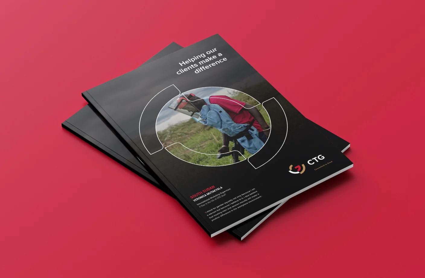
Visual language
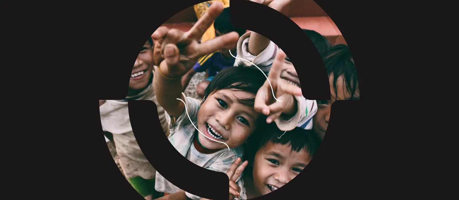
For the visual language we evolved the concept of the 'ripple effect' so that it could be used in a number of creative ways.
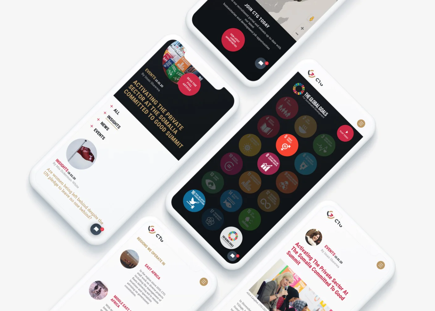
Adding a digital touch
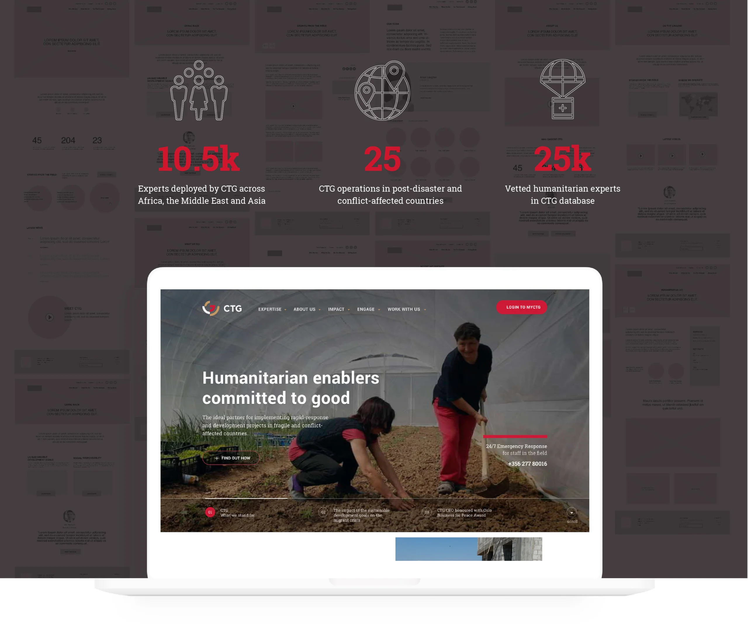
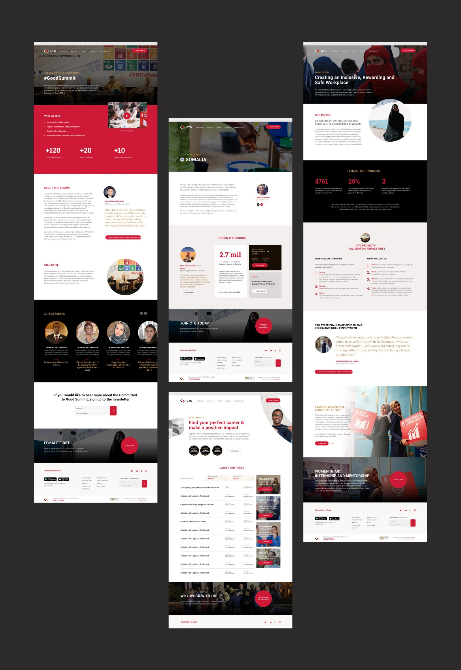
We wanted to craft a digital landscape that mirrored the essence of CTG. Our content strategy focused on the lasting effects of CTG and the individuals responsible for it by zeroing in on their experiences on the ground. We created a section specifically dedicated to this, called ‘Stories from the field’. This particular strategy was used to fulfil one of CTGs key objectives; recruiting talent who wants to be at the forefront of change. Staff support is another focus point and supplies staff with valuable content necessary when working in conflict territories.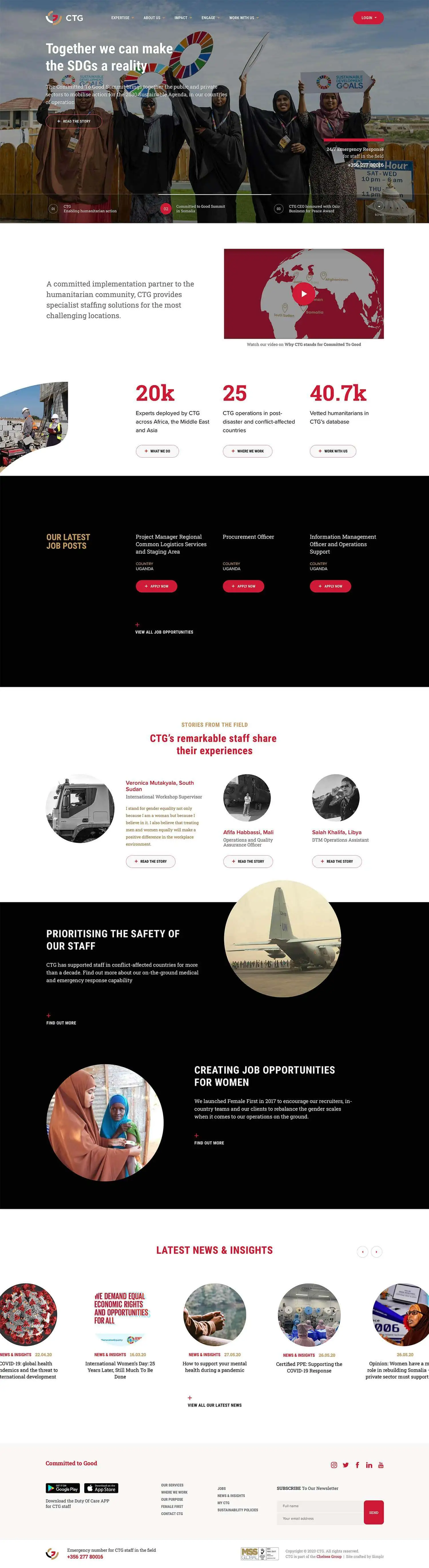
“I cannot thank the Simplr team enough for partnering with us on this incredible re-branding journey – I’m thrilled that the new brand connects with what CTG stands for and what lies at the heart of our company. Little did I know that our new brand would be such an integral part of our business and social good strategy; you gave it more life than I could have ever imagined. Our website is a great business tool that looks good but also gets across the people aspect of what we do and it continues to grow and evolve. I believe it defines us as a leader and a sustainable business model required by the humanitarian sector. Truly a great achievement – particularly as concept to completion was achieved remotely between Dubai and Cape Town.”


