Brief
Hart International is an internationally recognised risk management company, delivering innovative and integrated security solutions in complex areas. They approached Simplr with the task to refine their identity and re-design their website from the ground up as well as to re-position Hart as a world-class global leader in land, sea and air security.
Solution
We did a brand and competitor analysis with the Brand Manager of Hart and took a strategic approach in elevating the brand with a strong identity, elevated colour palette and powerful visual language.
Identity Refresh
Visual Language
Website Design
Website Development
Original logo
Logo refinement
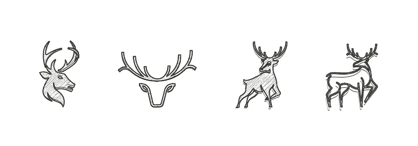
We explored different styles of illustration for Hart's main symbol - the stag. The original logo predominantly focused on the strong stag 'head', symbolising safety, protection and trust. Whilst exploring different avenues, the refined logo maintained the essence of the original logo but provided for more clarity and impact.
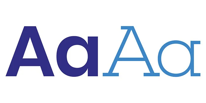
Type and color
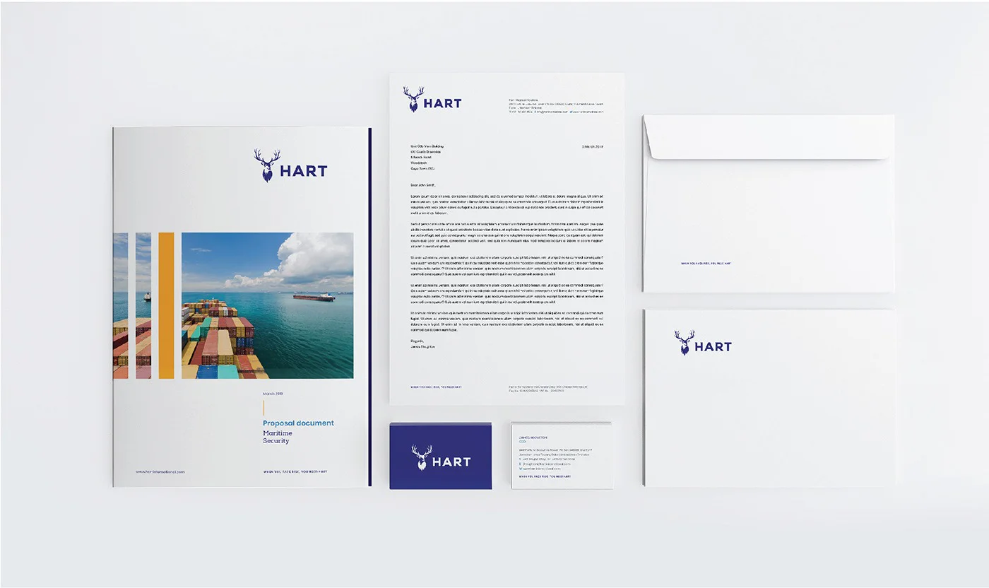
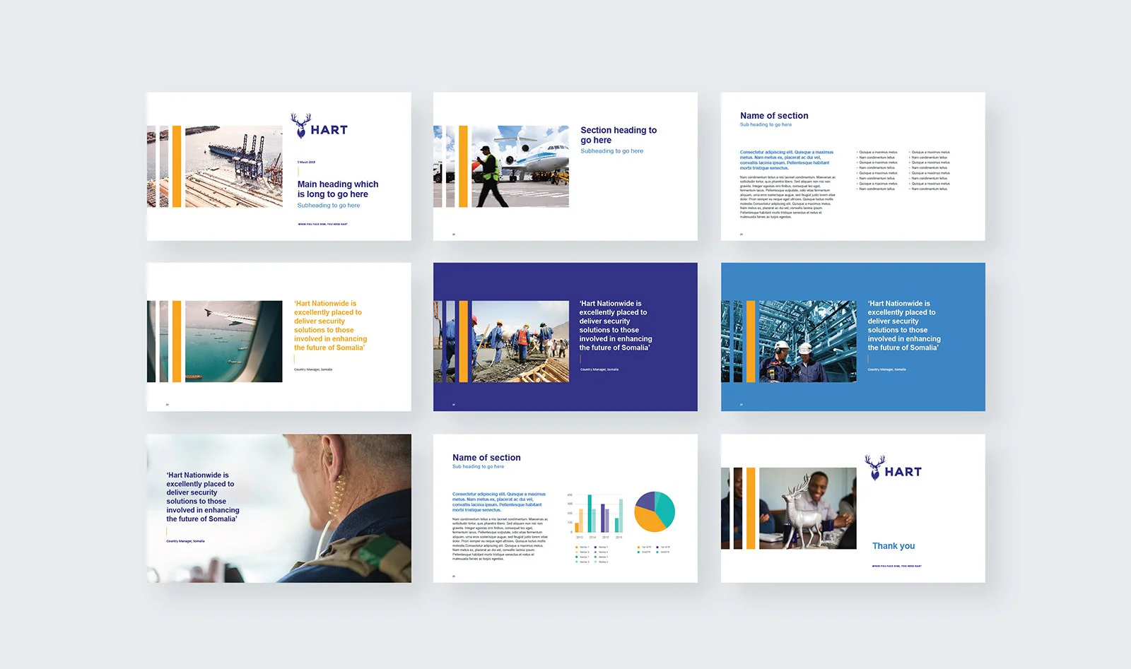
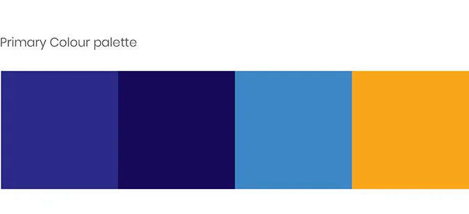
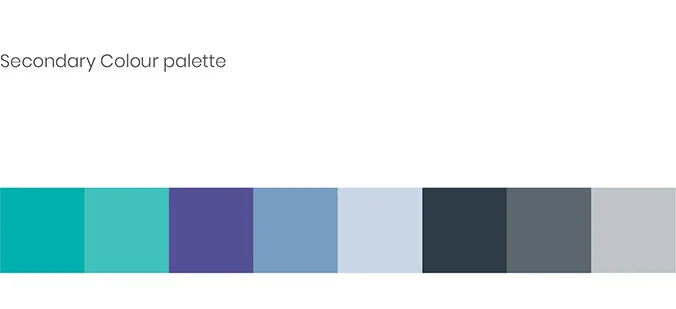
We chose two bold typefaces - Poppins and Nexa slab. The attributes of these typefaces complement the strong symbolism of the stag. The colour palette was elevated with a brighter blue and a contrasting yellow was added to create dimension and impact.
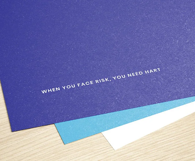
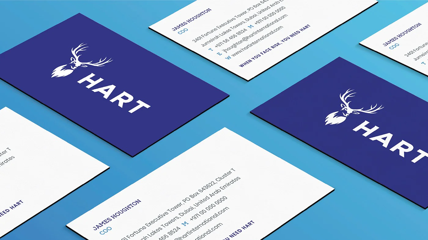
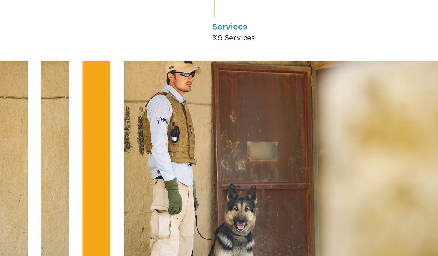
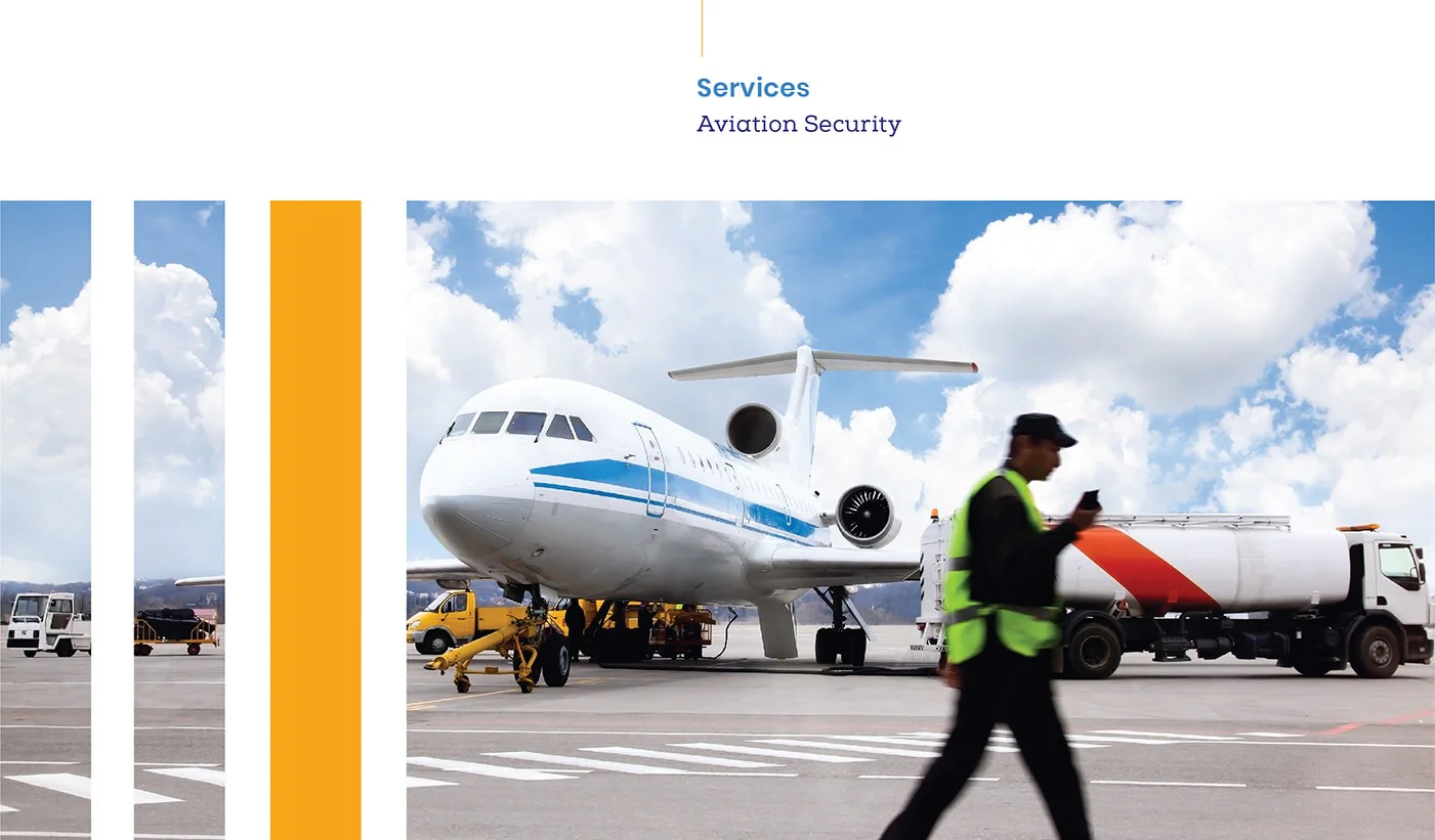
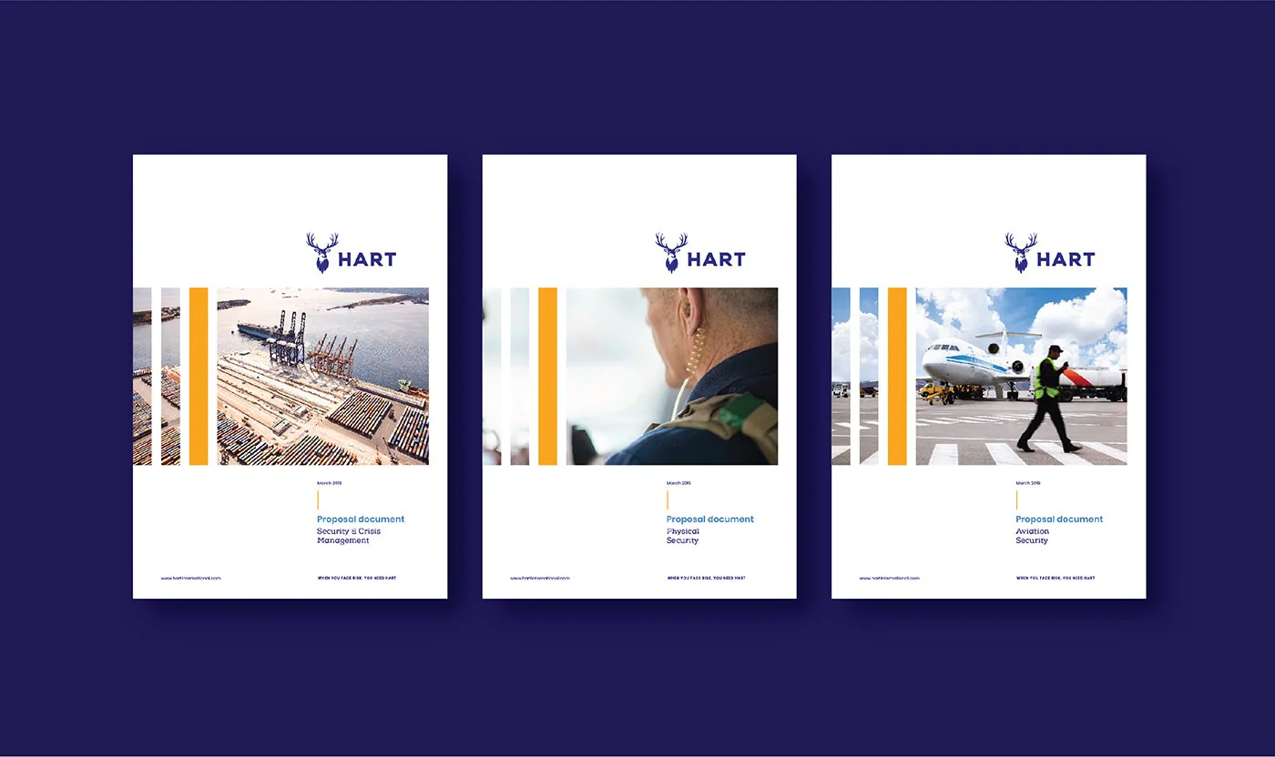
Visual language
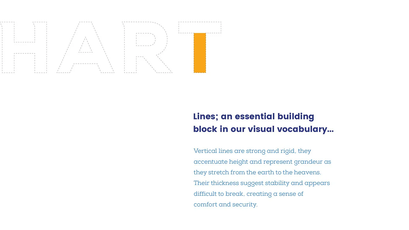
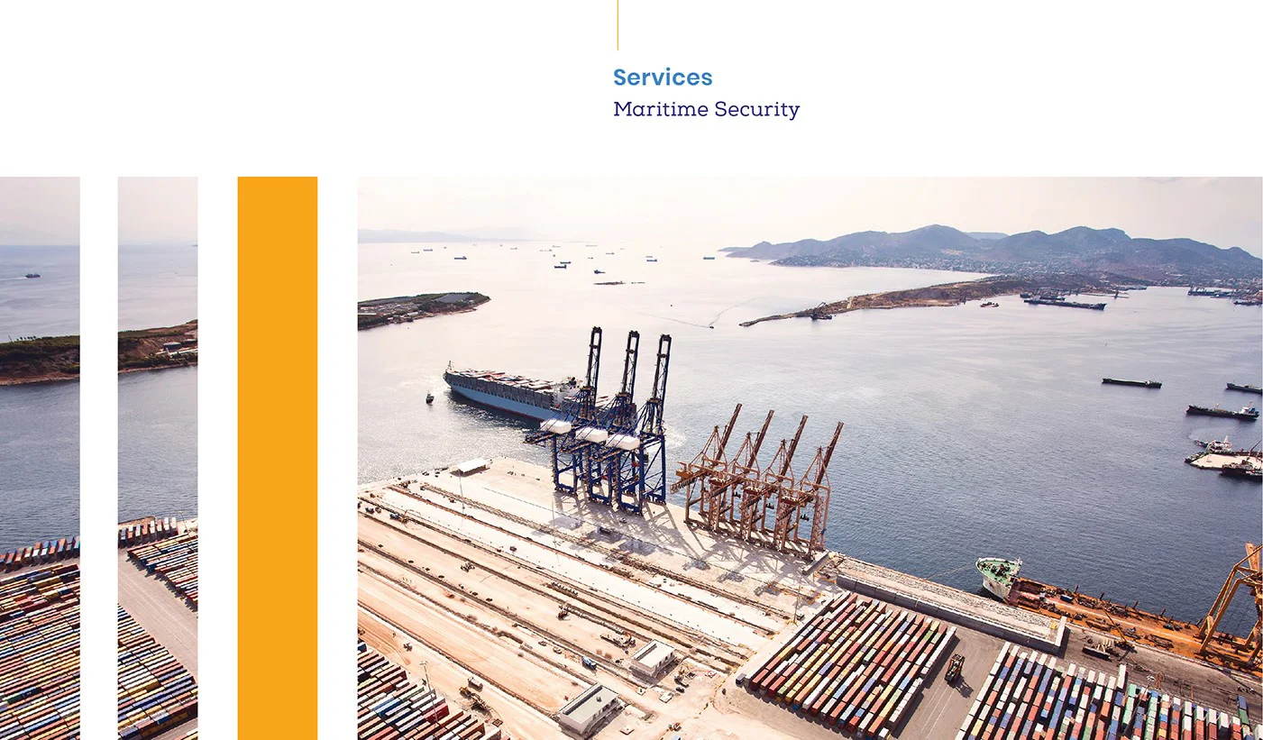
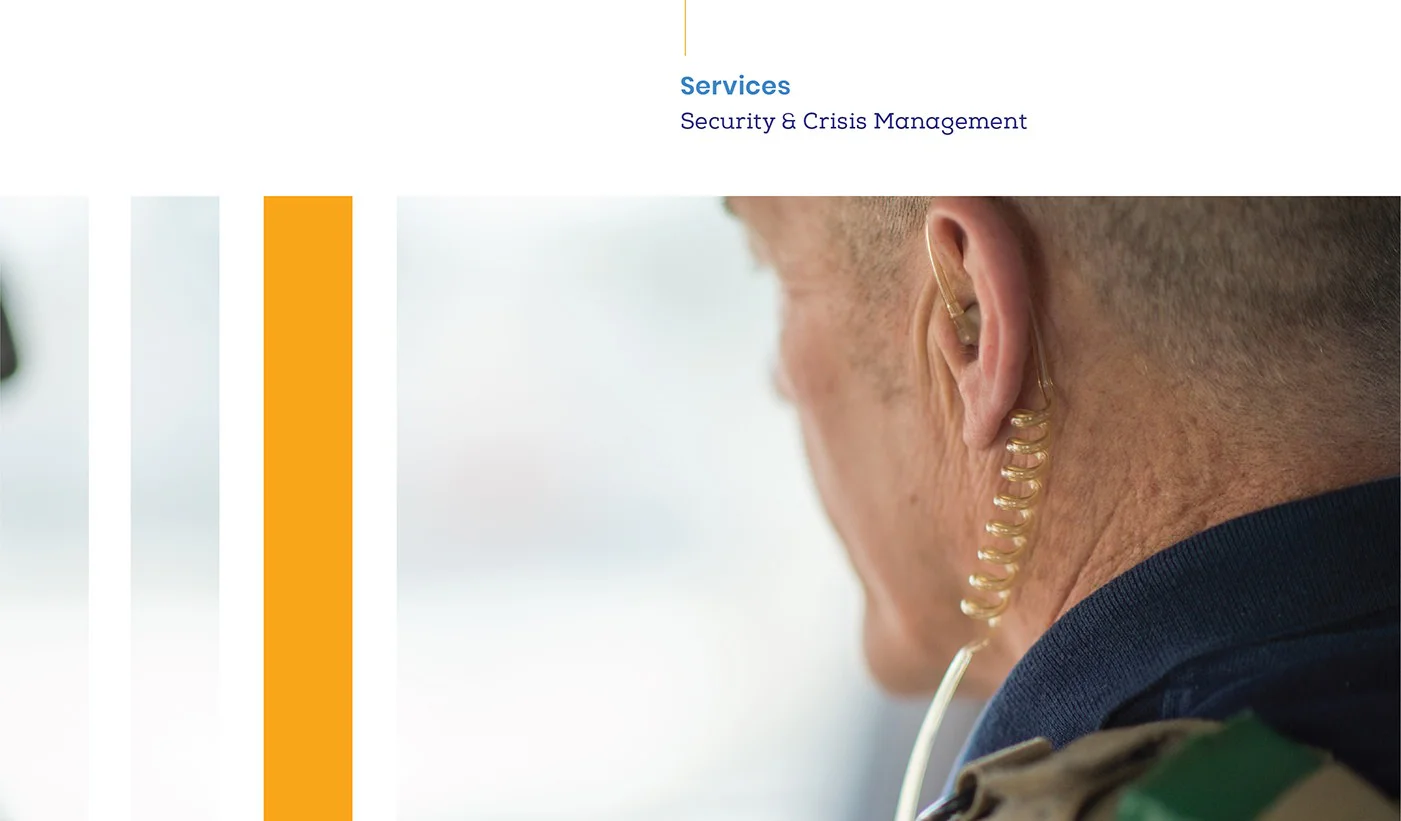
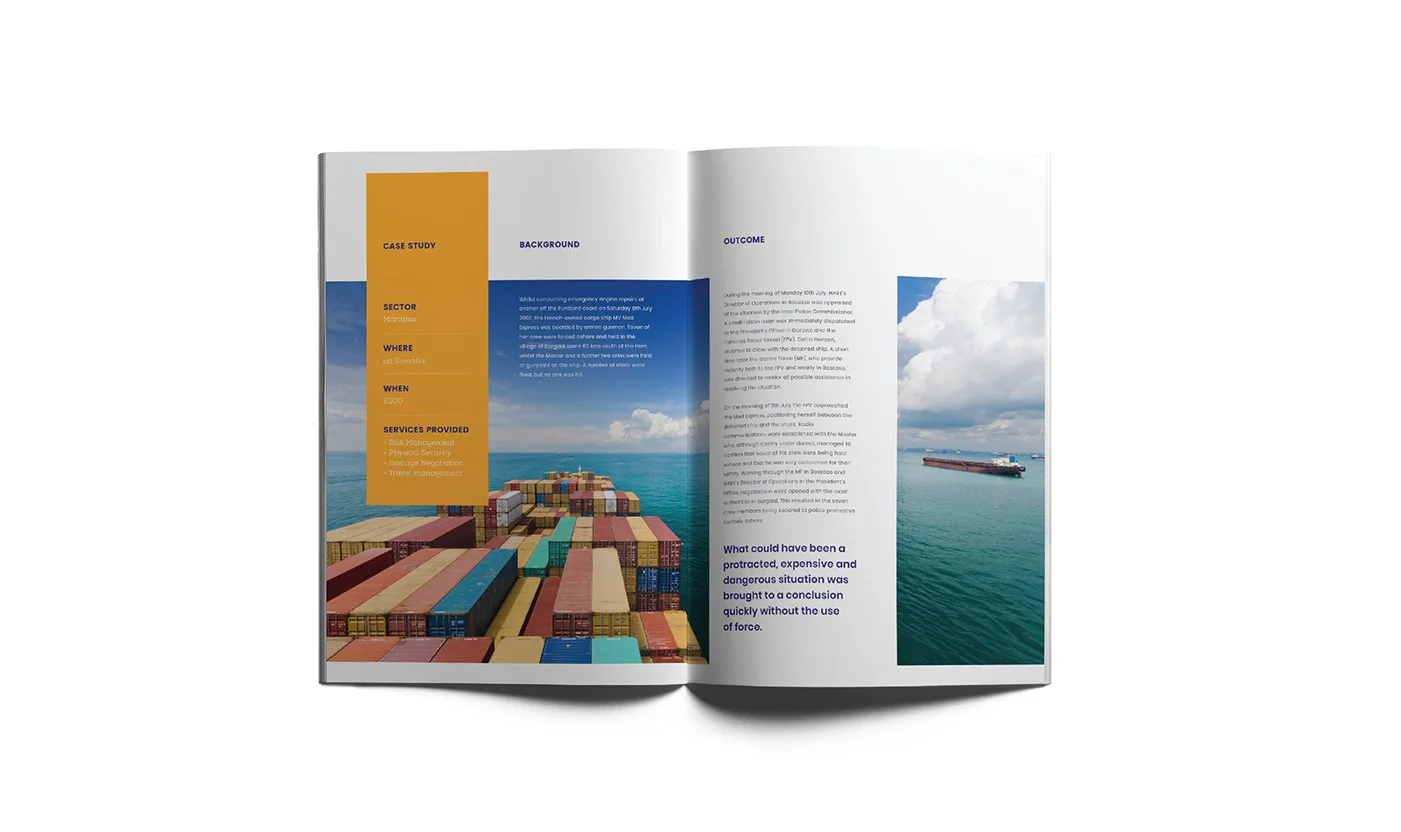
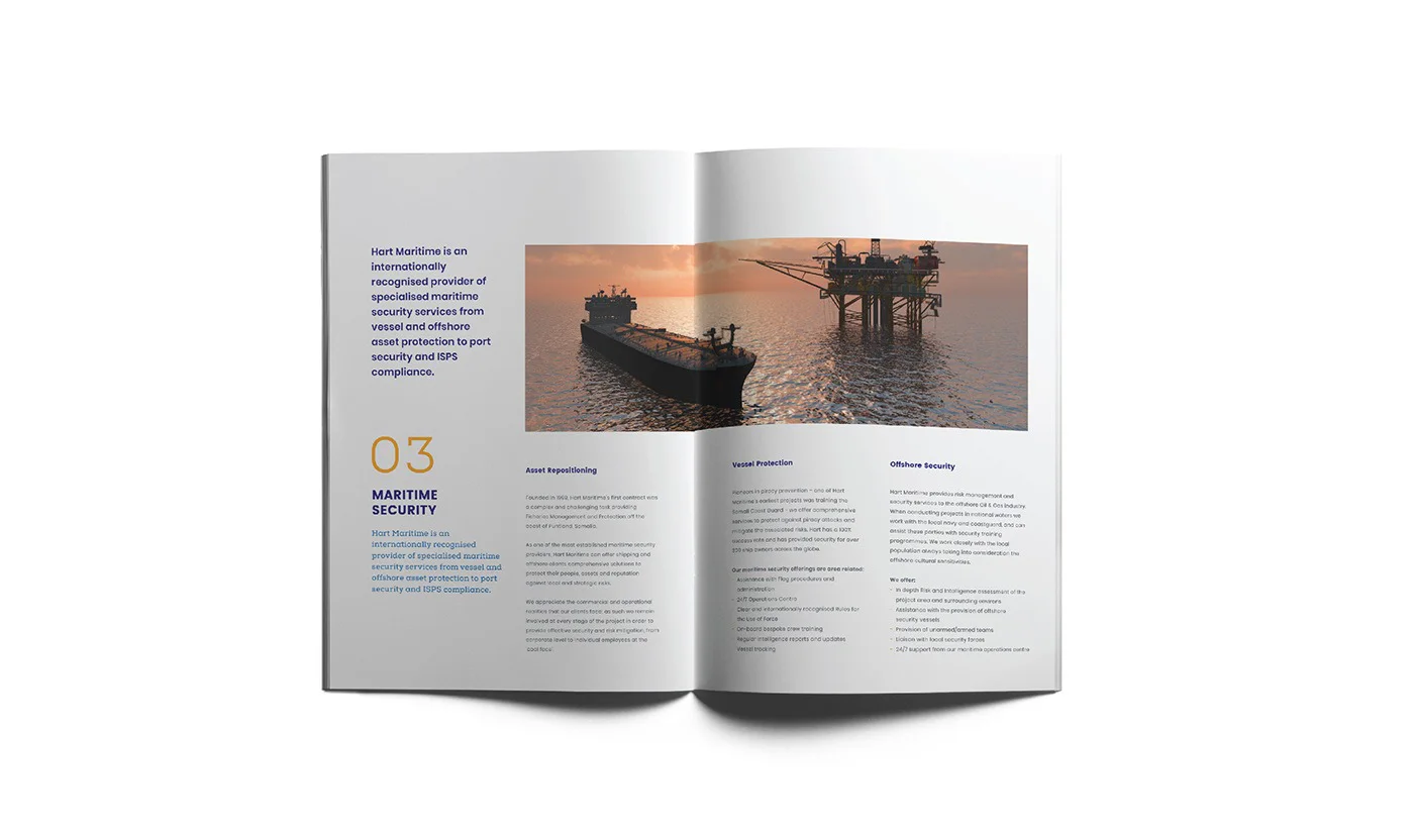
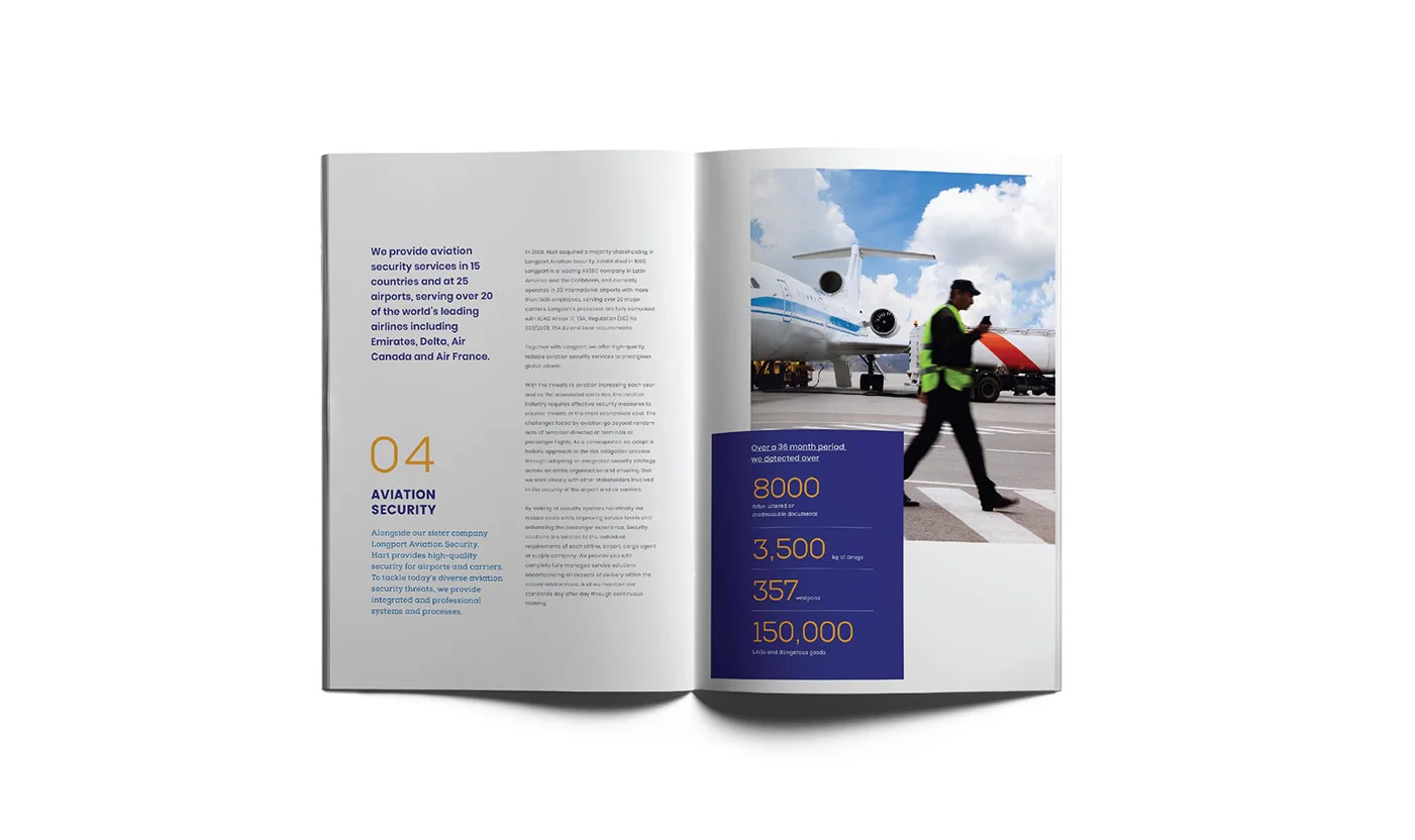
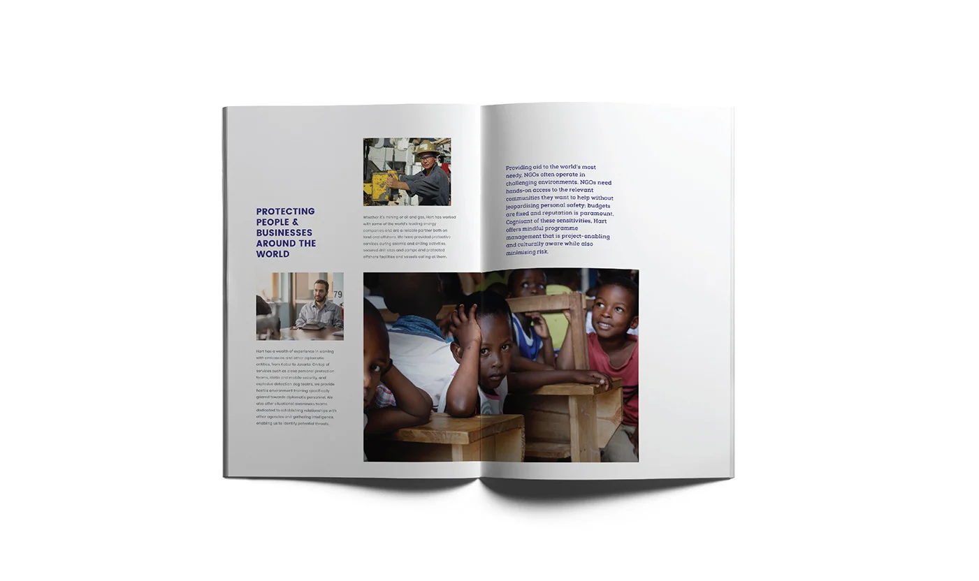
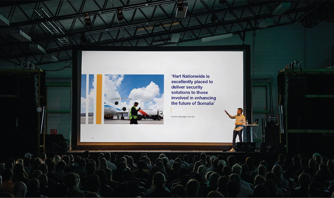
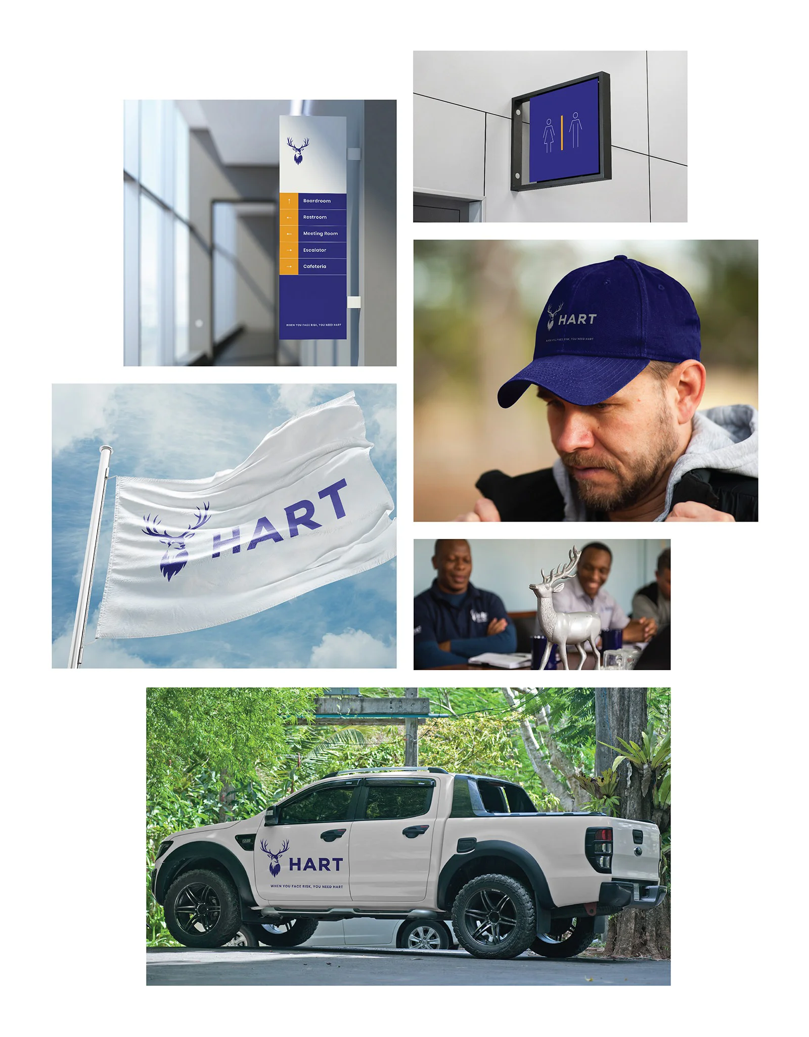
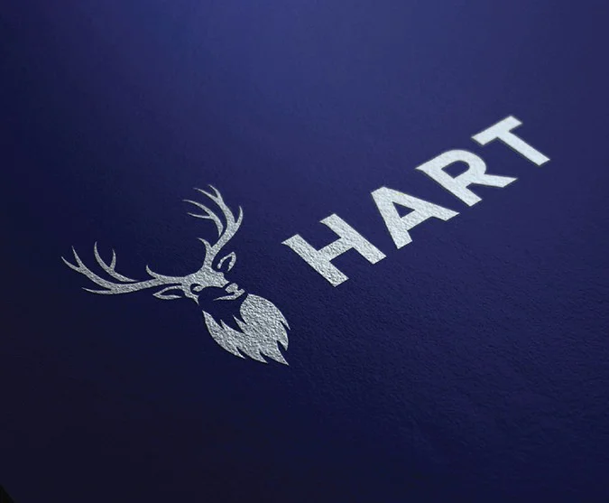
To support the essence of the brand, we created a strong yet simple visual language that could easily be applied to both the printed andd digital world.
Digital
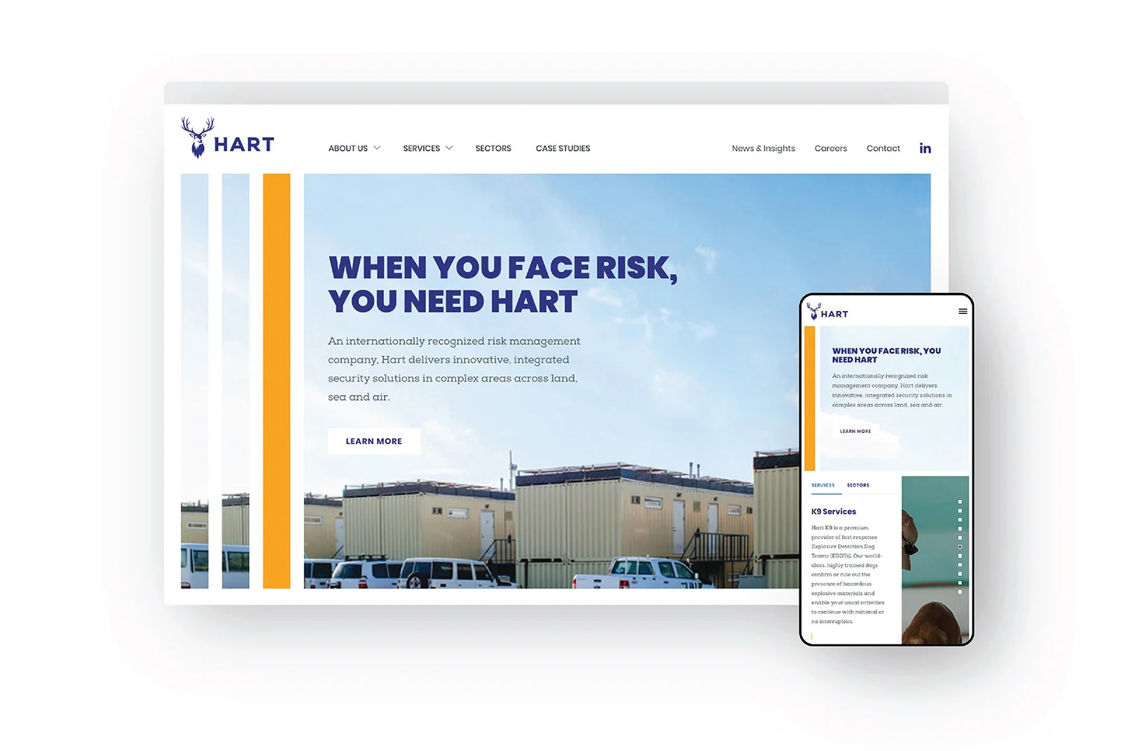
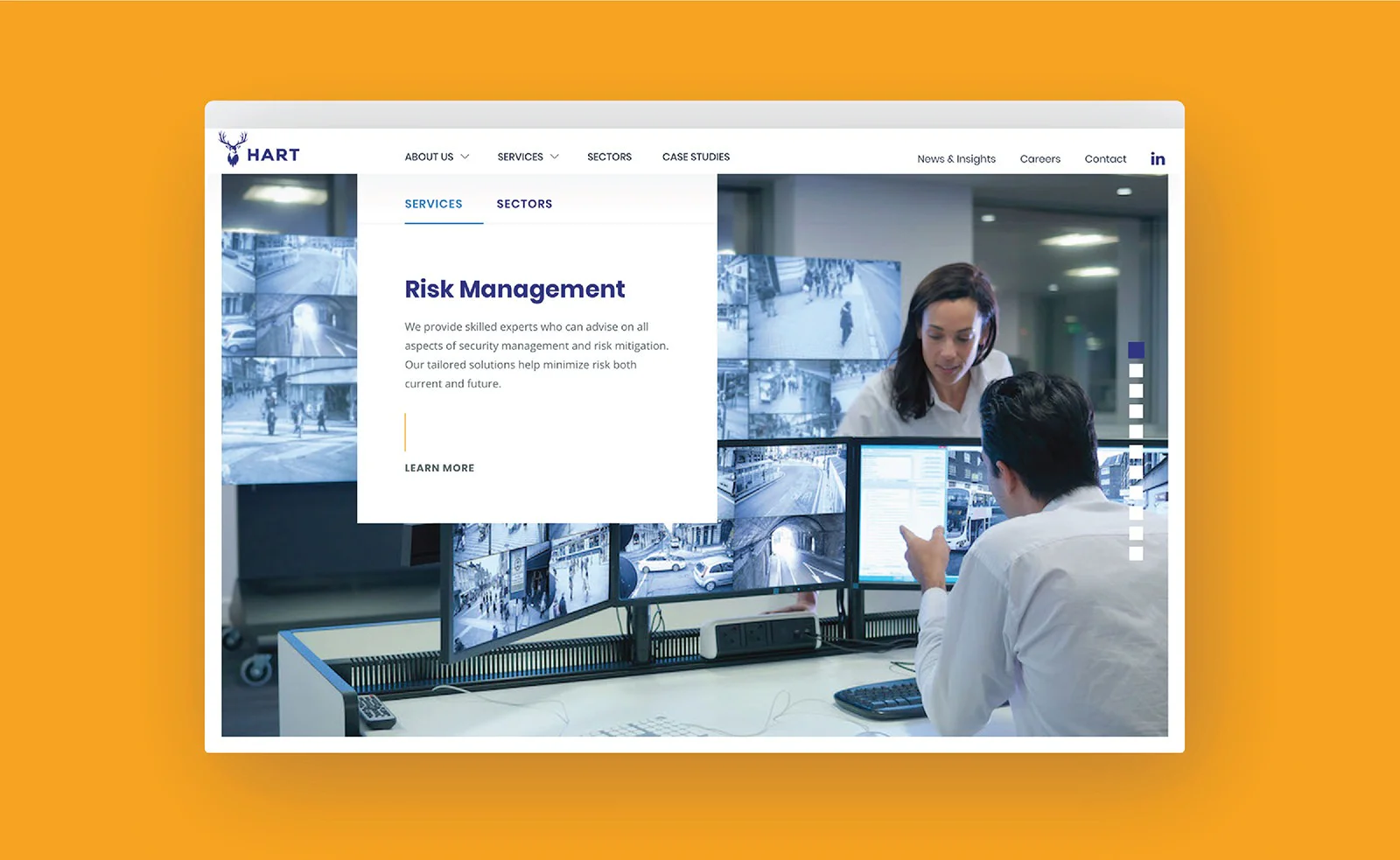
The website was designed from the ground up in order to re-position Hart as a world-class global leader in land, sea and air security.
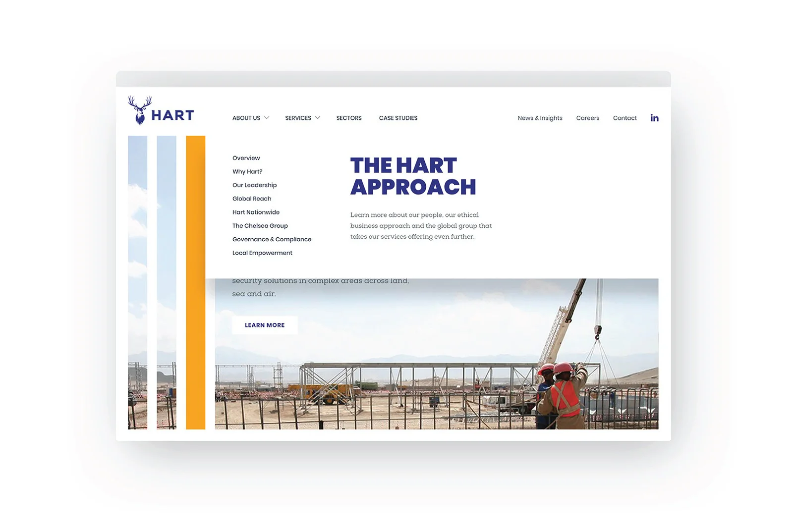
The end solution is a responsive framework that heavily relies on new photography and clear, easy to use navigation. A customised WordPress CMS was built with a content strategy in place, enabling Hart to dynamically manage all their content and grow their brand.
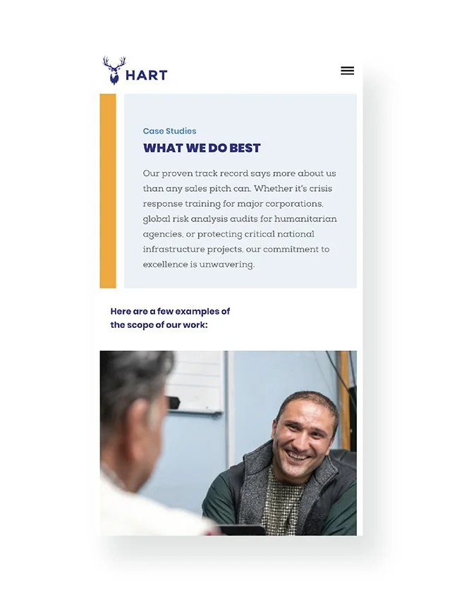
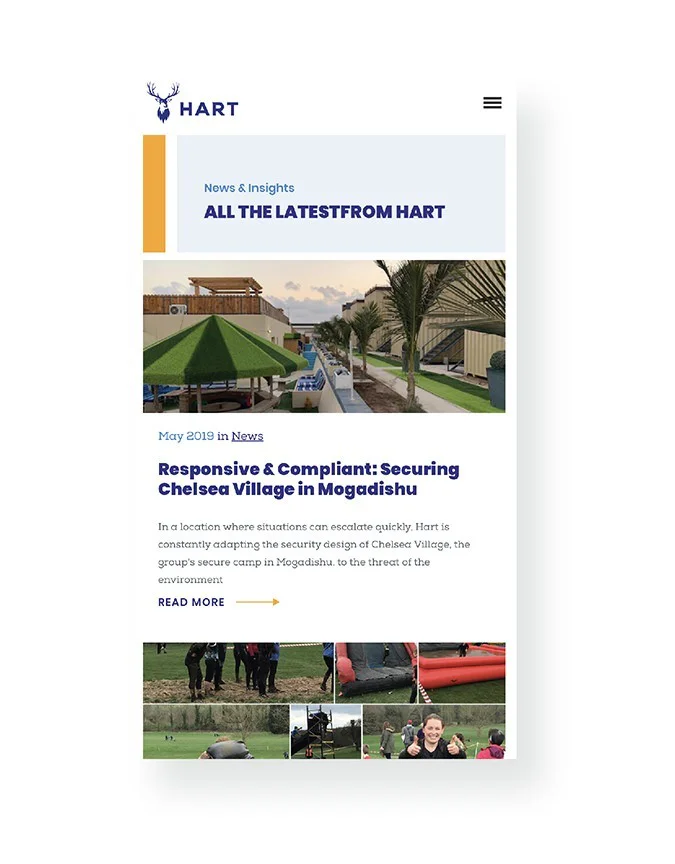
Mobile
A lightweight, responsive framework helps site visitors, no matter where they are to engage with the new Hart website content.
Case Studies
Showcasing what Hart does best is vital in the success of the site as a communication tool. Driving new leads and building brand awereness.


