

Brief
1 Map approached us to refresh their brand identity. The task was to review the brand and make it more cohesive through the development of a visual language style that was both literal and approachable.
Solution
Our main priority was to differentiate 1Map from their competitors. We chose a bold typeface, vibrant color palette and easy appliable visual style that ensured that the product interfaces and diagrams were easy to understand and use.
Branding
Visual Language Development
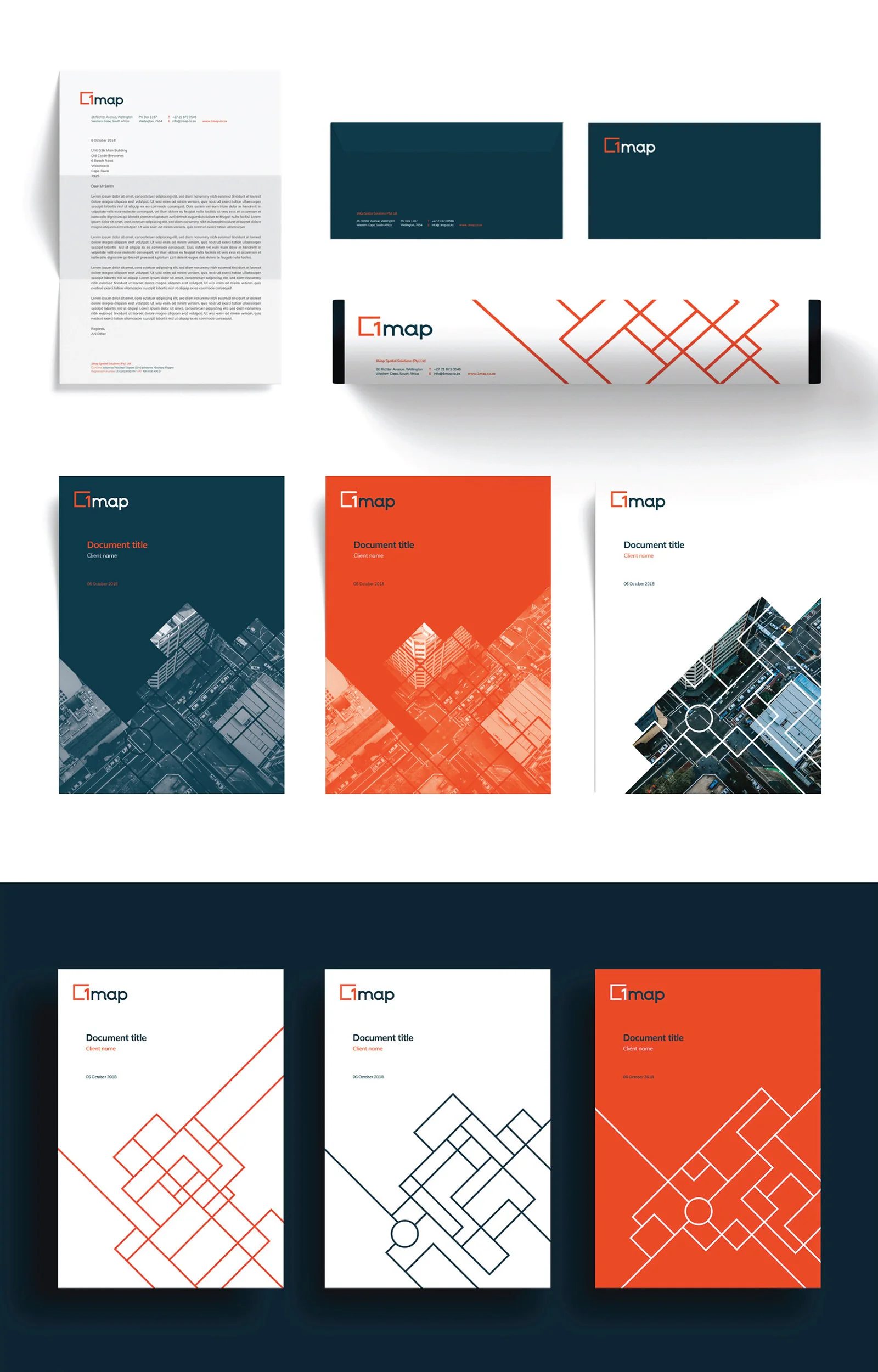
Brand Rollout
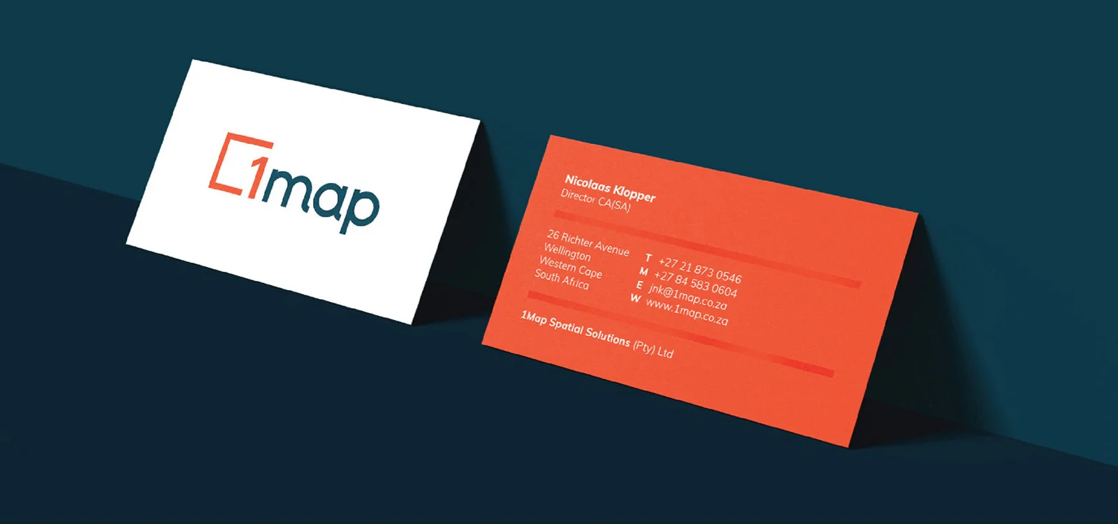
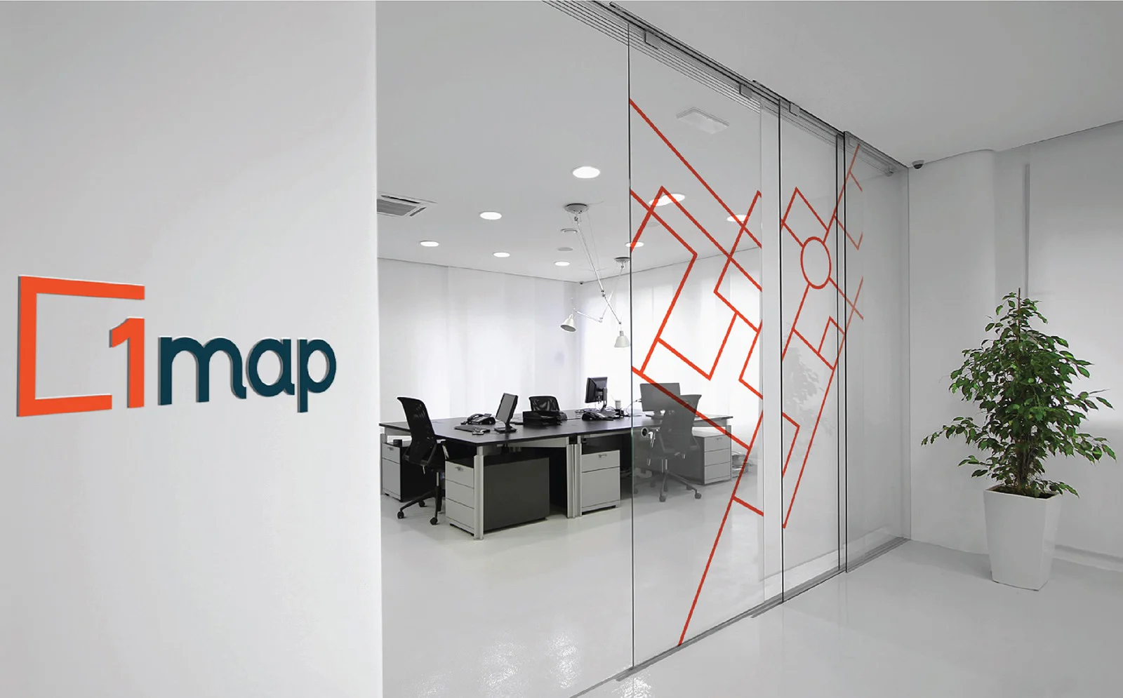
Brandmark
We created a brand mark which could be used as a standalone brand device, both online and in traditional brand environments.
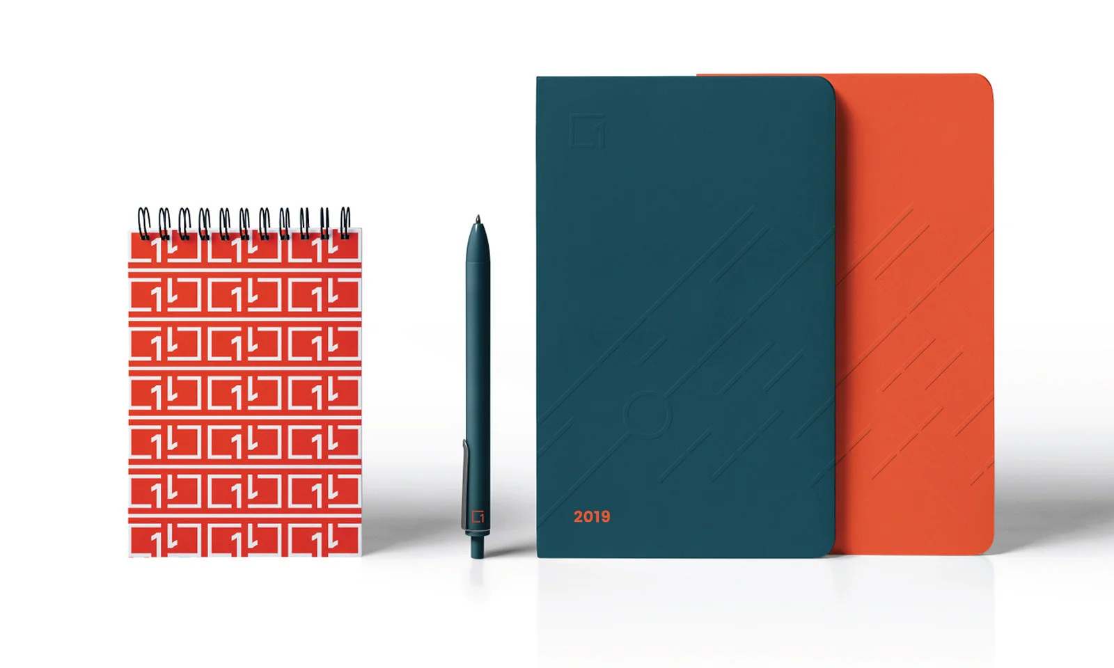
Type and color
We chose Poppins, a web friendly, strong and easily legible font that works well on print, web and within the product's interface.
The brand needed to be differentiated from their competitors who favoured the use of blue in their identity. We decided to use orange and grey as primary brand colours as we felt this would resonate with the mostly male, IT professional target market.


Visual language
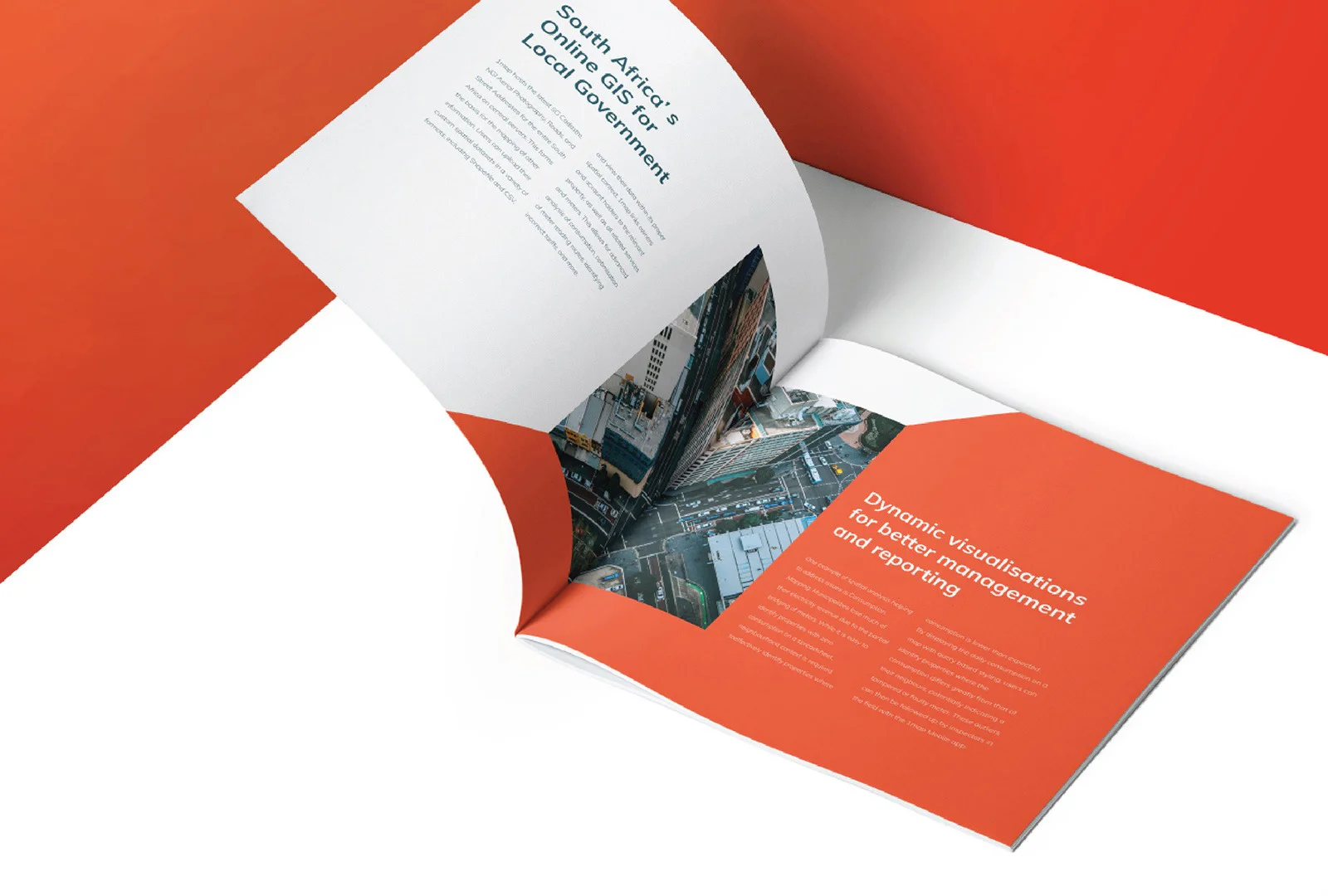
We created a graphic, simplistic and evident visual style that that can be applied in various different ways - with or without photography.
"Simplr and their team excelled in understanding our complex product in our niche market, aligning all aspects of the brand to the long term business vision. We have received nothing but positive feedback from our clients, with a number of them remarking on how our brand image is now in a whole new league."


