

Brief
Loadit offers a convenient, reliable, caring and cost-effective service for those moments when you just ‘need a truck’.
The client approached Simplr for a revamp of their existing corporate look and feel as well as to relook their current processes to make it easier for customers to book a delivery and for drivers to join the Loadit network and get more jobs.
Solution
Simplr set out to create a visual identity that would resonate better with the intended target audience, making it more fun through the use of colour and illustrations.
Working closely with the client we reviewed and refined their various online booking and application processes and rolled out a new website and app, which are easy to use and more enjoyable to interact with.
Brand Identity Revamp
Illustration
Wireframing
App UI Design
Website and App Development
Brand revamp and application
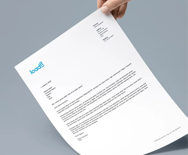
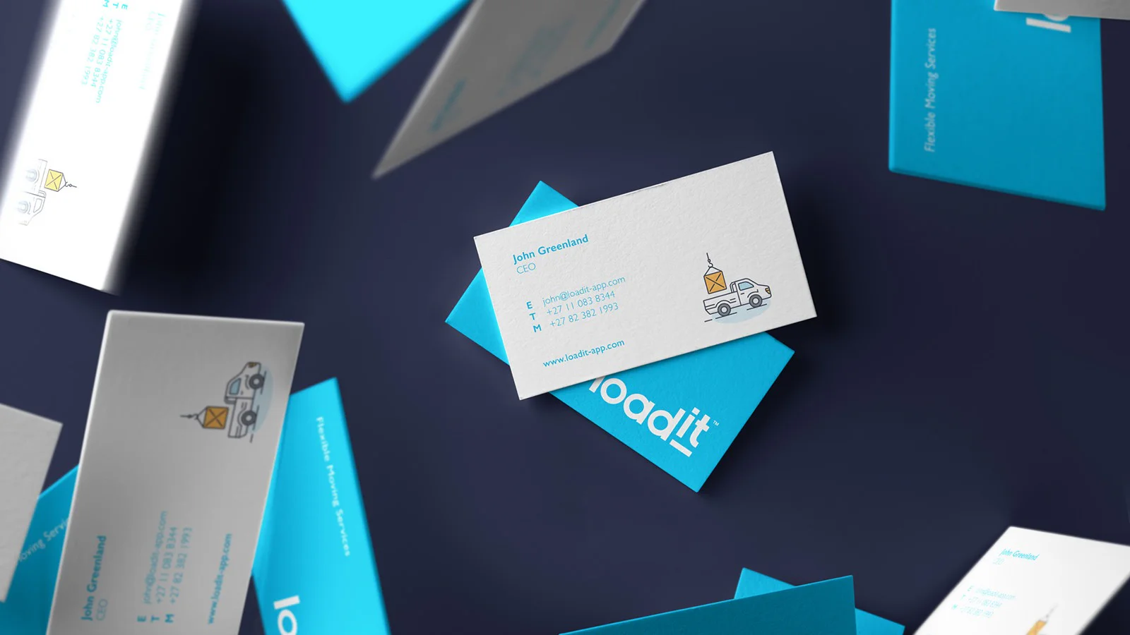
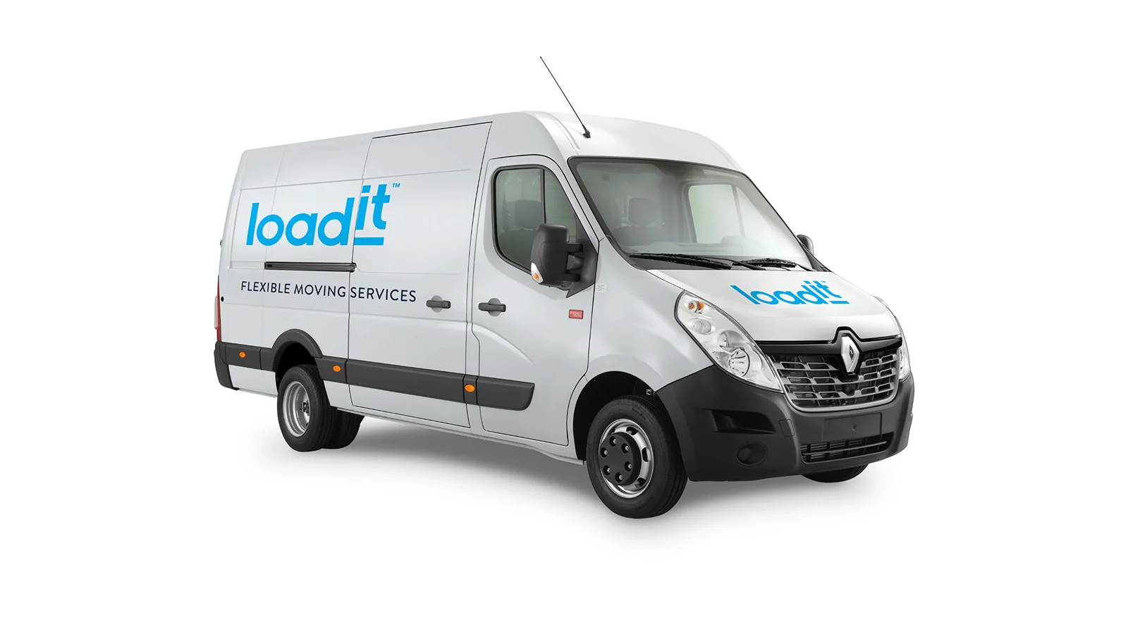
The old logo was refreshed to give it a more contemporary appeal, thereby lending longevity to the overall brand. More vibrant colours were selected to liven up the look and feel and a new font set was introduced. Although most of the brand identity resides online, it was successfully translated and applied to corporate stationery and vehicle branding.
Old Logo
New Logo
Logo Spacing
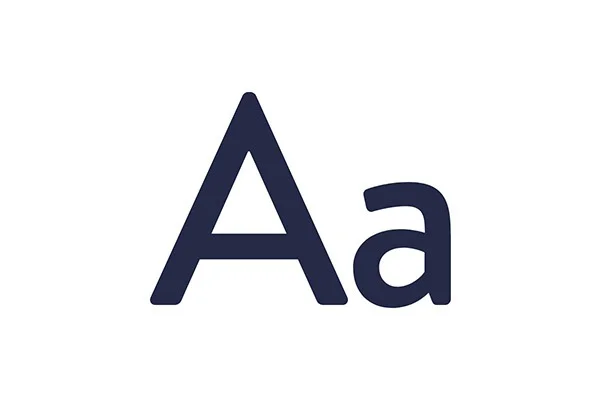
Primary Typeface
Primary Colour Palette

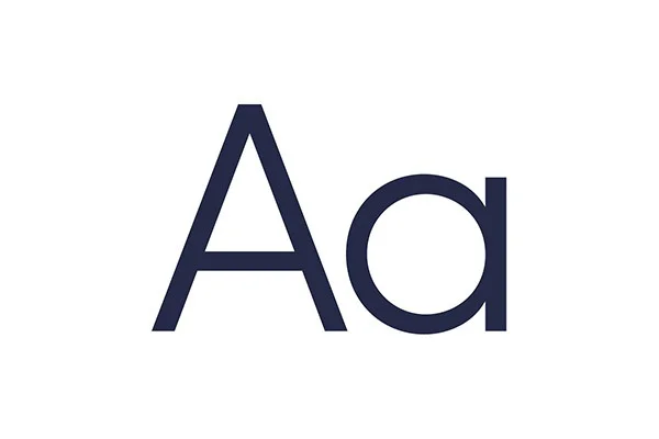
Secondary Typeface
Secondary Colour Palette

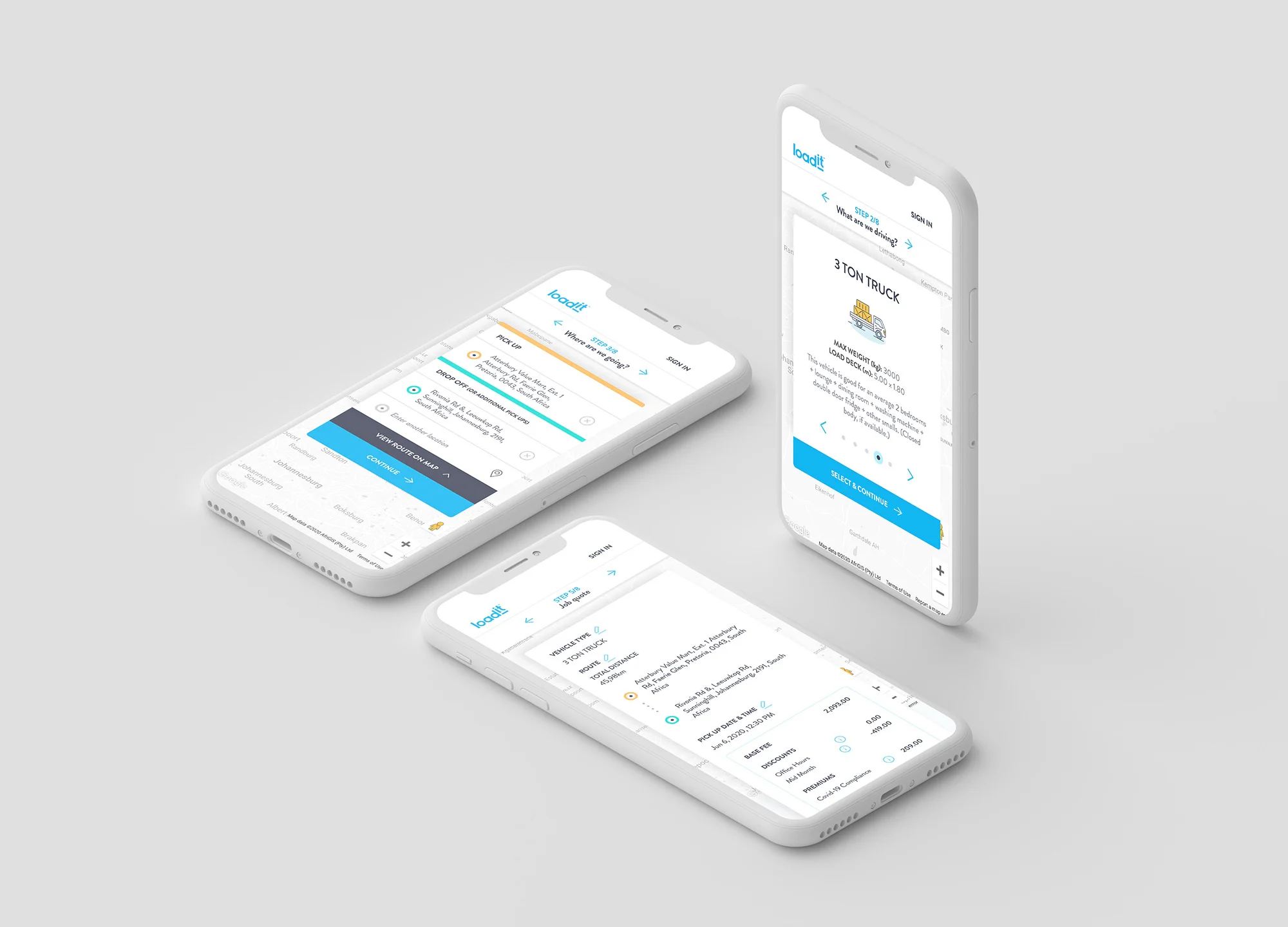
Booking Application
We moved away from a native iOS app to a web application that fast tracked the online booking process. The old delivery booking system was evaluated to identify problems with the process logic and user interaction. The new look and feel was applied and the final prototype was tested and found to be much more efficient in presenting and processing information.
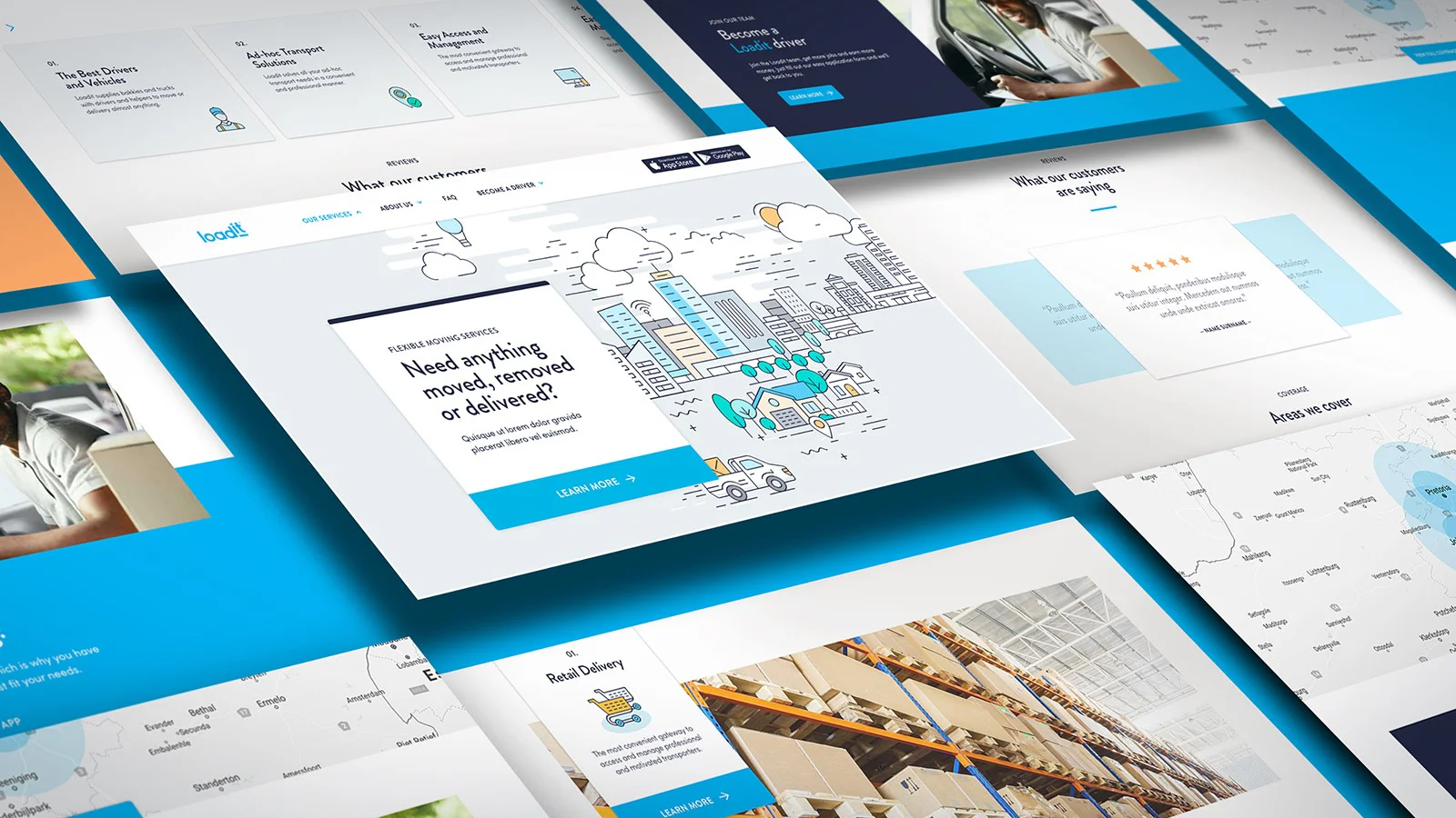
Online presence
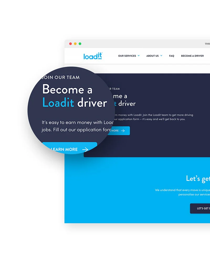
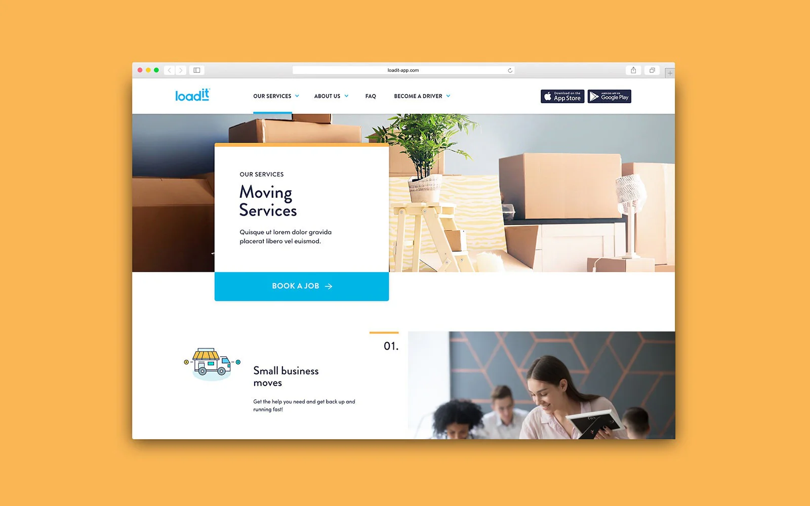
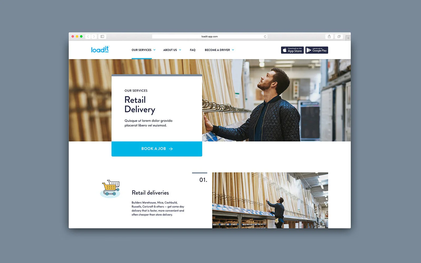
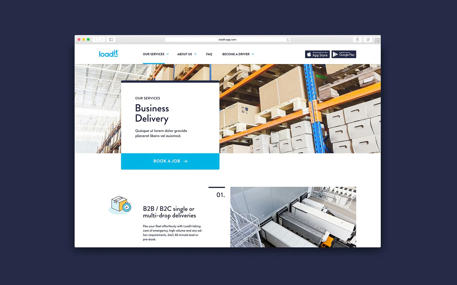
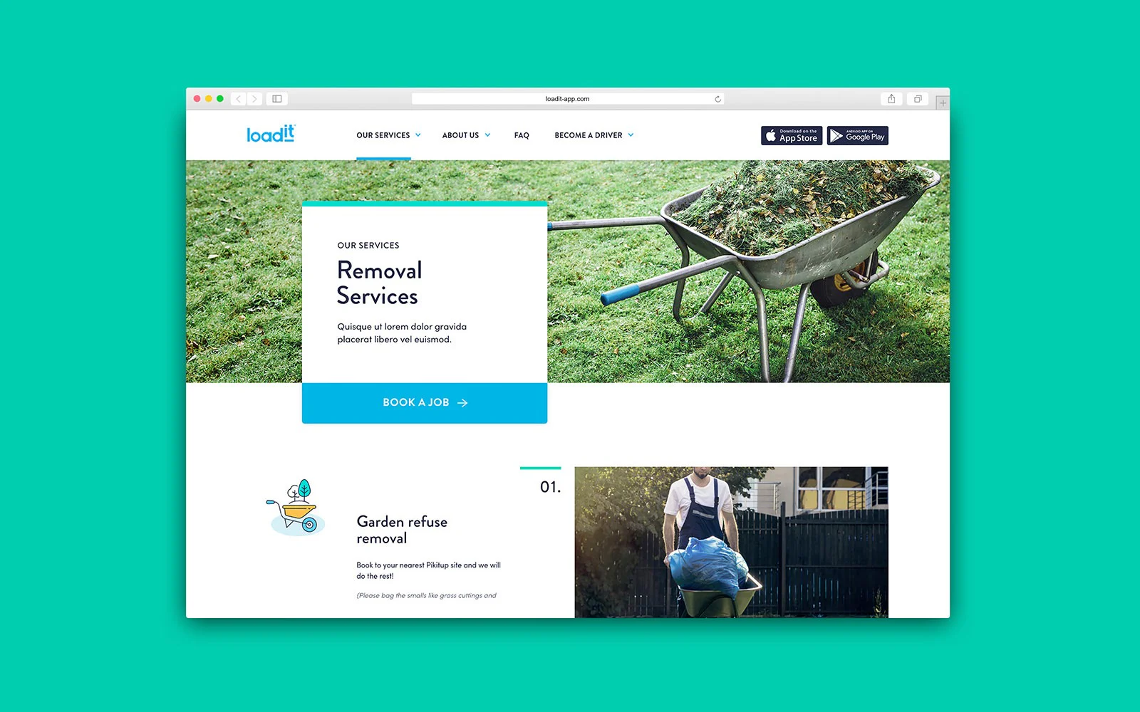
A new website was designed and developed with a strong focus on the user's experience and ease of use. Besides general information about the company, the website provides useful content related to the moving process and an online form whereby drivers can apply for a Loadit membership. It also serves as a promotional gateway for the Loadit bookings app.
Typography
It was decided early on that iconography and illustrations would be incorporated as essential devices to communicate the booking process to the user in a friendly and uncomplicated manner. Various descriptive icons were used to create an infographic system throughout the website.
Iconography
The usability of the website was enhanced through colour coding of the various service pages, thus providing the user with visual cues while navigating the website.
Colour
The usability of the website was enhanced through colour coding of the various service pages, thus providing the user with visual cues while navigating the website.
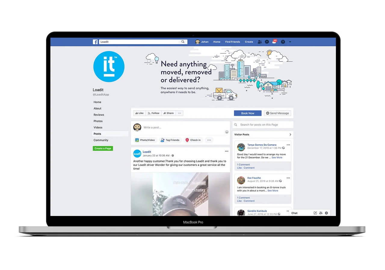
Social media
The new Loadit brand was applied and advertised on various social media platforms to create awareness of the brand and encourage feedback and interaction from existing and potential customers.
"Working with the Simplr team helped transform Loadit’s marketing website from an embarrassing mess to an invaluable marketing tool. From reworking our logo to consistent brand elements, the site just works. And works well. In their mind no detail is too small or insignificant which makes all the difference."


