Brief
To create a striking, bold brand identity for this new-to-market sports clothing brand Pavé.
Started by ex-professional tri-athlete and sports coach Brett Faure, Pavé wanted to position itself as a premium tri-suite, cycling kit and accessory brand with an emphasis of comfort, quality and durability as the cornerstone of the manufacture of all their goods. The brand target market is aimed at professionals and semi-professionals.
The brand is split between direct-to-public sales as well as custom corporate cycling apparel.
Solution
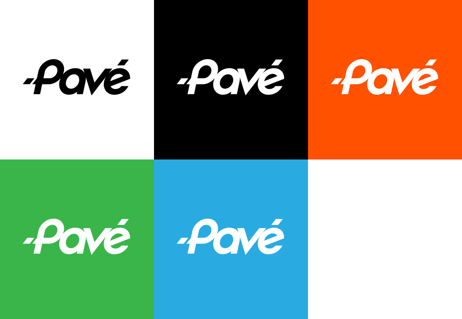
We created a bold, solid logotype identity that is easy to reproduce due to the vast clothing applications that would need to be rolled out across. The identity is a single black and white identity allowing it to adapt to, and work with any colour. This adaptability was crucial when adhering to the corporate clients brand guidelines allowing the Pavé brand to comfortably work with their brands.
Brand Identity Design
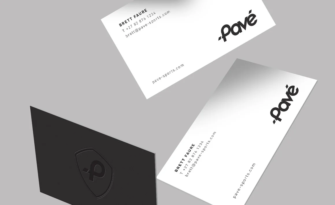
Corporate Stationery Collateral
Promotional Collateral
Packaging Design System
Fonts
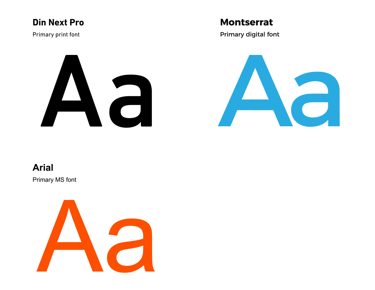
We use a classic sans serif font in Din Next Pro family as the primary print font. In support of the print font we use Monserrat for all digital / online elements and the classic Arial for all the internal Word and PPT templates.

Brand application
The simple typographic brand is bold and easily recognisable as its application is a simple black and white identity. The strength of the identity is in the adaptability of the brand to work within other corporate brand systems.
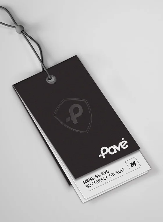
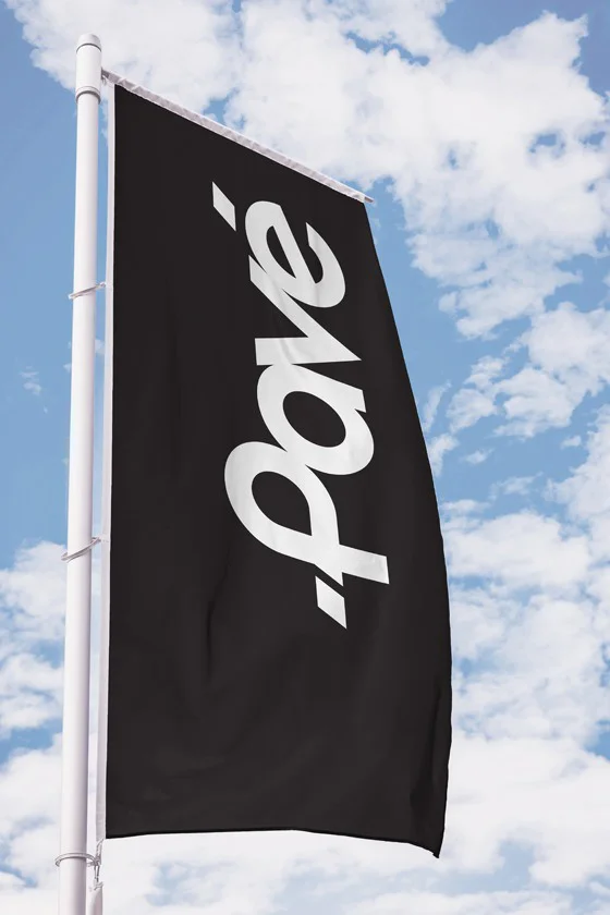
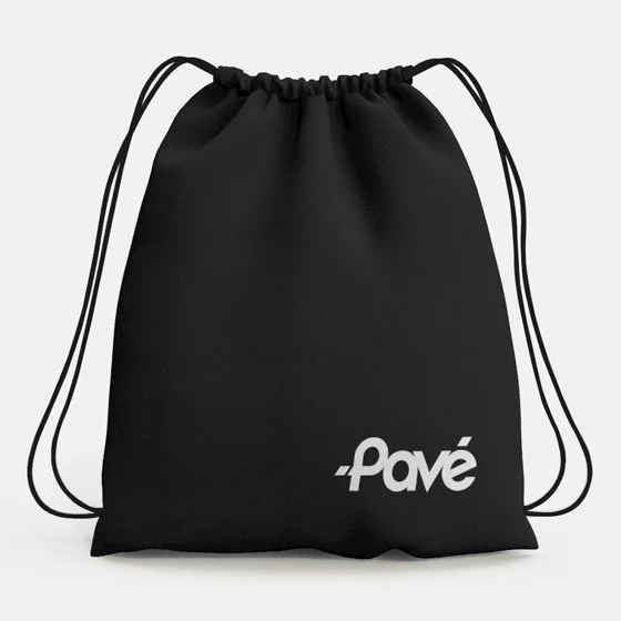
The Pavé apparel
Pavé focusses mainly on cycling and triathlon clothing along with a few accessory items for the two disciplines.
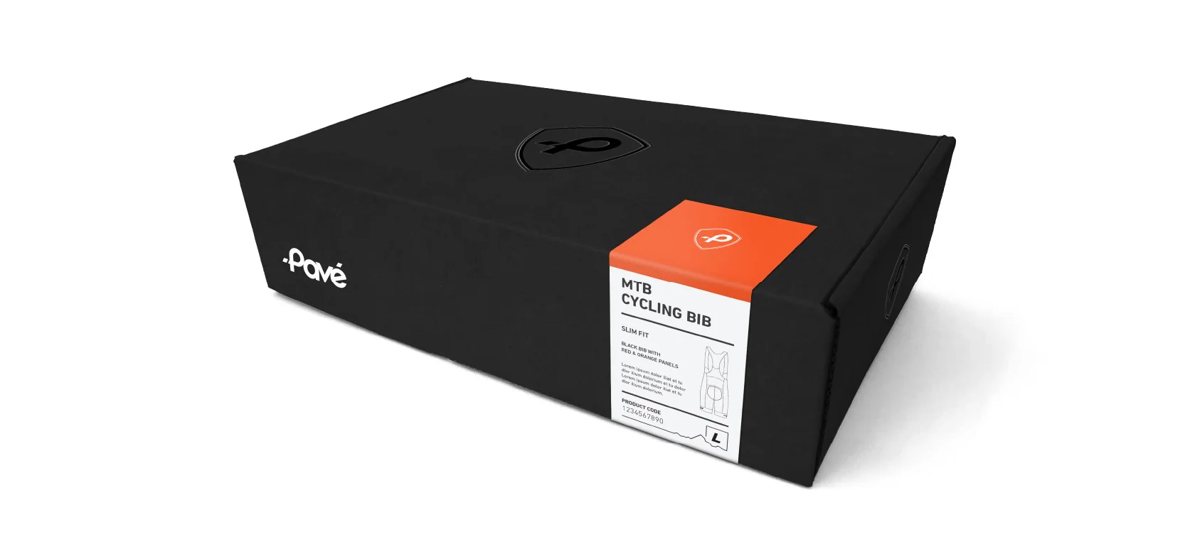
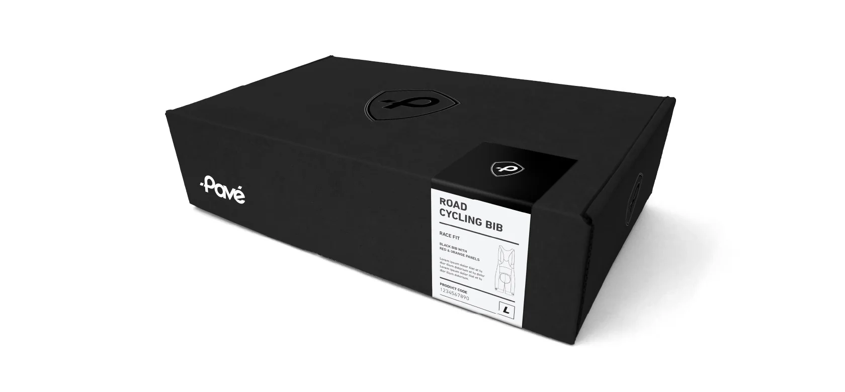
Pavé required a simple packaging solution to allow any of their kit to be distributed within an elegant package but not requiring individual packages per product i.e. MTB kits, road cycling kits and to Triathlon suites.
Simplr created a single branded packaging box that was sealed with a sticker unique and relevant to the clothing range which could be applied to the box once packaged. The sticker acts as a product identifier as well as a safety seal.
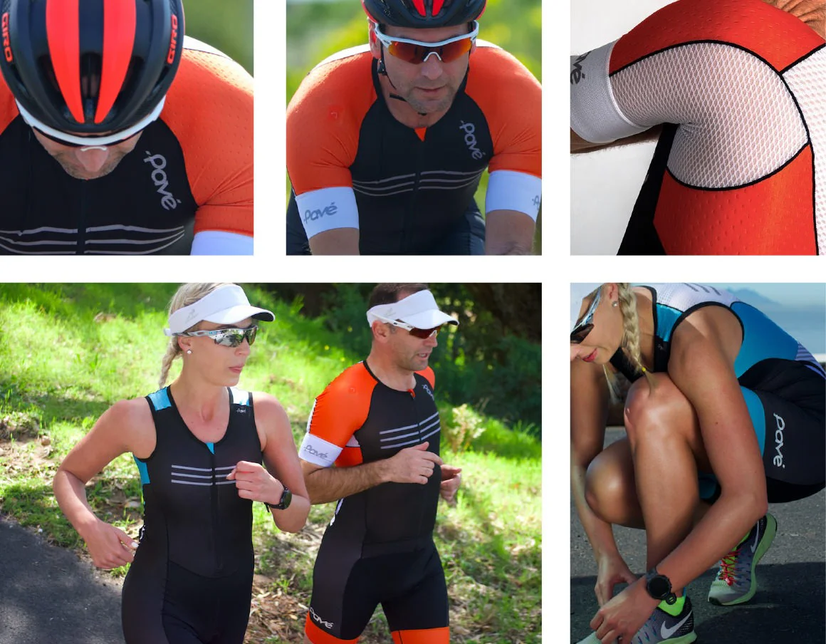
Custom corporate apparel
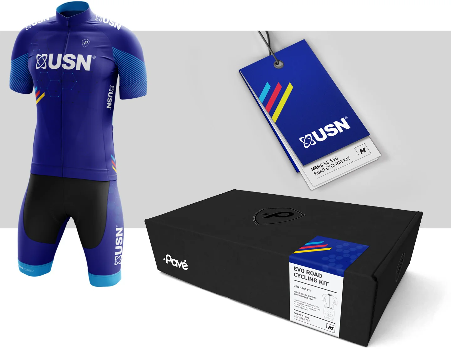
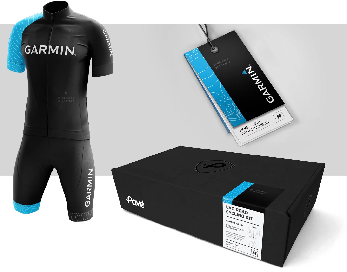
A large portion of the Pavé business is in creating bespoke, high quality sporting kits for corporate clients. The kits are custom designed with the clients brand and contains just the Pavé crest as a brand identifier. The packaging used is the same box as the Pavé kit except the identifier label changes to match the corporate kit graphics. The outer cover of the swing tag also changes to match the corporate kit graphics on the label.
"When we started our sports apparel brand we only had an idea for a name. A name is nothing when it is not recognisable. When we approached Simplr to help give our brand an identity, they didn’t hesitate to develop the look and tone for the brand. The team was very professional and got the brief instantly. Simplr also developed our product packaging, which looks professional and world class."


