Brief
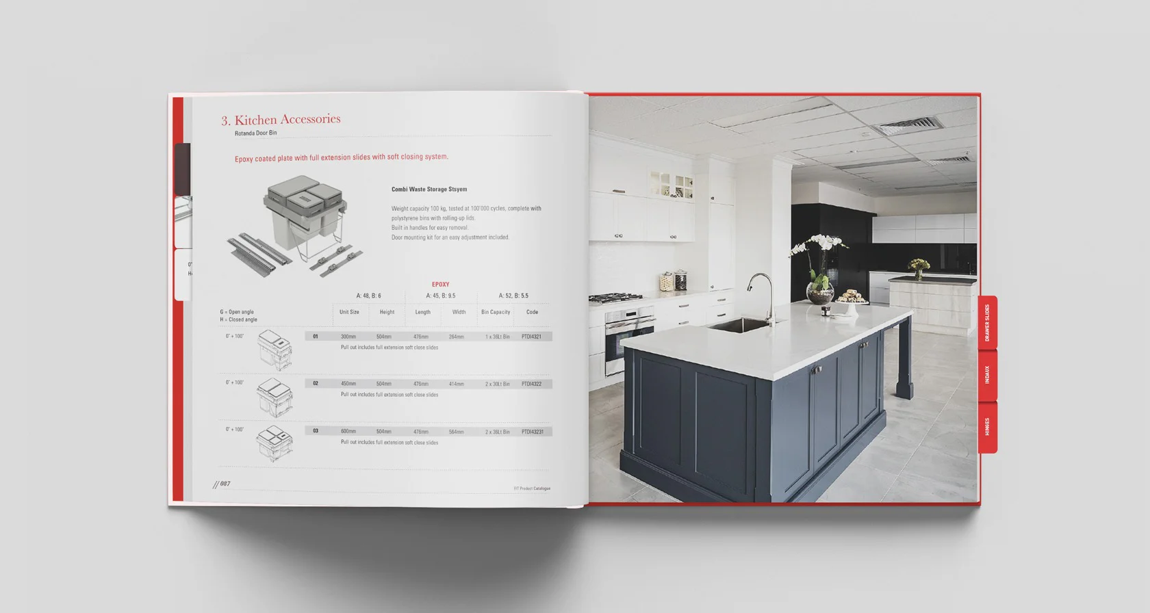
To create a vibrant and unique brand identity for this new to market furniture fitment and accessory company with a national foot print. To drive initial business Simplr was tasked to create the print sales catalogue allowing the sales team to go and see new customers with a leave-behind that is a little bit more fun than just a boring parts catalogue.
Solution
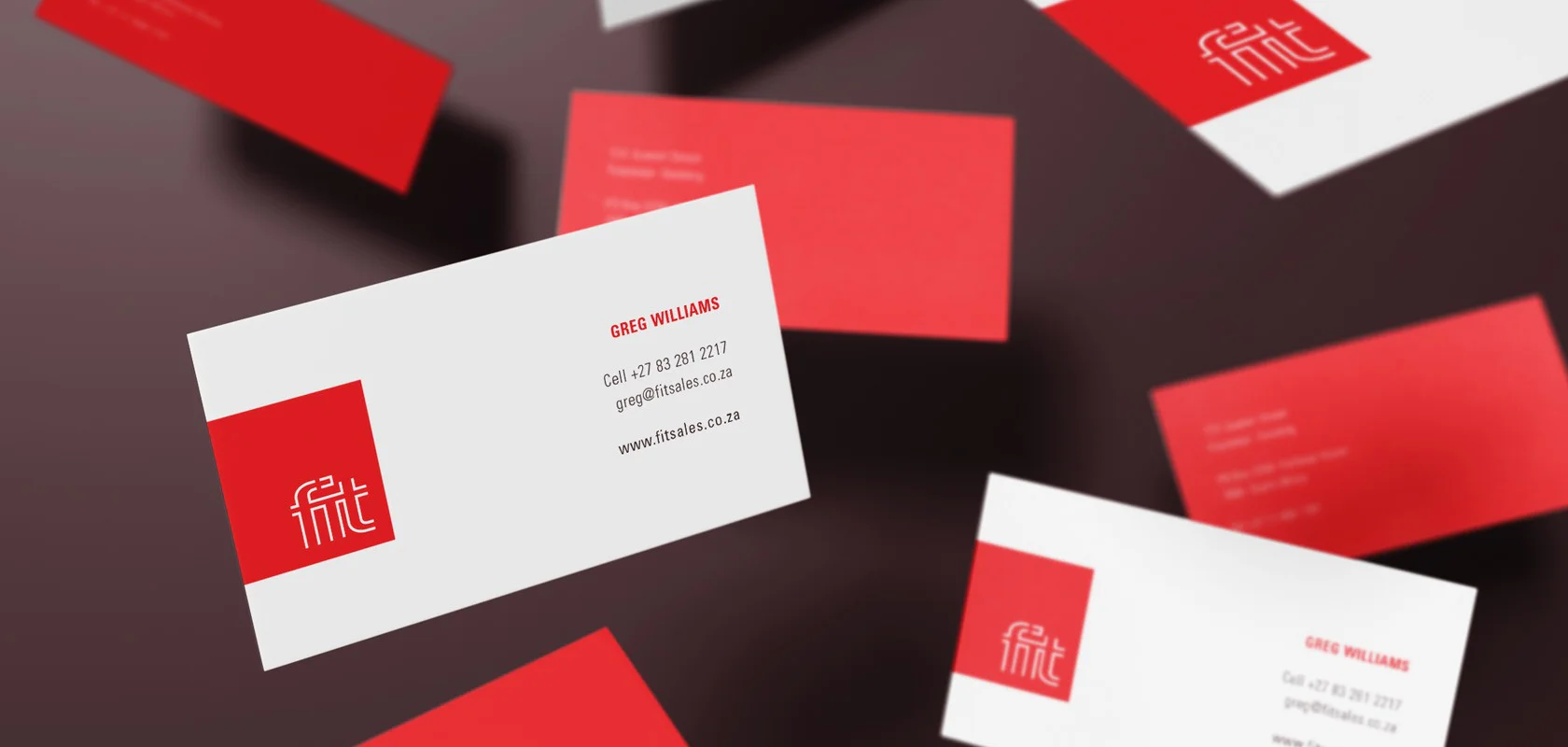
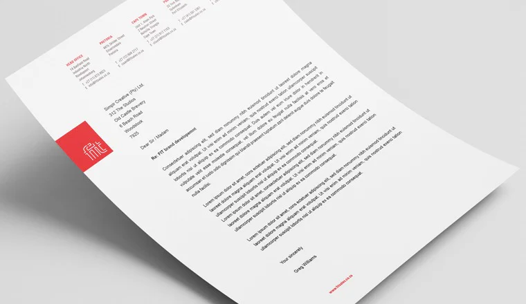
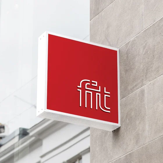
A simple deconstructed logotype contained in a square holding shape with a strong brand colour palette of red, white and black.
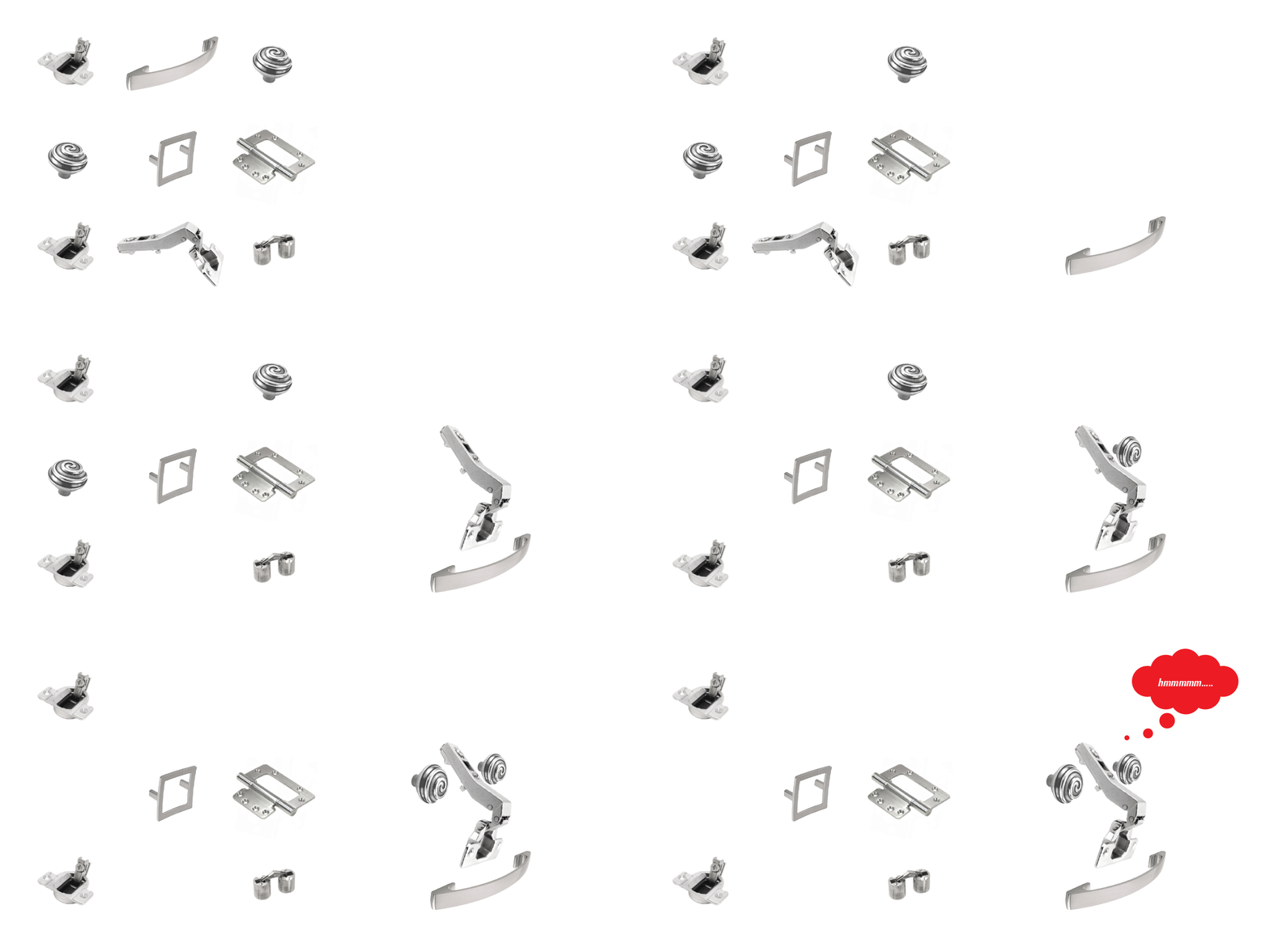
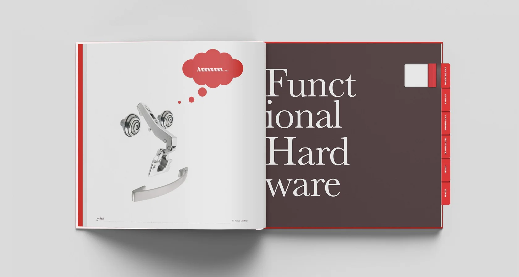
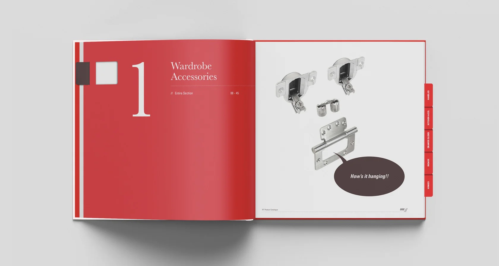
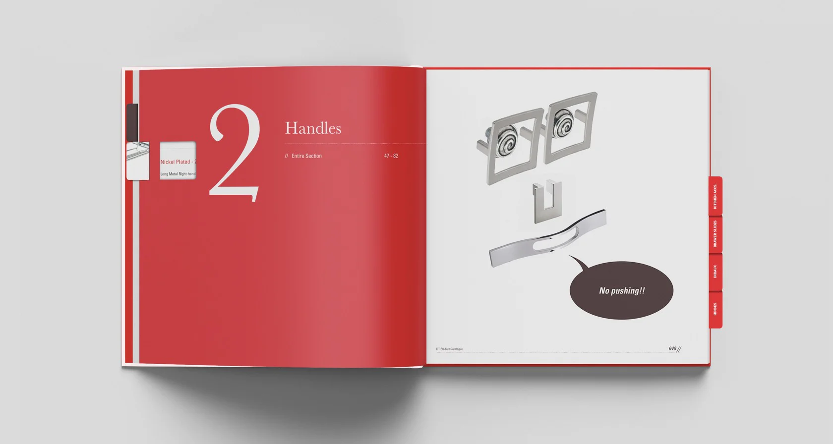
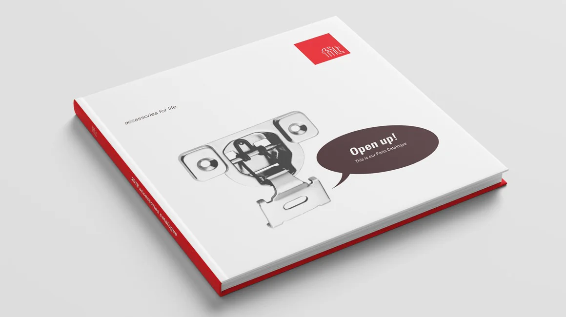
The sales catalogue is where we had a bit of fun with the brand, using their parts they sell to create faces and witty copy to designate the parts division within the company.
Brand Identity Design
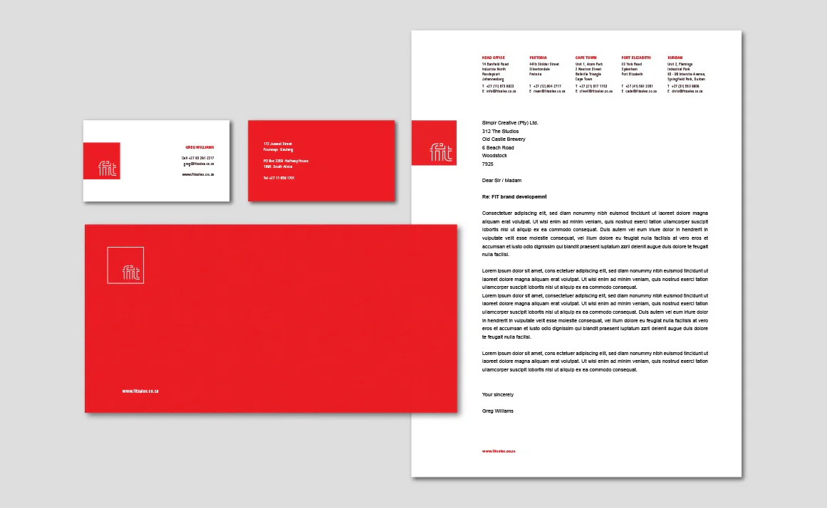
Corporate Stationery Collateral
Exterior Brand Signage
Merchandise Design
Parts Catalogue Design

Fonts
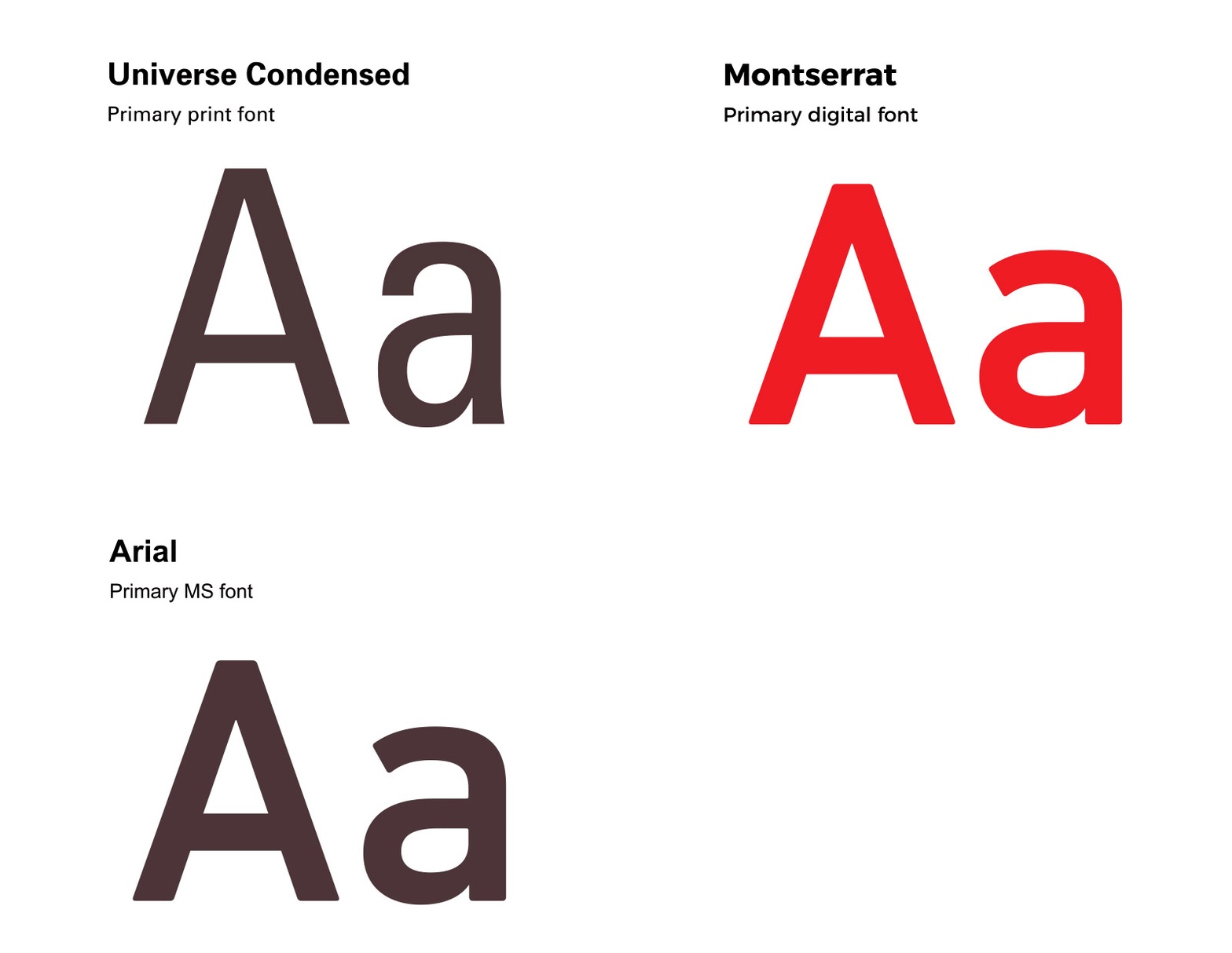
We chose a bold classic in the font Univers, to be the flagship font for all printable collateral for ‘fit’. In support of the print font we use Monserrat for all digital / online elements and the classic Arial for all the internal day to day templates that get shared and sent out to clients.

Brand application
As this was a new-to-market brand, it was designed for ease of use allowing the identity to be used either on a white background or with a white keyline on a red background. The identity can be locked up against the edge of a format or free-floated within a format to allow maximum visibility of the brand.

The brand ambassadors
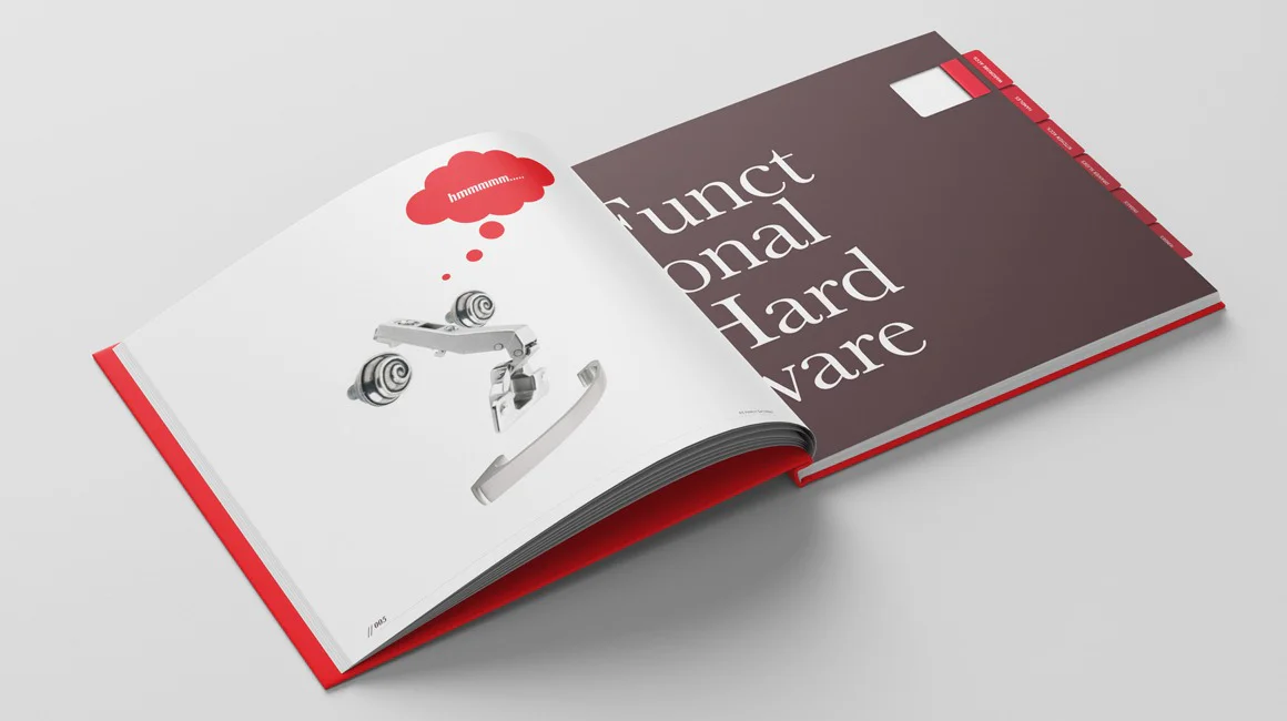
Instead of creating an elegant catalogue that just showcases parts, when tasked with designing the catalogue we decided to make the parts the main feature. We started with the creation of a few characters to represent the various parts / accessory divisions i.e. kitchen, wardrobe etc. We looked for a part, or a collection of parts that had unique face-like characteristics and gave them personality by adding a speech bubble and simple phrases to represent the division they were from.
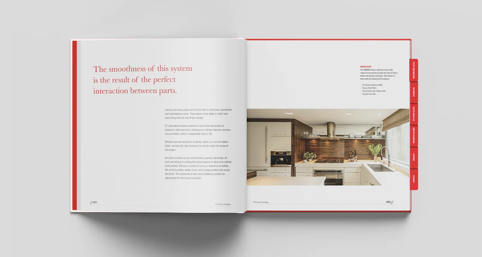
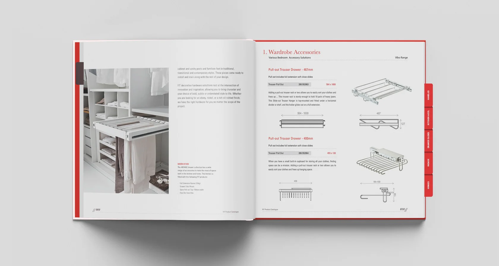
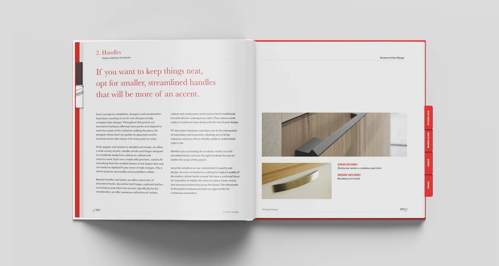
The rest of the catalogue was straight forward layout with clean use of space and type. We created a simple pull-out tab system to help the sales team easily access the various divisions of the catalogue.
"Simplr’s team of professional designers assisted FIT, as a new company by developing a recognisable brand. The team gave us superb advice in developing our brand and their creative solutions were exciting and very effective. We are of the opinion that this brand designed and created by Simpr assisted our company to become one of the most recognised companies in our market segment."


