
Brief
Burquip is a leading manufacturer, importer, and distributor of trailer axles and related components throughout Sub-Saharan Africa.
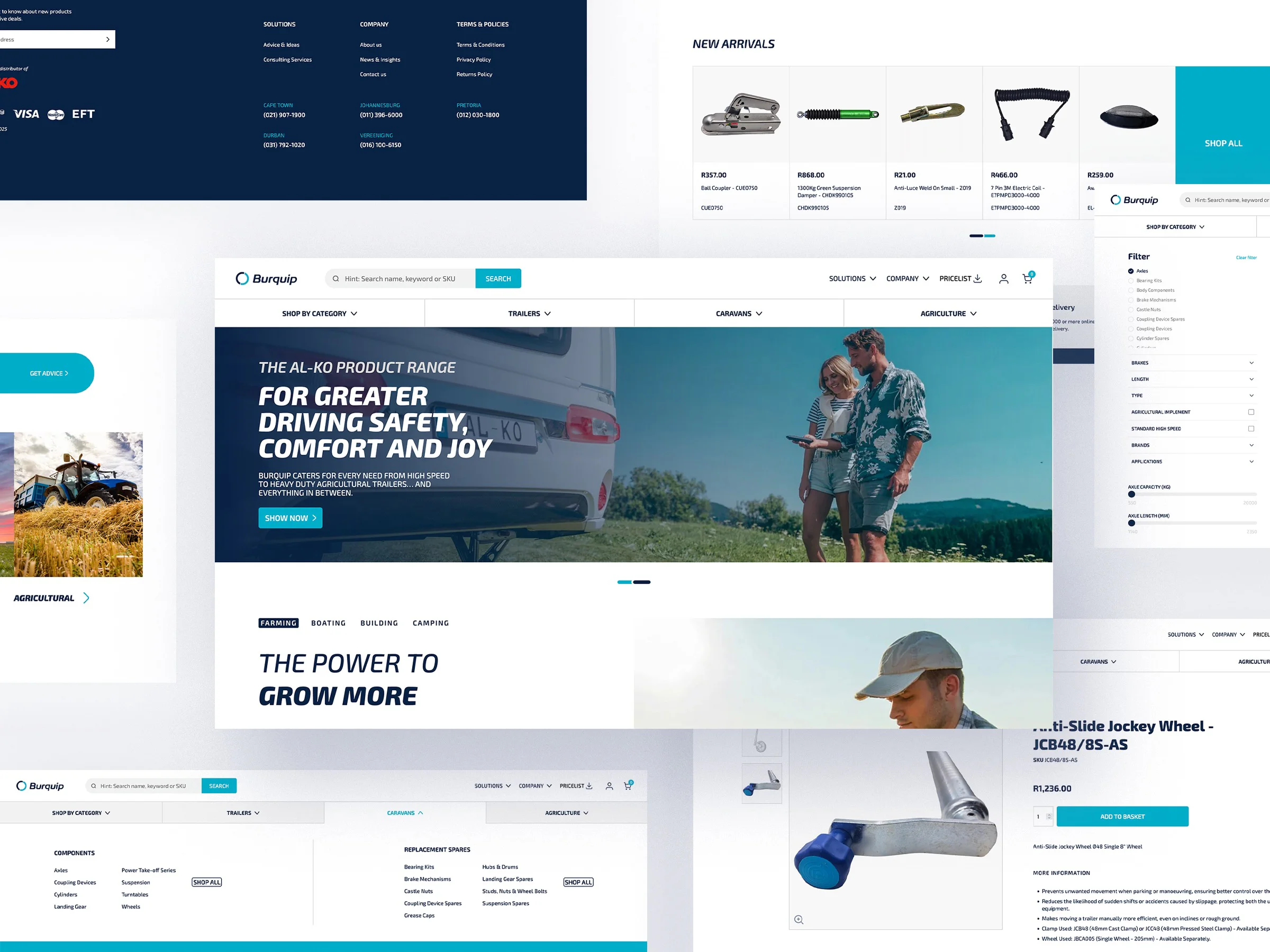
Burquip approached us to refresh their brand and rebuild their website, incorporating a robust online shopping portal for their products.
Solution
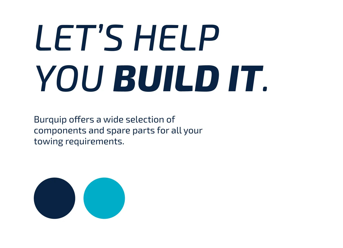
We kicked off the project with a brand workshop and together with the core management team, defined the business and marketing goals for the brand. This insight provided a guideline for us to refresh the brand and to ensure that the new brand identity and website design was differentiated from the competitors.
Identity Design
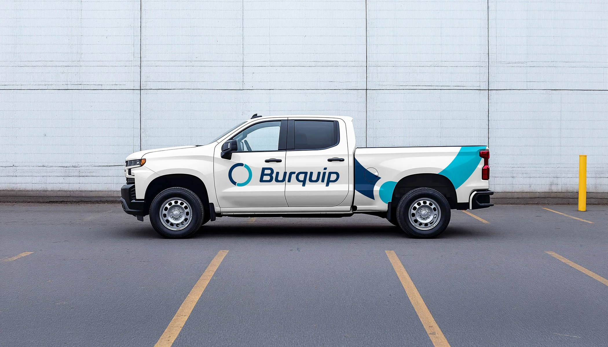
Brand Rollout
UI/UX Design
Creative Direction
Front-end Development
Back-end Development
e-Commerce
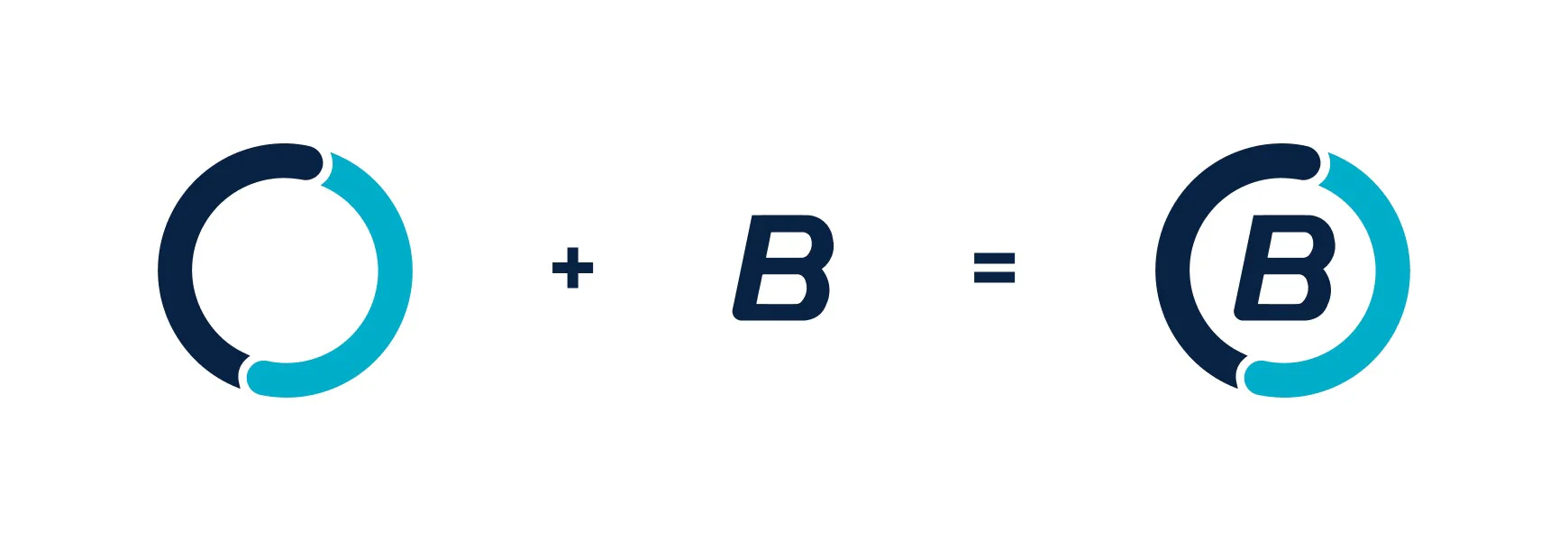
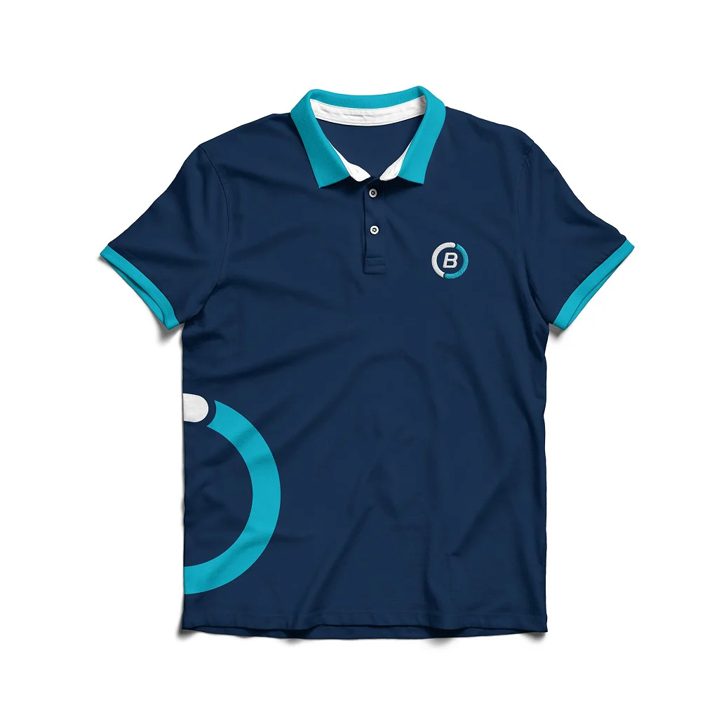
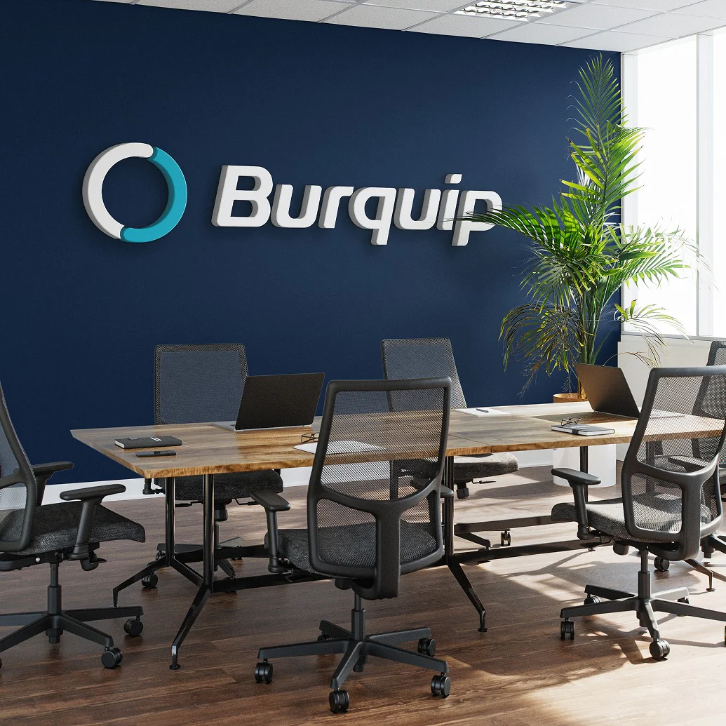
Logo
We began exploring the brand identity (logo) and looked at reworking the “wheel” device. We also reviewed the colour palette and looked at using a fresher blue to complement the other contemporary colours we chose for the brand.
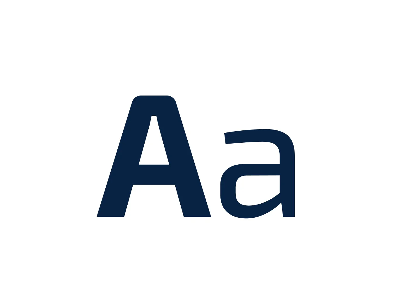
Brand font
Exo 2
Brand mark
As the client “brands” most of the product parts, we needed to create a standalone brand mark that could be easily reduced in size whilst remaining legible.
Building a tailored eCommerce experience
Next up was the product categorisation; this is where we created the activity usage categorisation for the products. This filtering system on the website provided a zero barrier to entry, making it easier for users to build their own custom trailer.
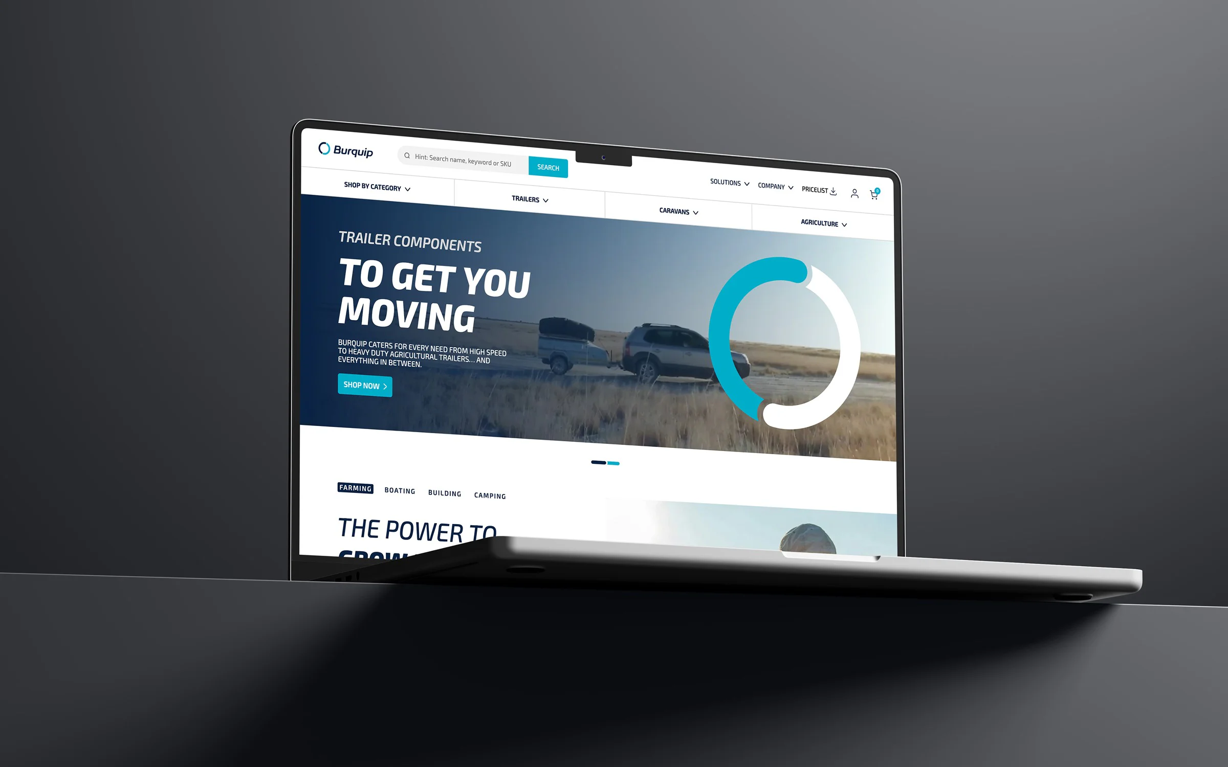
The user interface and experience
A bold and modern interface was conceived to complement the industrial/mechanical features of the products sold via the online store. The strong geometrical layout of content and the predominant use of green and blue give the website a strong masculine character, which the main target audience could identify with.
Mobile
We designed the website mobile-first, prioritising intuitive and seamless e-commerce experiences for users on smaller screens. The Navigation and checkout were optimised for speed, clarity, and usability on mobile devices, improving user engagement and satisfaction.
"After meeting with a number of different companies during the conceptualisation phase of re-branding our Company and completely over-hauling our website we decided to go with Simplr. They really know their stuff. Grant, Justin and their team are super friendly and are in touch with the latest trends to keep your business website current. We continue to work closely with Simplr on a monthly basis and I will happily recommend Simplr to anyone as I know they will do a great job."