Brief
Osoa engaged with Simplr to create a brand name, identity and visual style that reflects a premium, holistic wellbeing experience for high-performing individuals facing burnout, stress and anxiety. The identity needed to feel exclusive, nurturing and transformative, while remaining adaptable across both digital and print. Rooted in the essence of “Inner Wealth through Consolidated Wellbeing,” Osoa delivers a curated experience that blends clinical insight, lifestyle elevation, mindfulness and community support.
Solution
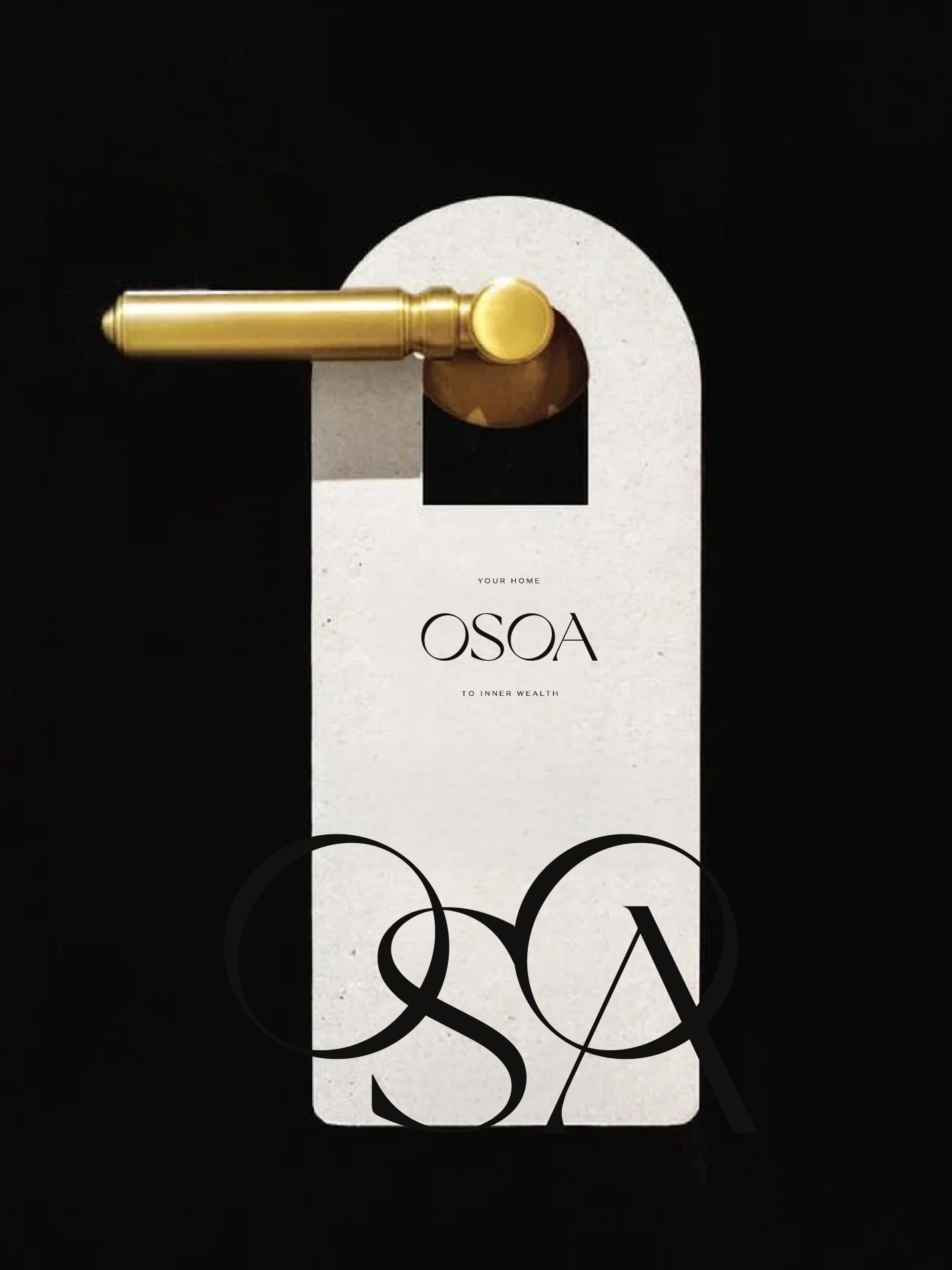
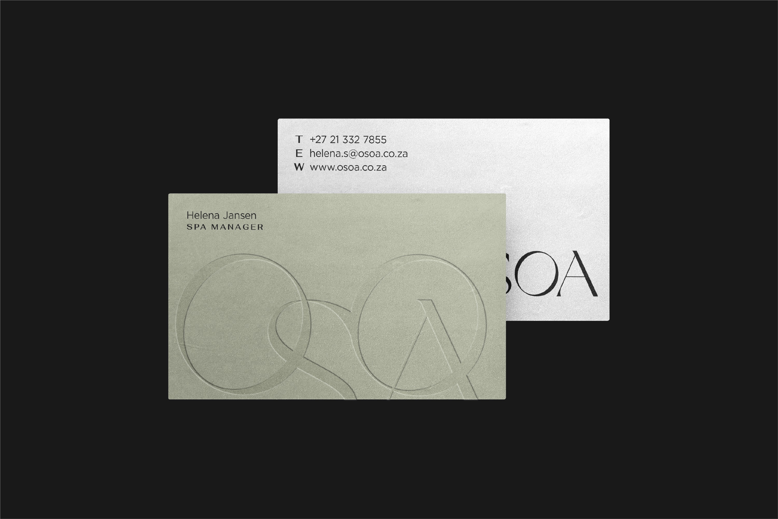
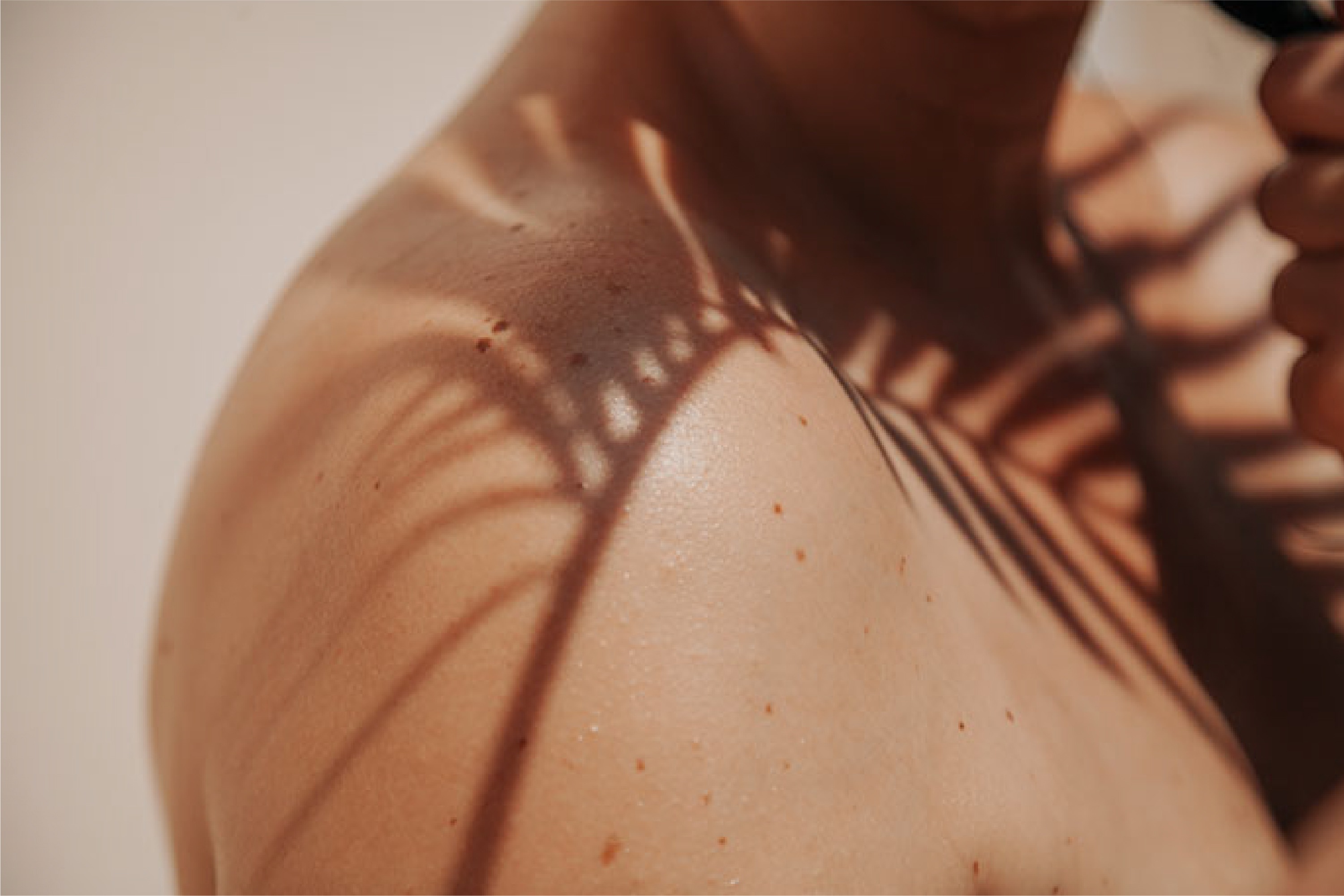
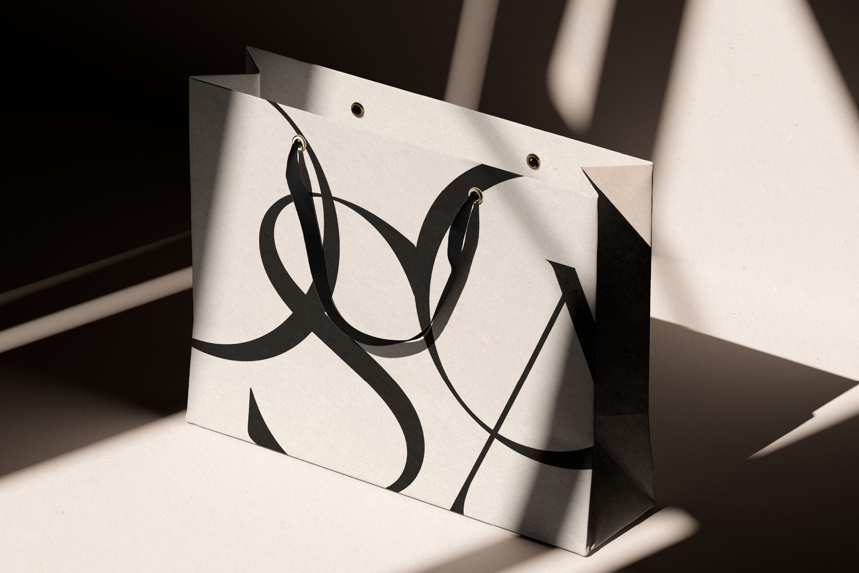
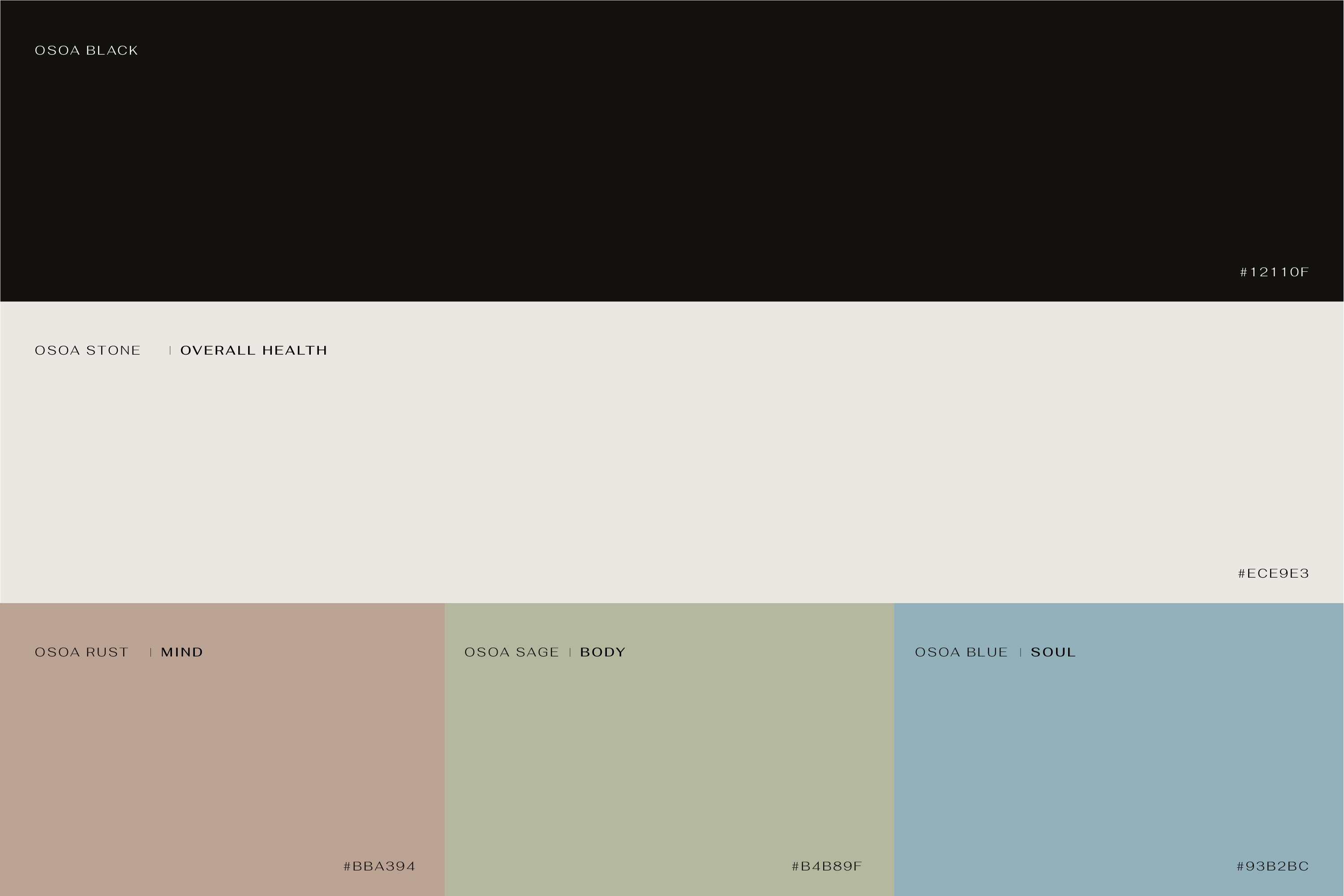
Simplr created a refined, minimalist visual identity inspired by light, water and Wabi-Sabi - symbols of clarity, calm, and inner transformation. The logotype serves as a mark of integration, complemented by elegant serif and sans-serif typography that brings warmth and refinement across applications. A grounded palette of earthy tones and deep black conveys strength and sophistication, while soft organic forms, generous white space and tactile textures express understated luxury and holistic renewal. Paired with photography capturing natural, intimate moments that evoke gentle awakening, these elements come together to form a cohesive narrative of calm transformation and contemporary wellbeing.
Name generation
Brand identity design
Visual language development
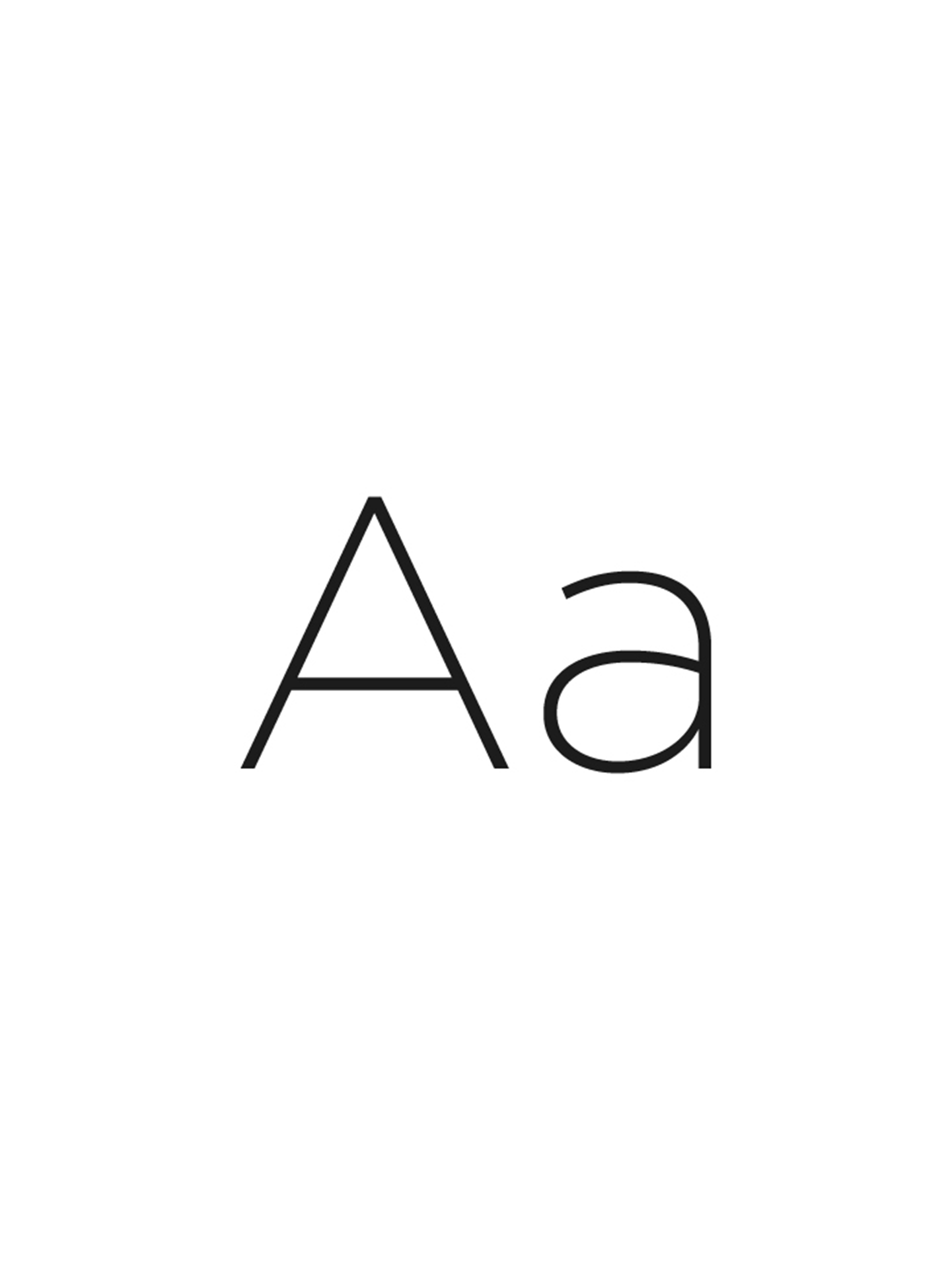
TYPOGRAPHY
Osoa’s typography balances elegance and clarity, pairing an elegant serif with a clean sans-serif to convey warmth, sophistication and readability. This complements a logotype that embodies movement and transformation, anchoring a cohesive visual system. Across digital and print, the brand merges understated elegance with bold graphic presence, using oversized typographic forms to create scale and distinction. The result is a contemporary, curated identity that feels unmistakably premium.