Brief
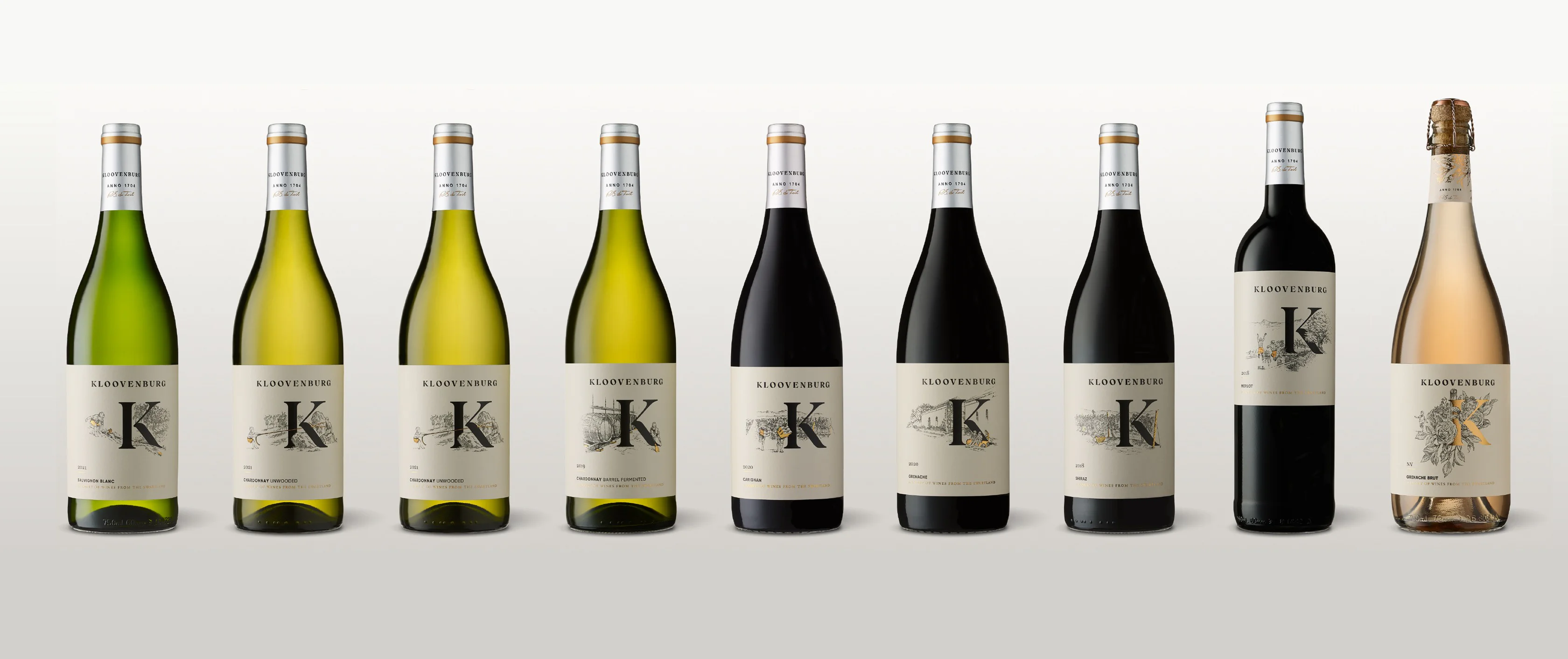
At first, our task was to give the farm brand and crest a fresh look, aiming to create a distinct and easily recognisable identity that could be used across various aspects of the farm. However, as our relationship with Kloovenburg blossomed, so did our fascination with the countless stories this remarkable place had to share. These stories formed a strong reference in creating the new wine packaging for them.
Solution
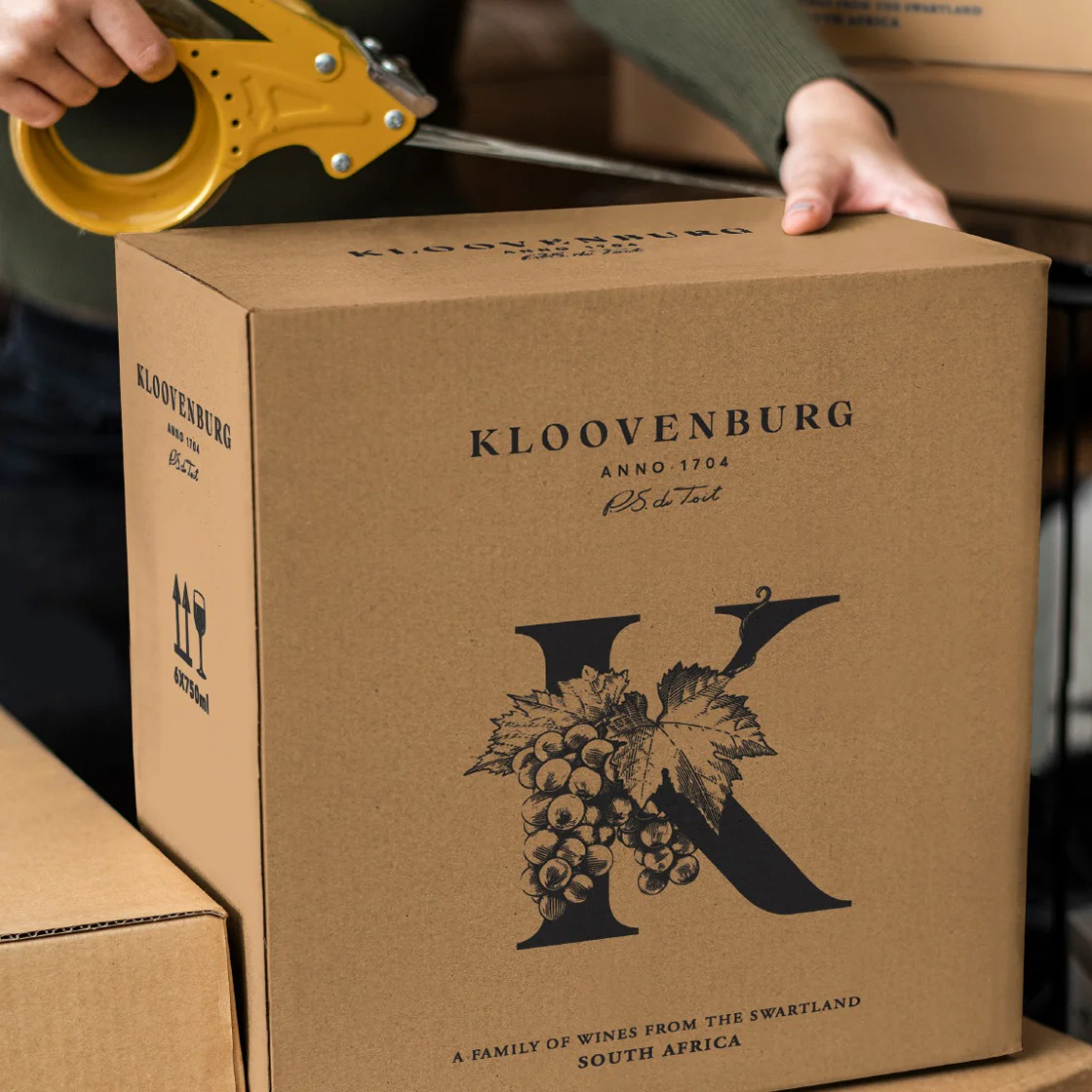
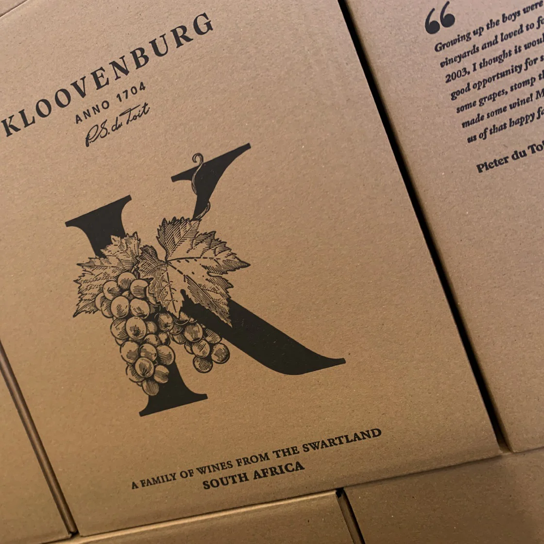
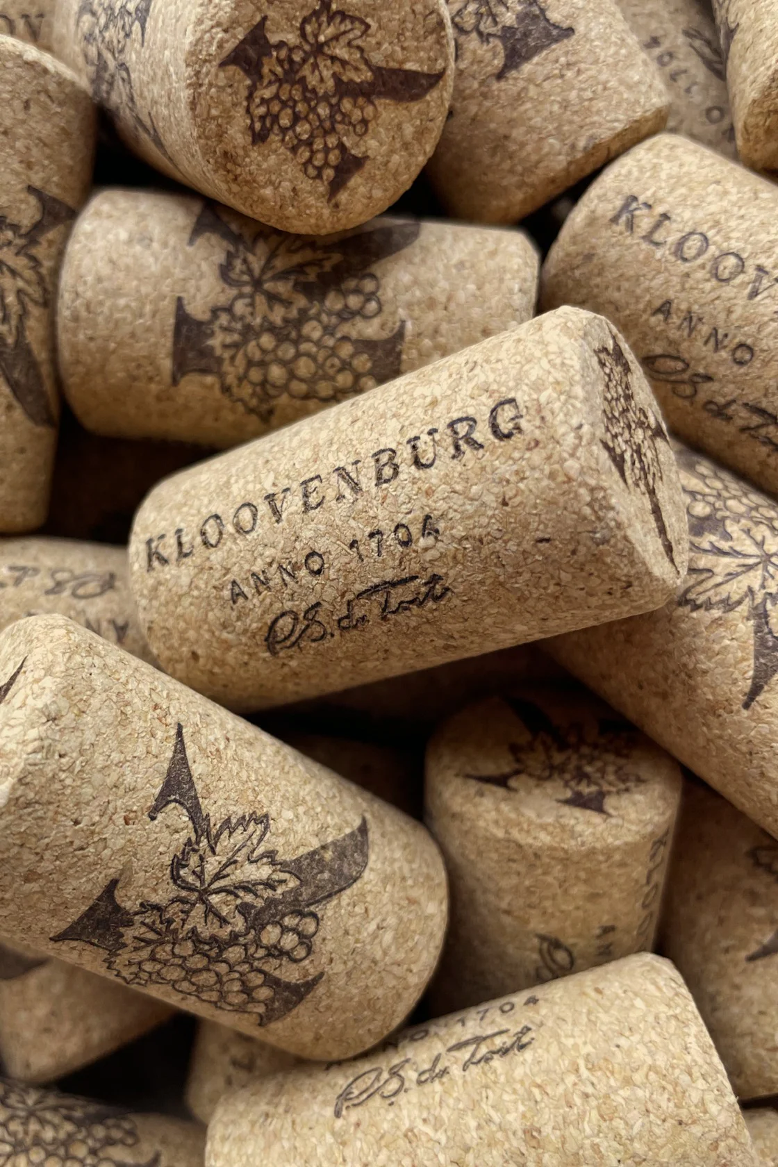
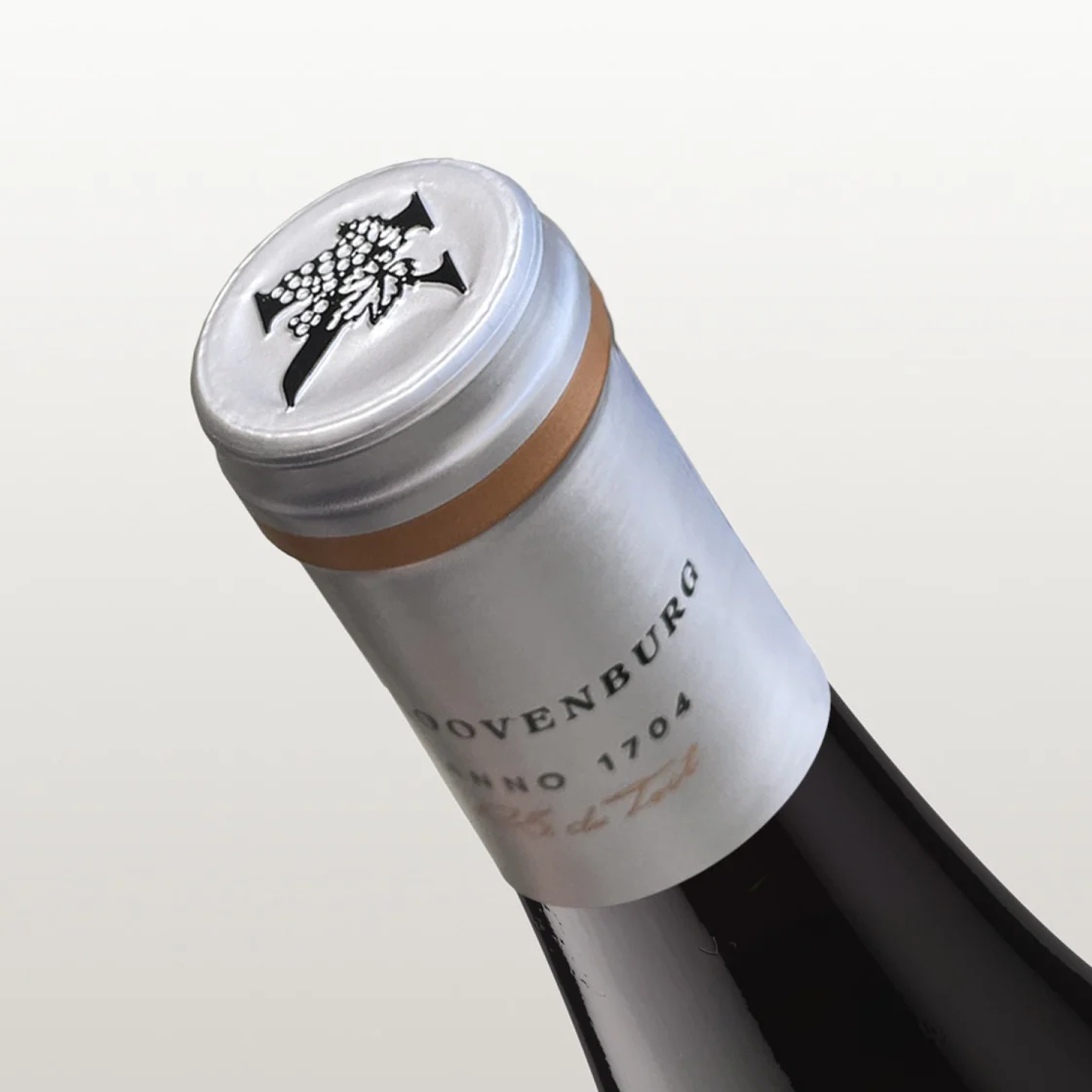
While we were busy exploring the farm and drawing inspiration from the original brand, we couldn't help but notice how the letter 'K' stood out in its usage and versatility. Rather than designing a traditional crest, we had a brilliant idea to make the 'K' the iconic symbol of Kloovenburg. We embraced this bold approach and decided to create all the packaging around this striking use of the Kloovenburg 'K'.
Brand Identity Development
Packaging Design
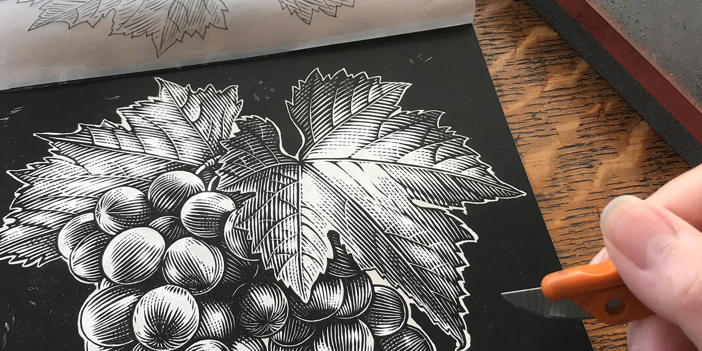
Illustration
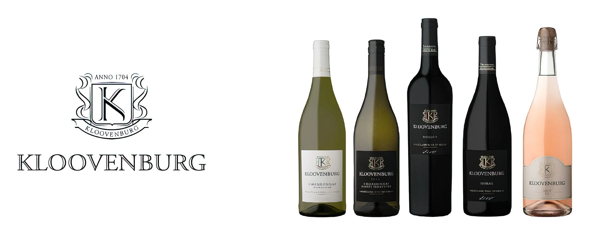
The original brand


Typography
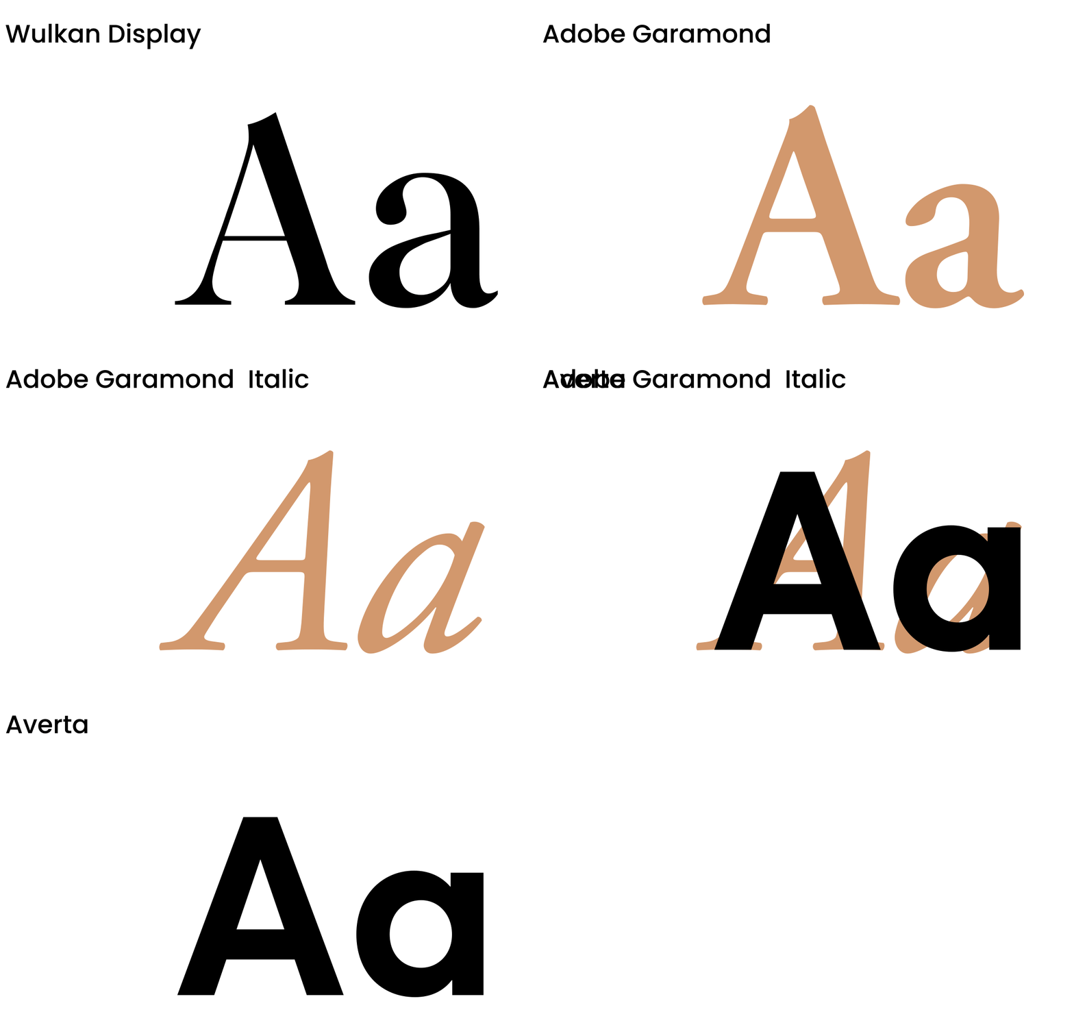
Our goal was to achieve a complimentary blend of fonts that harmoniously combined classic elements with a modern twist. To accomplish this, we chose the timeless elegance of the Adobe Garamond Pro family and paired it with the contemporary flair of the Averta font family. These two fonts beautifully complemented our brand font, Wulkan, resulting in an aesthetically pleasing combination.

Brand application
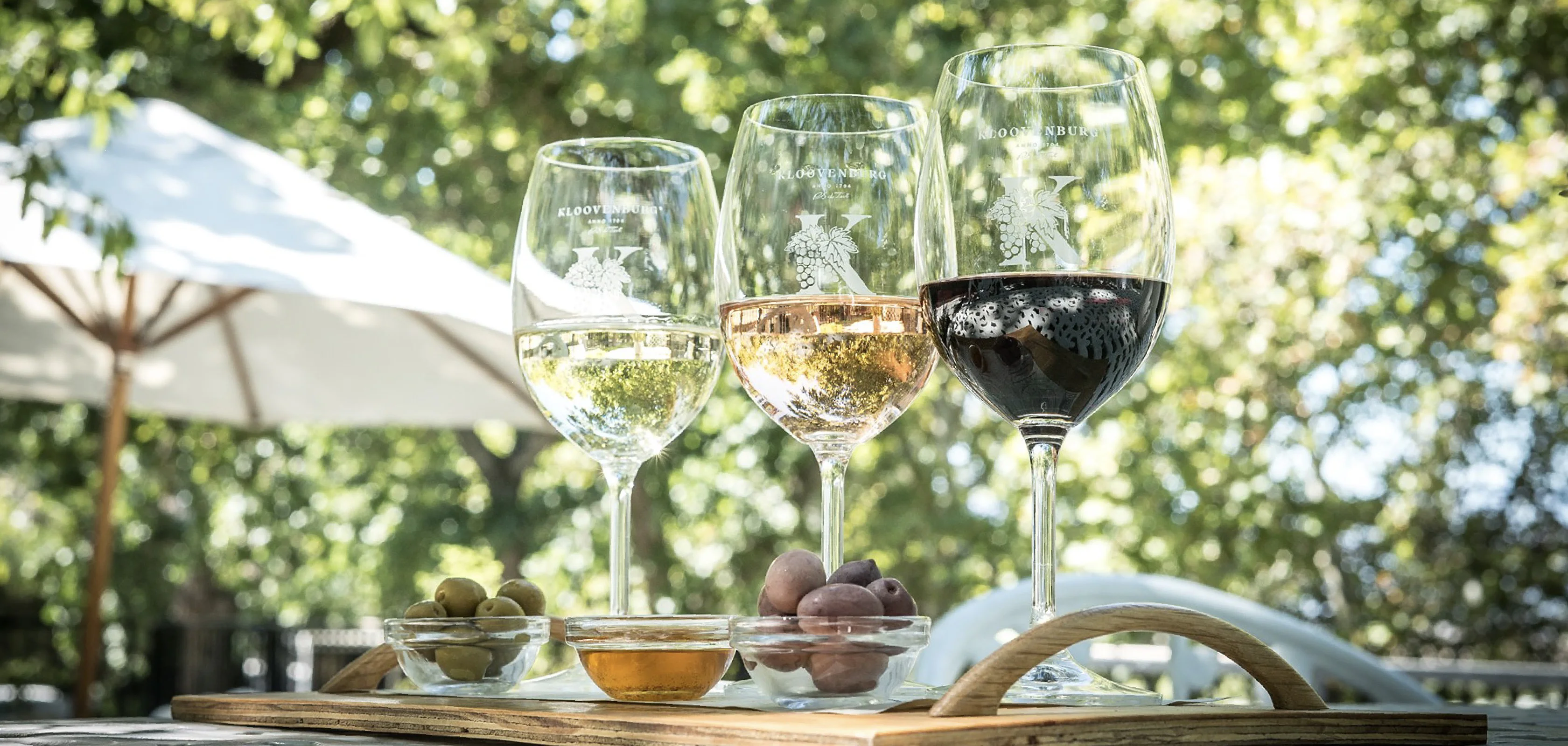
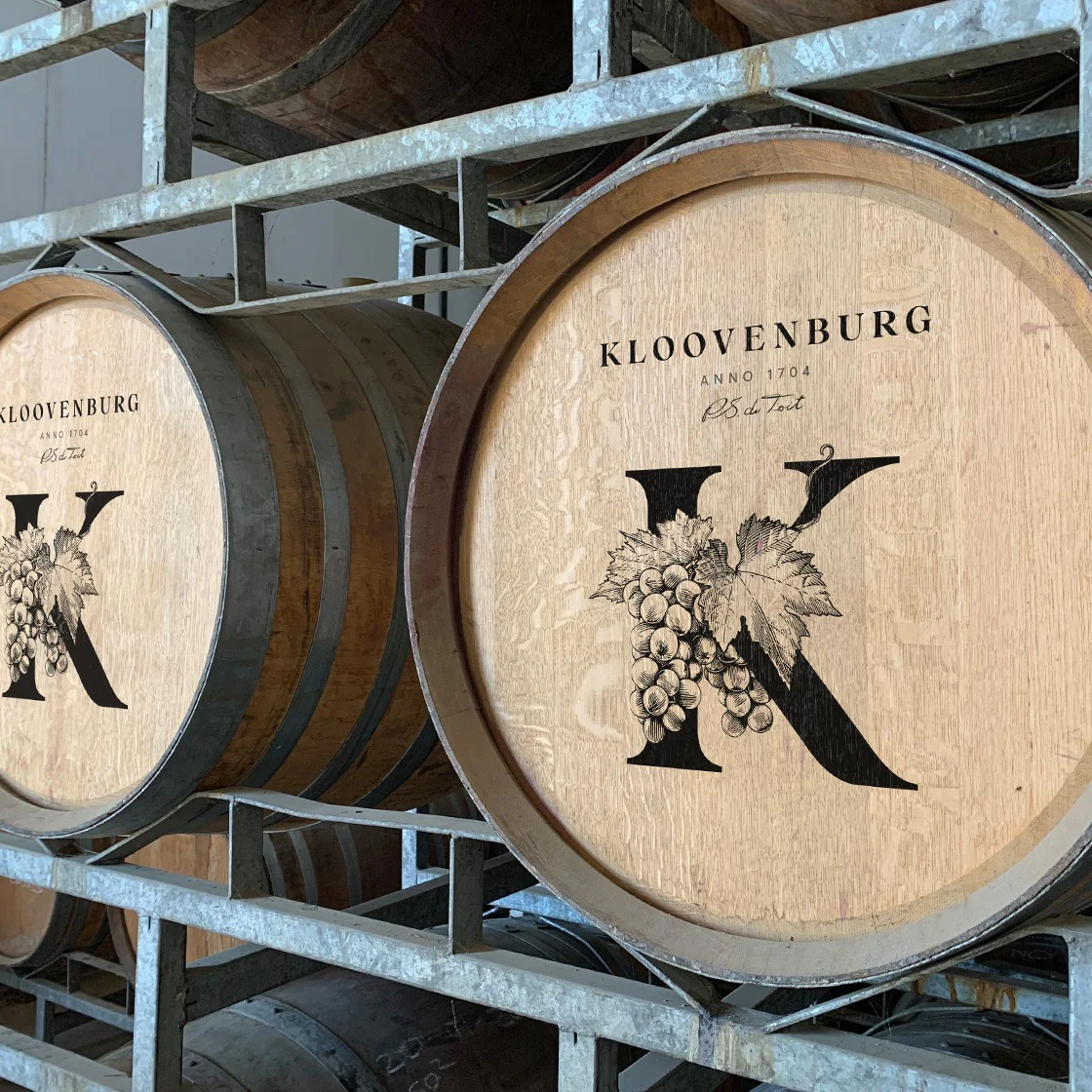
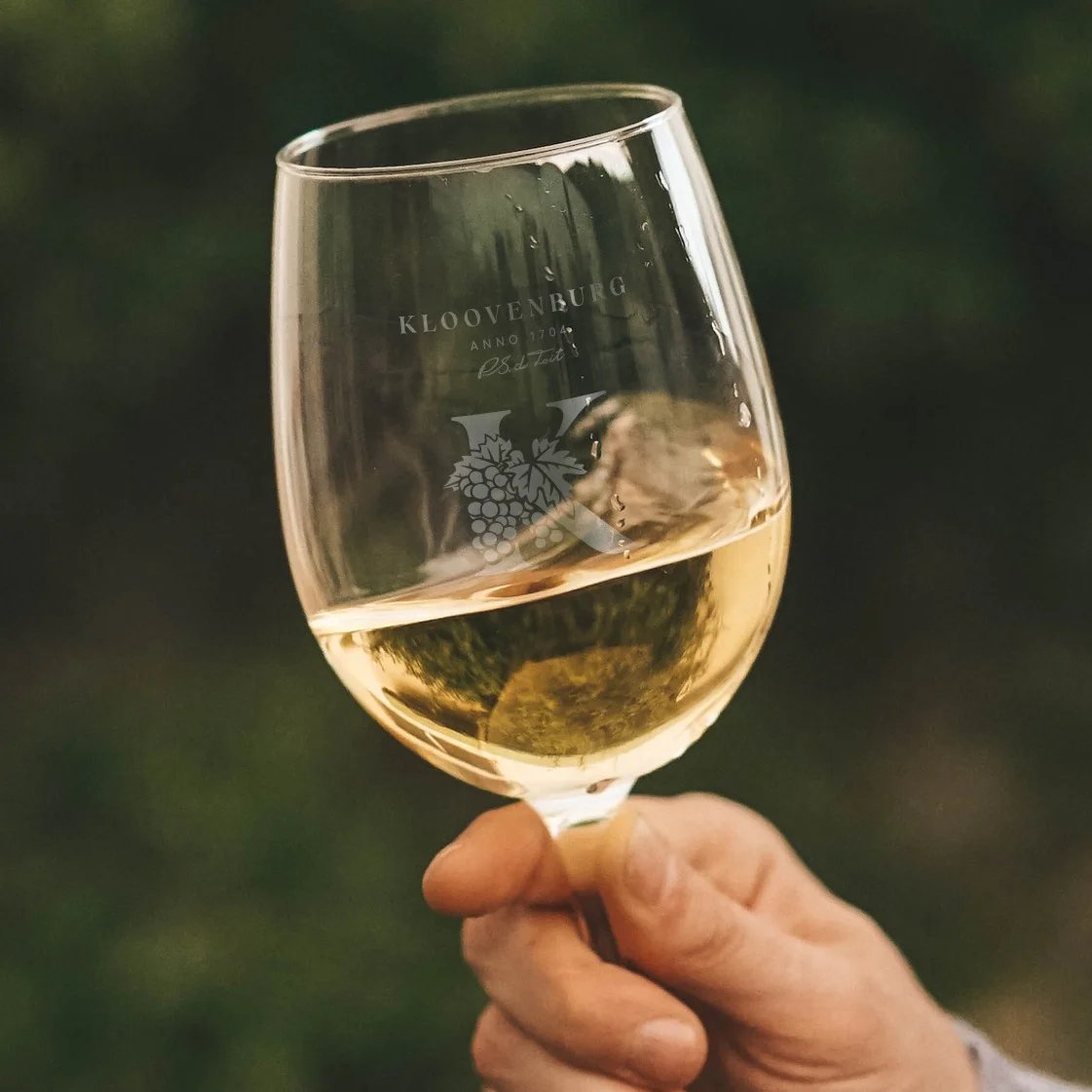
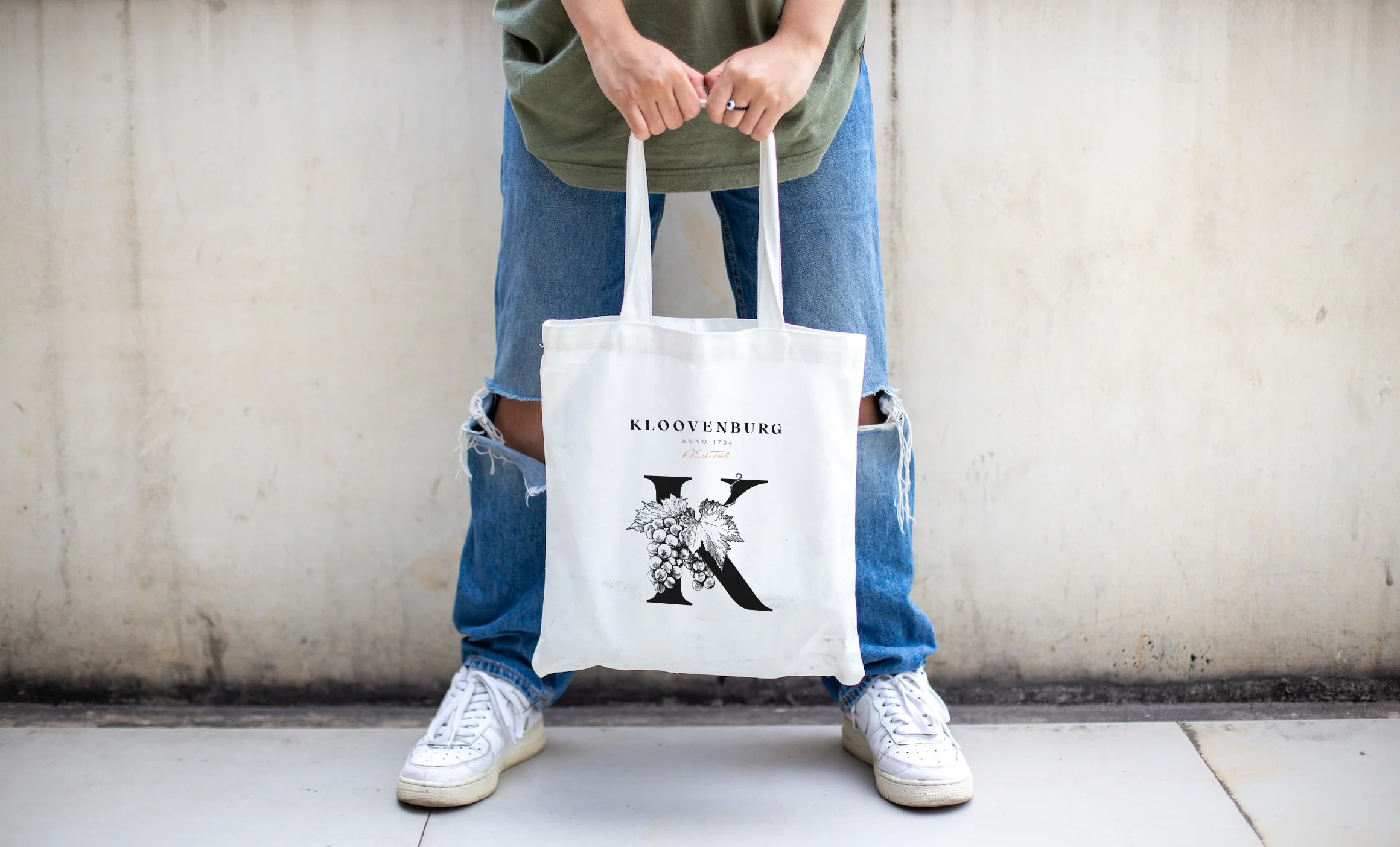
When crafting both the intricate and simplified versions of the 'K' crest illustration, we made sure that the logo effortlessly fit into every necessary application. Our logo's versatility is truly remarkable! It captivates attention with its bold and artistic style, which shines in both the intricate details and the clean, minimalist design.
Each cultivar tells a unique story
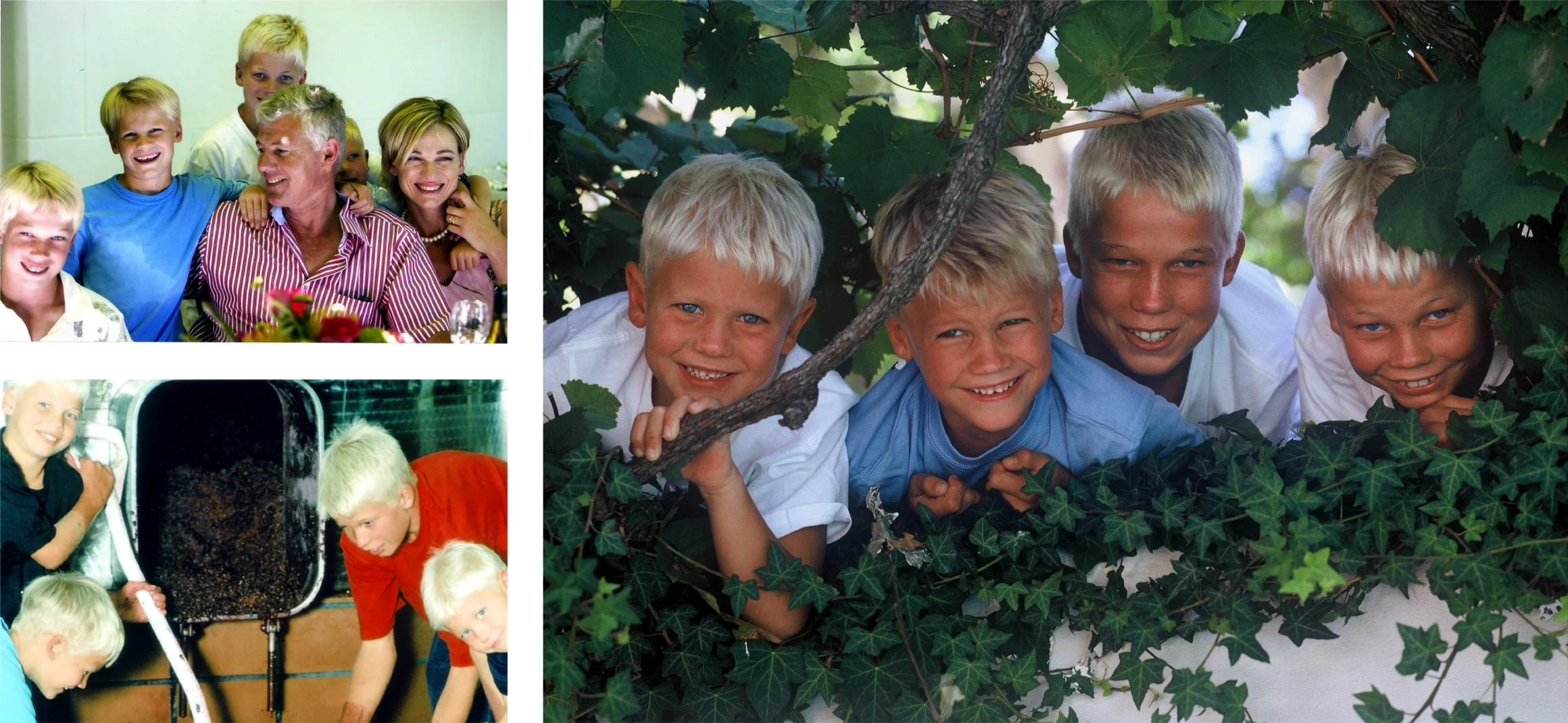
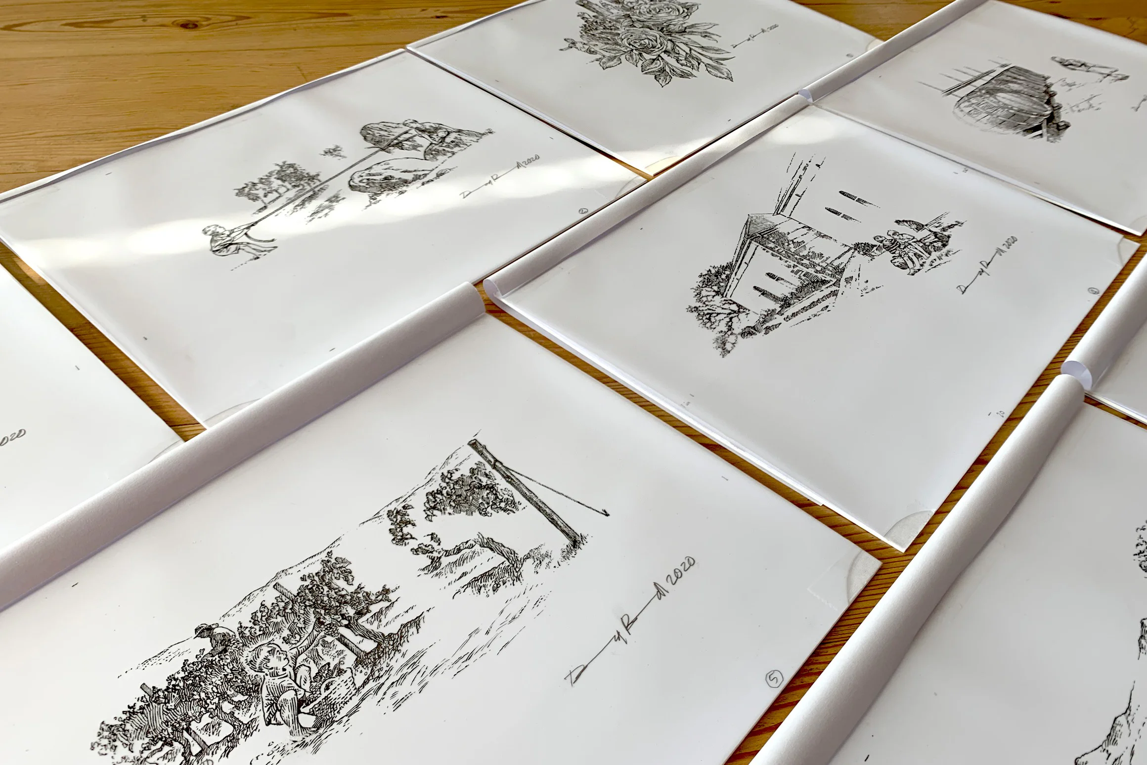
As we sat around the cozy campfire with the Kloovenburg family, it became crystal clear that the key to evolving the wine labels was hidden within their captivating family stories. We happily spent several delightful evenings sipping fine wine and listening to the tales of their four boys' upbringing on the farm. Their daily adventures included chores, sharing with others, lending a helping hand, and, above all, having a lot of fun!
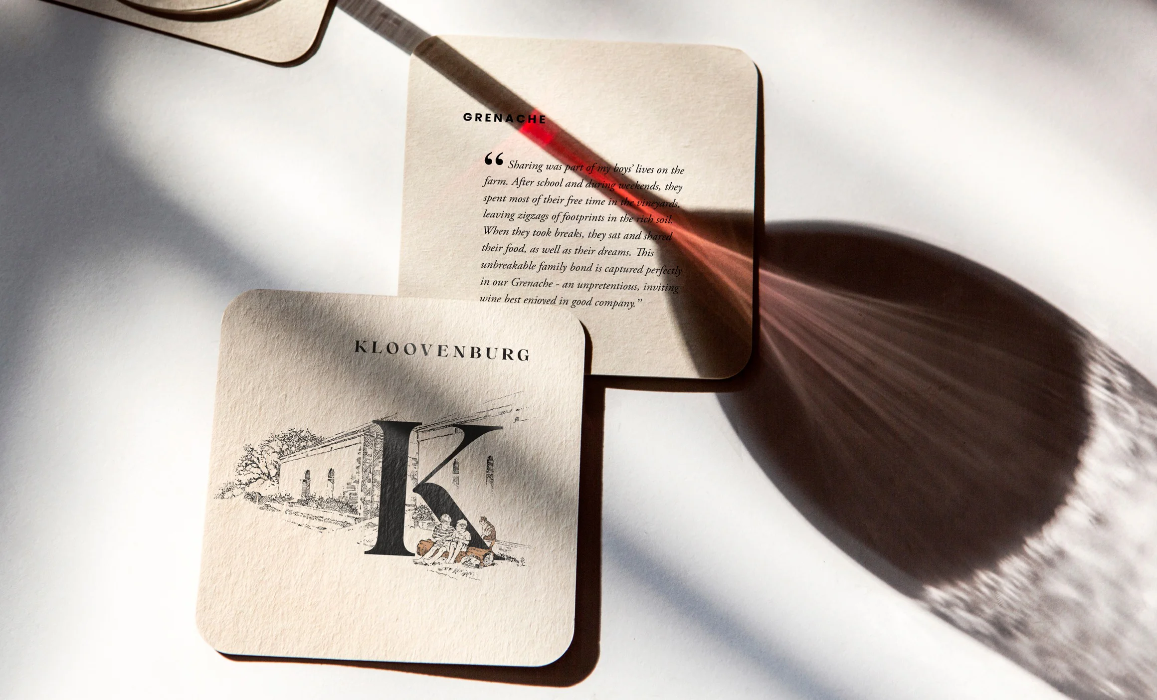
These stories were brought to life in the form of unique illustrations, specific to each cultivar.


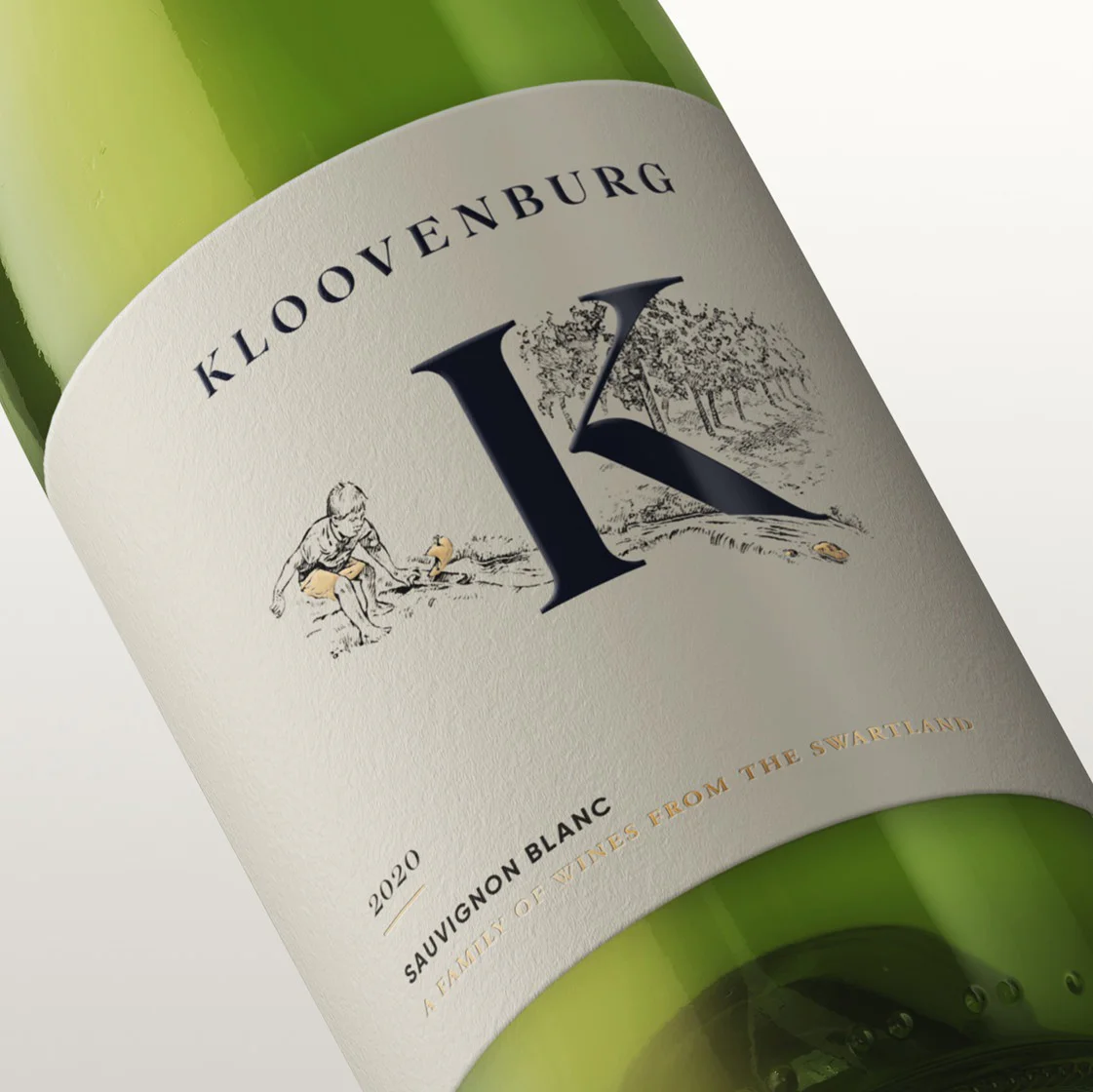
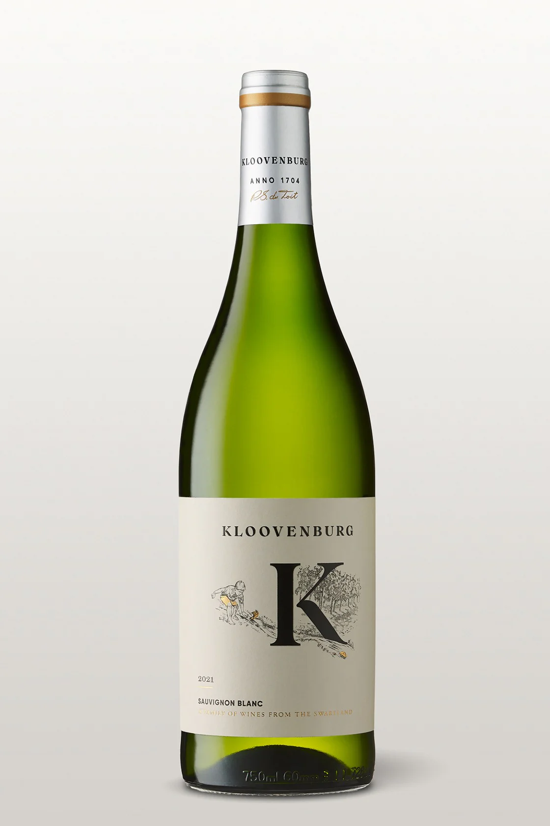
Sauvignon Blanc
“To my young boys, every moment was a chance for adventure; they would see rivulets on the farm as an opportunity for boat races. The running water became their playground; rocks became exciting obstacles and the breeze became joy. They’ll never forget their boyhood, filled with possibility - much like this refreshing Sauvignon Blanc. The same breeze that created so much excitement add the distinct characteristics to this crisp wine.”
Chardonnay Unwooded
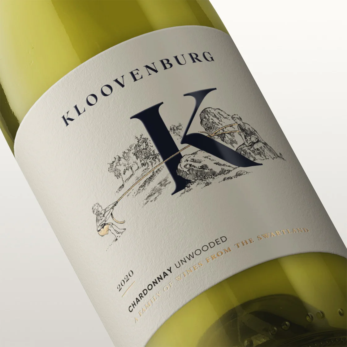
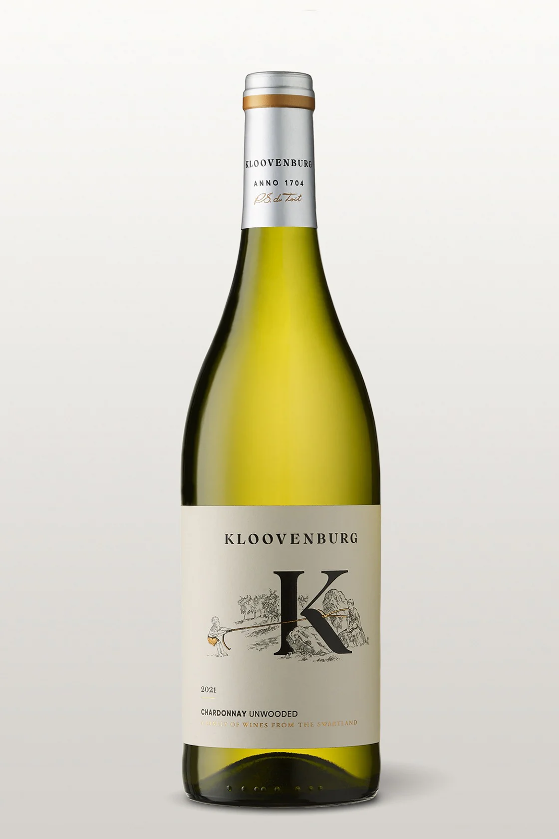
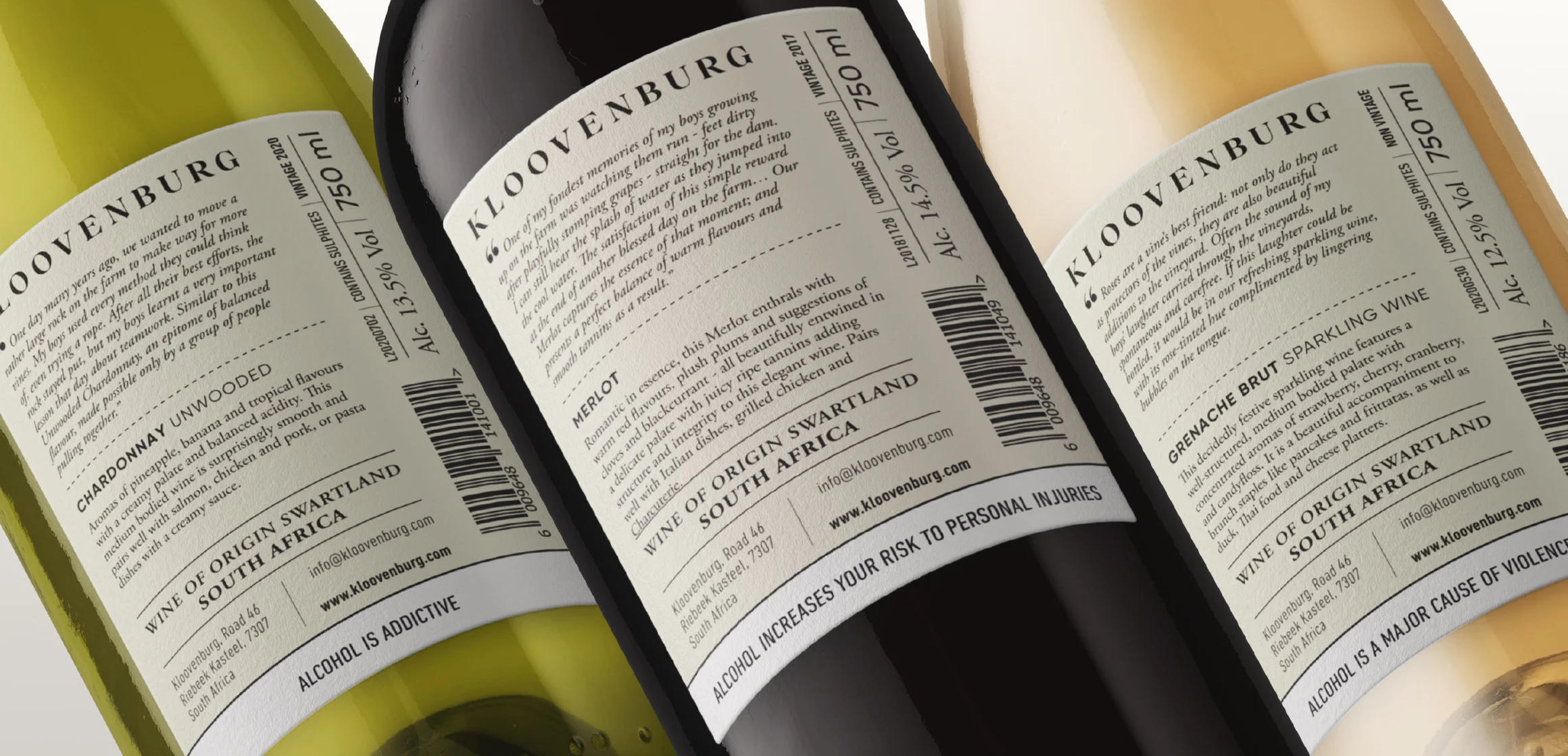
“One day many years ago, we wanted to move a rather large rock on the farm to make way for more vines. My boys used every method they could think of, even trying a rope. After all their best efforts, the rock stayed put, but my boys learnt a very important lesson that day about teamwork. Similar to this Unwooded Chardonnay, an epitome of balanced flavour, made possible only by a group of people pulling together.”
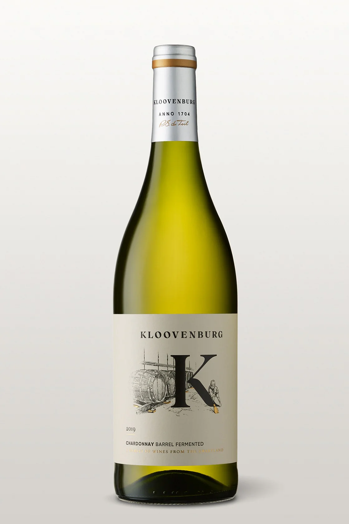
Chardonnay Barrel Fermented
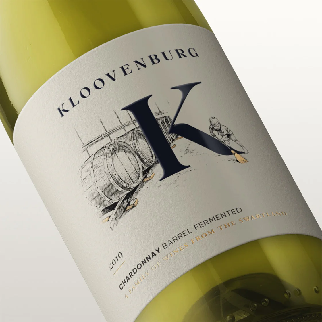
“On any given day, you could hear one of my boys sweeping in the cellar. He loved this small act, while the barrels worked their magic in the background. This would make me smile, knowing that my boys enjoyed being part of the farm just as much as I did. They’re all grown-up now, much like this wine, which, with a hands-on approach underpinned by care and attention, has blossomed into a fully fledged charismatic Chardonnay.”
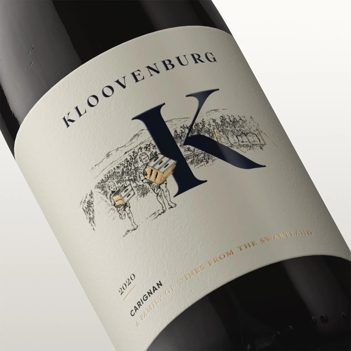
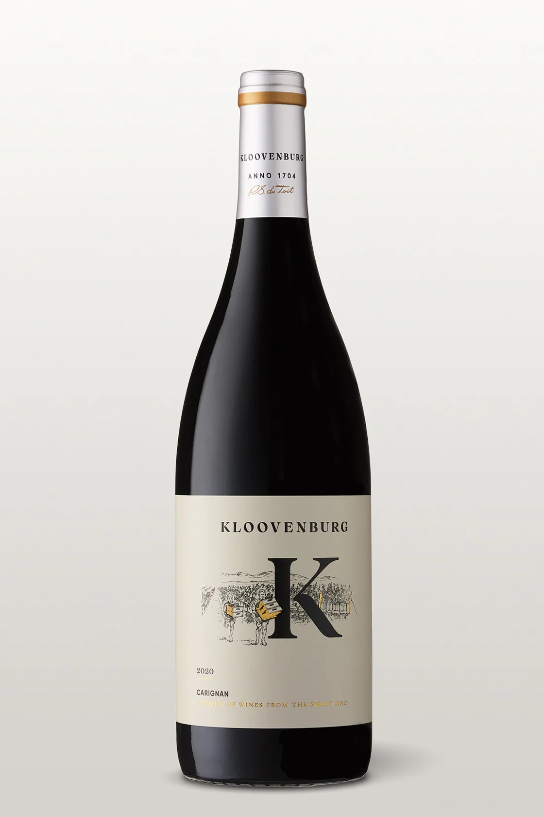
Carignan
“My boys used to love putting each other’s strength to the test by carrying loads of grape crates through the vineyards. The one carrying the most crates would win. It was never about the win, but rather about the act of participating in some friendly competition. Which reminds me a lof of the characteristics of our Carignan, an approachable wine ready to be enjoyed by those with an easygoing, inclusive nature.”
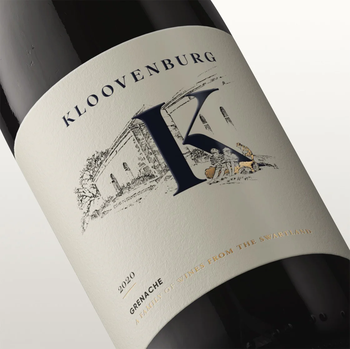
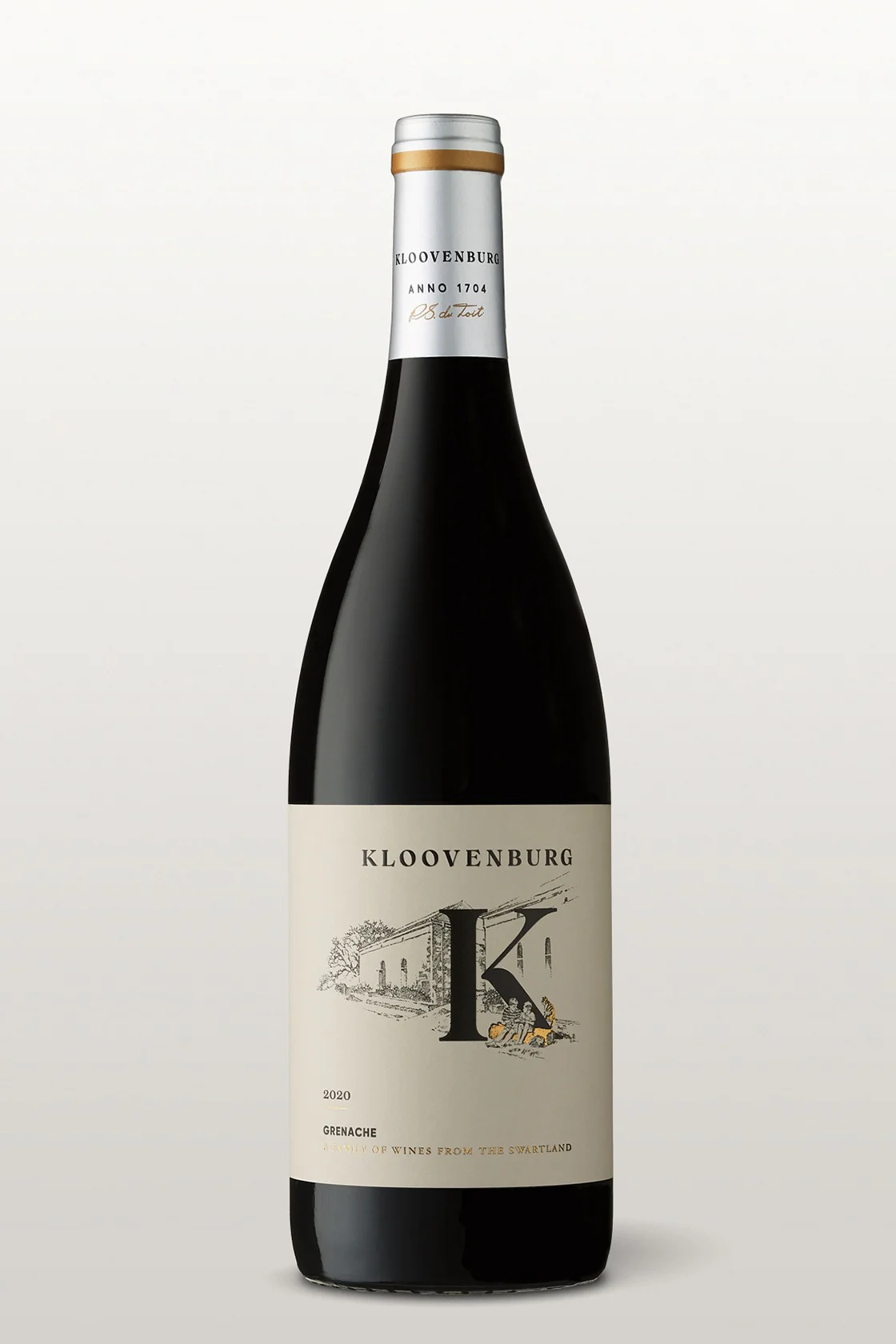
Grenache
“Sharing was part of my boys’ lives on the farm. After school and during weekends, they spent most of their free time in the vineyards, leaving zigzags of footprints in the rich soil. When they took breaks, they sat and shared their food, as well as their dreams. This unbreakable family bond is captured perfectly in our Grenache - an unpretentious, inviting wine best enjoyed in good company.”
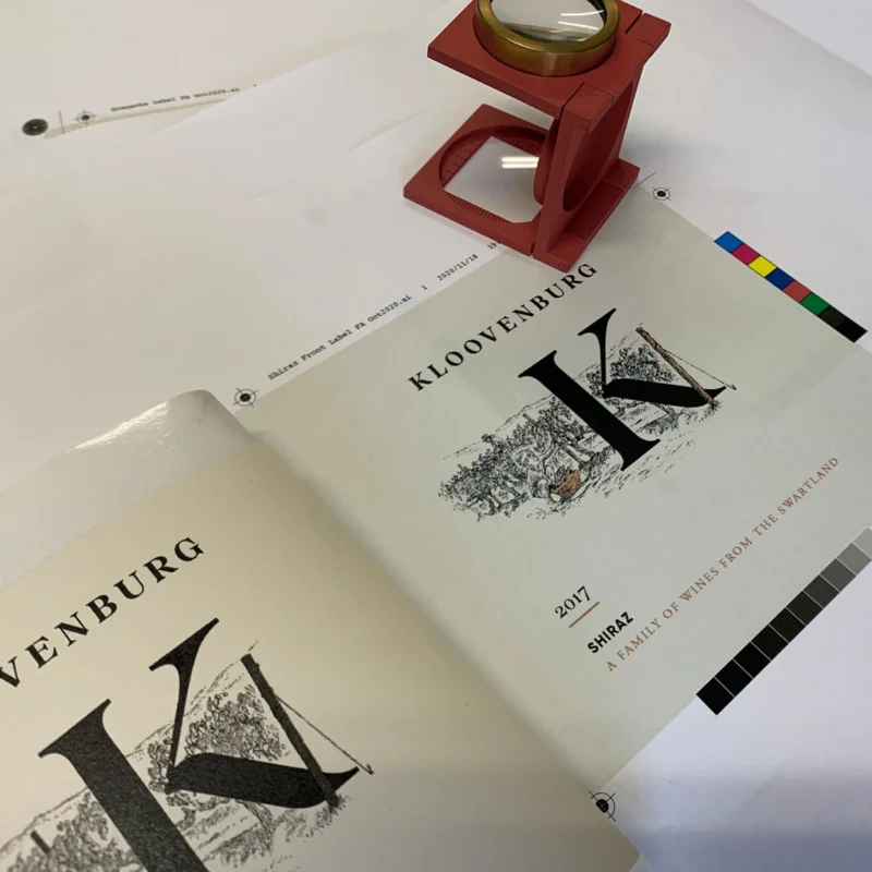
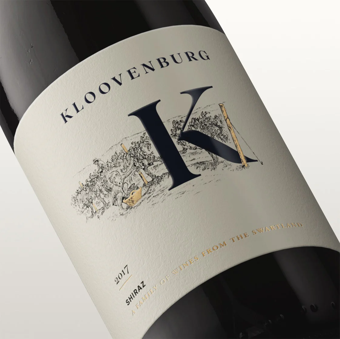
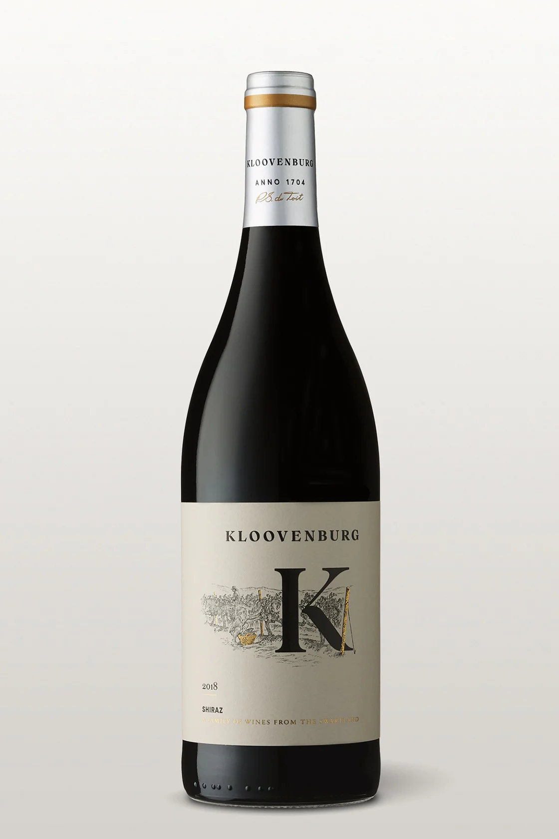
Shiraz
“From a very young age, my boys took to the farm like champions, and learnt by watching, asking questions and working hand-in-hand with everyone involved in the wine-making process. As they grew into men, Kloovenburg grew in the craft of making wine. Today, we have honed our skill and are proud to present this satisfying Shiraz. Testament to the saying, “wisdom comes with age”, this wine boasts rich flavours created by ageing in French oak barrels.”
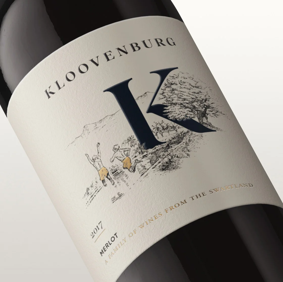
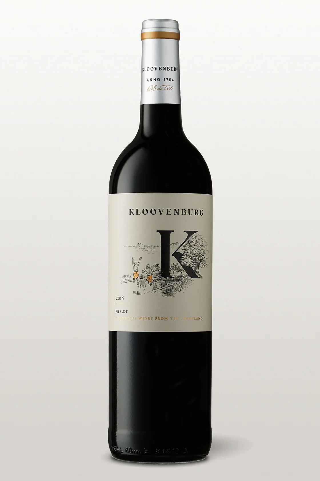
Merlot
“One of my fondest memories of my boys growing up on the farm was watching them run - feet dirty after playfully stomping grapes - straight for the dam. I can still hear the splash of water as they jumped into the cool water. The satisfaction of this simple reward at the end of another blessed day on the farm… Our Merlot captures the essence of that moment; and presents a perfect balance of warm flavours and smooth tannins as a result.”
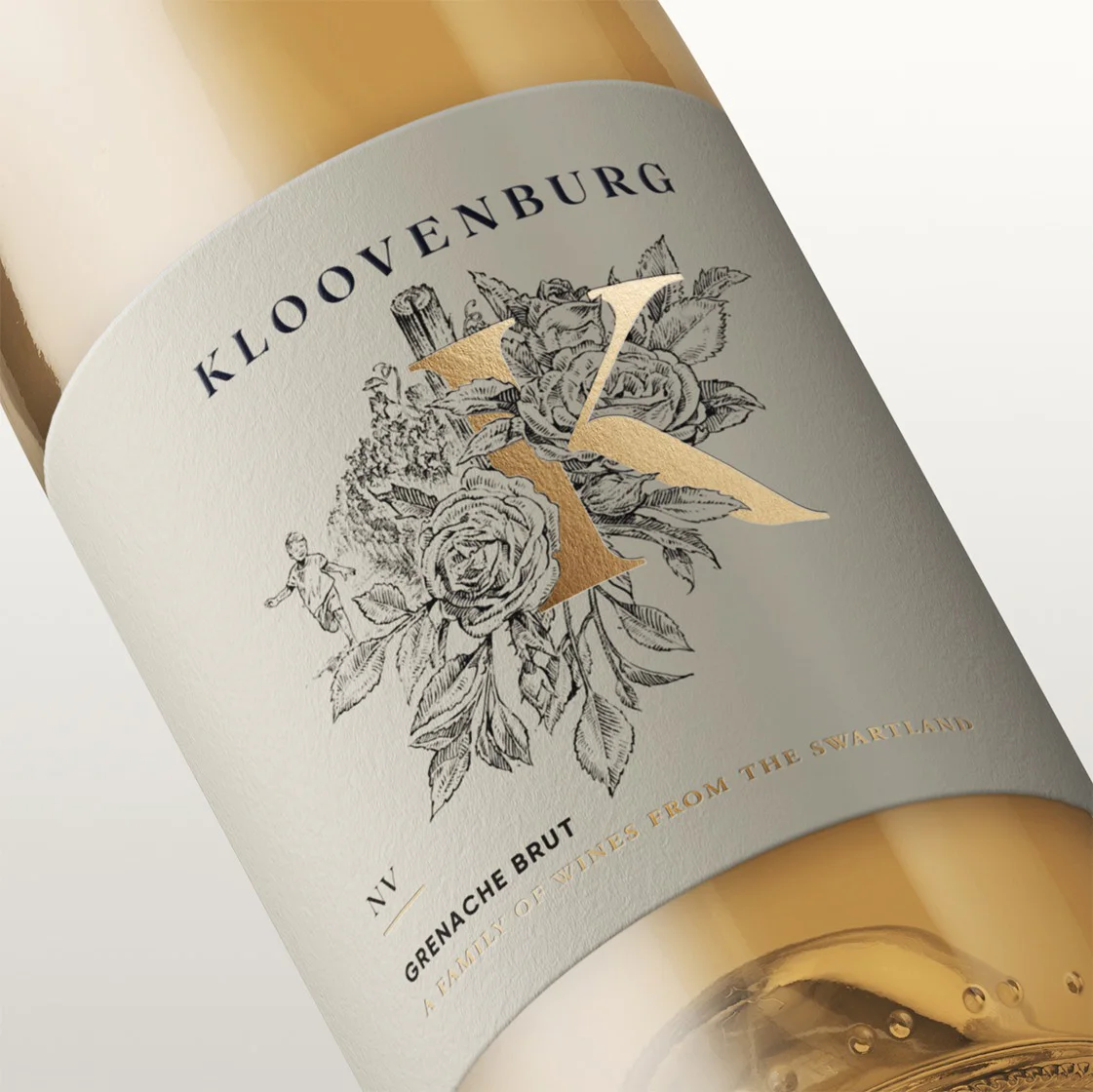
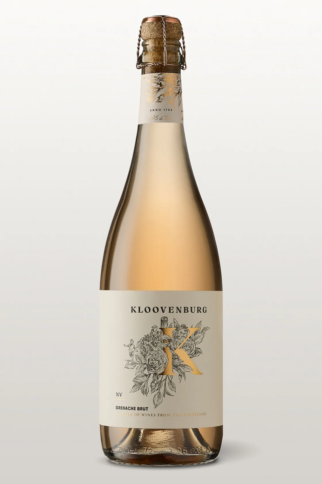
Grenache Brut
“Roses are a vine’s best friend: not only do they act as protectors of the vines, they are also beautiful additions to the vineyard. Often the sound of my boys’ laughter carried through the vineyards, spontaneous and carefree. If this laughter could be bottled, it would be in our refreshing sparkling wine, with its rose-tinted hue complimented by lingering bubbles on the tongue.”
Consistent brand emphasis
While the packaging design beautifully captured the spirit of the boys' farm adventures with its delightful illustrations, it was equally important to maintain a prominent presence of the Kloovenburg masterbrand. We ensured that the packaging seamlessly integrated the nostalgic references while proudly showcasing the unmistakable Kloovenburg brand identity.
