Brief
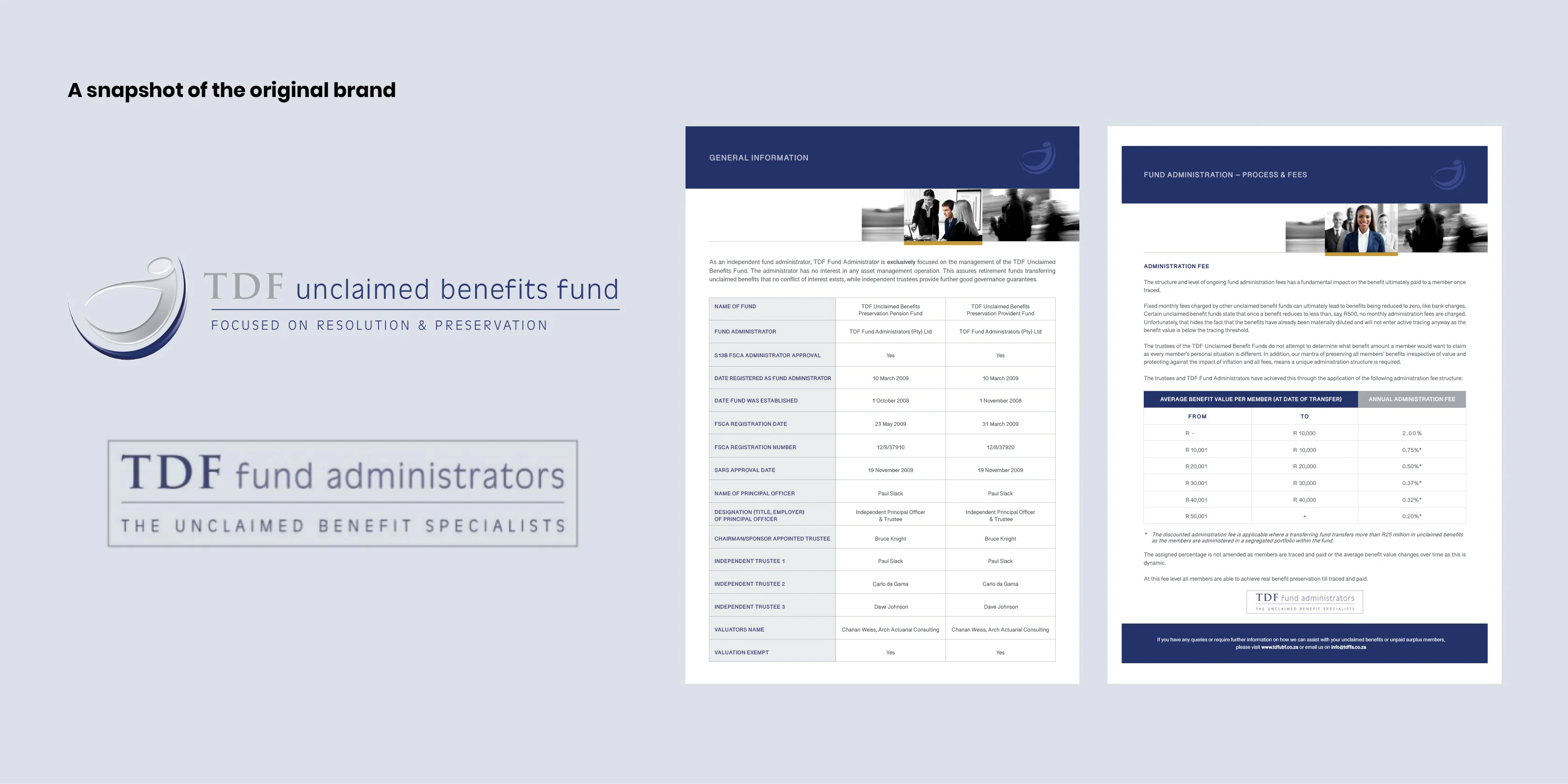
Core Fund Administrators, previously known as TDF Fund Administrators, have a singular goal of safeguarding unclaimed benefits to ensure real benefit preservation for their clients. Their specialty is of paramount importance within the unclaimed benefits space, and in response they embarked on a transformation journey of rebranding and to re-engage their valued clients.
Simplr set out to establish an identity that prominently underscored the twin pillars of preservation and resolution, while cultivating a brand visual style that conveyed trust and security.
Solution
Our creative journey involved exploring and delving into a typographic approach to shape the brand's identity. Through focused typographic solutions, we communicated the interconnection between the two central objectives – preservation and resolution – that together form an enduring, limitless solution.
Identity Rebrand
Visual Language
Collateral Design
Website Design
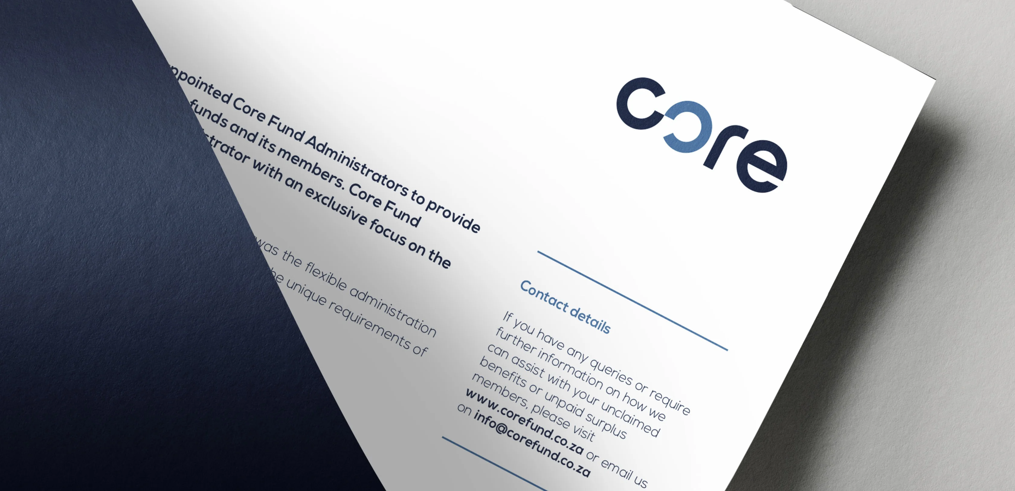
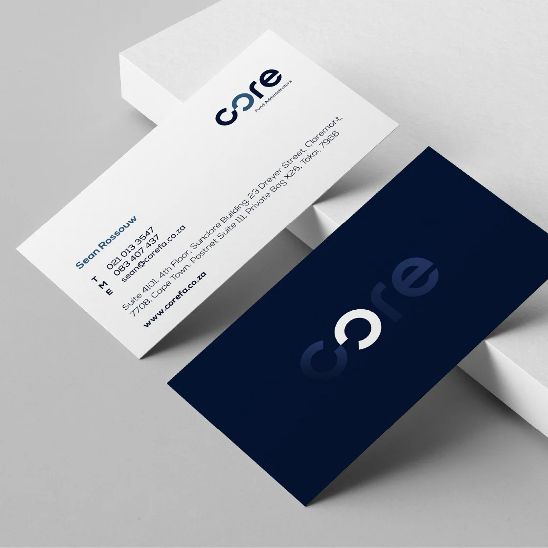
Identity design that connects
Similar to an infinity symbol, the first two characters are designed to connect, suggesting a continuous flow and harmonious balance. The synergy between preservation and resolution communicates the company's dedication to safeguarding unclaimed benefits and reinforces the idea of a perpetual, holistic solution for their clients.
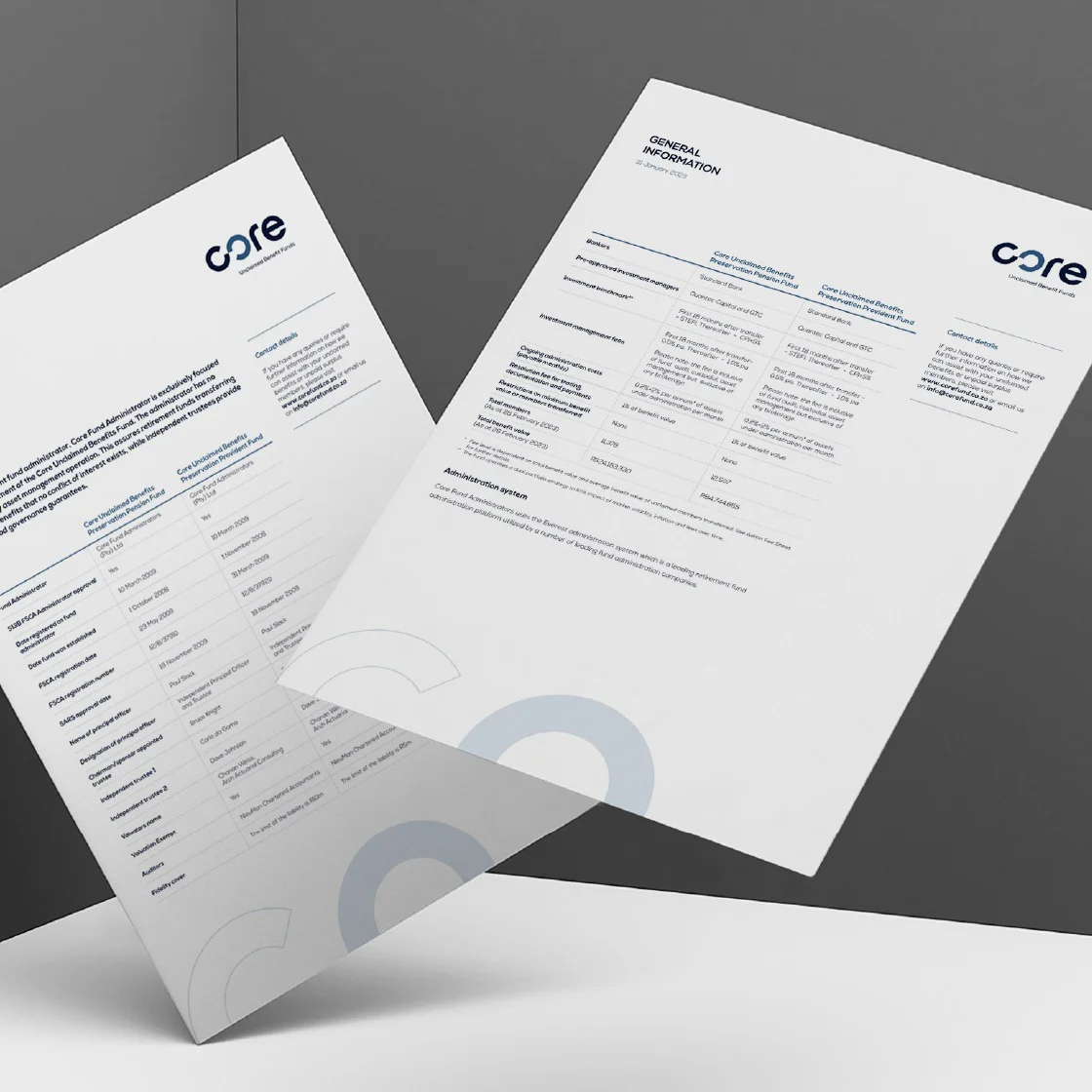
Creating trust with a client-centred visual language
The infinity icon from the brand's word mark is used in the visual language as a powerful representation of Core Fund Administrators' ongoing partnership with their clients. The inherent symbolism of the cycle aligns with the brand's values and commitment to provide trust, transparency and protection. It also highlights the emotional connection, reassuring their clients that their financial wellbeing is in qualified and trustworthy hands.