Brief
Corbium, previously know as AFGRI Management Services is a division of AFGRI. Corbium is a management service system that assists and runs many of the back-end admin support of a company, with a strong focus on the agricultural sector. Our brief was to rebrand Corbium as they were looking to branch out beyond AFGRI and expand their business.
Solution
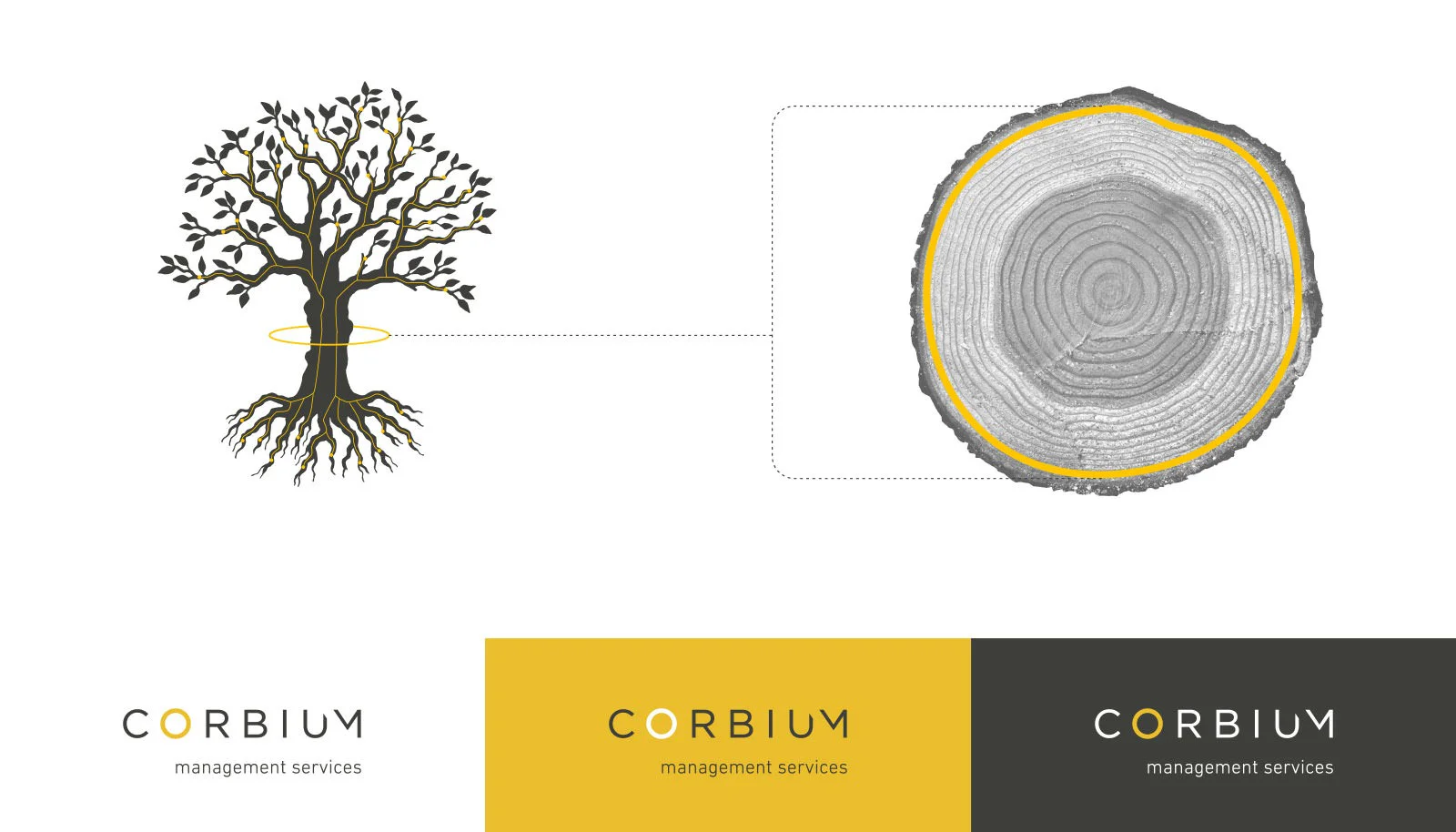
Simplr set out to evolve the Corbium brand for their new pursuits. Keeping in the realm of agriculture we used their name which was derived from the word cambium, as inspiration. Simplified, cambium is a thin layer of tissue that exists around the trunk of a tree, its purpose is to organise the cells and promote growth of the tree. We used this as the basis for all the creative.
Identity Design
Visual Language
Brand Rollout
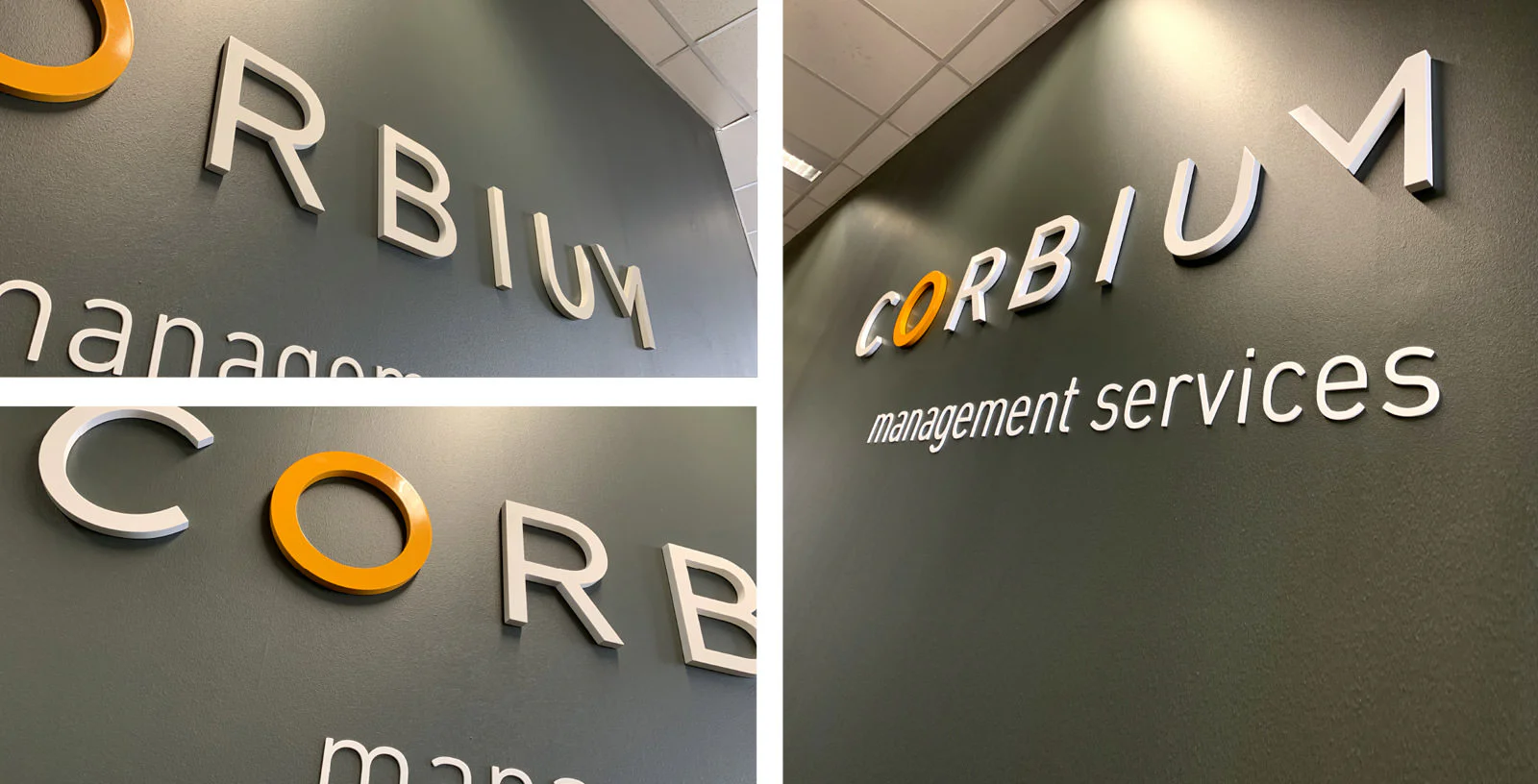
Signage
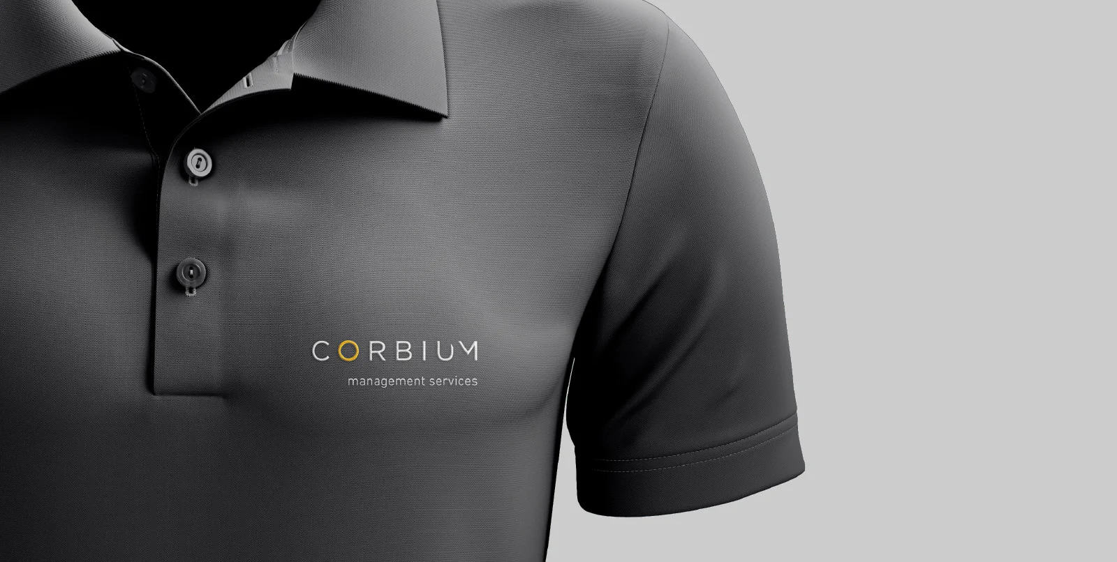
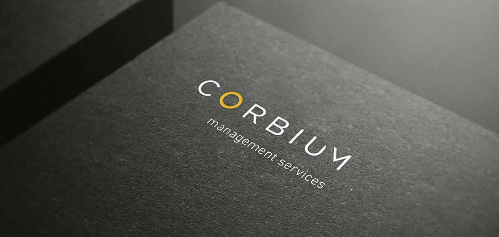
Identity Design
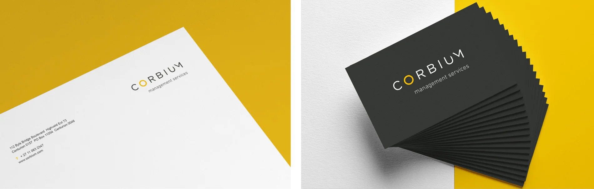
We wanted to have a clean typographic identity, with a strong link to the brand look and feel.
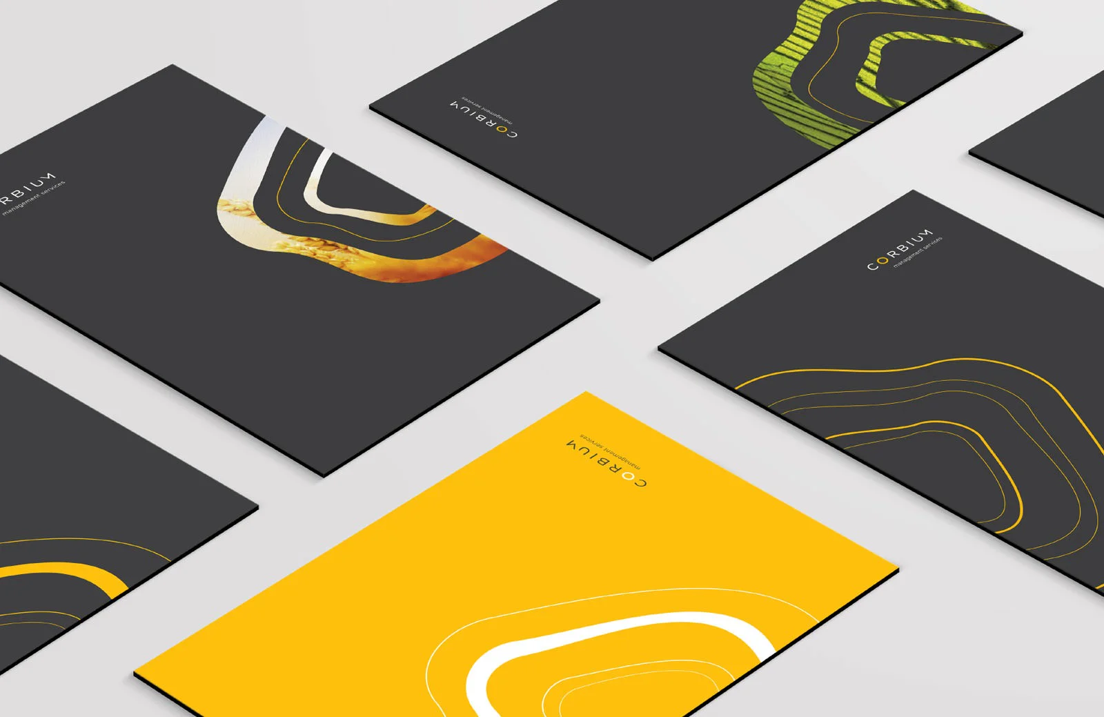
We highlighted the “O” from the name Corbium to represent a basic graphic interpretation of a tree’s cambium cross section and to represent the 360° management services Corbium offers.
Typography
Conforming to a simplistic and clean brand look, We chose the
Gotham font family as the corporate typeface for Corbium.


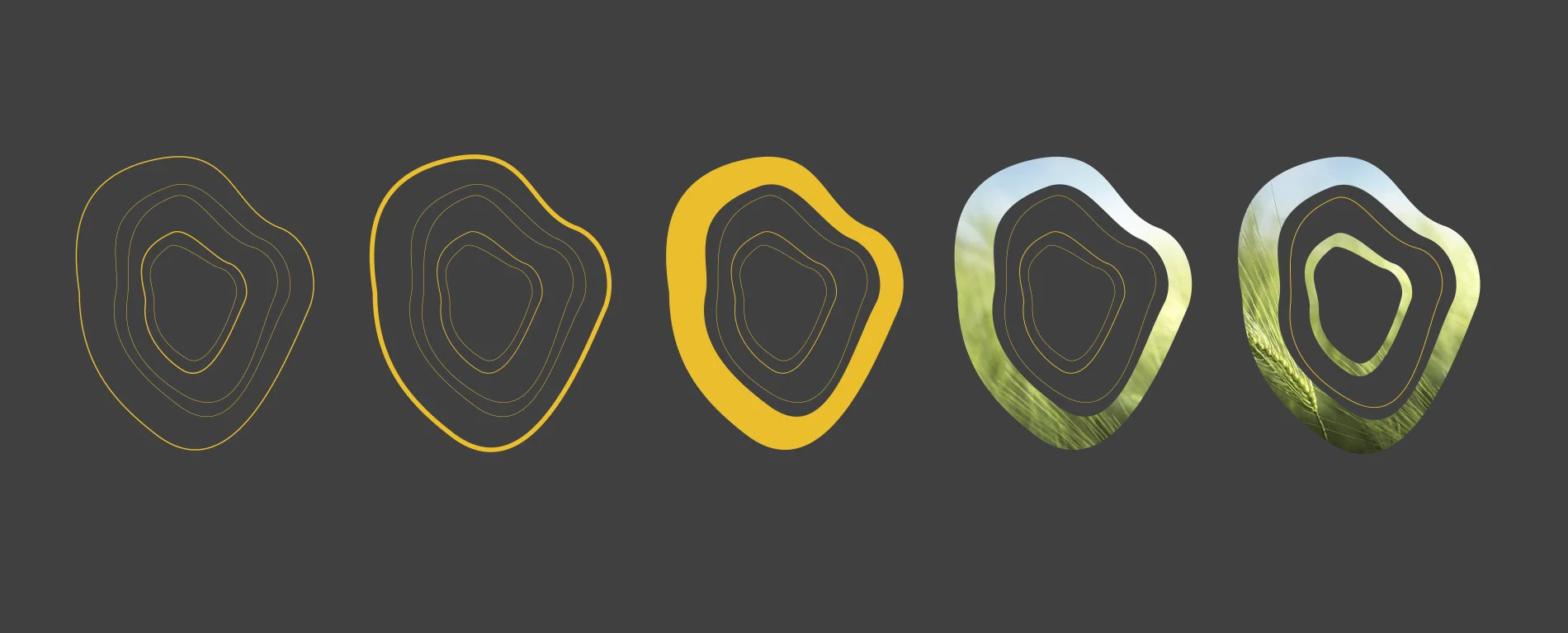
Visual Language
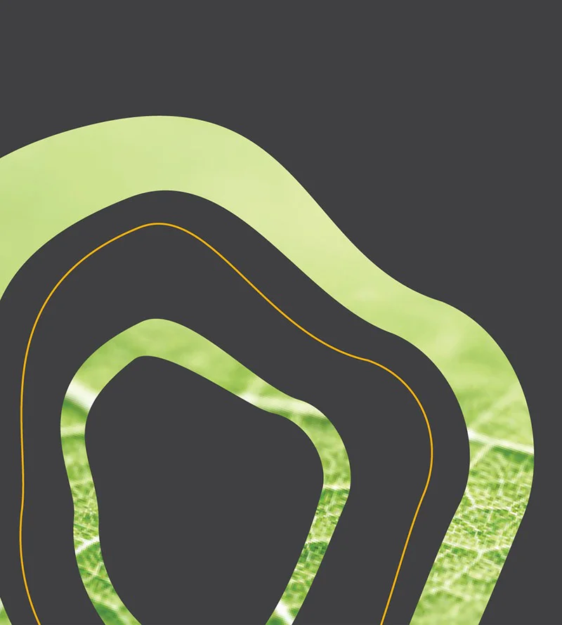
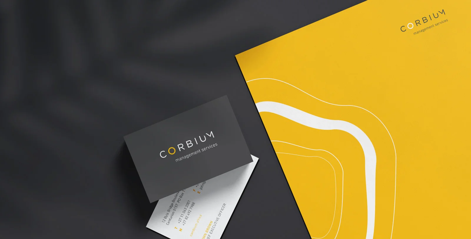
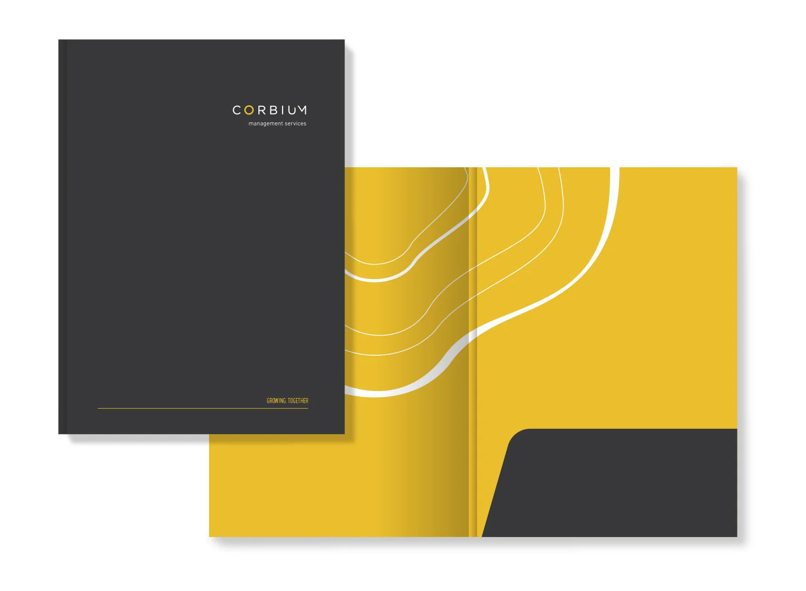
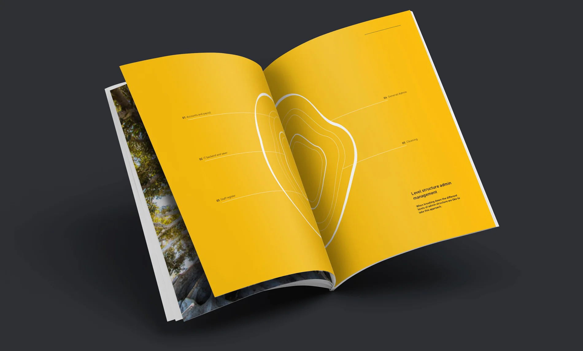
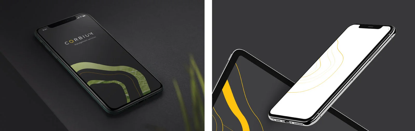
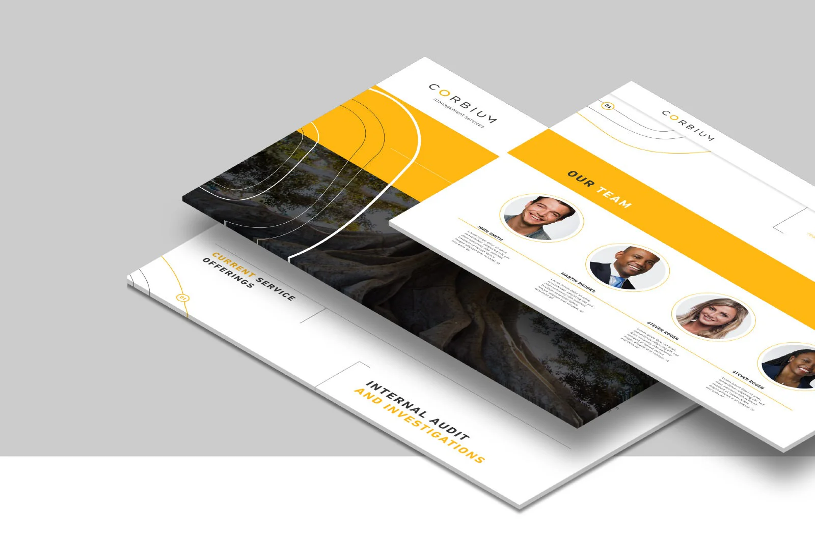
Keeping within the theme of botany and agriculture, we used the growth rings from a tree to form the core graphic device for Corbium's visual language. We expanded on this idea by using the graphic device in various ways ie; through cropping them, alternating the rings line thicknesses and placing relevant visuals inside the ring graphic. This creates creative diversity across all brand collateral.