Brief
Simplr was approached by AFGRI Group Holdings while they were in the process of acquiring a banking licence for a business bank with an emphasis on Agriculture. Once the licence was finalised Simplr went on to create the brand CI.
Solution
We set out to create a visual design system that is simple, professional and approachable within the banking realm, with a strong link to the agriculture industry.
Identity Design
Visual Language
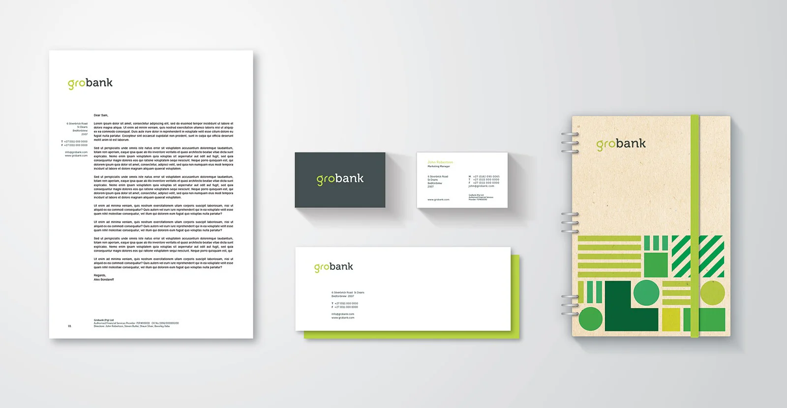
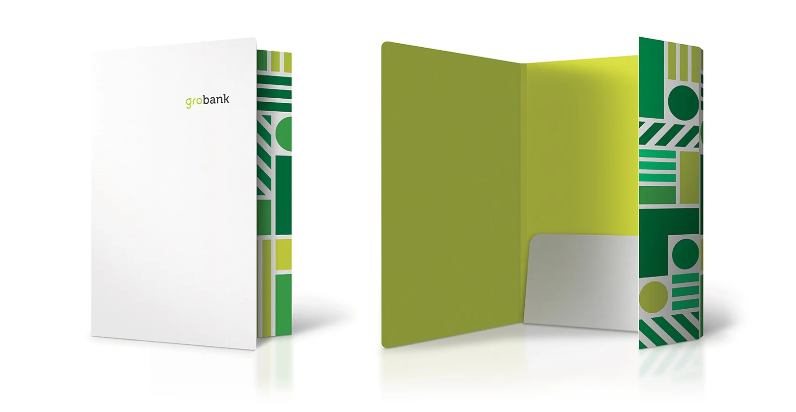
Brand Rollout
Identity Design
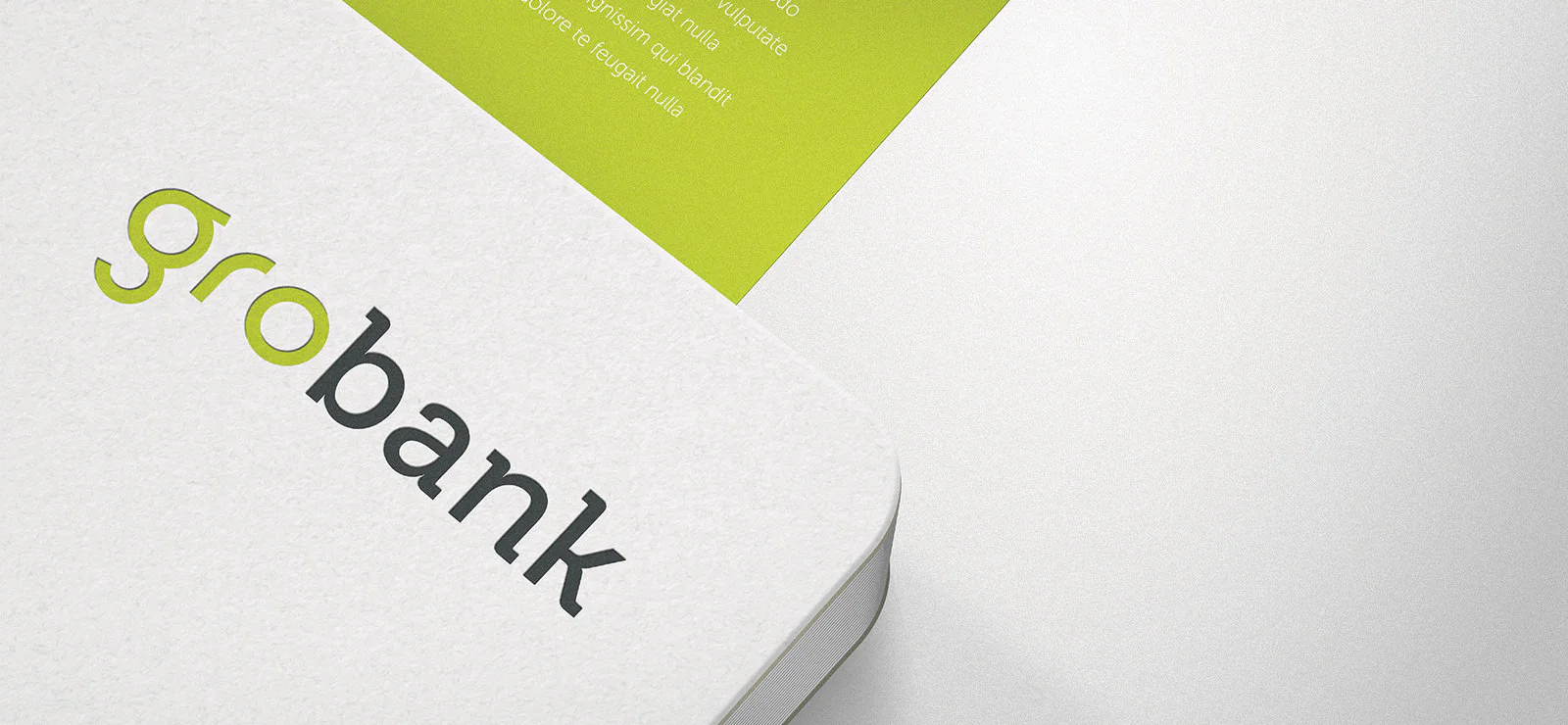
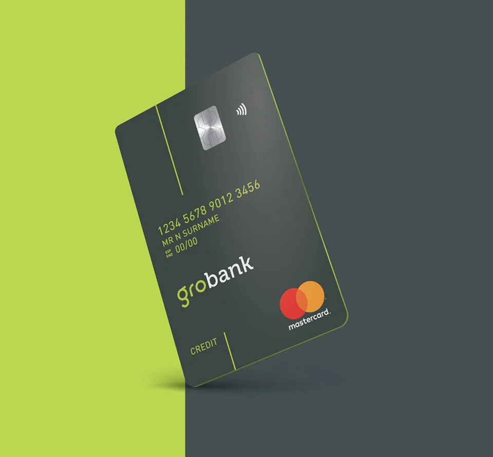
In creating the identity we wanted to visualise the merge between banking and agriculture. The 'gro' typeface was created using circular shapes to depict the organic shapes found in nature and in agriculture, while the dark slab serif typeface represents the banking side. We also set out to create a unique “g” that could be used as a stand alone recognisable brand icon on collateral.
Typography
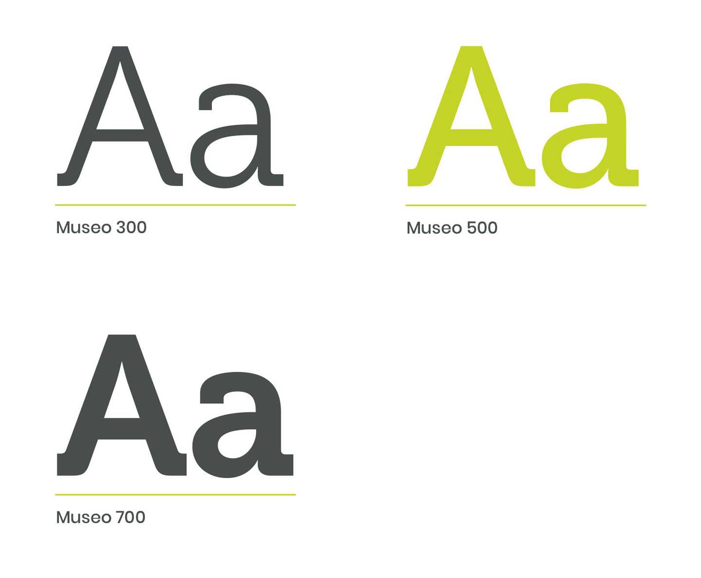
The font used for the Grobank brand is the slab serif font, Museo which is similar to the type we created for 'bank' in the logotype.



Visual Language
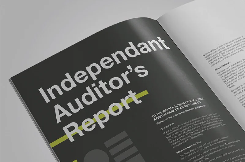
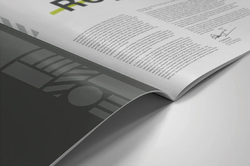
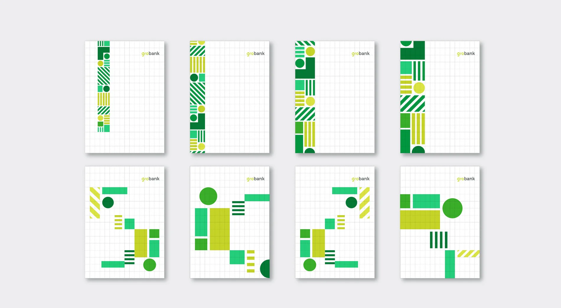
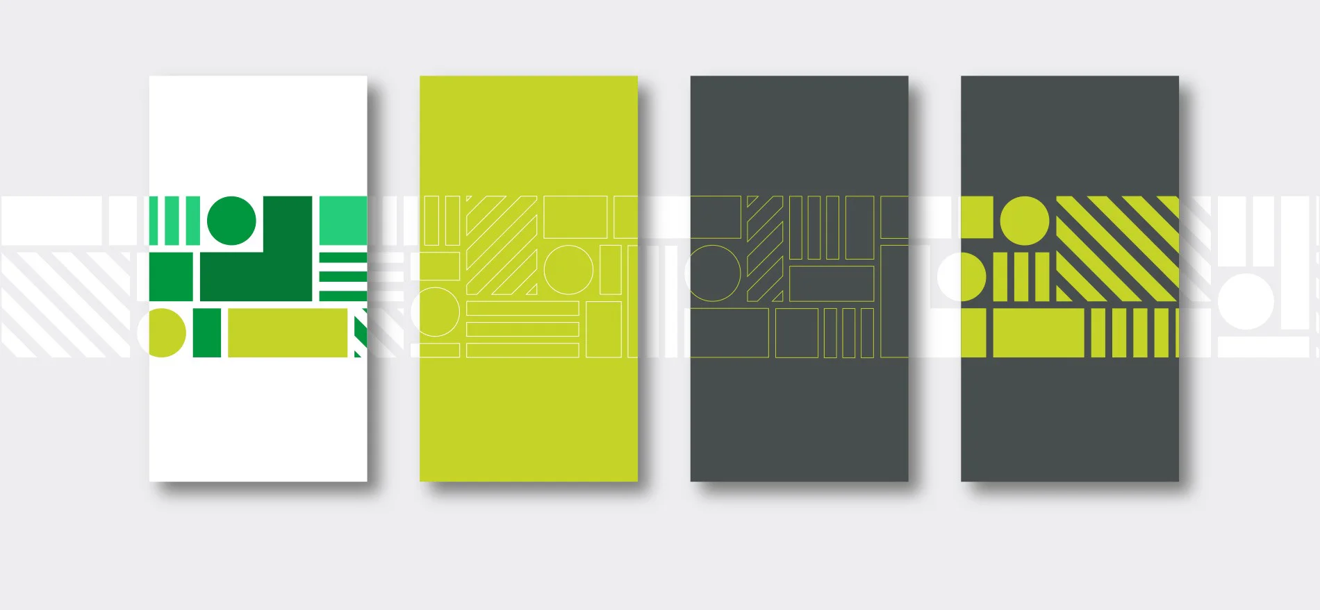
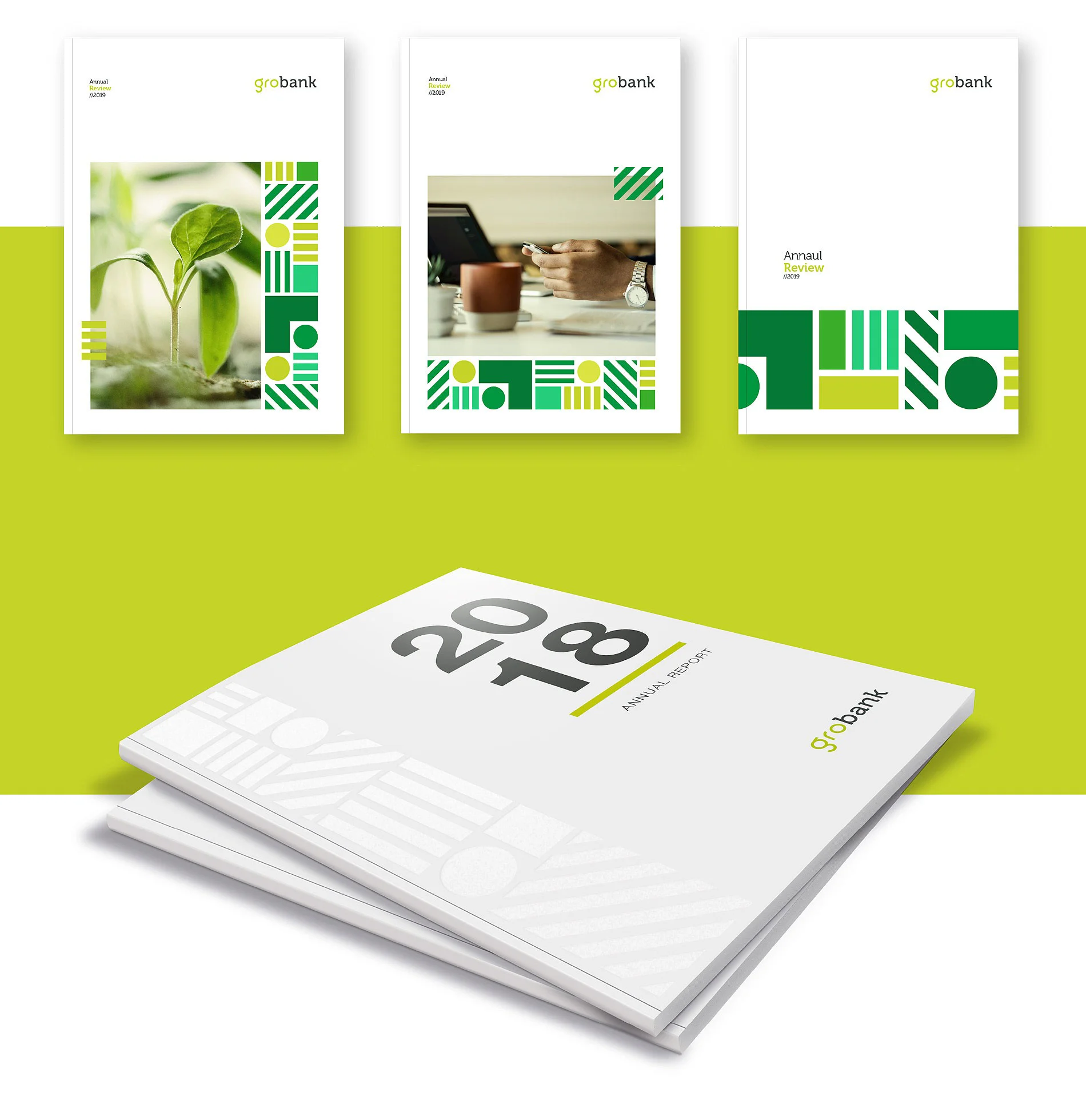
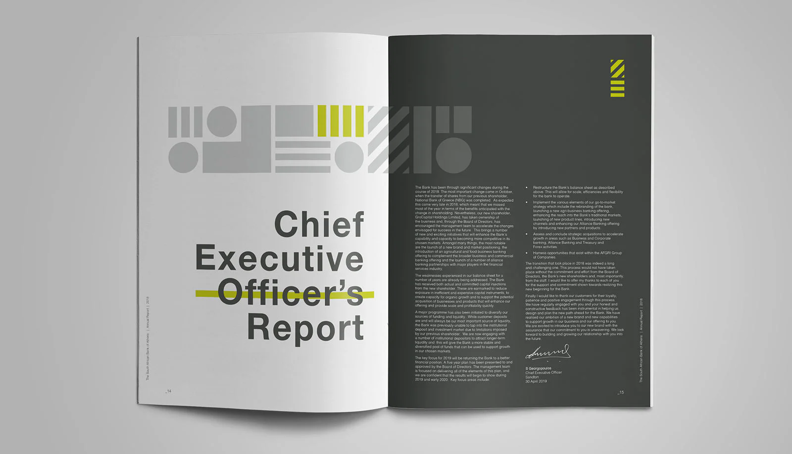
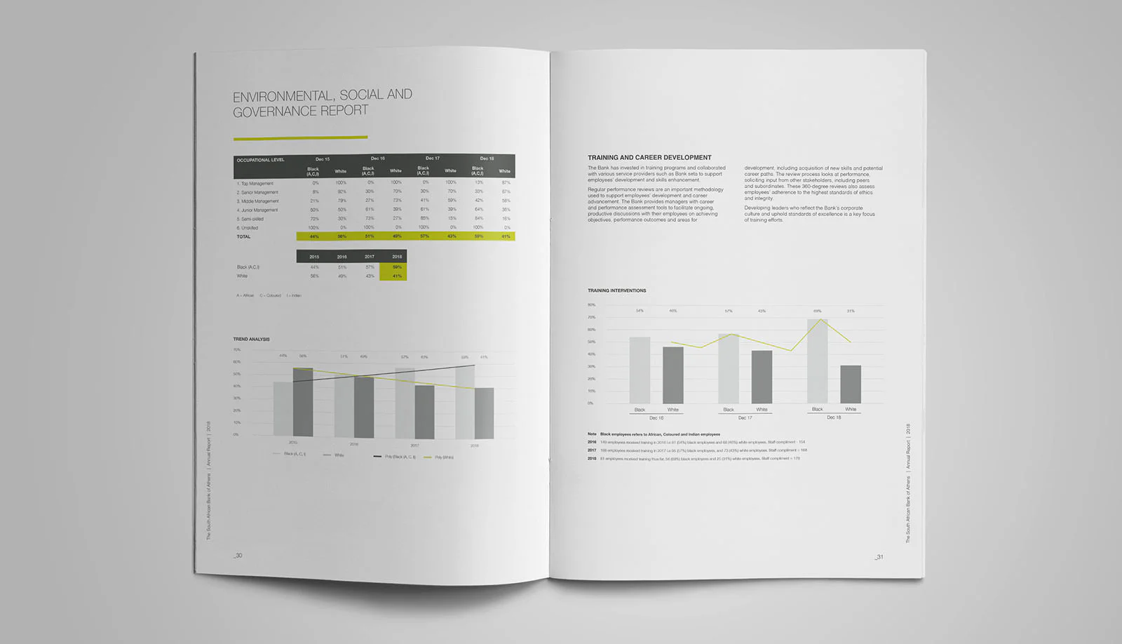
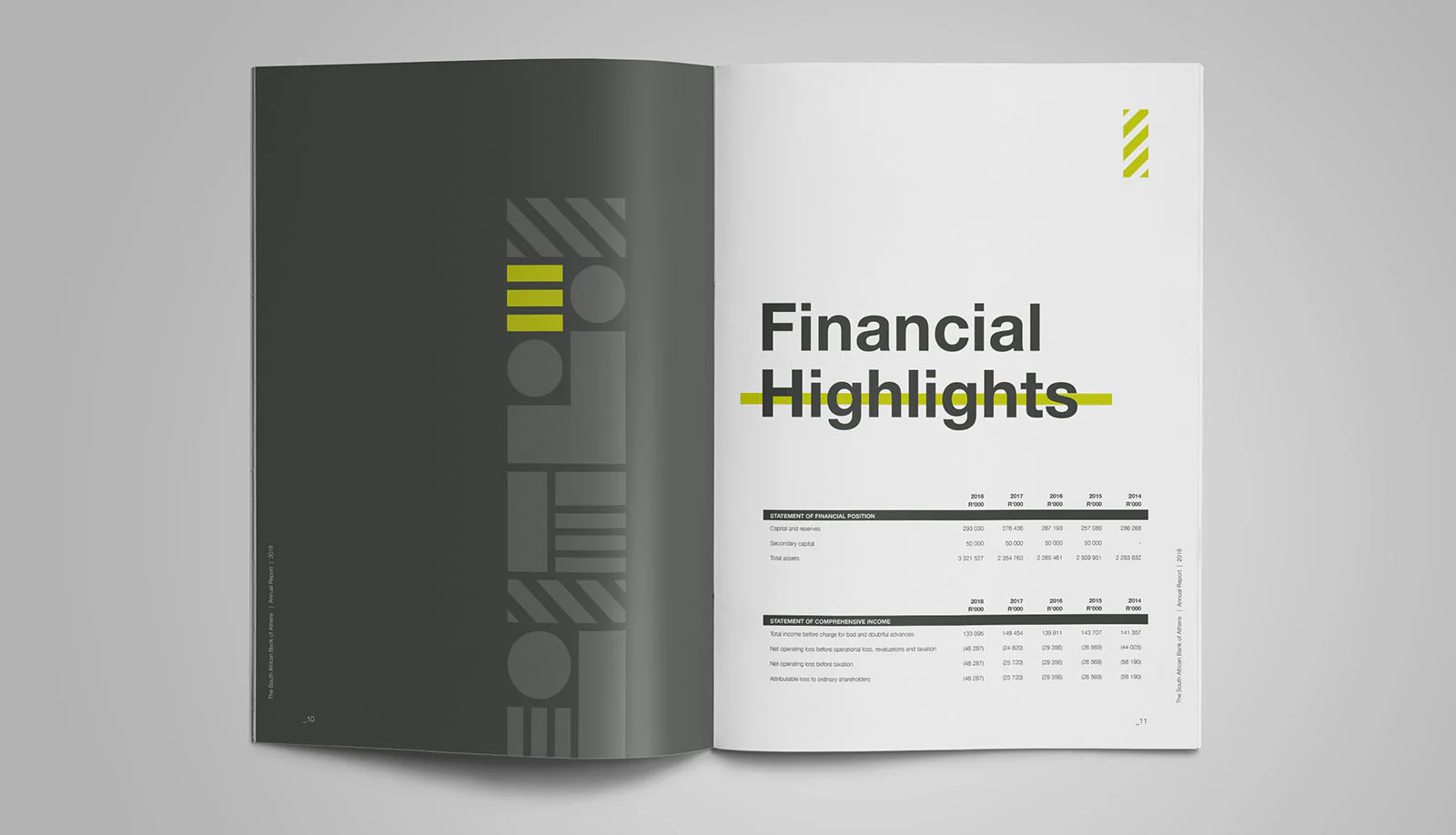
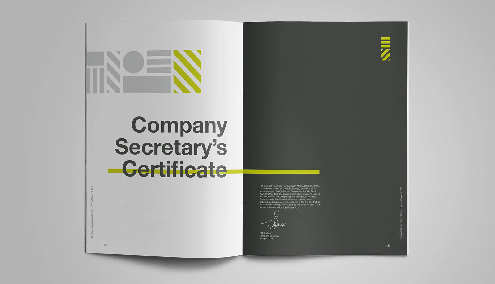
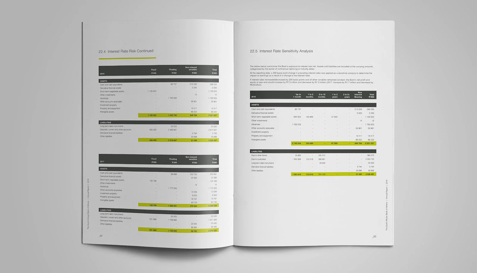
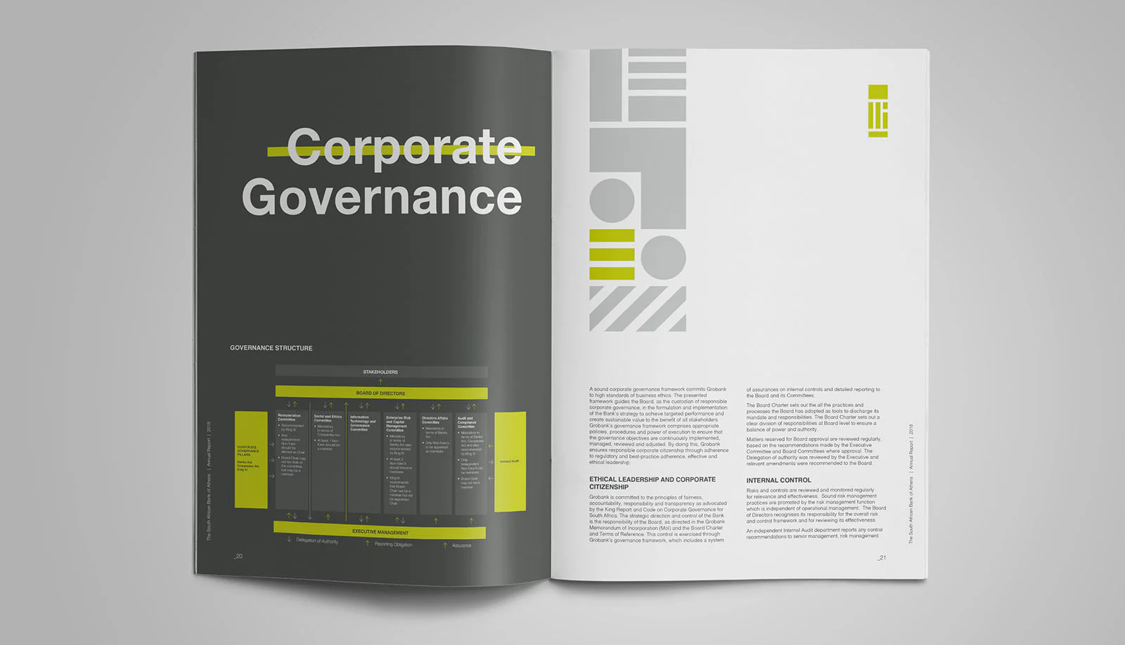
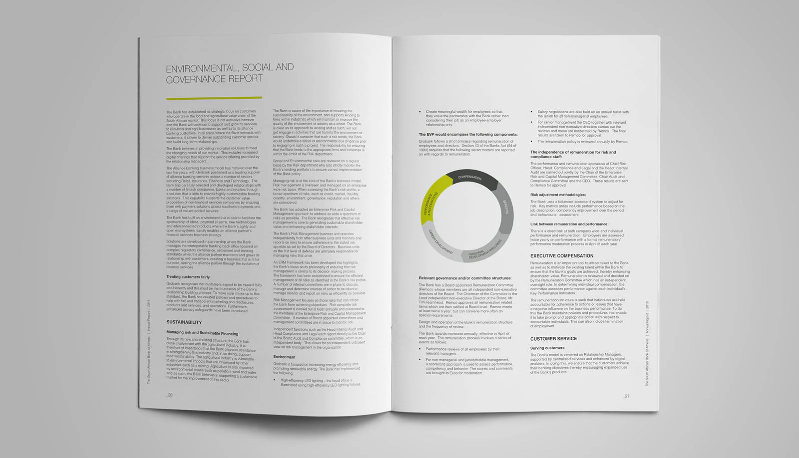
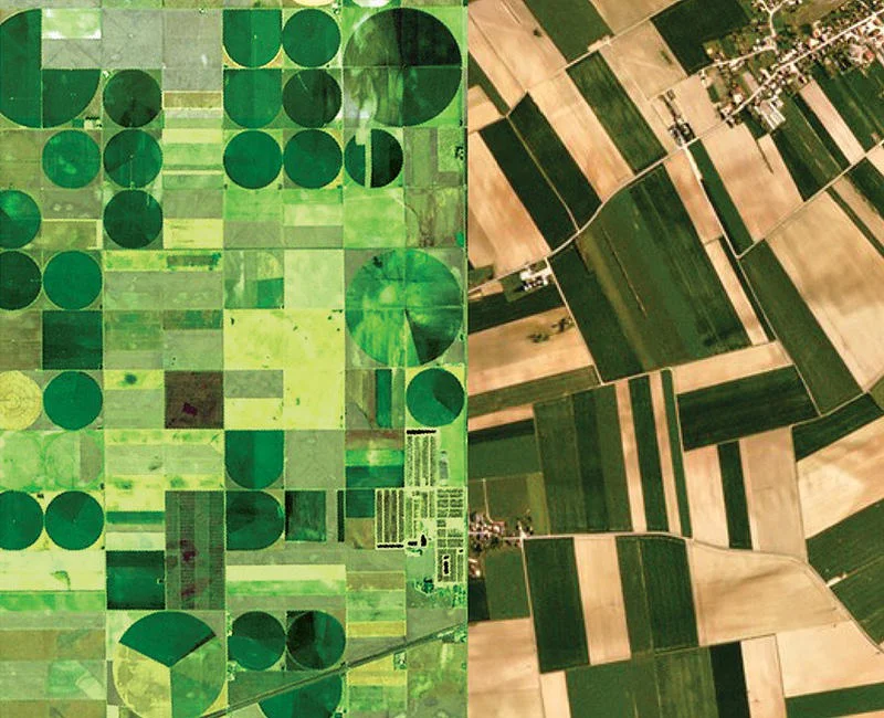
Stemming from our extensive experience with branding in the financial sector we wanted to create a visual language that is both versatile and adaptive and thus can easily translate through the many divisions a bank may have. The modular graphic language we created for Grobank is based on geometric shapes which reference the patterning of farm lands and fields found within the agricultural and food industry. Simplr interpreted this into a simple pattern that can change colour shape and size and introduced visuals and copy that can be translated into endless but still recognisable ways to apply across all facets of the brand.
