Brief
Simplr was approached to rebrand AFGRI Group Holdings, with the goal of creating a distinct differentiation between AFGRI Group Holdings and AFGRI Agri Services.
Solution
AFGRI Group Holdings being an Investments Holding company is responsible for the day to day business processes of agriculture. We therefore wanted to create a brand that would still be associated with AFGRI but had a no-fuss business persona that was easily recognised.
Identity Design
Visual Language Development
Brand Rollout
Web Design
Web Development
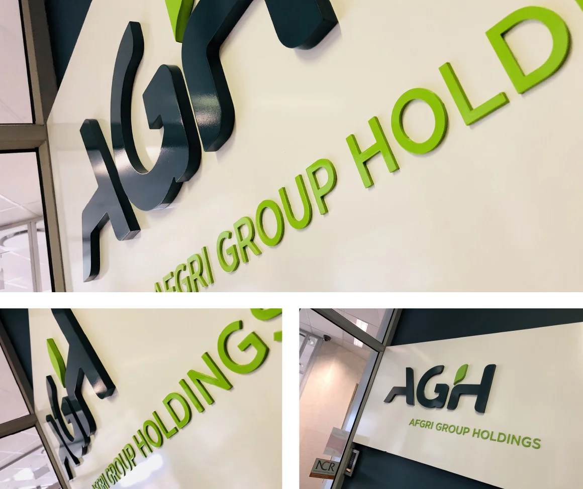
Signage
Identity Design
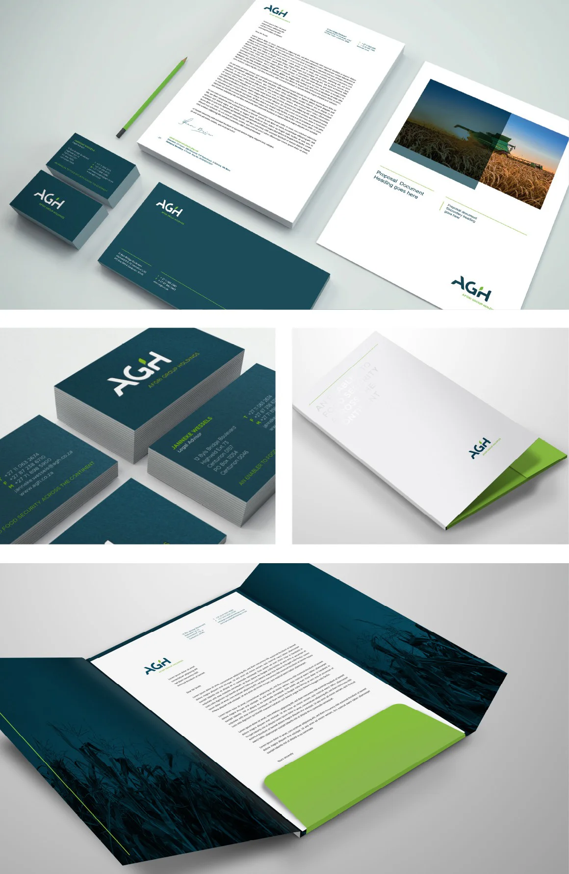
When creating the Identity for AGH, Simplr wanted the identity to be bold, typographic and easy to read with a touch of agriculture. We achieved this by creating a unique “H” with a simple graphic leaf icon.
Typography
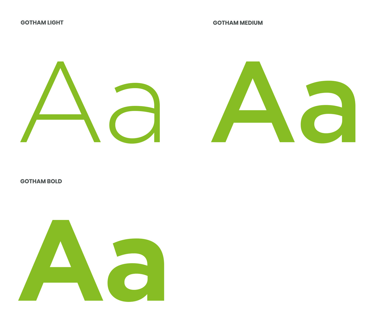
We chose Gotham, a bold structured font to compliment the bold typographic identity we created for AGH.



Visual language
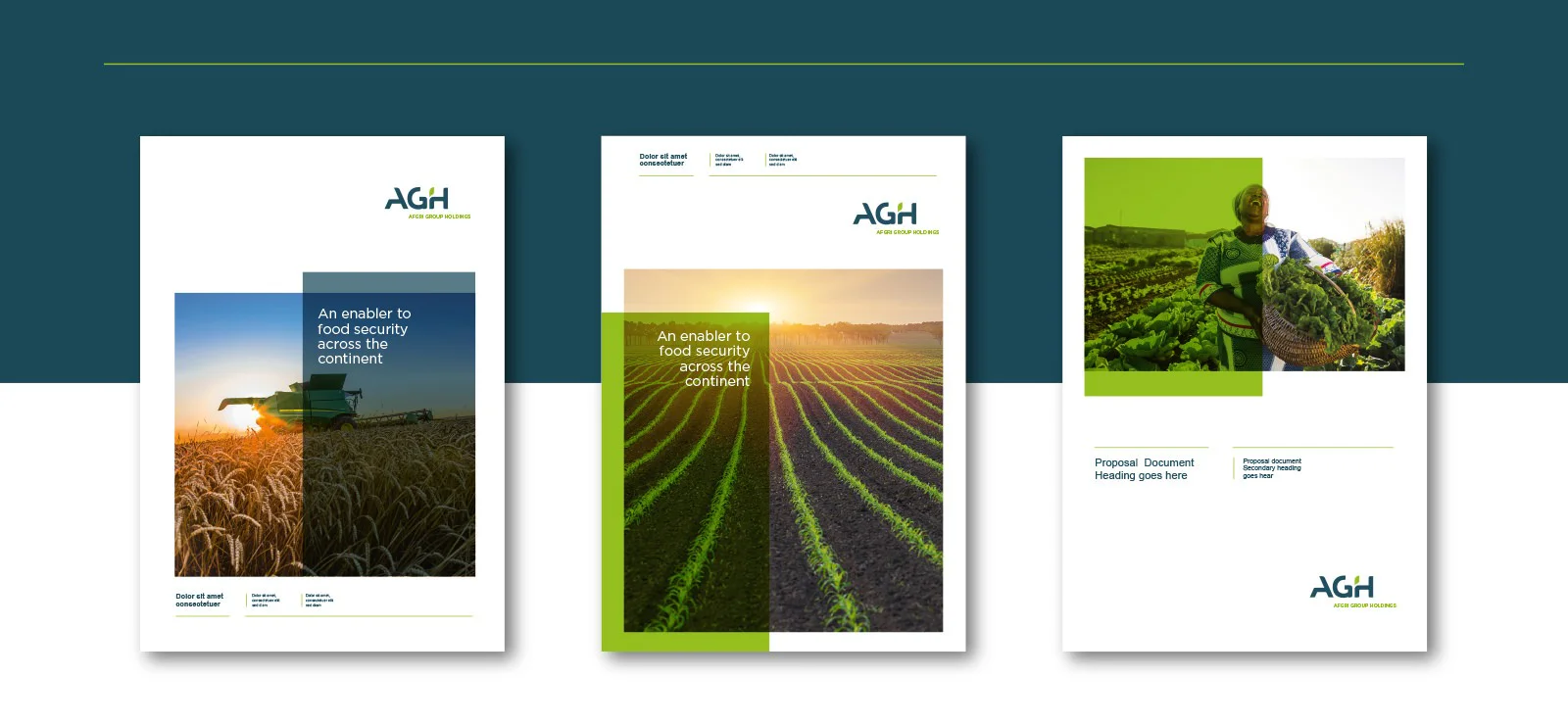
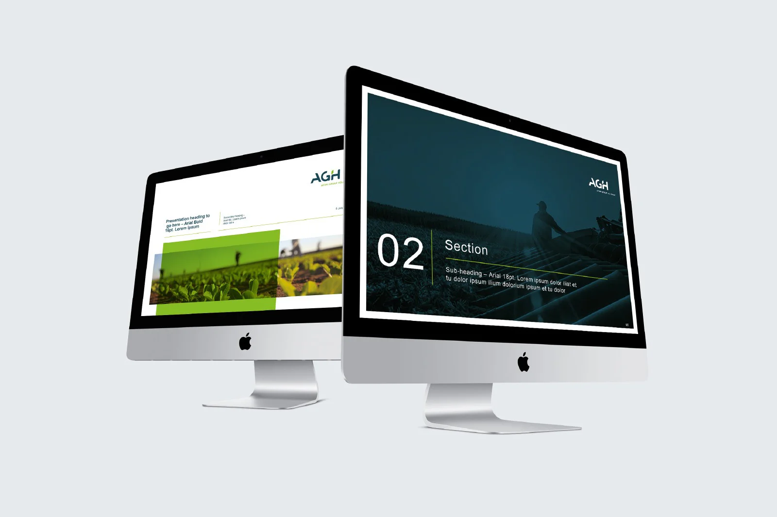
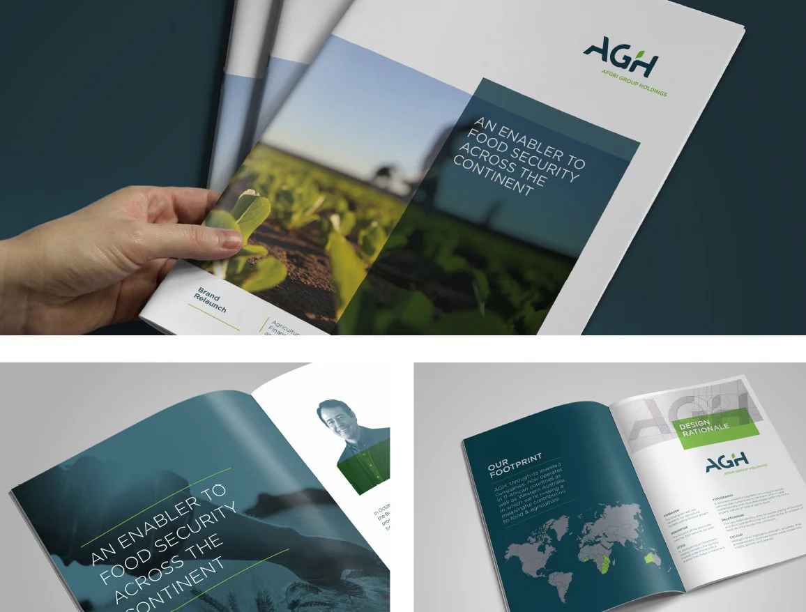
With AGH being an Investments Holdings company, the visual language needed to be straight-forward, yet professional. We achieved this by using bold visuals from across the agricultural and food processing value chain as base. We then used AGH's corporate colours lensed over the visuals to talk to their clarity and focus in their business practice.
"Working with Simplr really opened my eyes to the benefits of having a seriously talented, professional designer to do the identity of a company. Having one designer taking care of all the design elements means they are constantly thinking about how everything fits together and has been instrumental in our having a unified brand. Before working with Simplr, we struggled to get to the level we were aiming for, and now our corporate materials, and our actual experiment designs, are on a whole new level of visually striking and professional. They are also outstanding in the digital development side which make the relationship even stronger. During our time working together, Simplr has truly shown their passion for what the create and for the company they create it for, which is remarkable. They are not only gifted designers and digital developers but can help lead brands and organisations in the right direction with strategic decisions."


