Brief
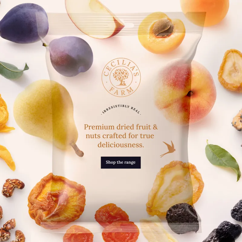
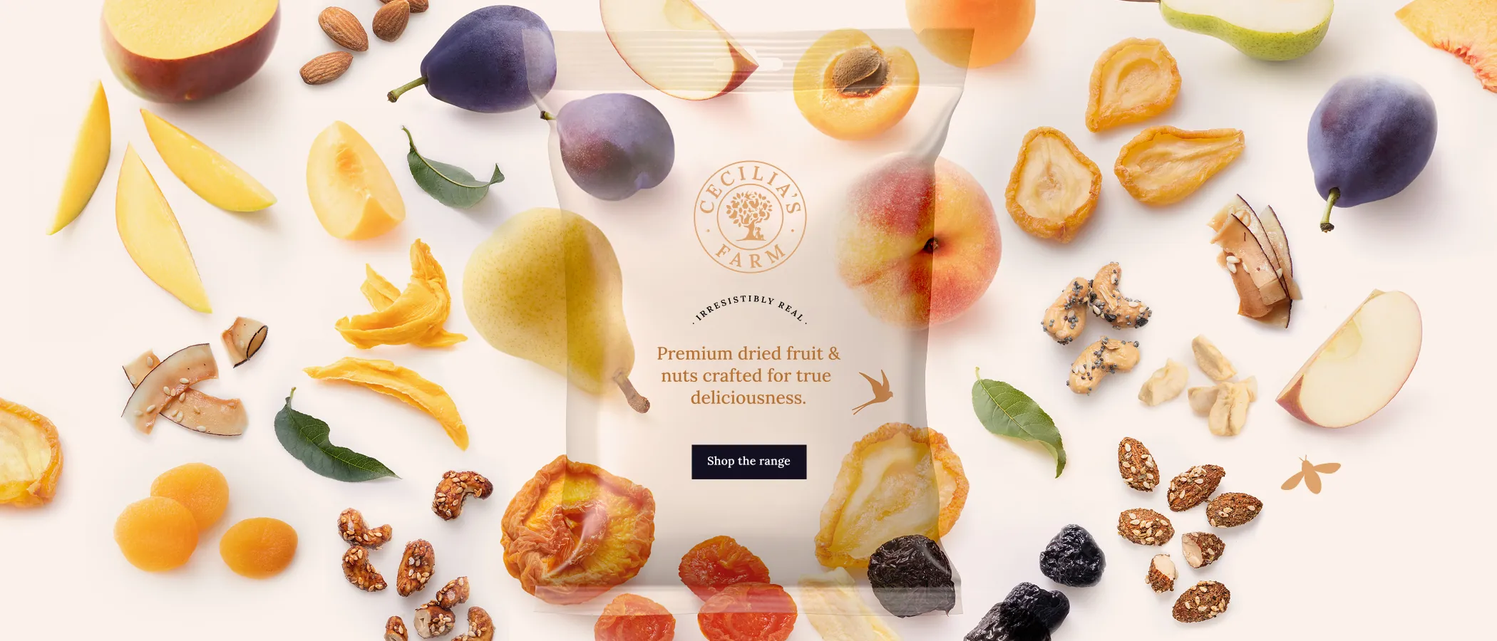
Cecilia’s Farm, known for their premium range of dried fruit, nuts, and treats, underwent a packaging refresh to better reflect their premium positioning. With taste, quality, and transparency still at the core, the brand needed an updated eCommerce experience that could match the sophistication of its new look while continuing to reflect the heritage and warmth of the farm where it all began. To reflect the updated identity, Simplr was once again tasked with reimagining and rebuilding the website.
Solution
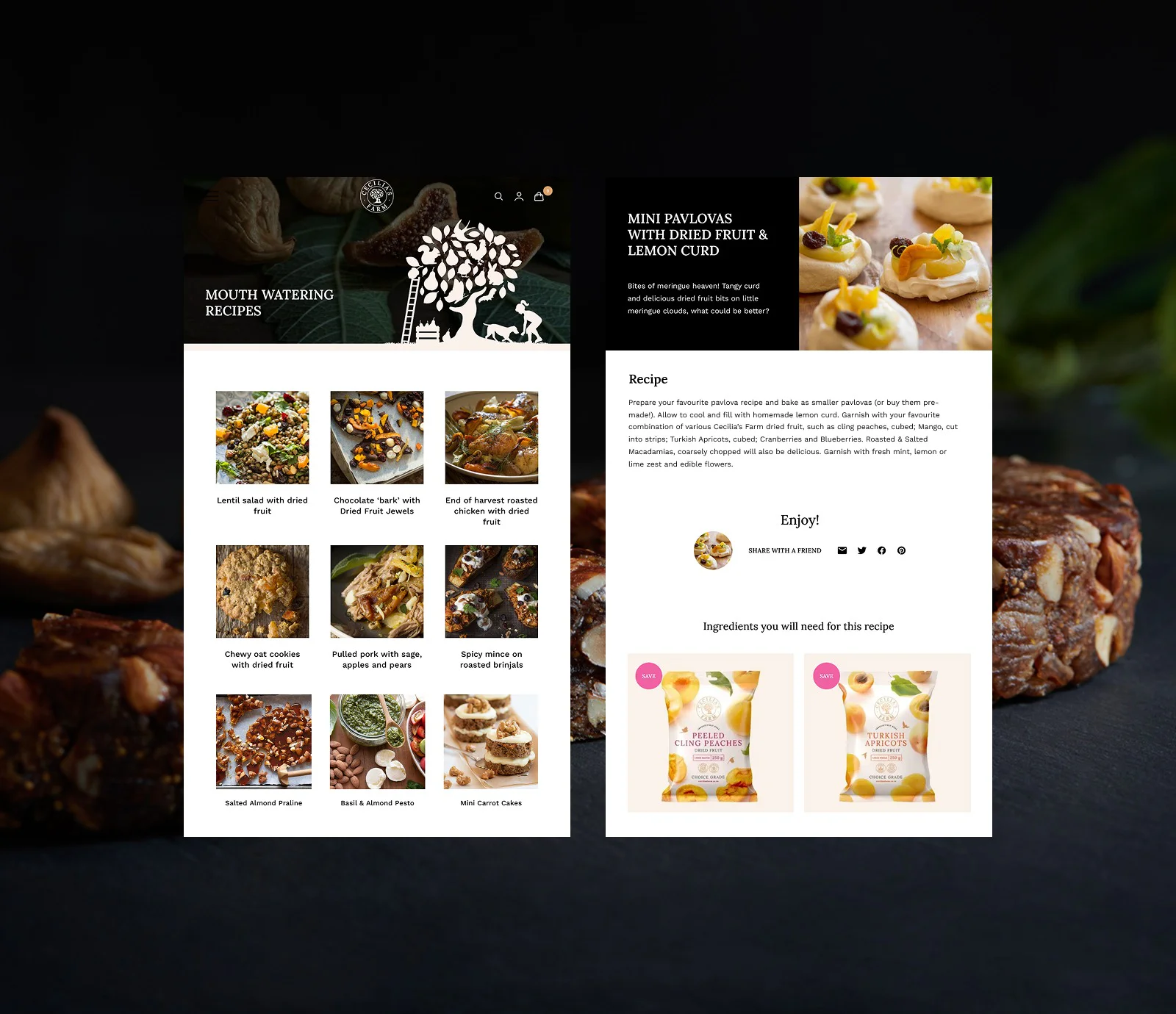
With a new set of sophisticated in situ photography forming the creative backbone, we crafted a digital experience that balances warmth and elegance. The rich, moody photographic style offers a striking contrast to the packshots and brighter graphic elements - bringing depth and freshness to the brand story. We enhanced the site’s layout, structure, and usability to better support eCommerce and content, while maintaining the authenticity of the farm-to-table journey. The result is a seamless blend of visual richness and functional clarity - a digital storefront that feels as considered as the brand itself.
UI Design
Front & Backend Development
Content Management System
e-Commerce
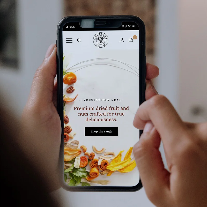
Simple, Fast, Mobile-Ready
We took a mobile-first approach to ensure the site performs smoothly on phones and smaller devices, where most users start their browsing. This meant prioritizing fast loading times, clear visuals, and straightforward navigation to create an effortless shopping experience. Once the mobile experience was solid, we then adapted the design to take advantage of larger screens without losing that simplicity and ease of use.
"I have now used Simplr for several digital & website projects and have been absolutely wowed by their professionalism, genuine interest, commitment and on deadline delivery, not to mention a great balance between creative design and functional business orientation. It is an absolute pleasure dealing with the team and they are the first digital agency I have been happy to recommend in a very long time."