Brief
TASK is a global clinical research organisation committed to advancing healthcare through ethical and innovative clinical trials. Despite being a leader in medical research, TASK’s existing brand and website no longer reflected the professionalism, clarity, or credibility of their work. They partnered with Simplr to refresh their brand and create a more engaging, future-proof digital presence.
Solution
Simplr developed a refined visual identity and modern, user-focused website that communicates TASK’s expertise with clarity and confidence. Featuring a sophisticated color palette, clean typography, and intuitive design, the updated brand reflects the organisation’s scientific rigor and forward-thinking approach. The website prioritises usability and accessibility, resulting in a polished, professional, and approachable experience that aligns with TASK’s leadership in clinical research.
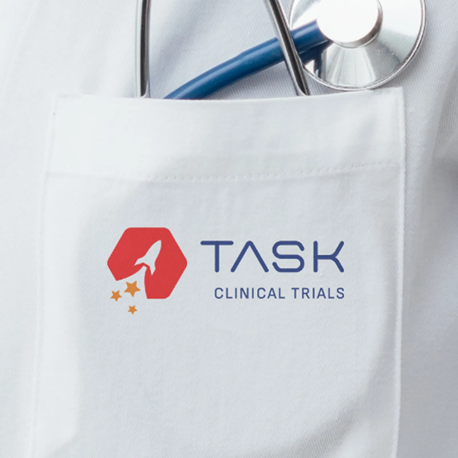
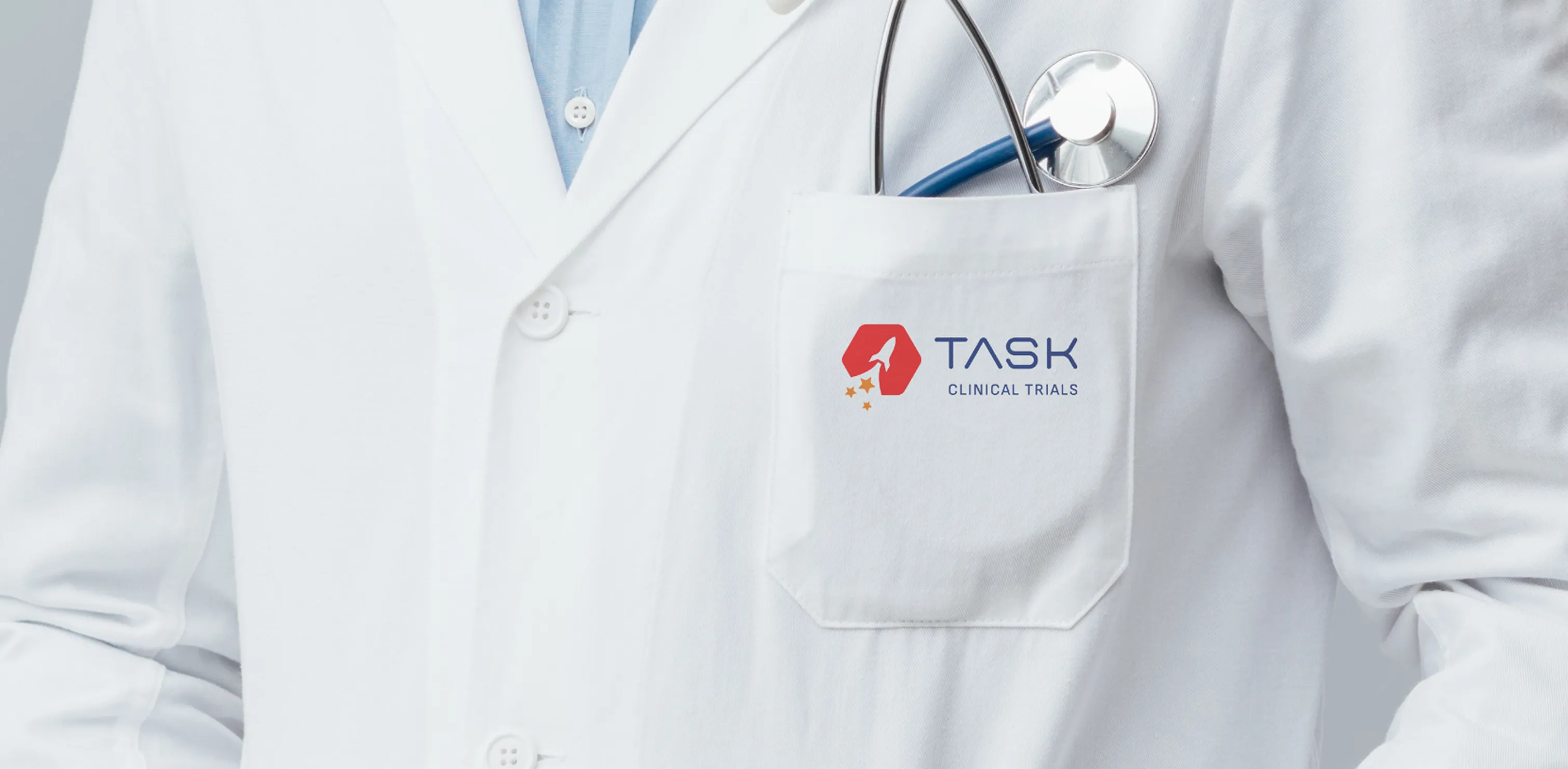
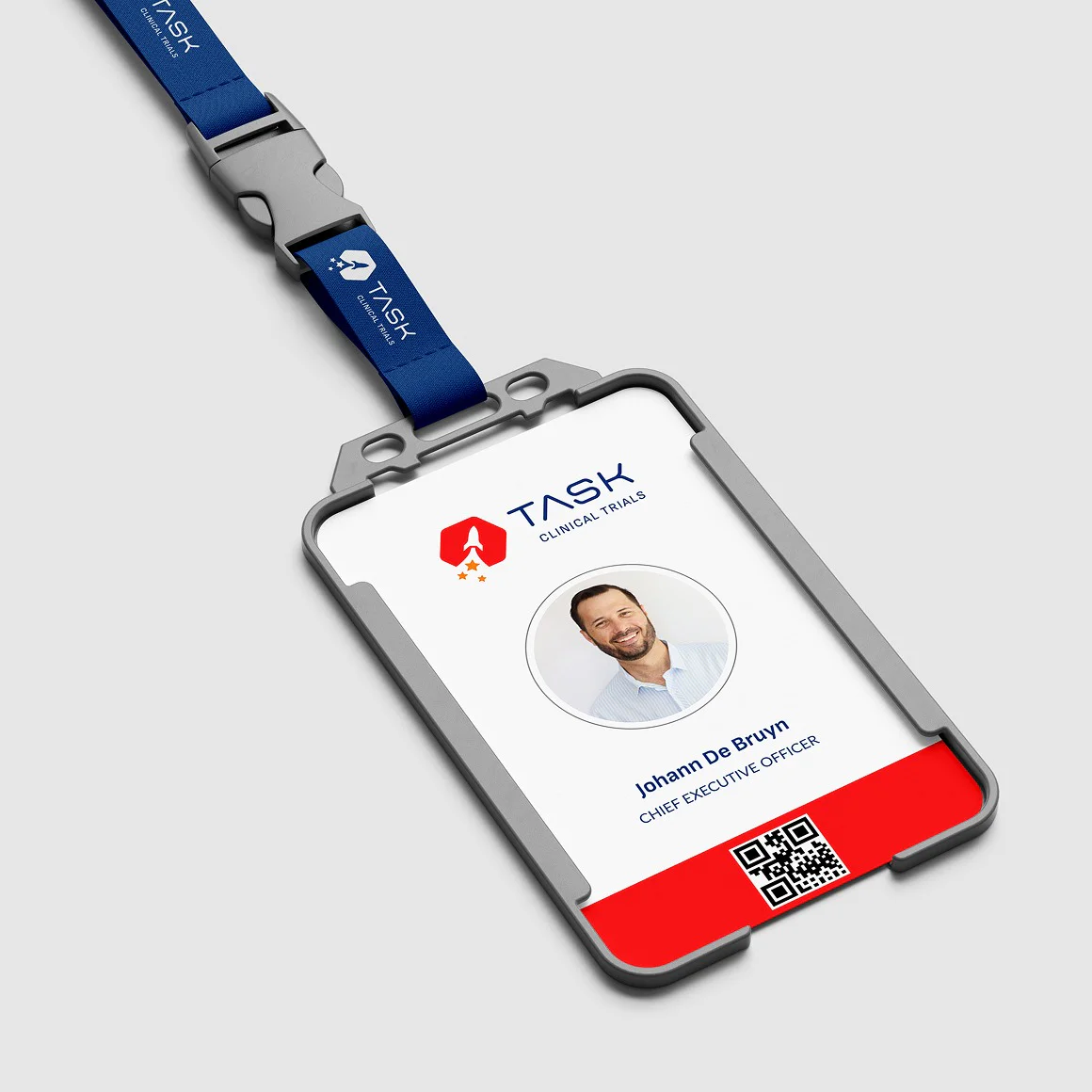
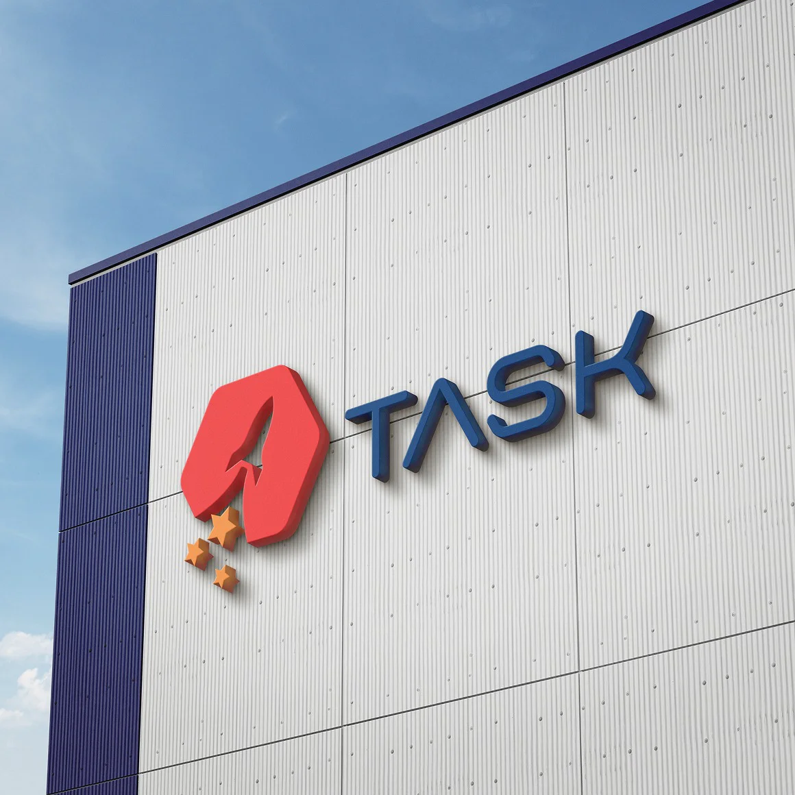
Brand Design
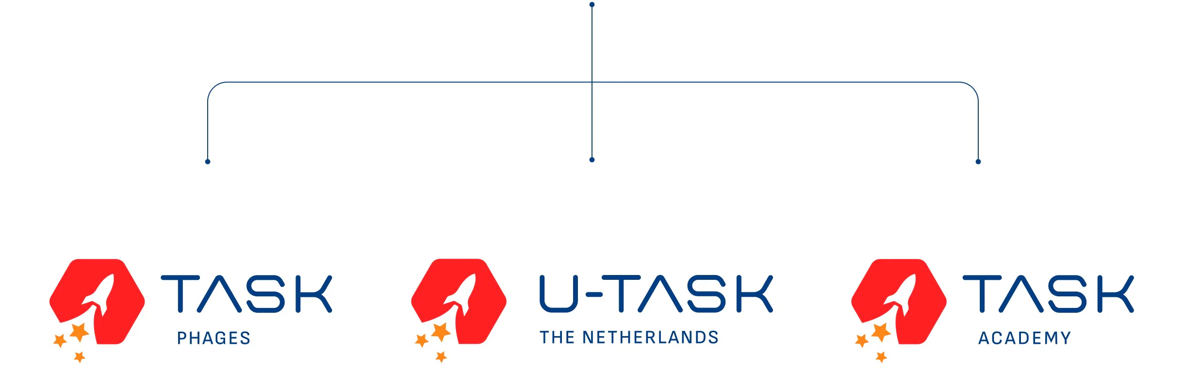
Sub Logos
Visual Language
UI & UX Design
Content Management System
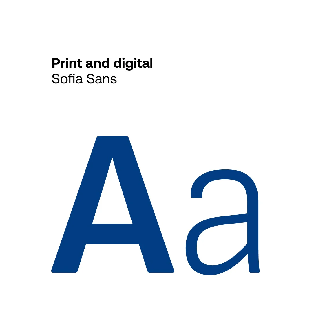
Typography
Sofia Sans was selected as the new corporate typeface for its versatility and approachable character. With a wide range of weights, it adapts easily across various applications – from headlines to body copy – while its subtle rounded corners add a softer, more human touch that aligns with the refreshed brand identity.
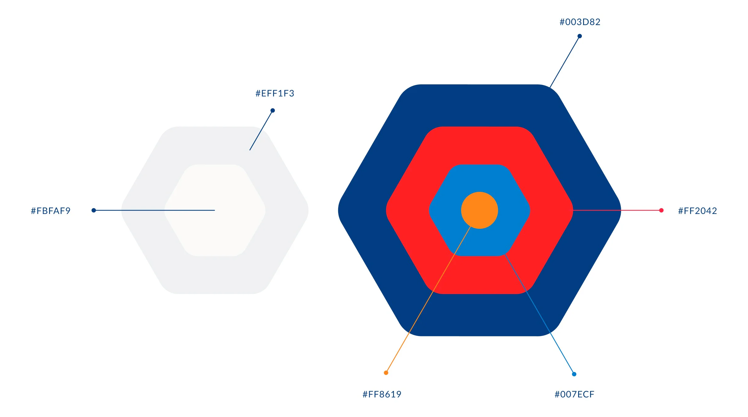
Colour palette
The previous brand's color palette was refined to a more focused selection, combining both warm and cool tones to reflect the dual nature of TASK’s work – balancing clinical precision with a compassionate, human-centered approach.
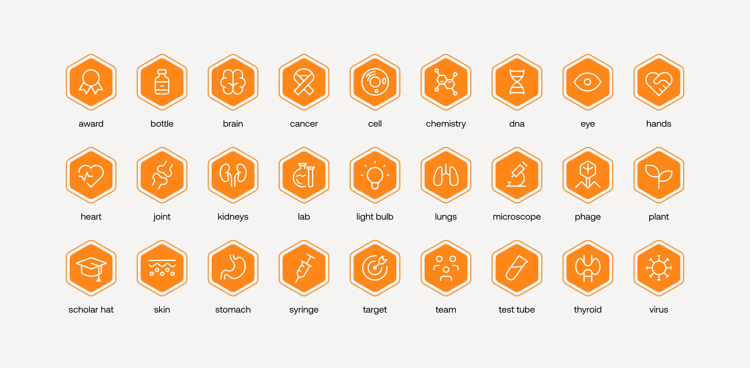
Iconography
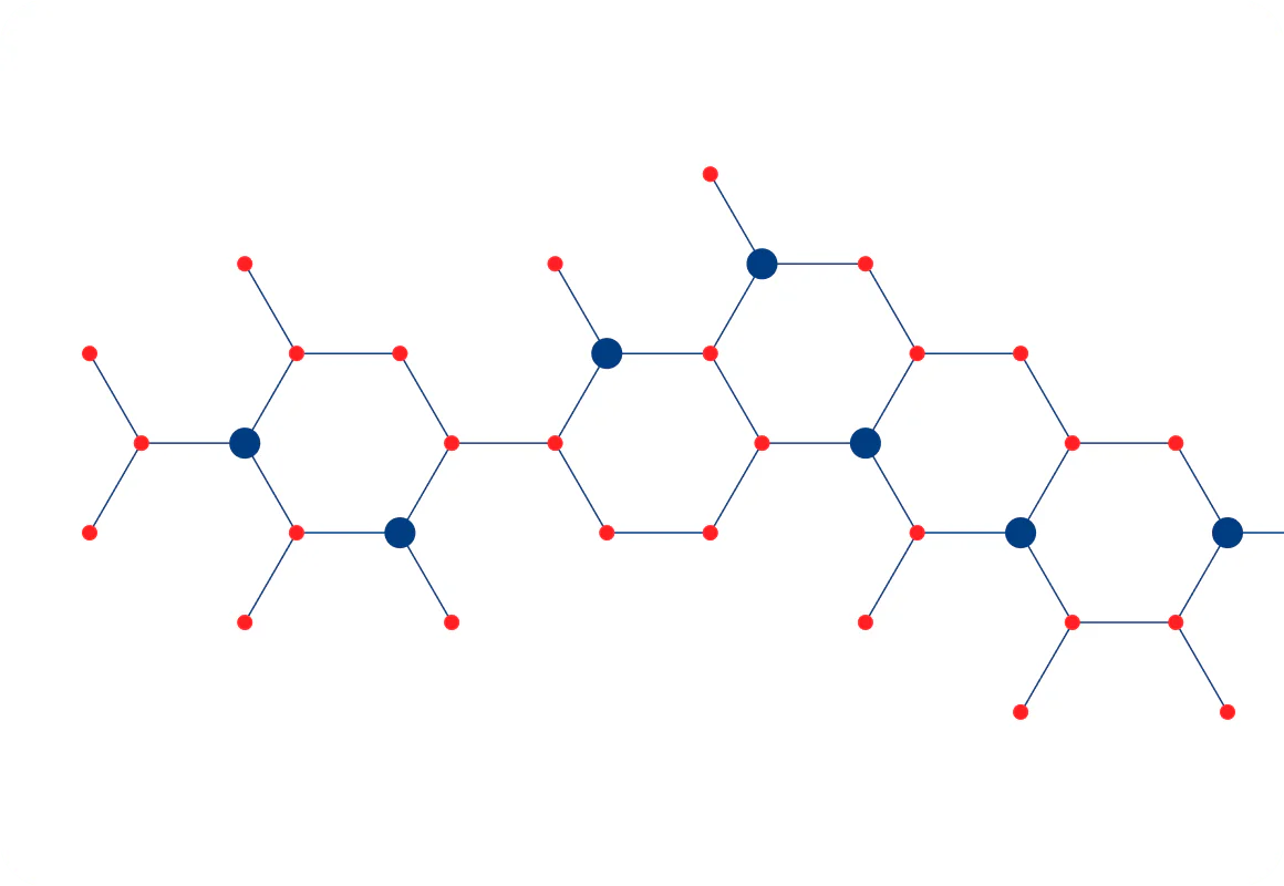
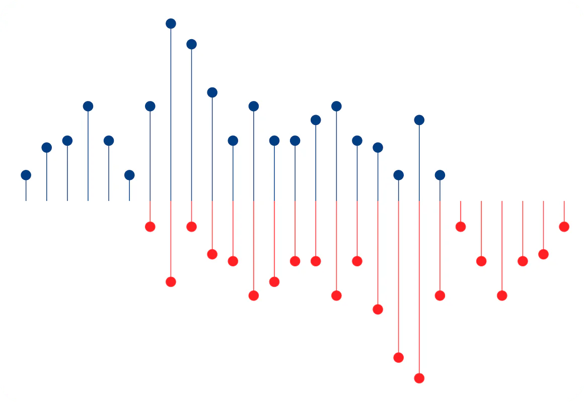
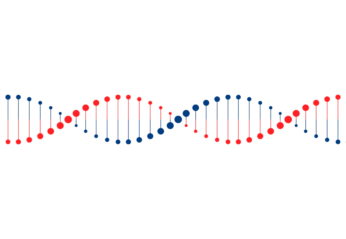
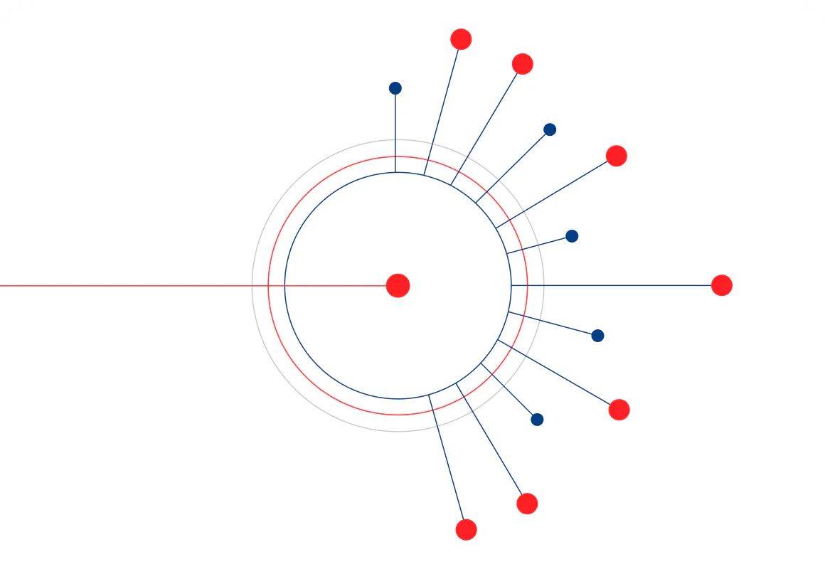
Visual language
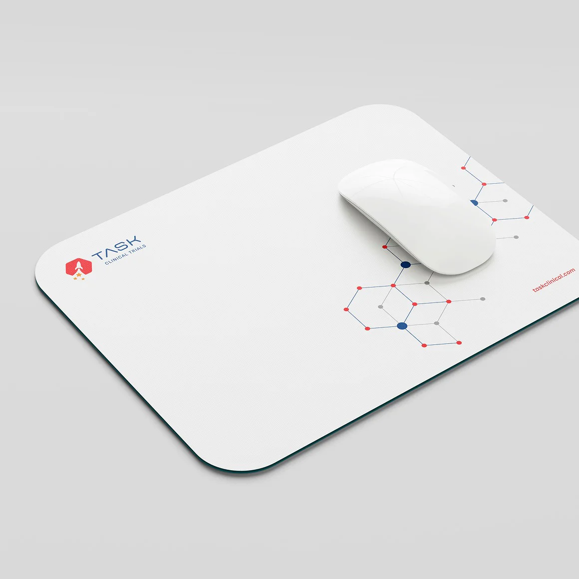
The brand refresh includes a new suite of graphic elements featuring lines and dots, designed to visually represent molecular structures and statistical research charts. These graphics help to convey the scientific foundation of TASK’s work, while adding a dynamic and modern visual language that reinforces the brand’s focus on innovation and data-driven research.
Website
The new website incorporates ample white space to create a clean, clinical atmosphere, while subtle, streamlined micro-animations are used throughout to enhance user engagement and provide a smooth, intuitive browsing experience.
"I recently had the pleasure of working with SIMPLR on the design of our new website, and I couldn't be more pleased with the results. From start to finish, the entire team was professional, responsive, and dedicated to creating a website that met our needs and exceeded our expectations."