Brief
Gain Theory is a leading marketing effectiveness and foresight consultancy with a mission to put quality data at the heart of every investment decision. Available in more than 111 markets, with multiple award-winning solutions, we set out to align this tech giant with a brand that speaks of their unmatched expertise.
Solution
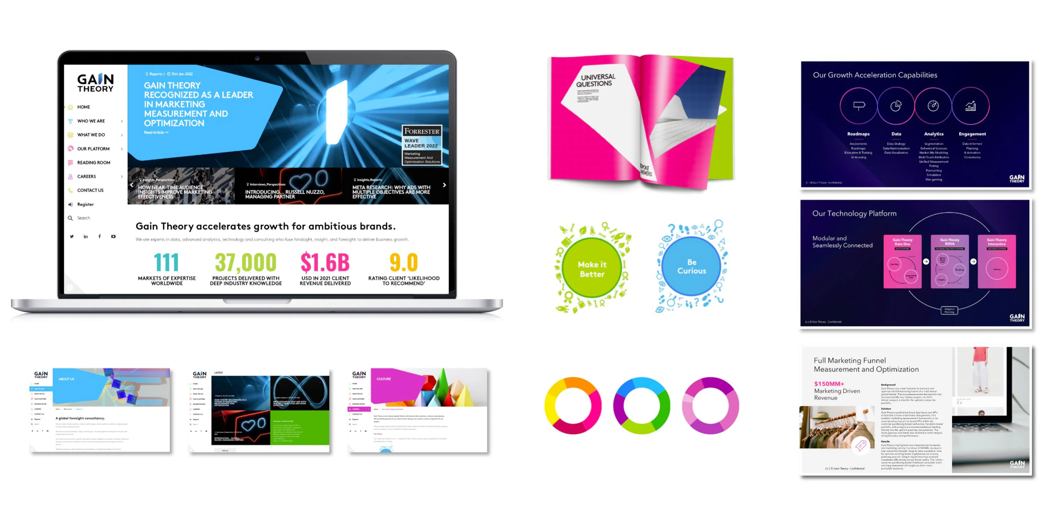
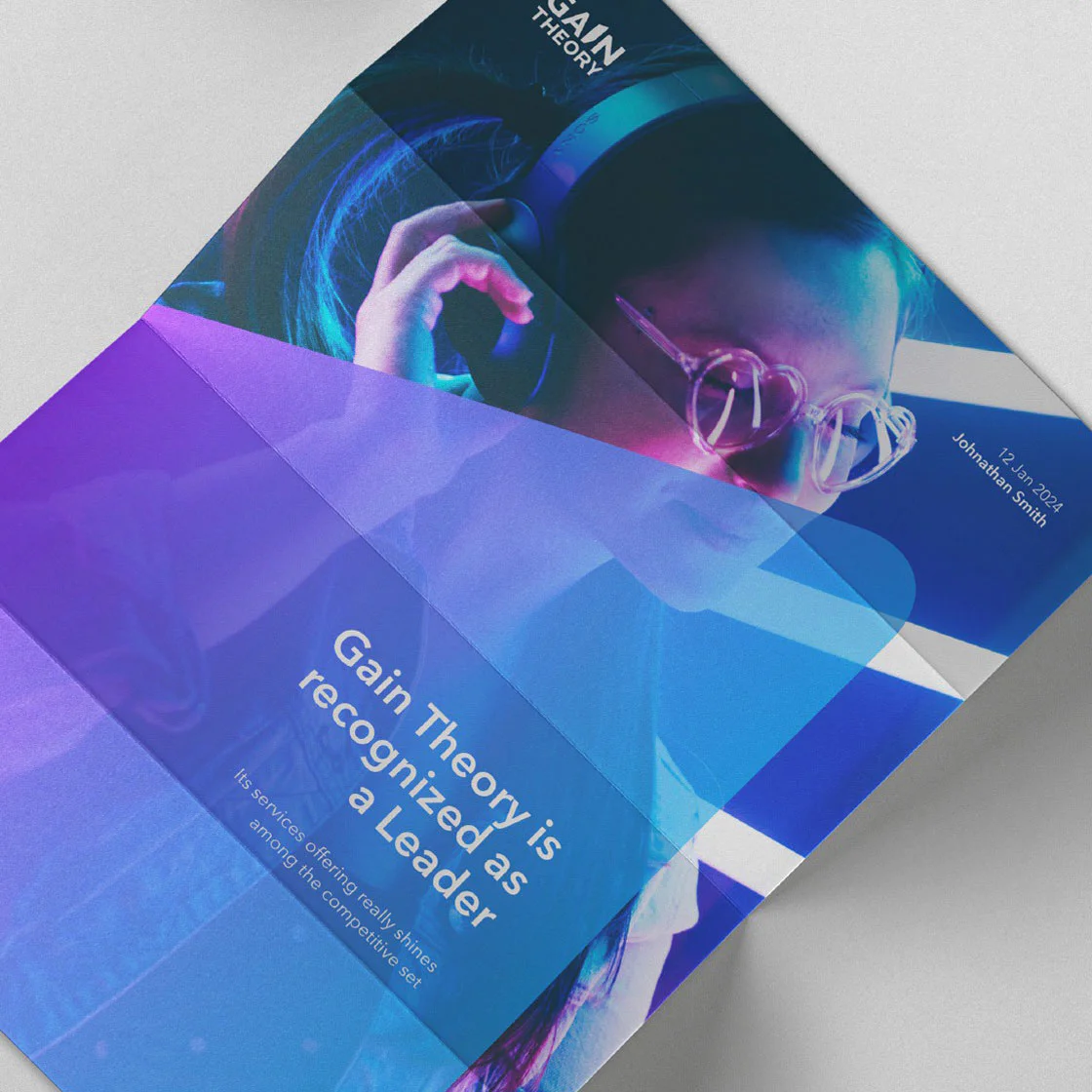
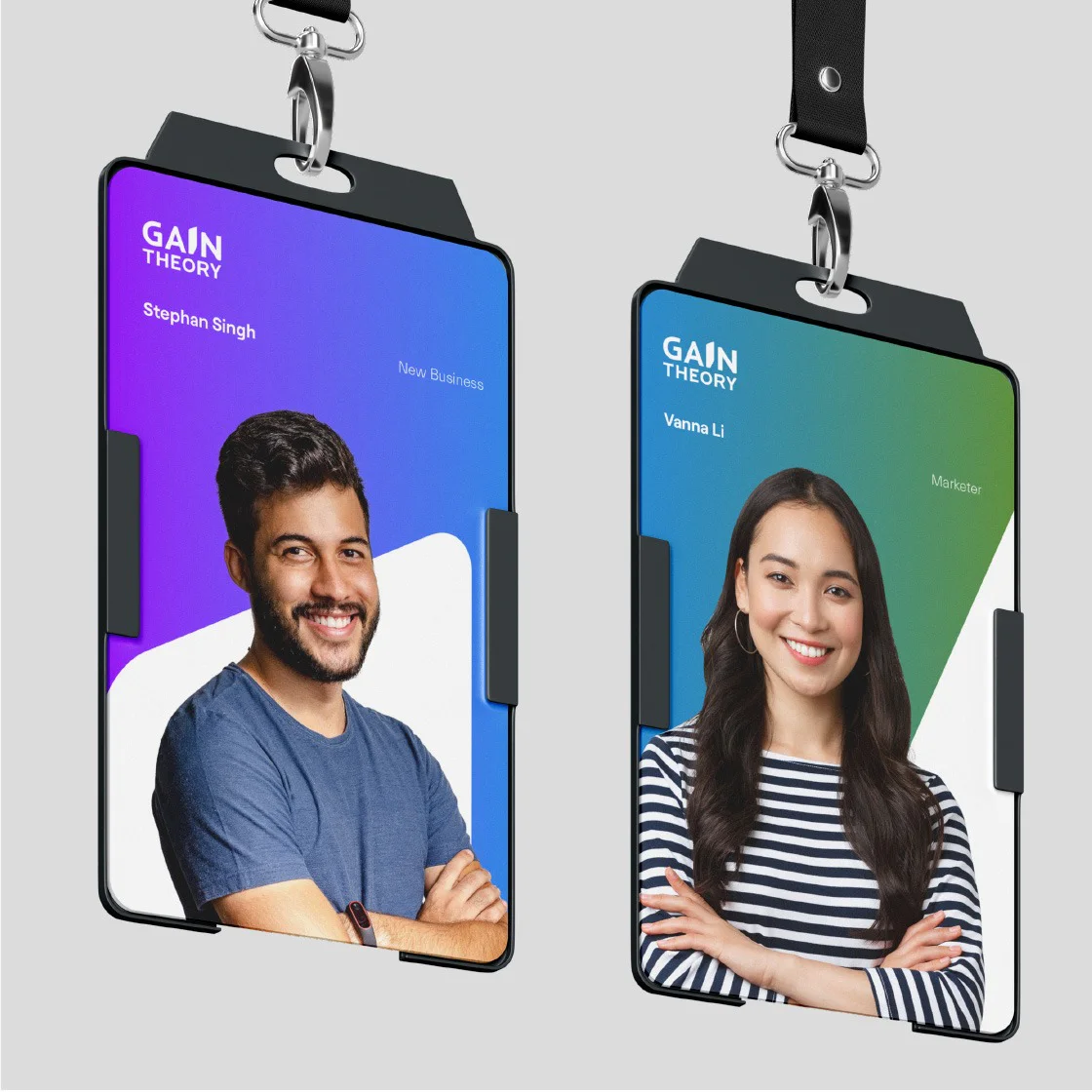
Simplr was tasked to refresh the Gain Theory brand, while retaining the equity of their existing brand identity and colours. For a unified experience, the refreshed brand was rolled out across all channels, including marketing collateral, social media and the new website.
Visual Language
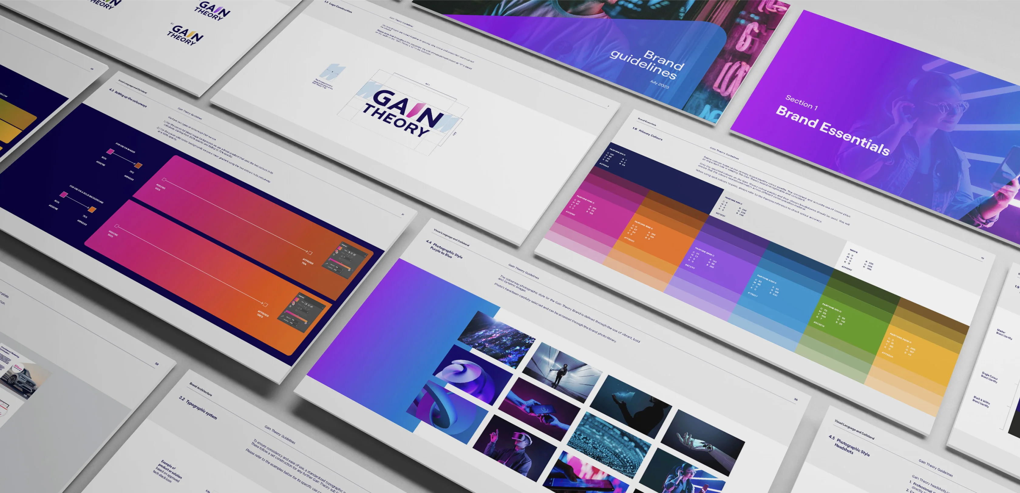
Brand Guidelines
Sub Logos
Microsoft Template Creation
Social Media Templates
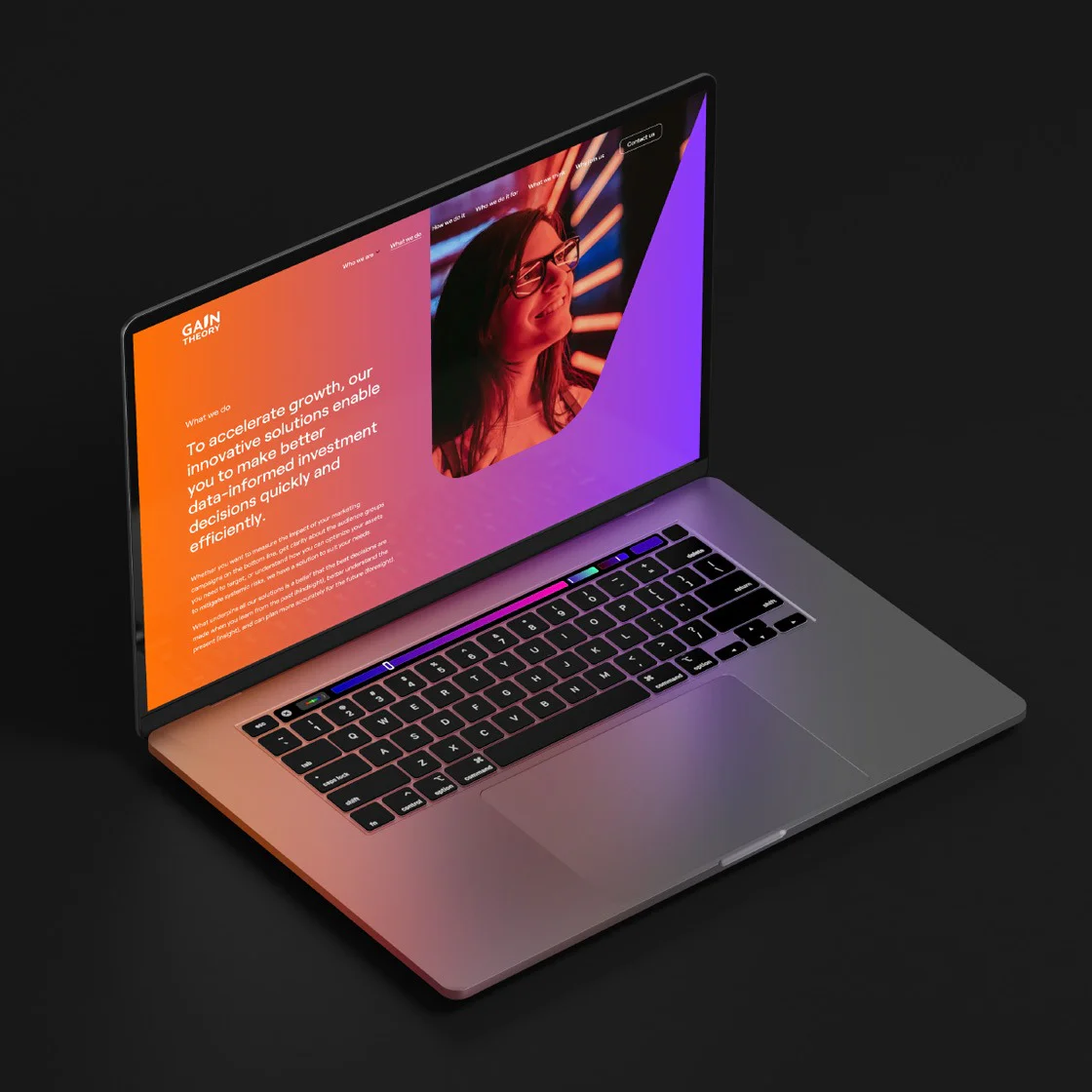
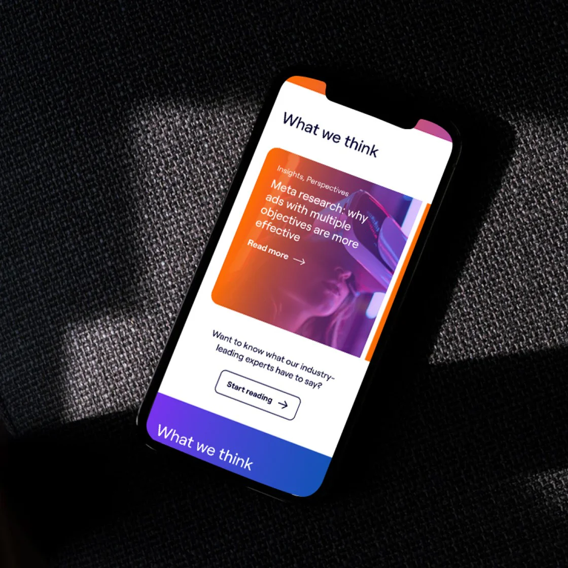
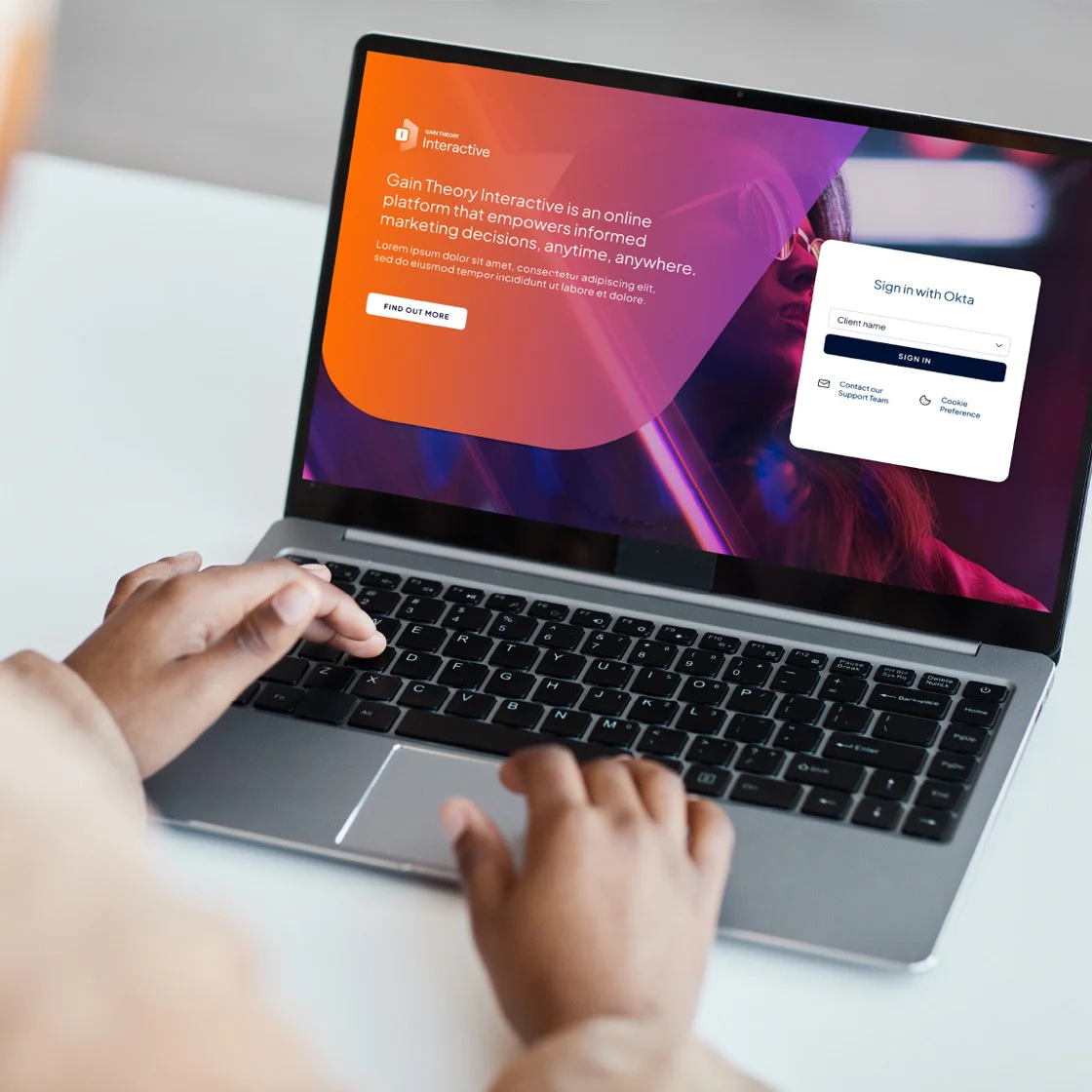
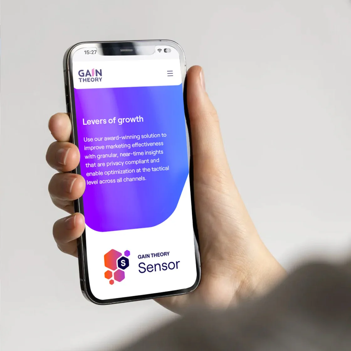
UI/UX Design
Content Management System
Motion Graphics
Snapshot of the original brand
Our approach
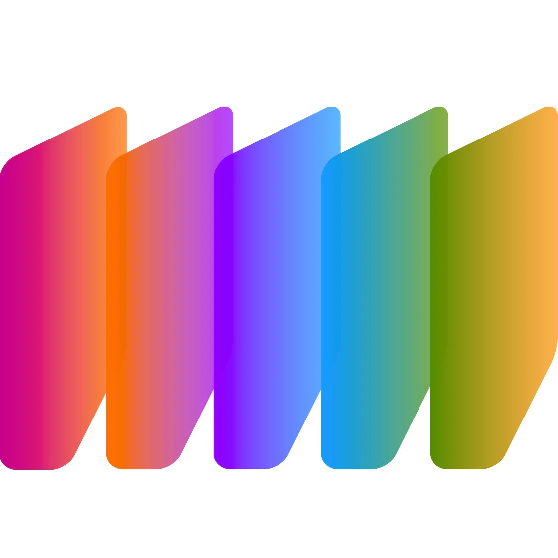
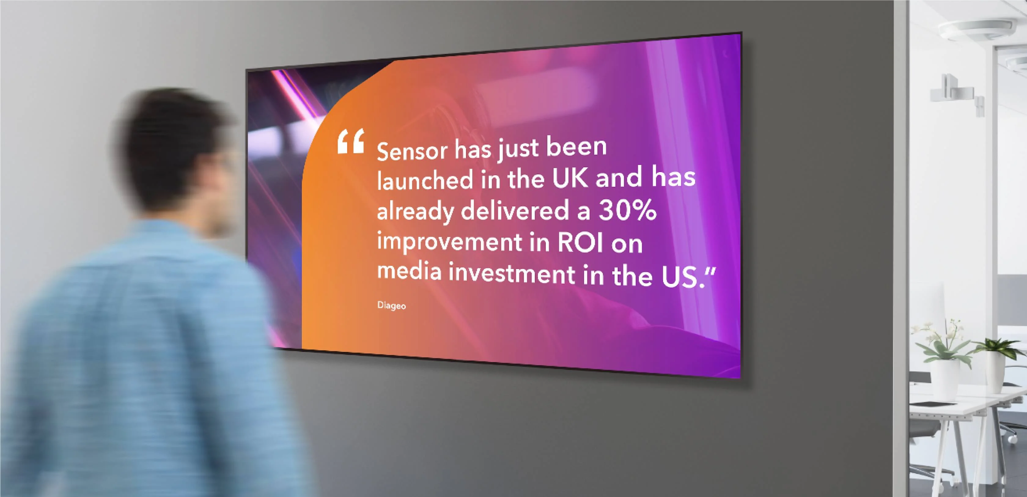
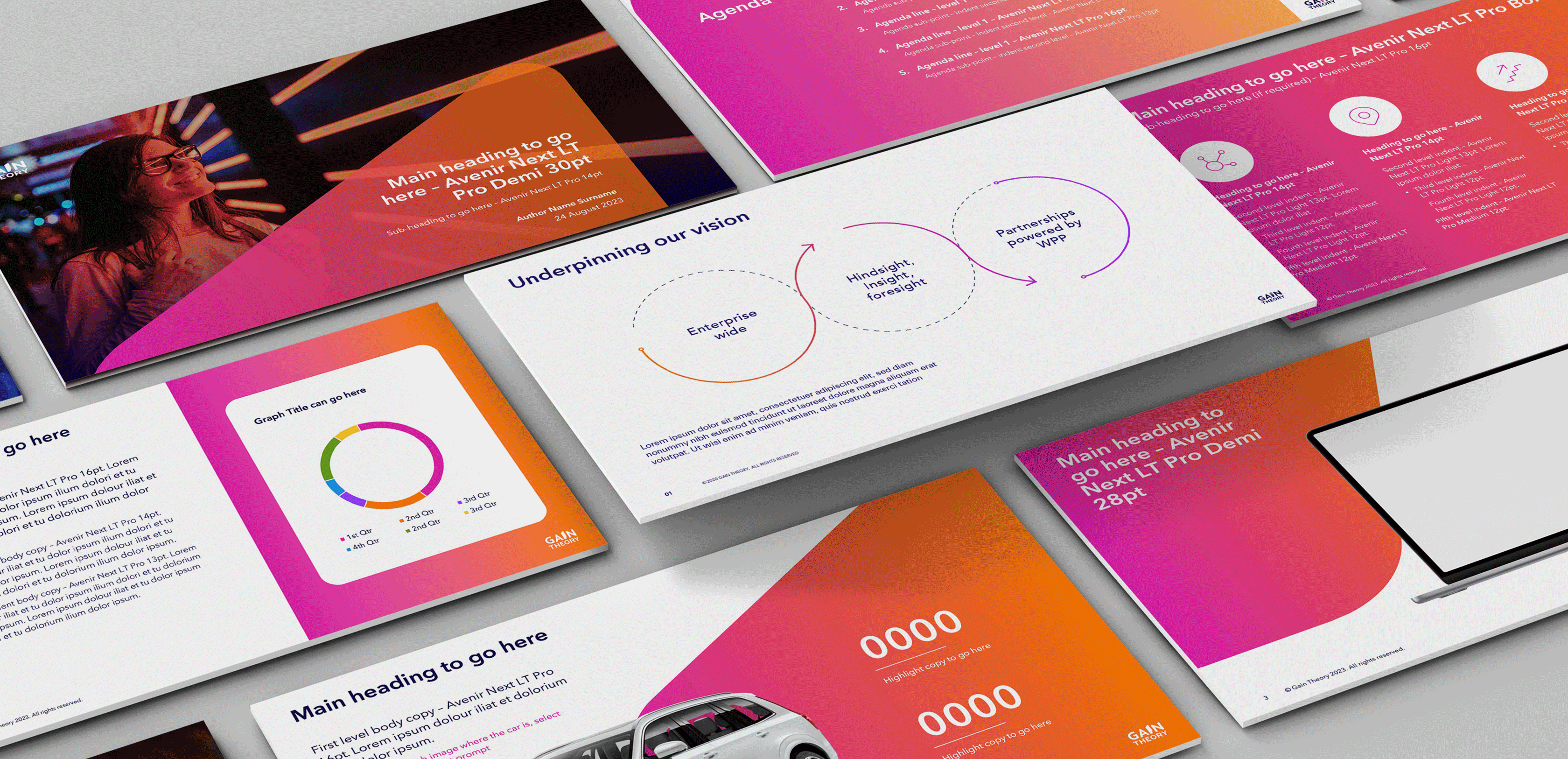
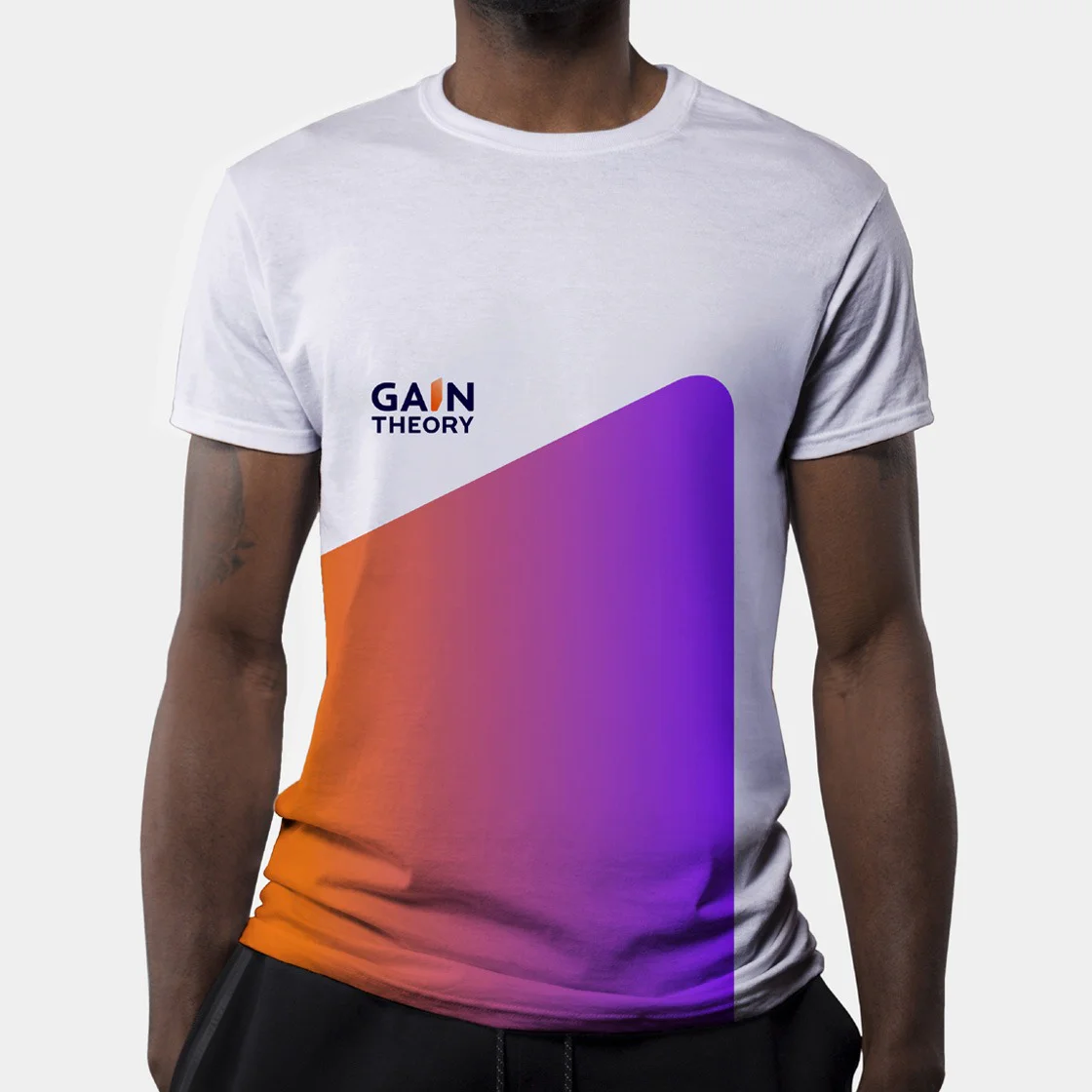
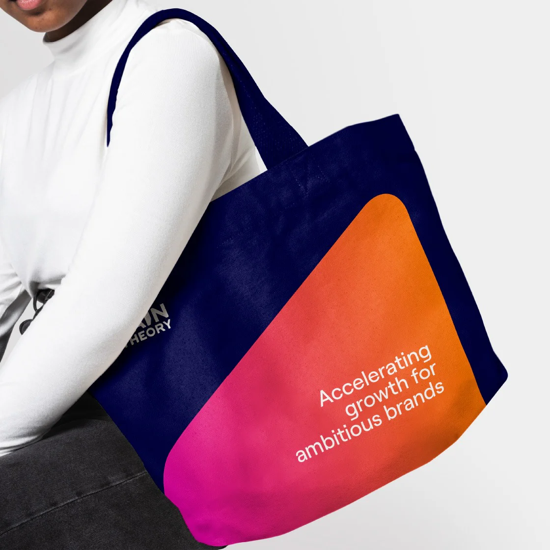
Due to our mandate to retain the existing equity of the brand, we opted to refresh the existing colours and added a sixth to create five tonal gradients – also known as the Gain Theory colourways.
Each colourway is used with its respective logo and has a set of images curated especially for it, as seen below in the updated colour palette.

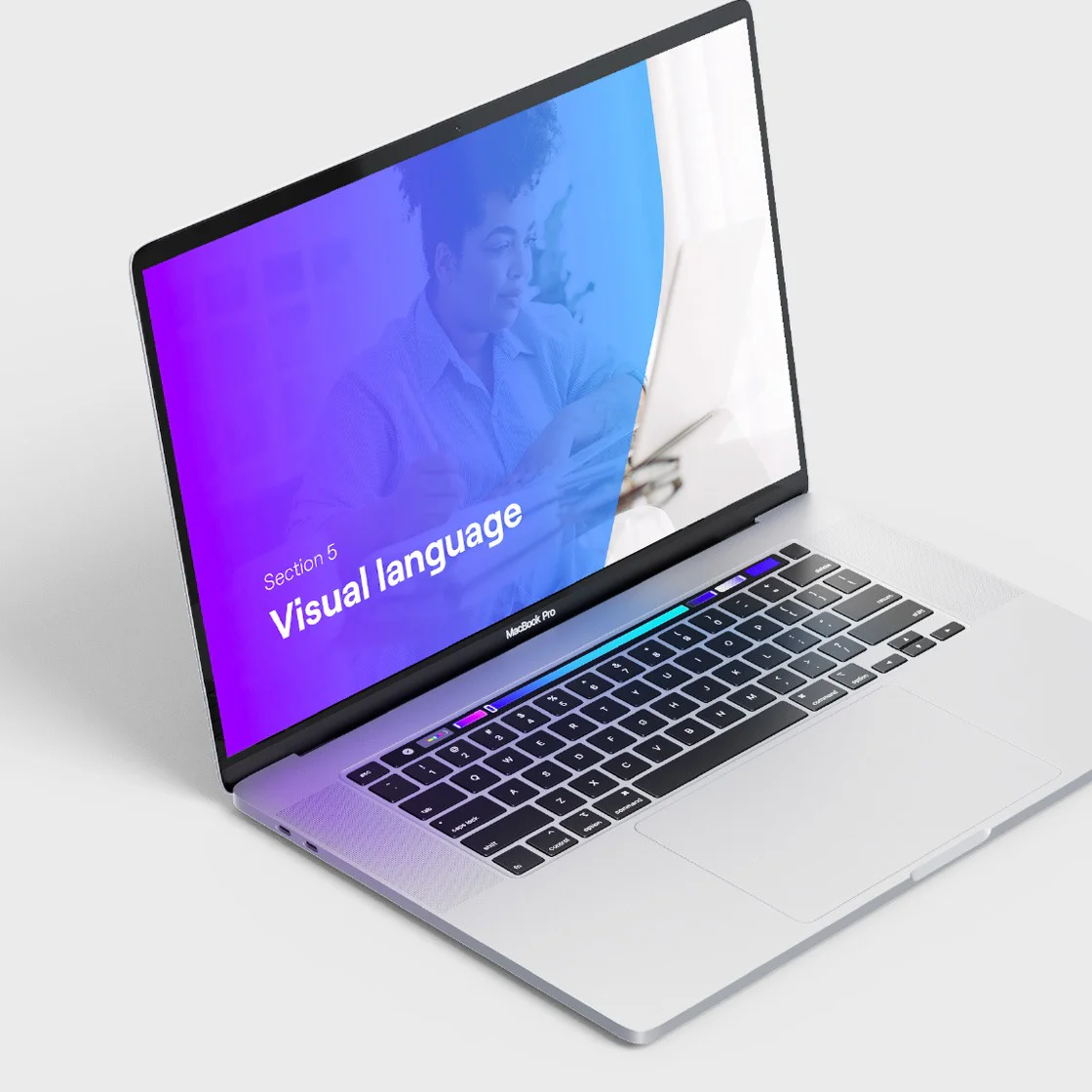
Visual language
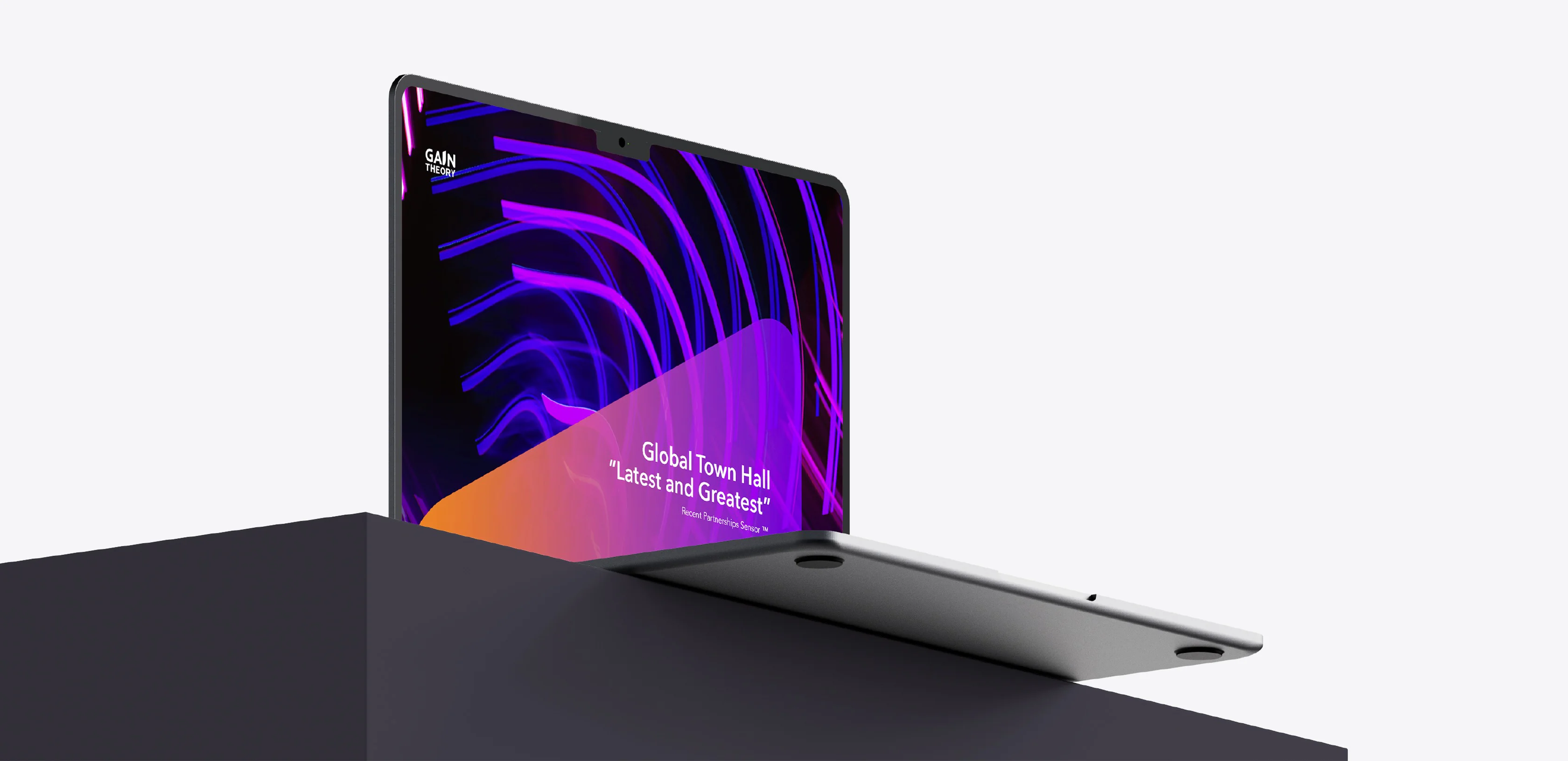
The “I” from the Gain Theory logotype forms the basis of the visual language, and can be used as a singular super graphic that pans up or down or as various crops within a layout.
Typography and colourways
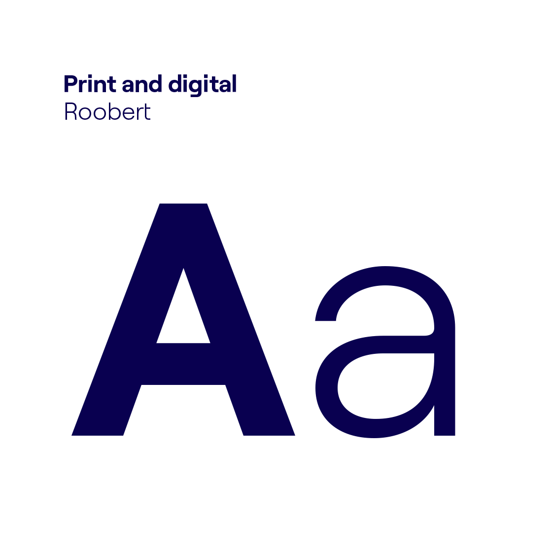
We chose a bespoke sans serif typeface, Avenir Next LT pro, as the primary corporate typeface for print and digital collateral to set the brand apart from its competitors.
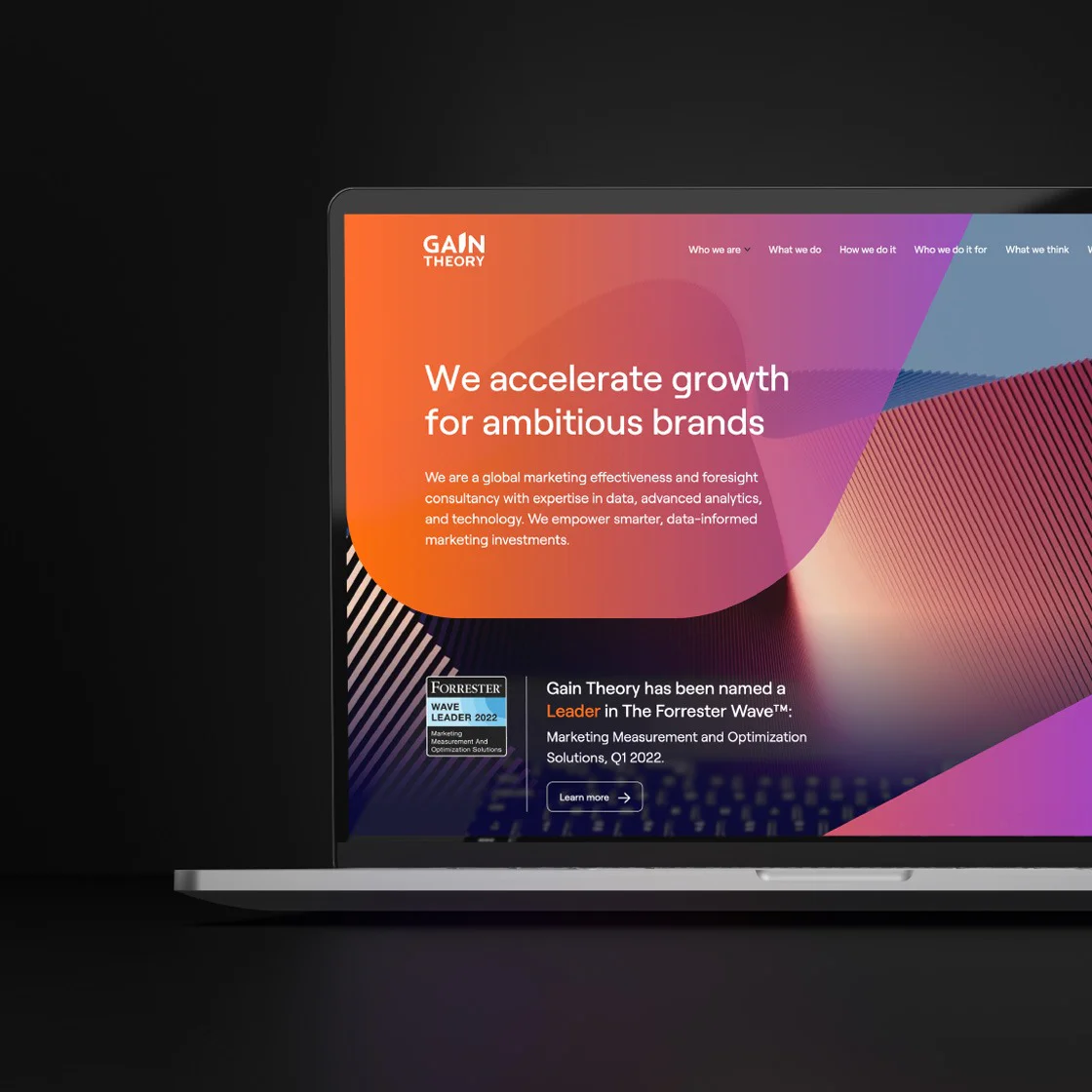
Creating a unified brand presence
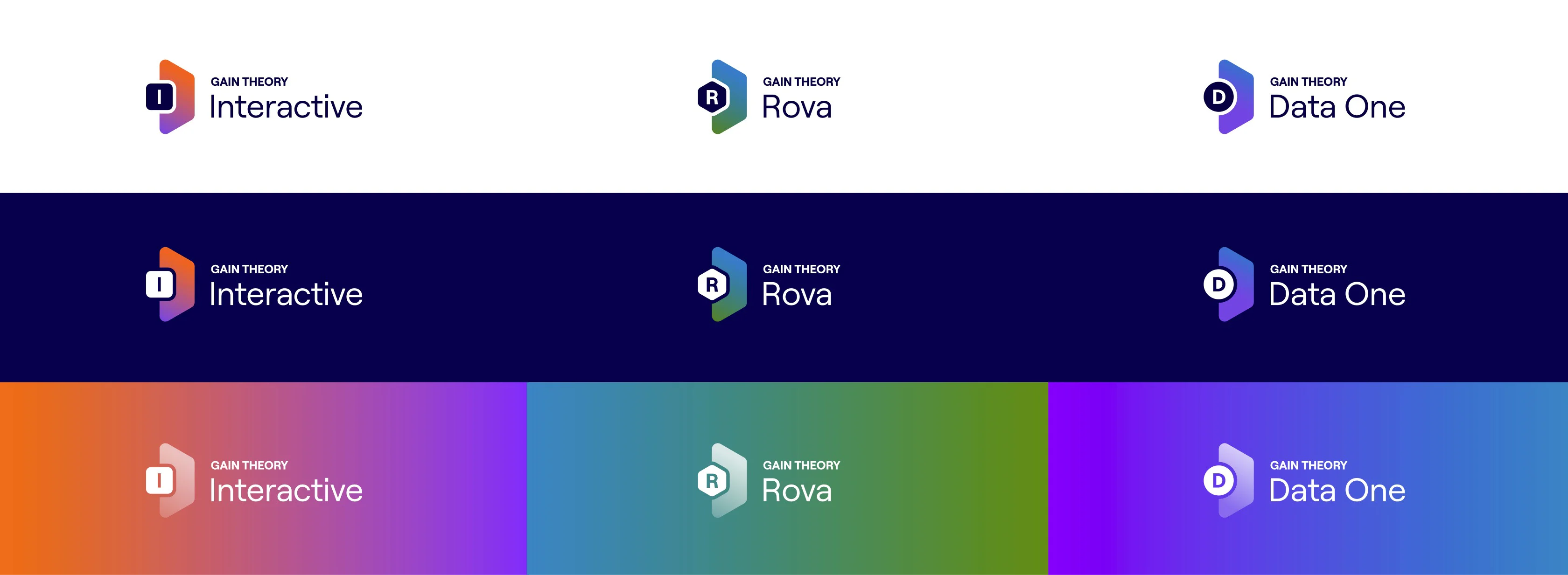
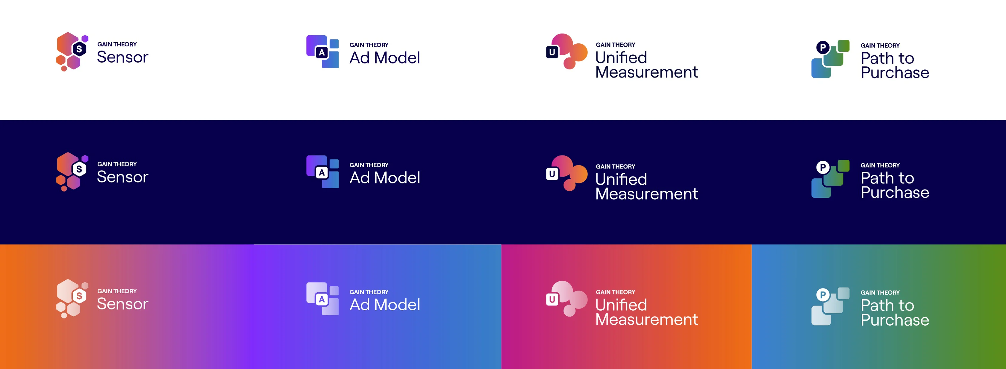
As part of the comprehensive brand refresh, we conducted a thorough analysis of the brand’s existing architecture. The primary objective was to align their range of products and services – including platforms, solutions, academies, centers of excellence, and initiatives – with the newly established visual language.
Firstly, we established clear and distinct guidelines that govern these various entities. The guidelines were designed to facilitate the seamless integration of any future identities into the hierarchical framework.
Creating a typographic system
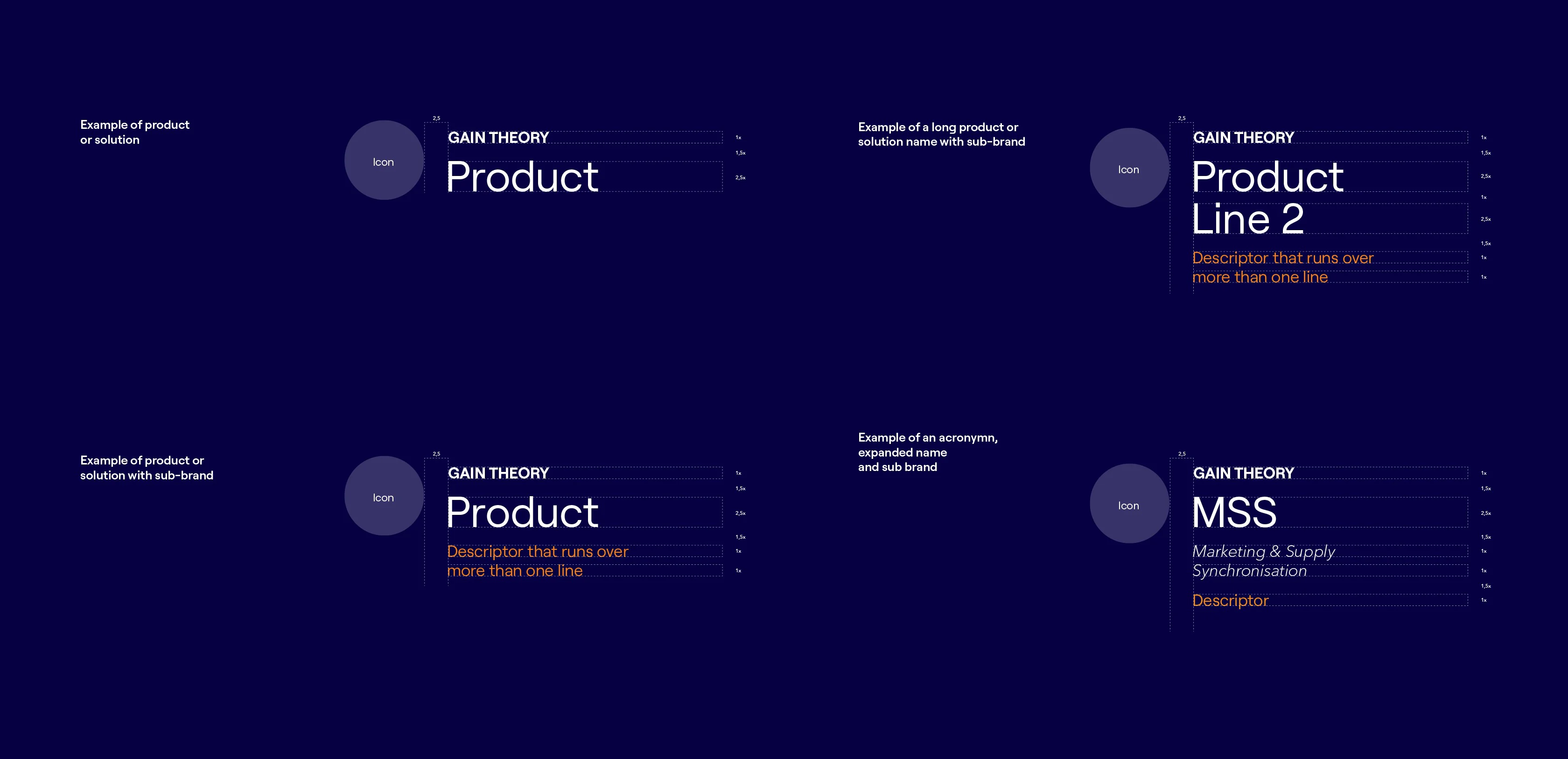
Snapshot of the brand hierarchy redesign

Brand Guidelines that Define. Align. Inspire.
Another key deliverable of the brand refresh was an extensive brand guide, from identity and usage to visual language and application. The guide serves to aid in any future design needs for suppliers and/or clients.