Brief
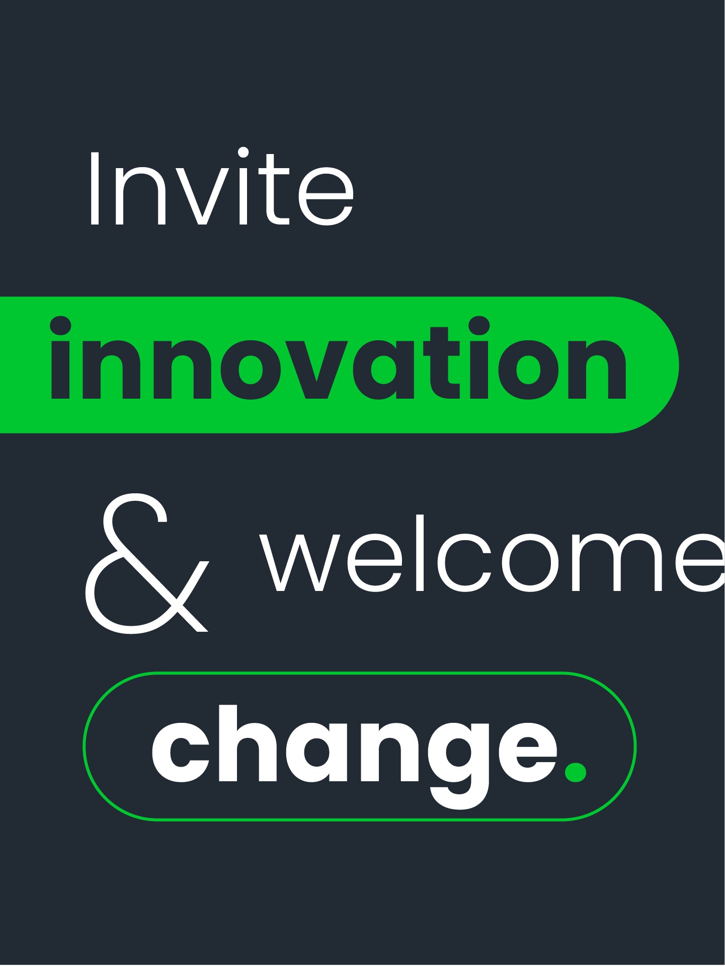
PaySpace partnered with Simplr to refresh its brand identity and strengthen its competitive positioning in international markets. The goal was to modernise the visual identity, highlight strategic value, and deliver a consistent suite of assets for use across all platforms. The new identity needed to reflect PaySpace’s role as a foundation for future-ready workforce management, enabling organisations to adapt and thrive in an evolving business environment.
Solution
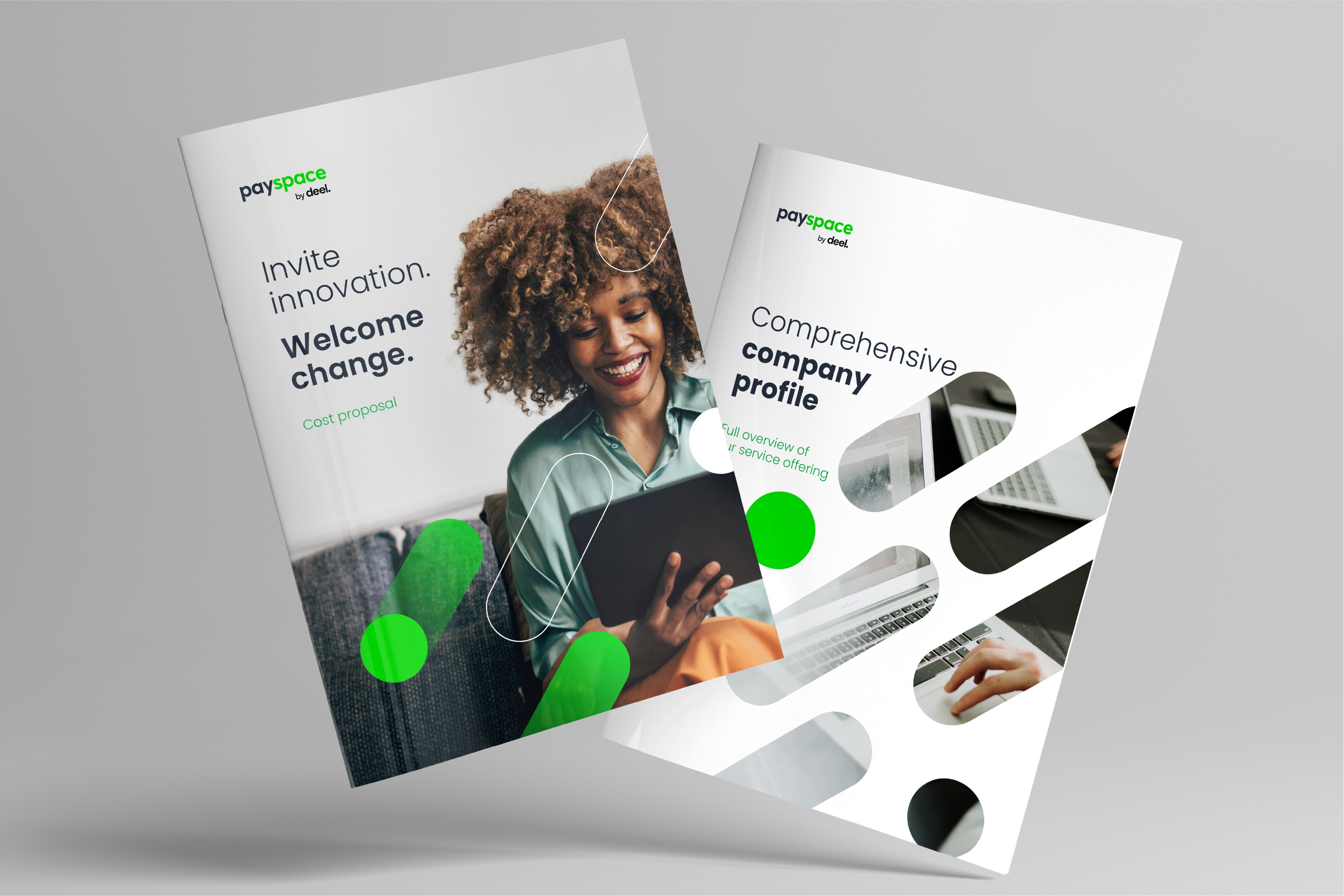
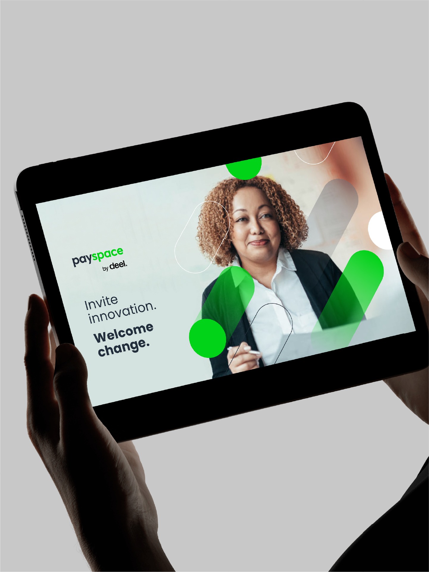
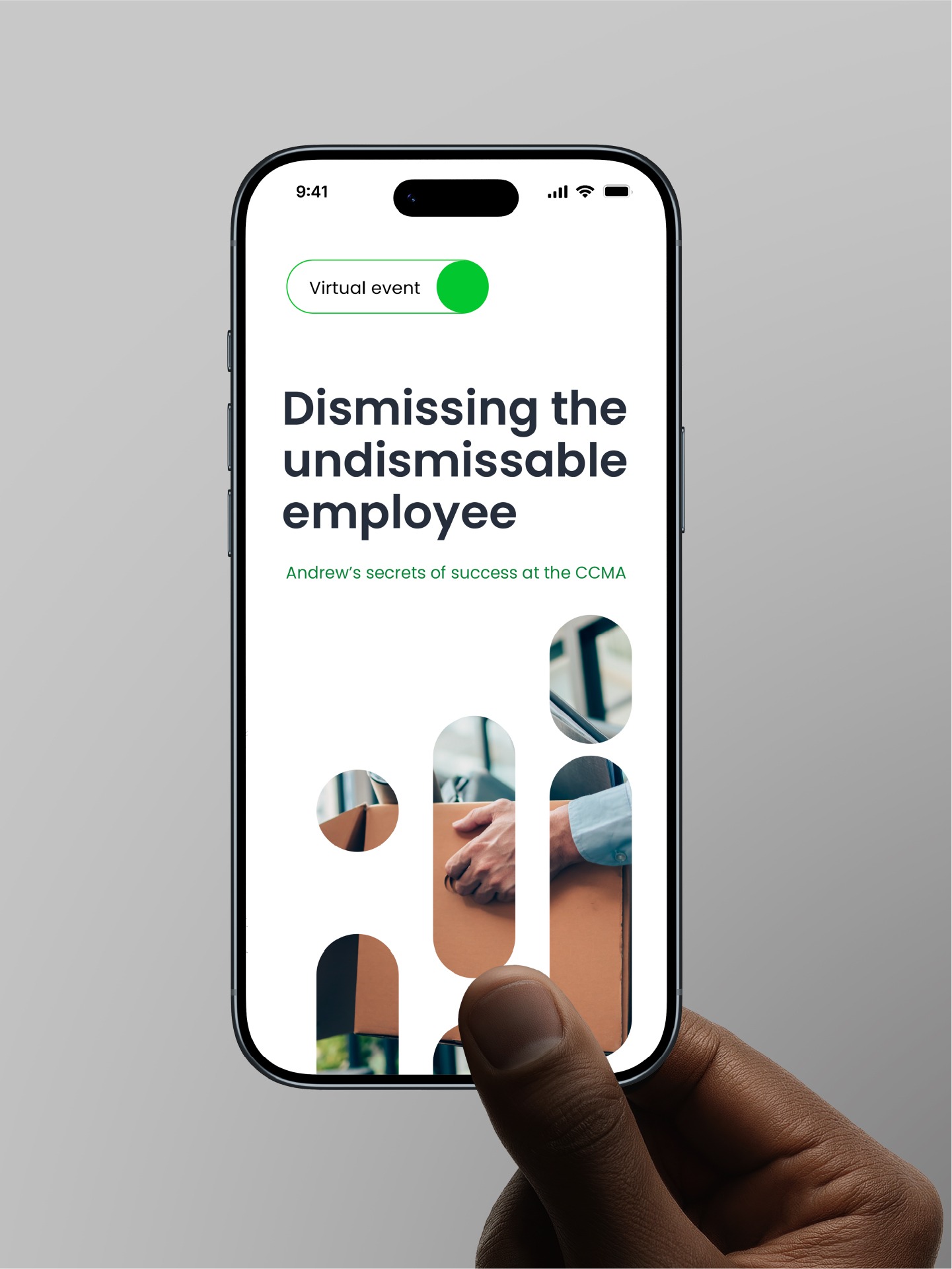
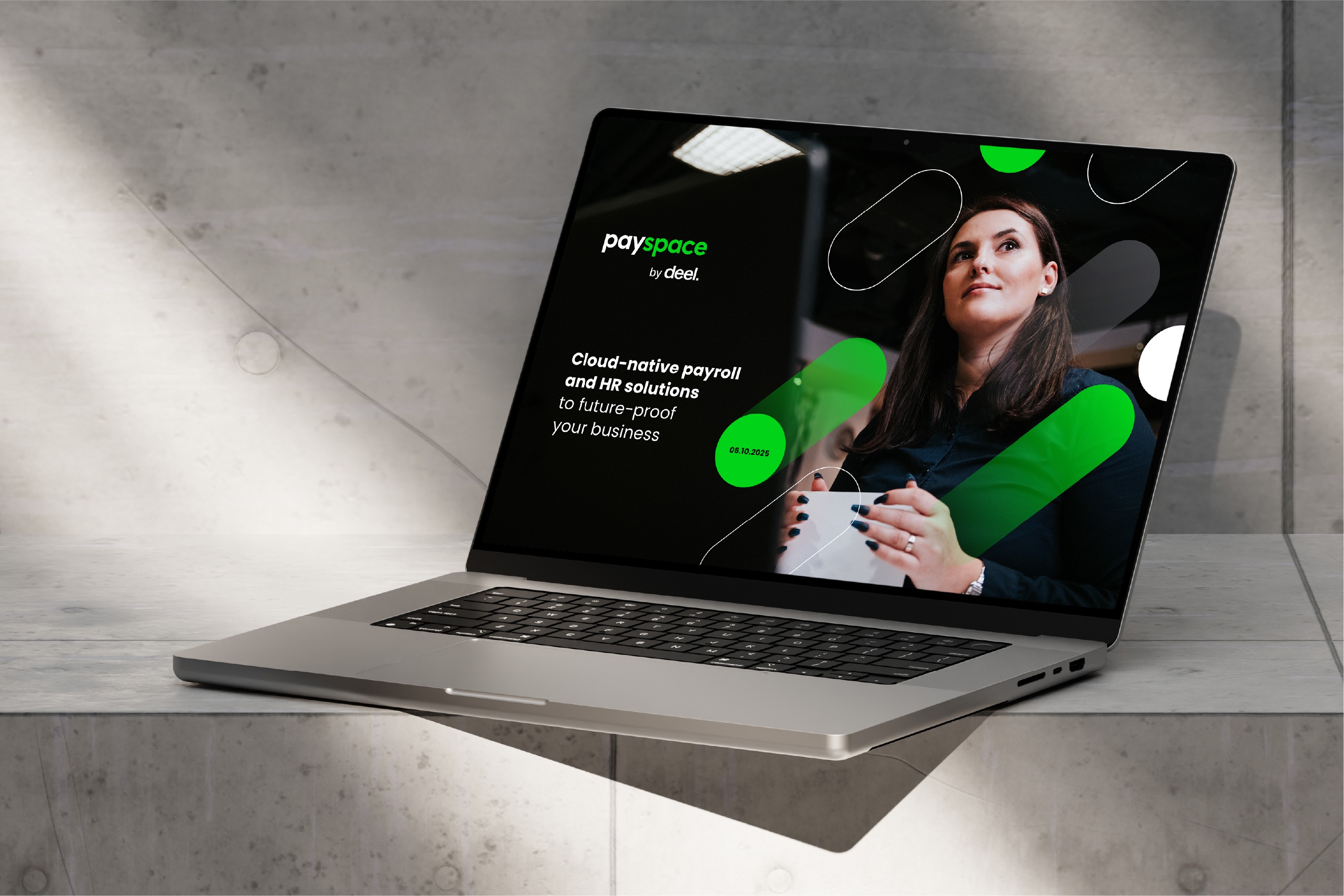
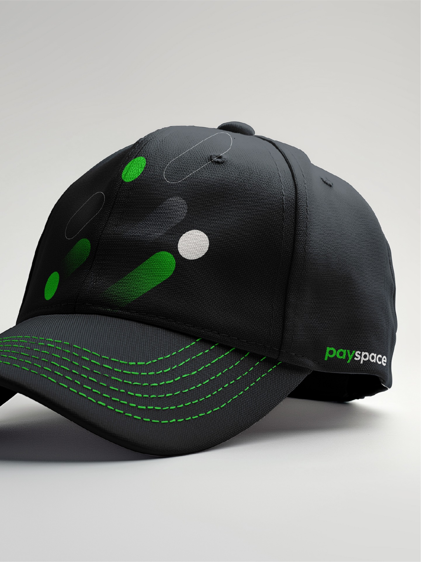
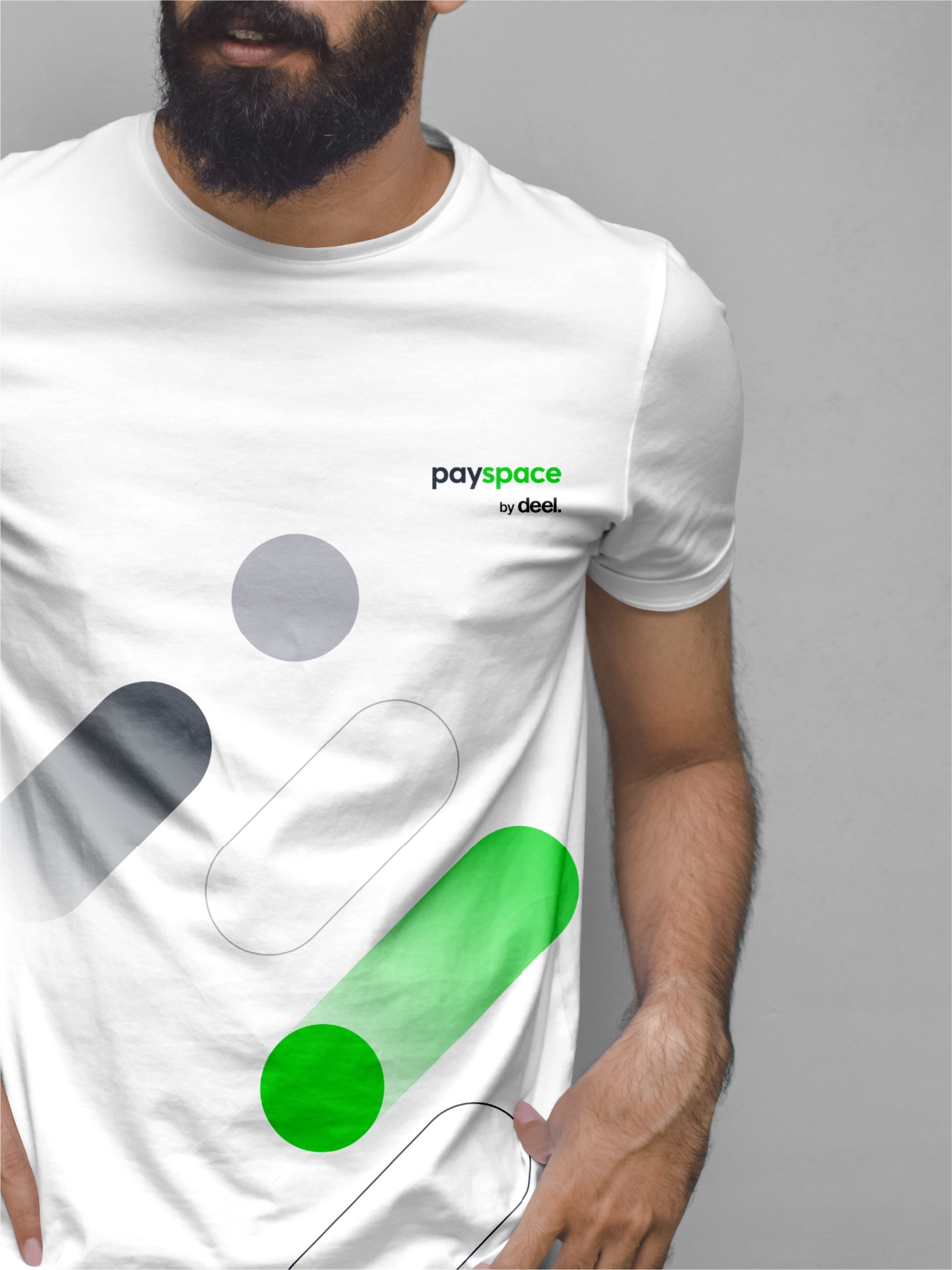
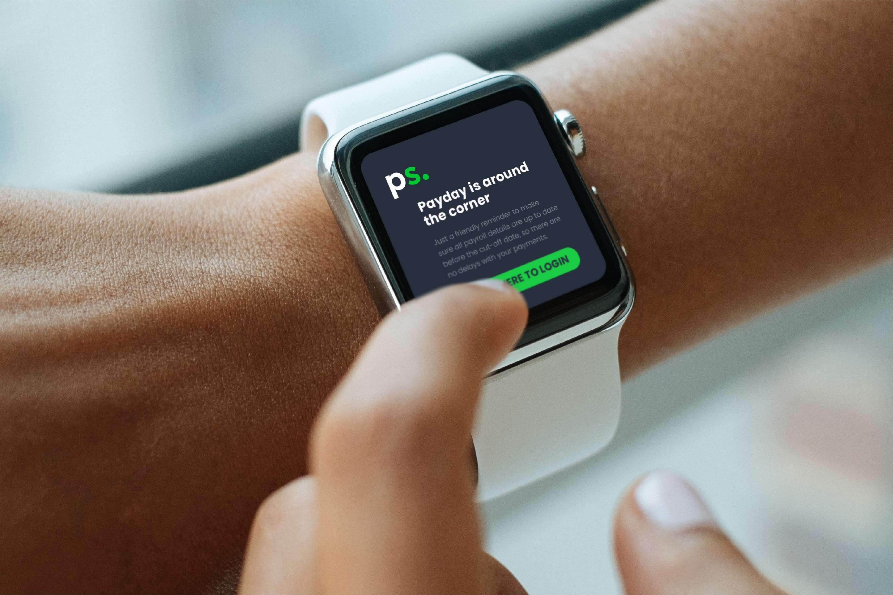
Simplr refreshed the PaySpace identity, introducing an acronym version for international recognition and creating a modern visual language anchored in rounded linear shapes that symbolise momentum and growth. Intentional use of solid and gradient colours communicates both reliability and scalability, reinforcing PaySpace’s role as a trusted yet forward-looking partner. Practical assets, such as PowerPoint templates, icon set, curated imagery, and a logo animation, ensured consistent rollout across platforms. The new identity was launched seamlessly and received highly positive feedback from both internal and external audiences.
Logo Evolution
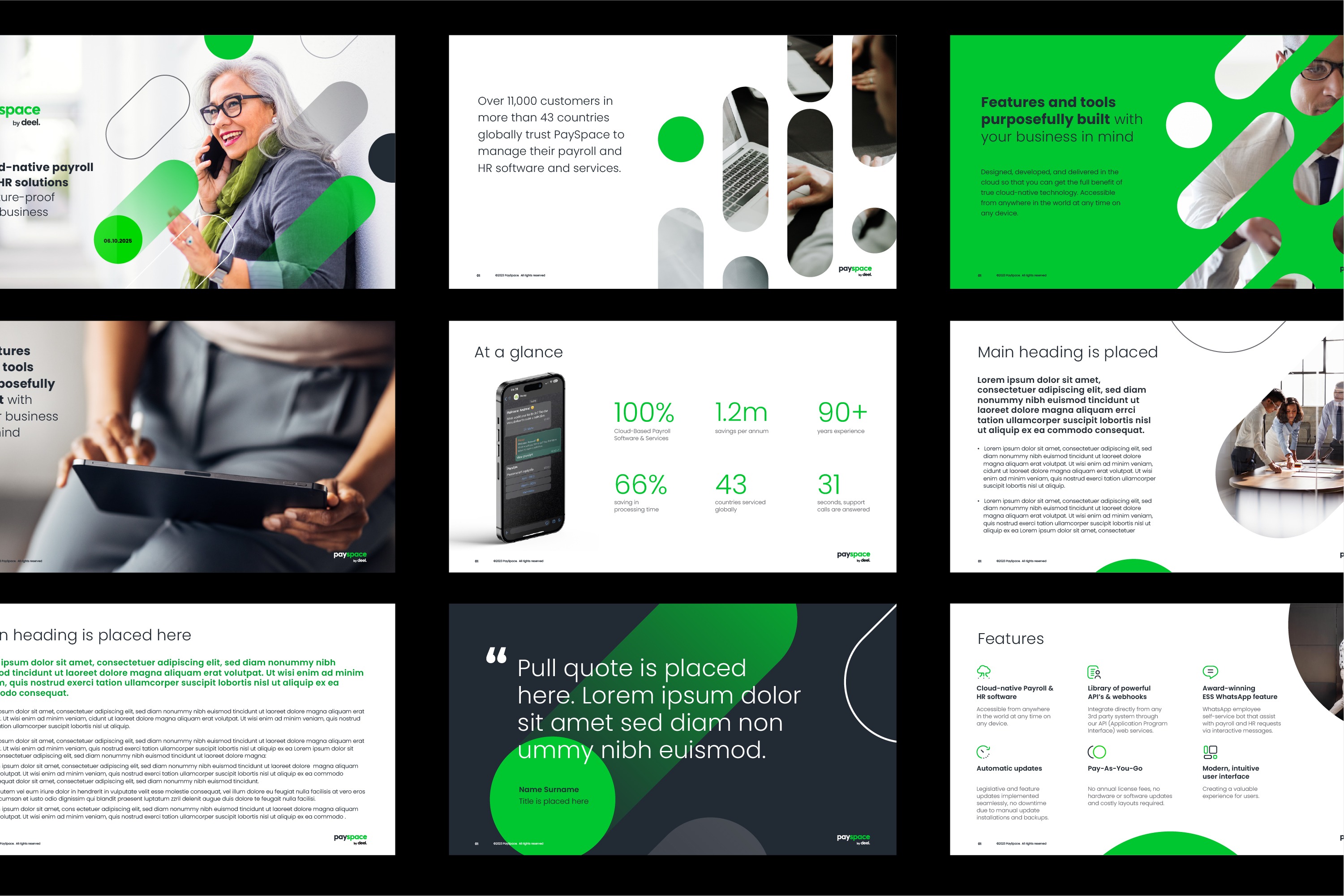
Microsoft Template Creation
Social Media Templates
Motion Graphics
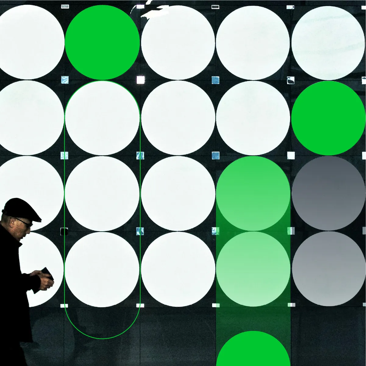
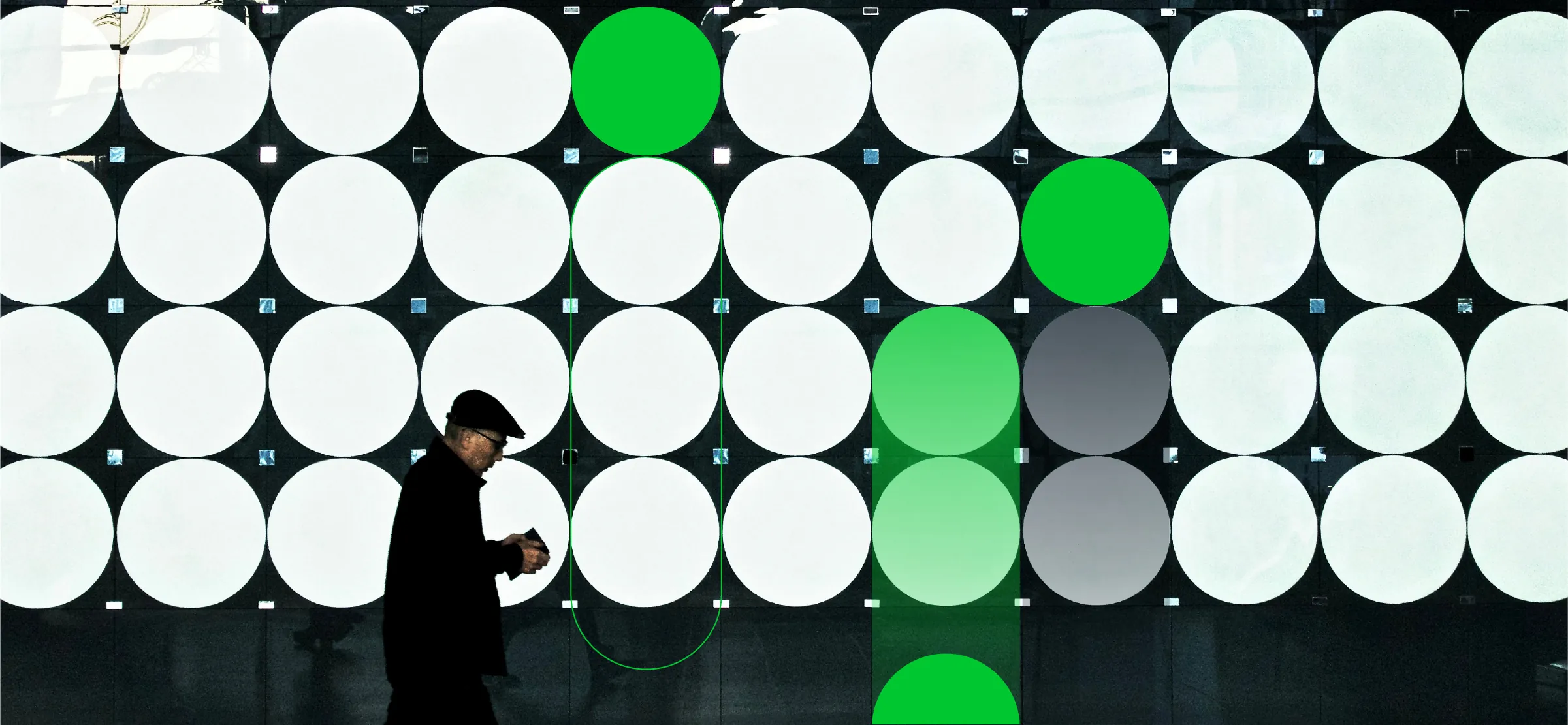
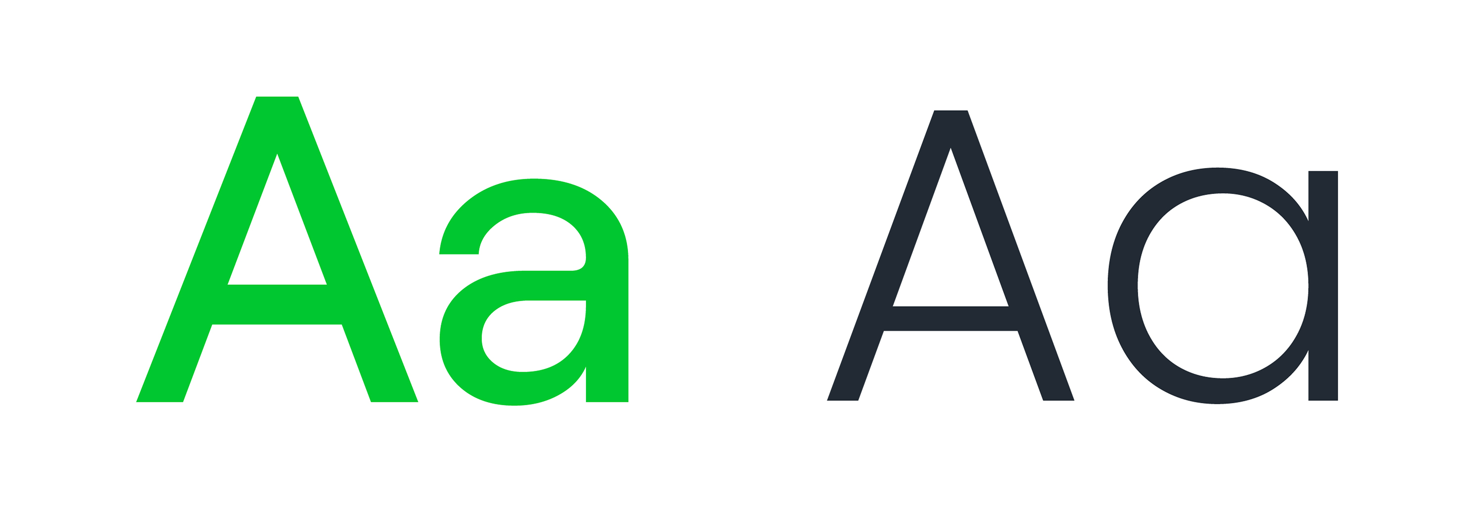
Visual Language
Iconography
The icon system uses solid, rounded forms to ensure simplicity and clarity. Designed for both digital and print applications, the icons communicate key features, tools and services quickly and intuitively. Their consistent style integrates seamlessly with the broader visual language, adding a modern edge while maintaining functionality.