Brief
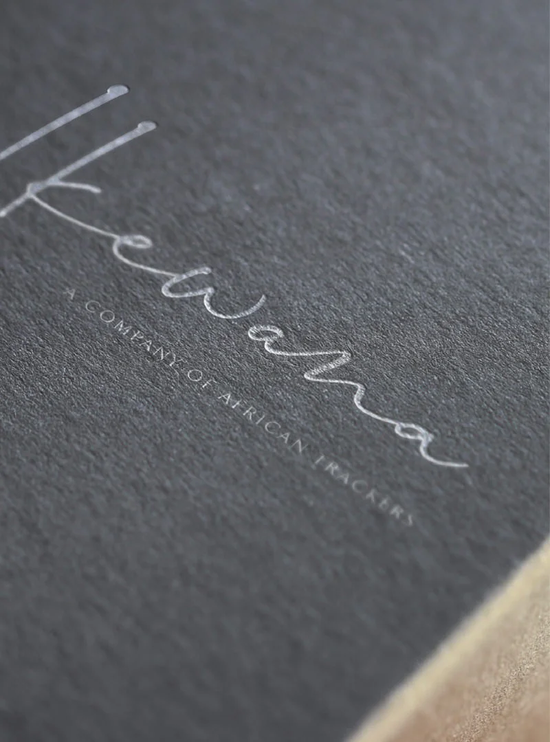
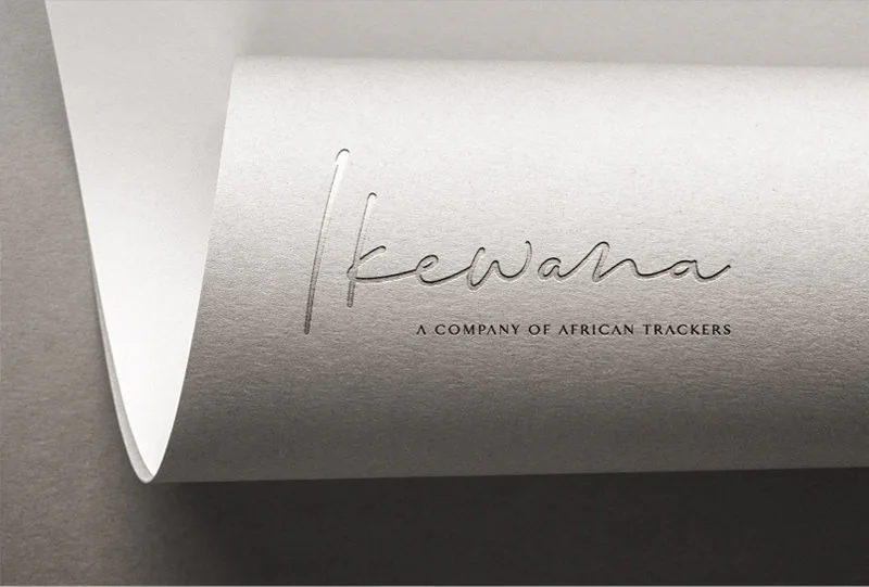
Ikewana is a luxury travel agency that specialises in seamless and memorable travel experiences for the sophisticated traveller. Born out of a common passion for Africa and with more than 26 years’ experience in hospitality & tourism, Ikewana tasked Simplr to bring their vision to life.
Solution
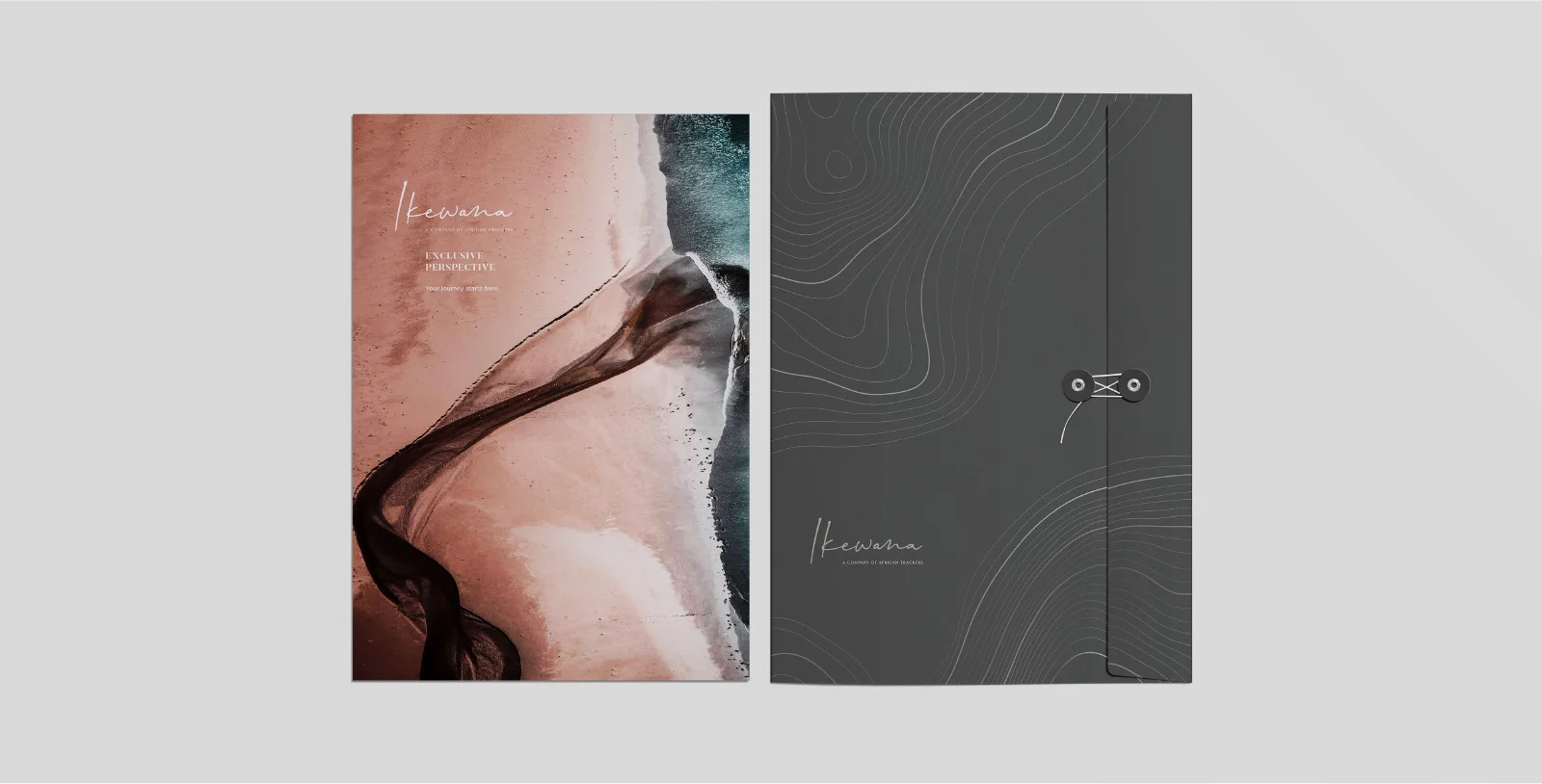
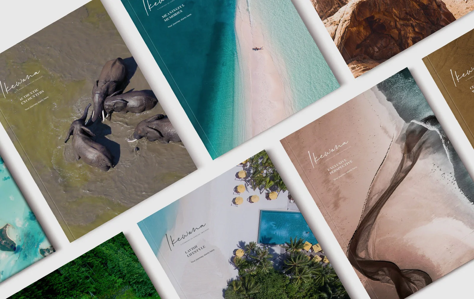
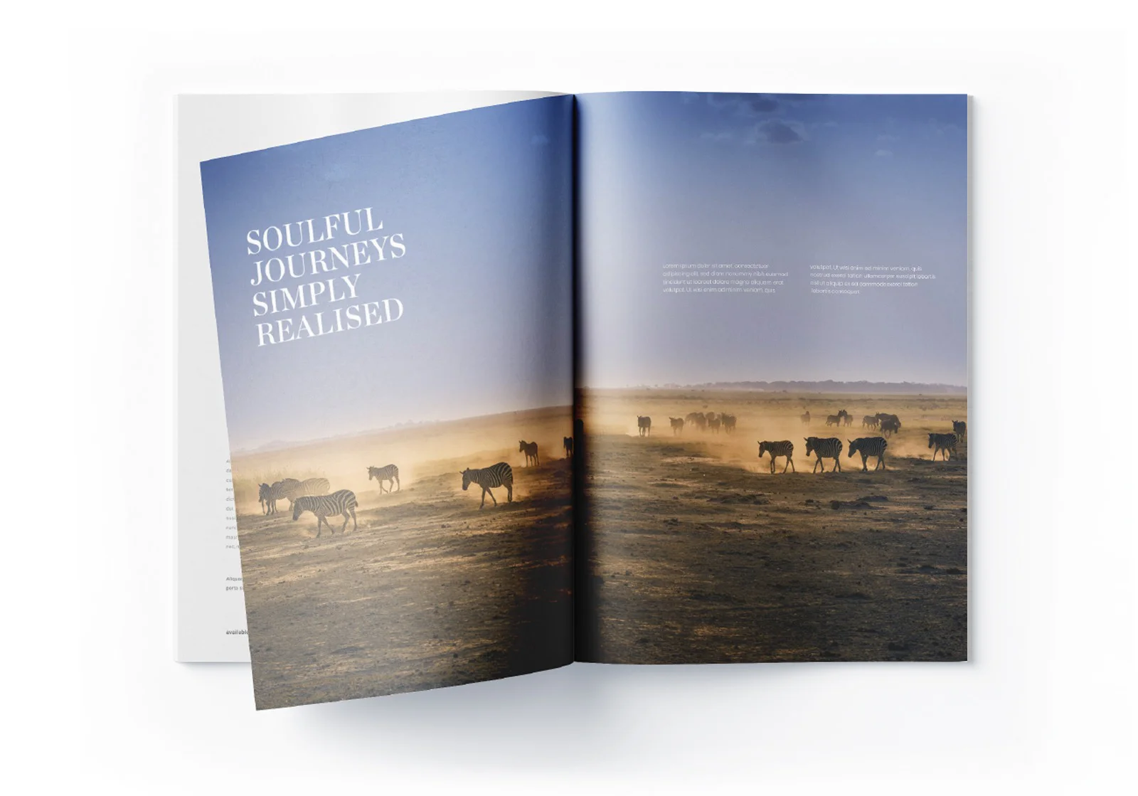
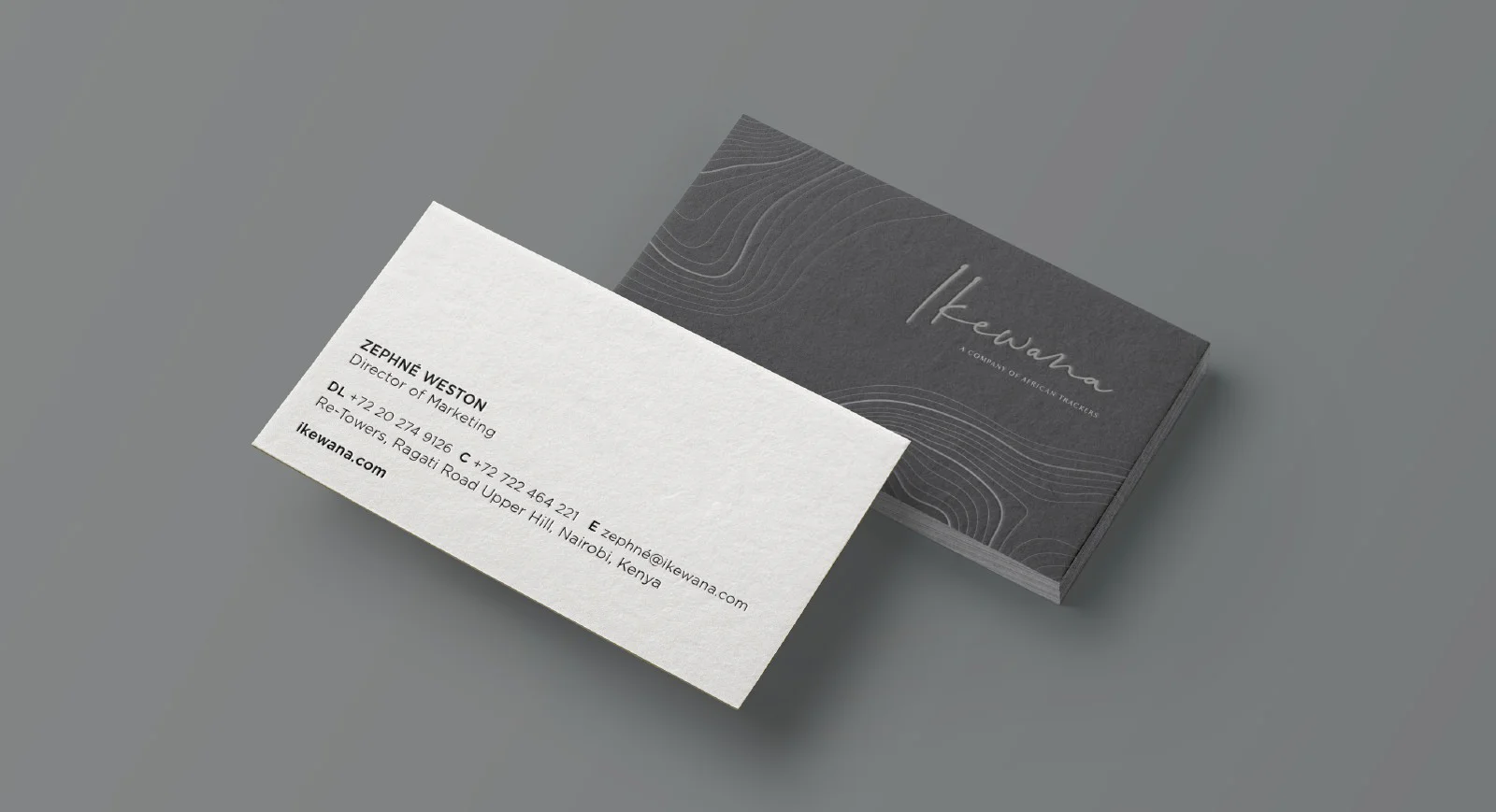
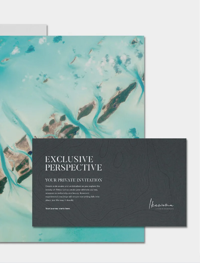
Simplr answered with a distinctively elegant brand that takes inspiration from the continent it seeks to represent. Refined topographic lines add texture to print collateral in the form of high-end print finishes, while full bleed aerial photography of African landscapes display Africa’s full splendour. Our work included everything from name generation to identity development, print collateral and web design.
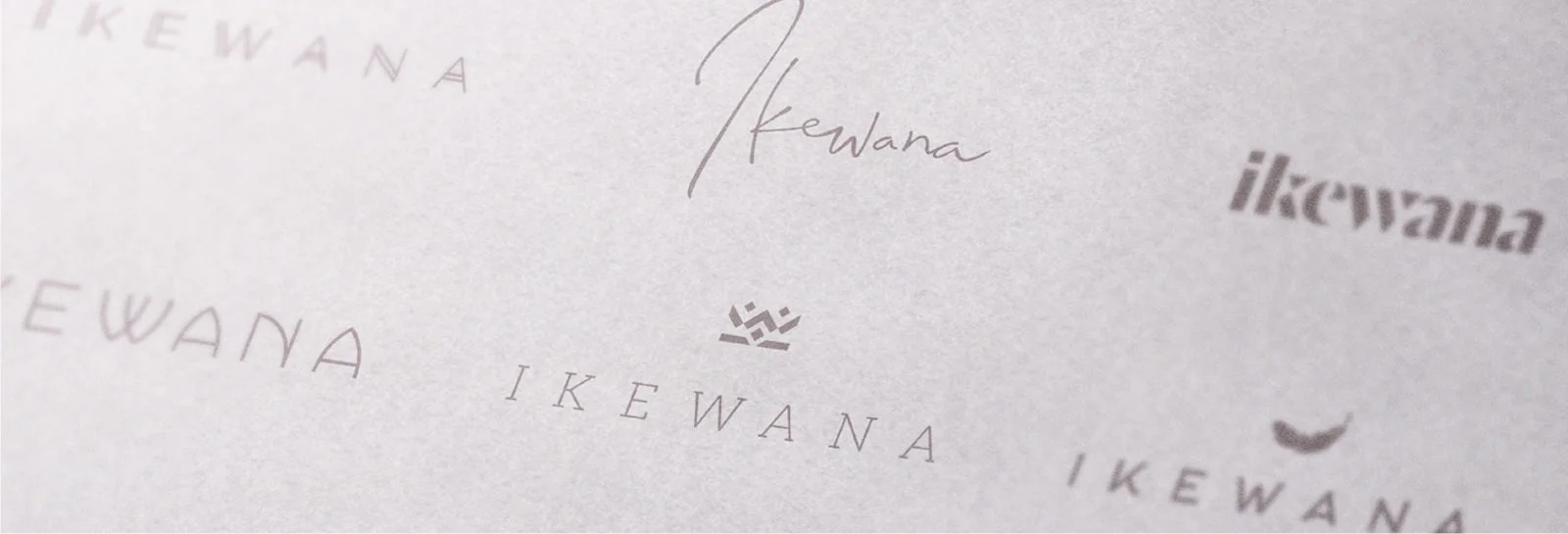
Name Generation
Identity Design
Visual Language Development
Website Design
Ikewana
/ˌɪkɪˈwɑːnə/.
We chose a uniquely African name – Ikewana, meaning “the chosen one” to keep within our clients strong love for Africa.

Typeface & colours
The Butler and Hurme type families were chosen respectively for their timeless elegance and sophistication, while the primary colours were kept neutral to offset the muted secondary colour palette that takes inspiration from the African landscape.


Visual language
In developing Ikewana’s visual language we identified a need to differentiate the retail from the corporate in the two differentiating styles below. (Please drag the arrows to the left and right to reveal the two styles.)
All corporate collateral carries the topographic lines on Ikewana's primary colours (seen on the left) while all customer facing collateral makes use of full bleed aerial photography of the African landscape (seen on the right).
Iconic Africa Brandmark
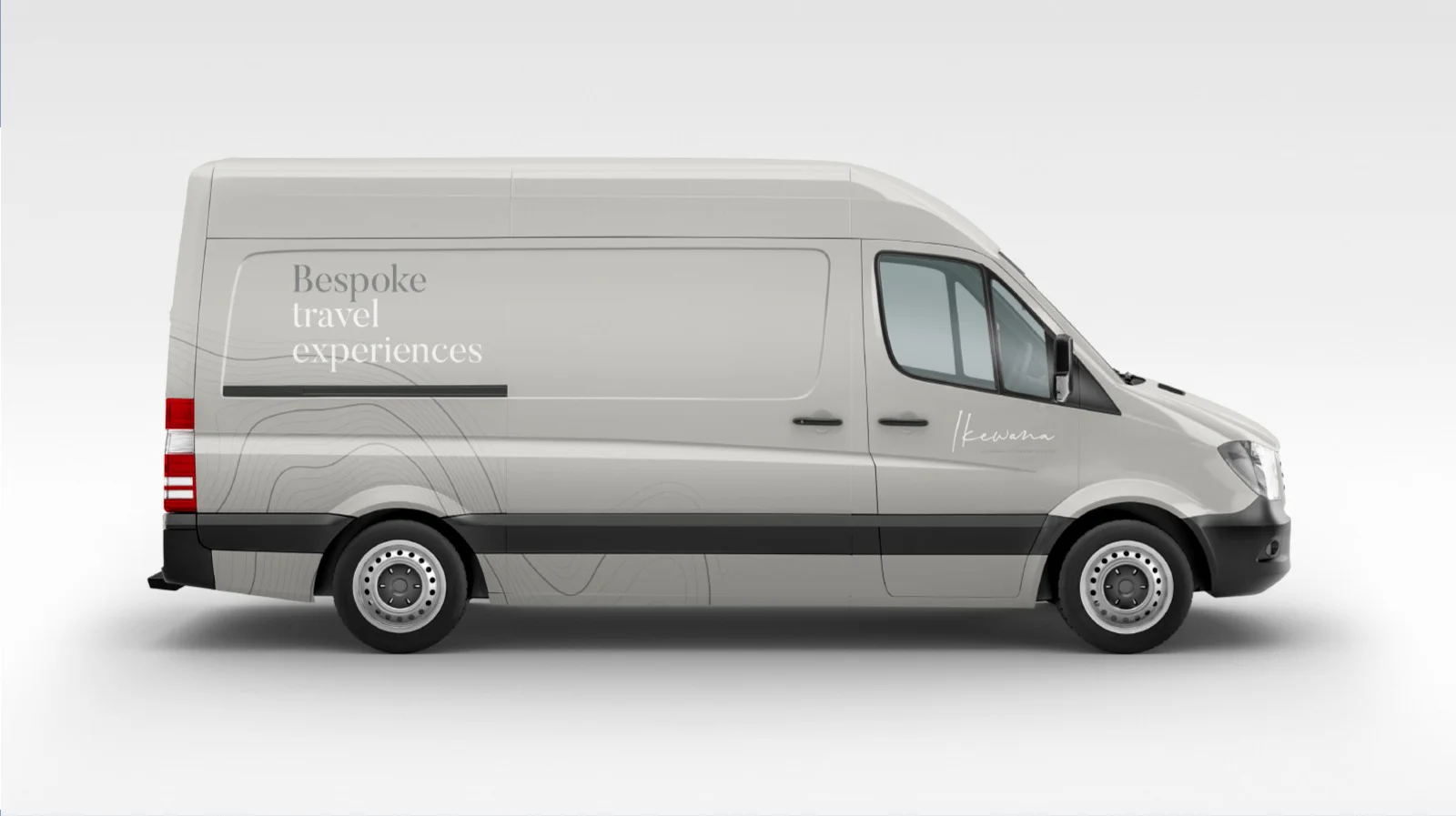
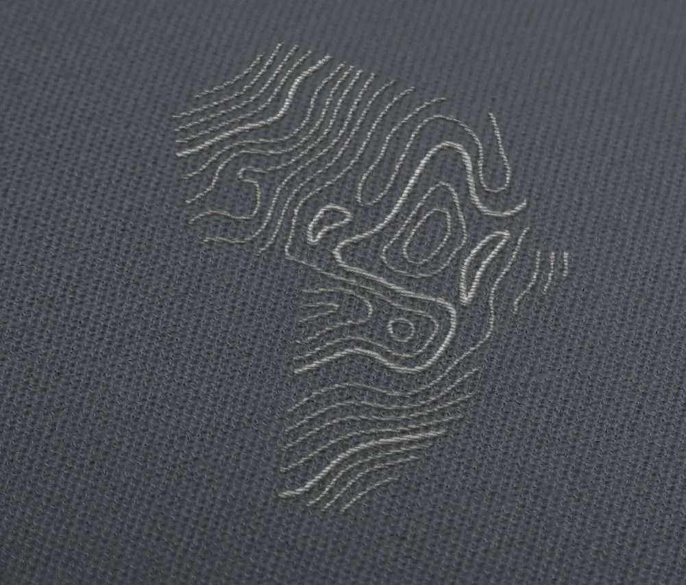
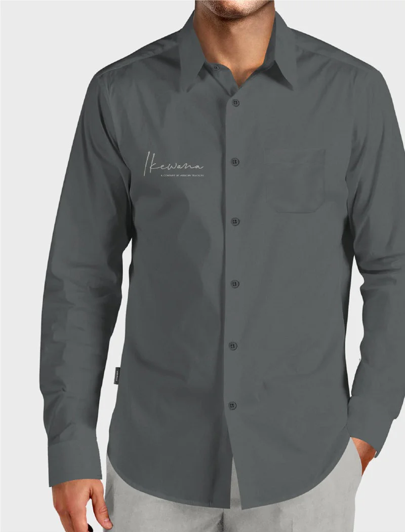
We created an iconic Africa shaped brandmark that echoes the topographic lines we used in the corporate branding to be used as a standalone brand device on corporate clothing and livery.

Mobile
All web and newsletter design was adapted to mobile for ease of use.
It’s true what they say about Africa. That its beauty is like no other, that its children’s smiles shine brighter and that upon meeting the unspoilt natural world and its wildlife, you will be forever changed. This is a different kind of journey, one where hearts are touched and souls are moved. We welcome you to immerse yourself in the best that this magnificent continent has to offer, safe in the knowledge that your being here ensures its very survival.


