Brief
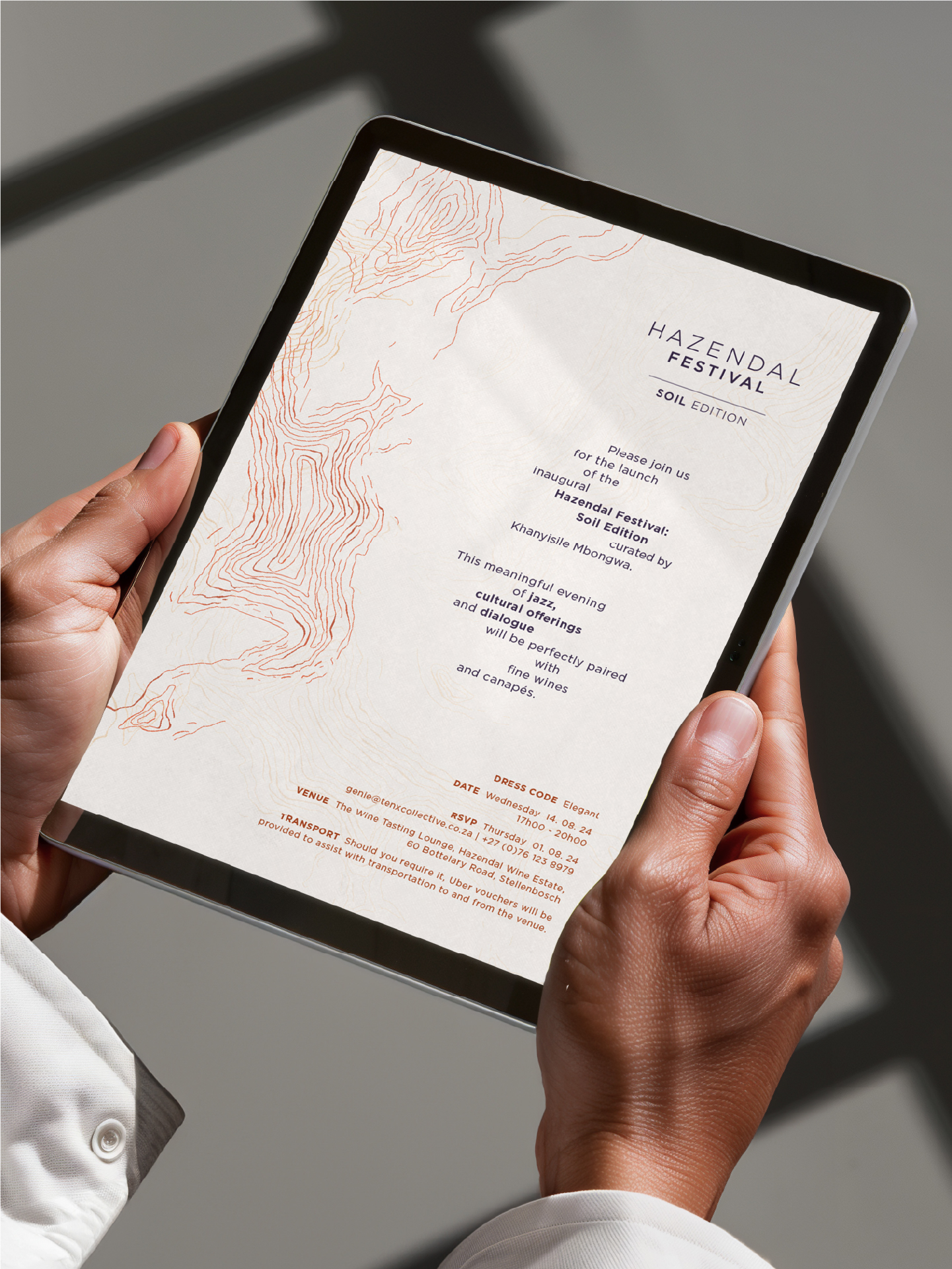
Hazendal Festival launched its Soil Edition 2024 to explore humanity’s relationship with land through art, culture, and ecological dialogue. The identity needed to move beyond expected earthy aesthetics, drawing instead on African geometry, minimalism, indigenous practice, ecological grief, and African luxury. The creative direction aimed to express Ubuntu by uniting artists, scientists, and cultural practitioners through a cohesive visual and digital system spanning logo, typography, colour, social, print, and digital touchpoints.
Solution
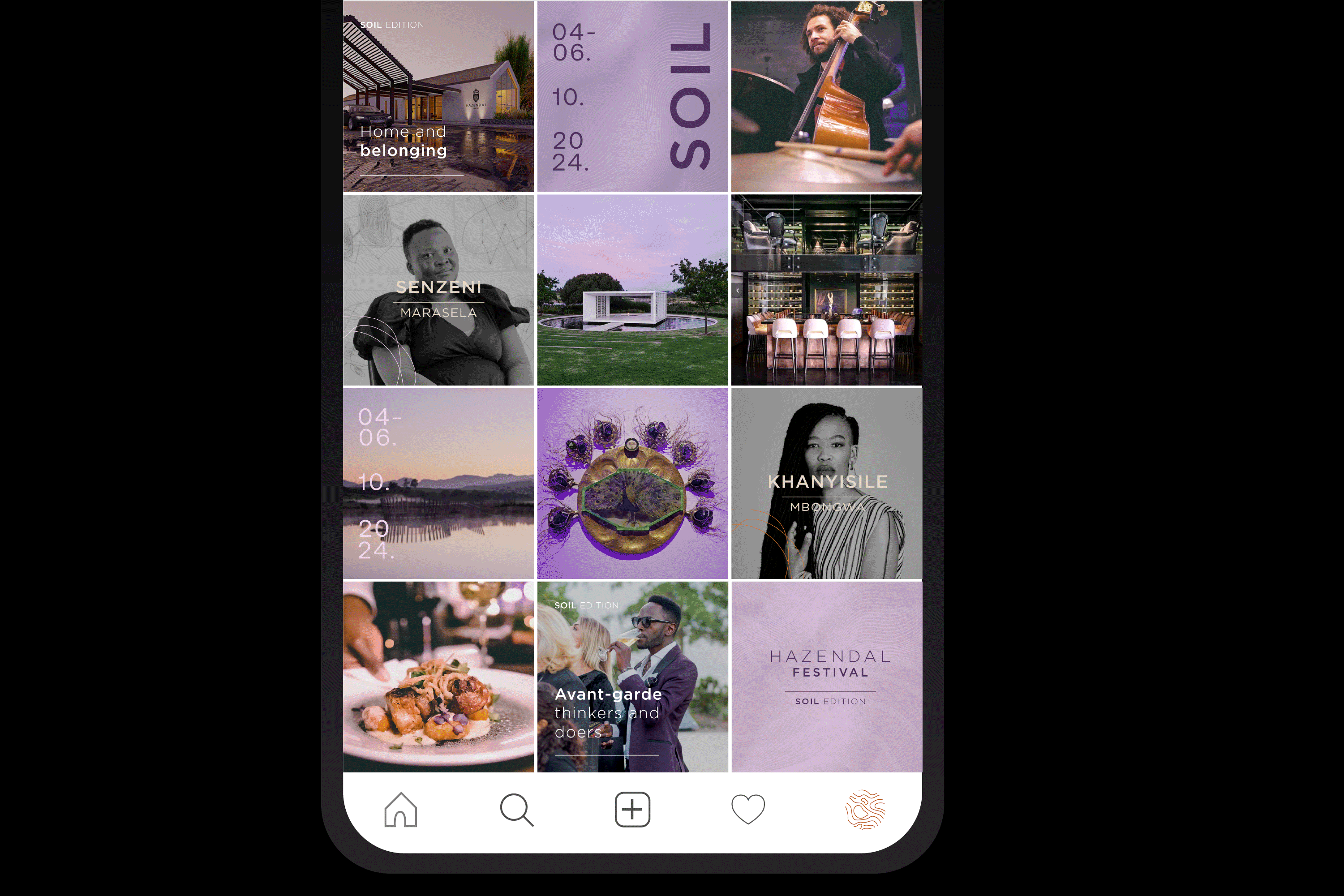
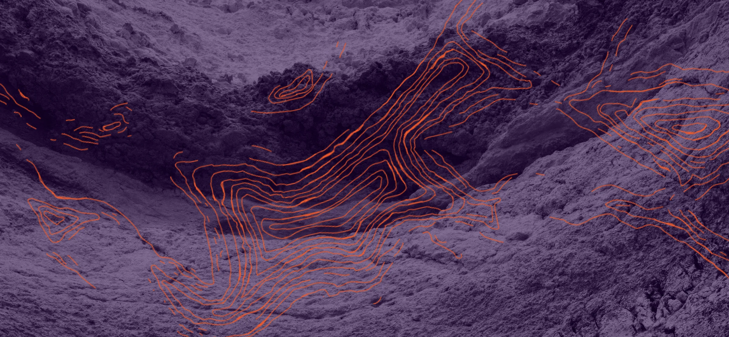
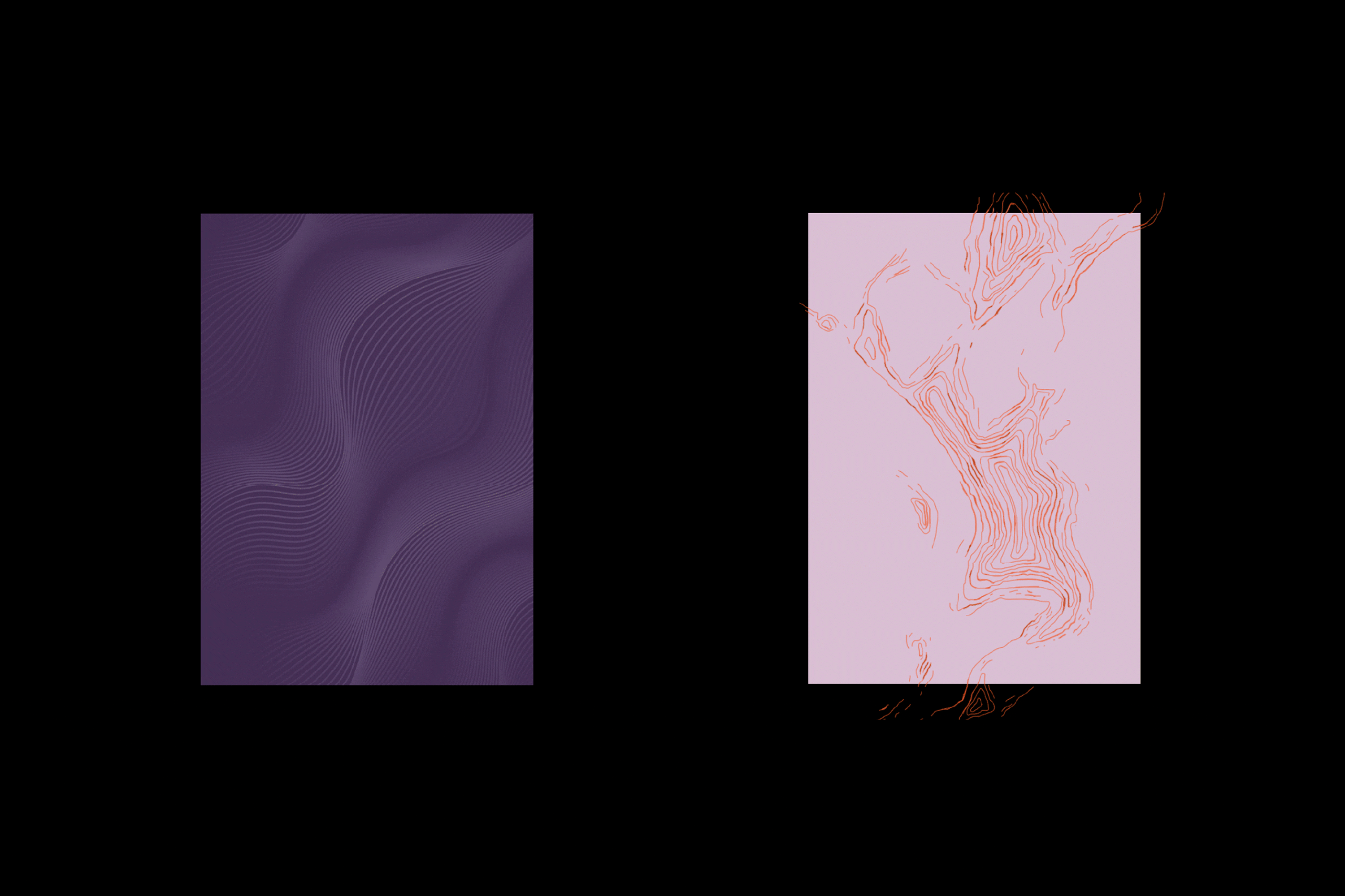
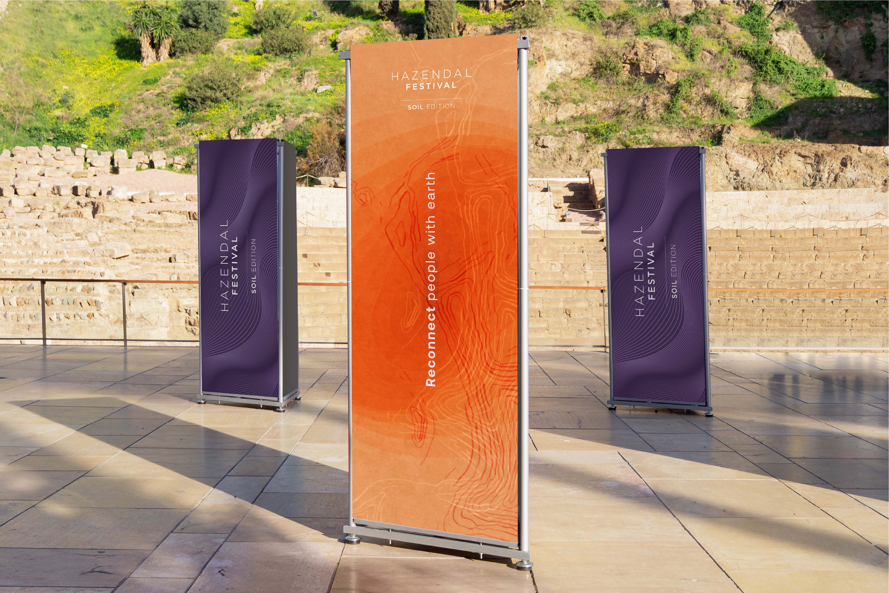
Simplr developed a visual language rooted in topography and African geometry, inspired by the Hazendal Estate’s landscape. Contour lines, symbolising both terrain and humanity’s imprint on the earth, became the core graphic device. A mineral-based palette with lilac and deep purple conveyed fertility, spirituality, and African luxury, avoiding predictable browns and greens. The system translated seamlessly across digital, print, and experiential formats.
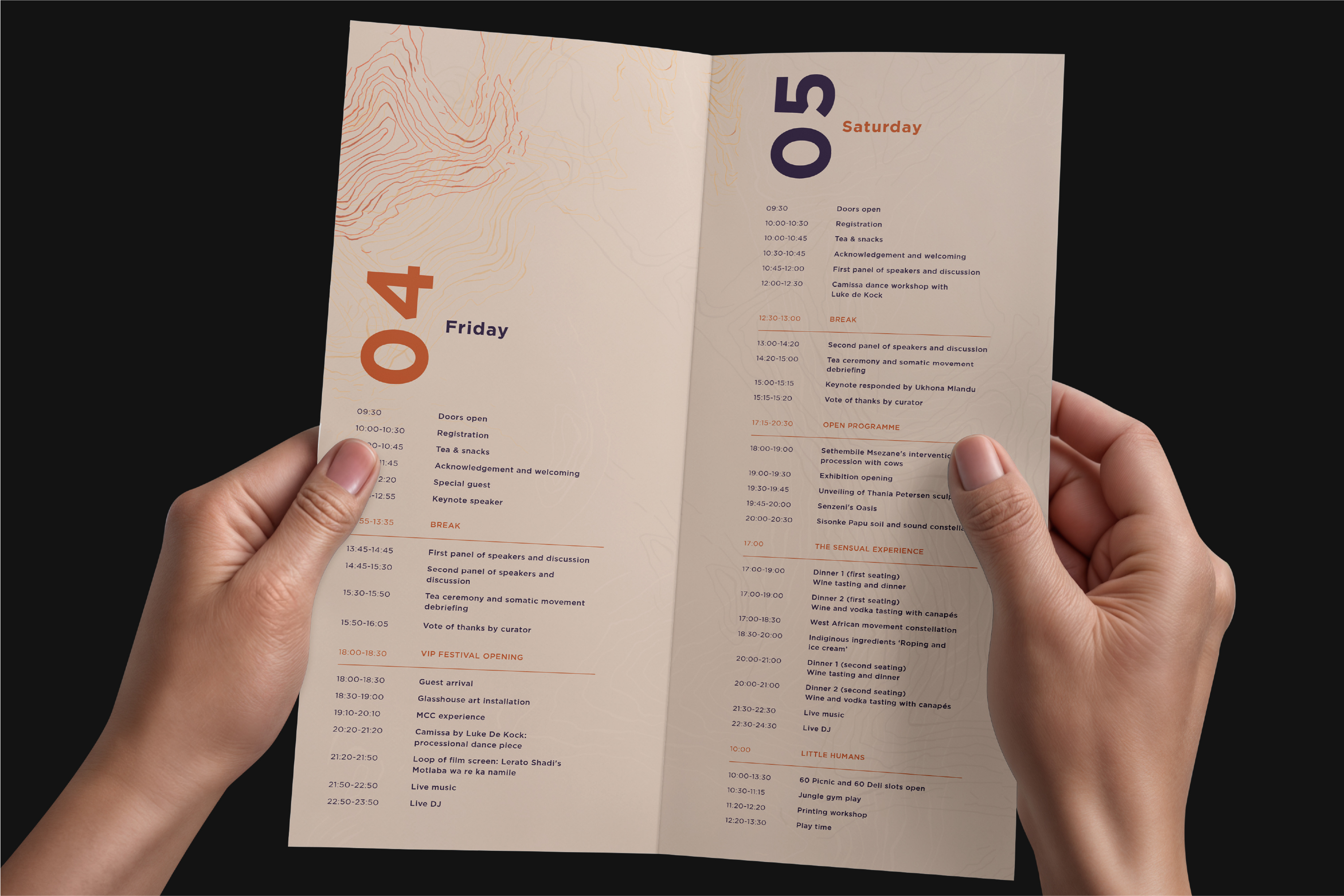
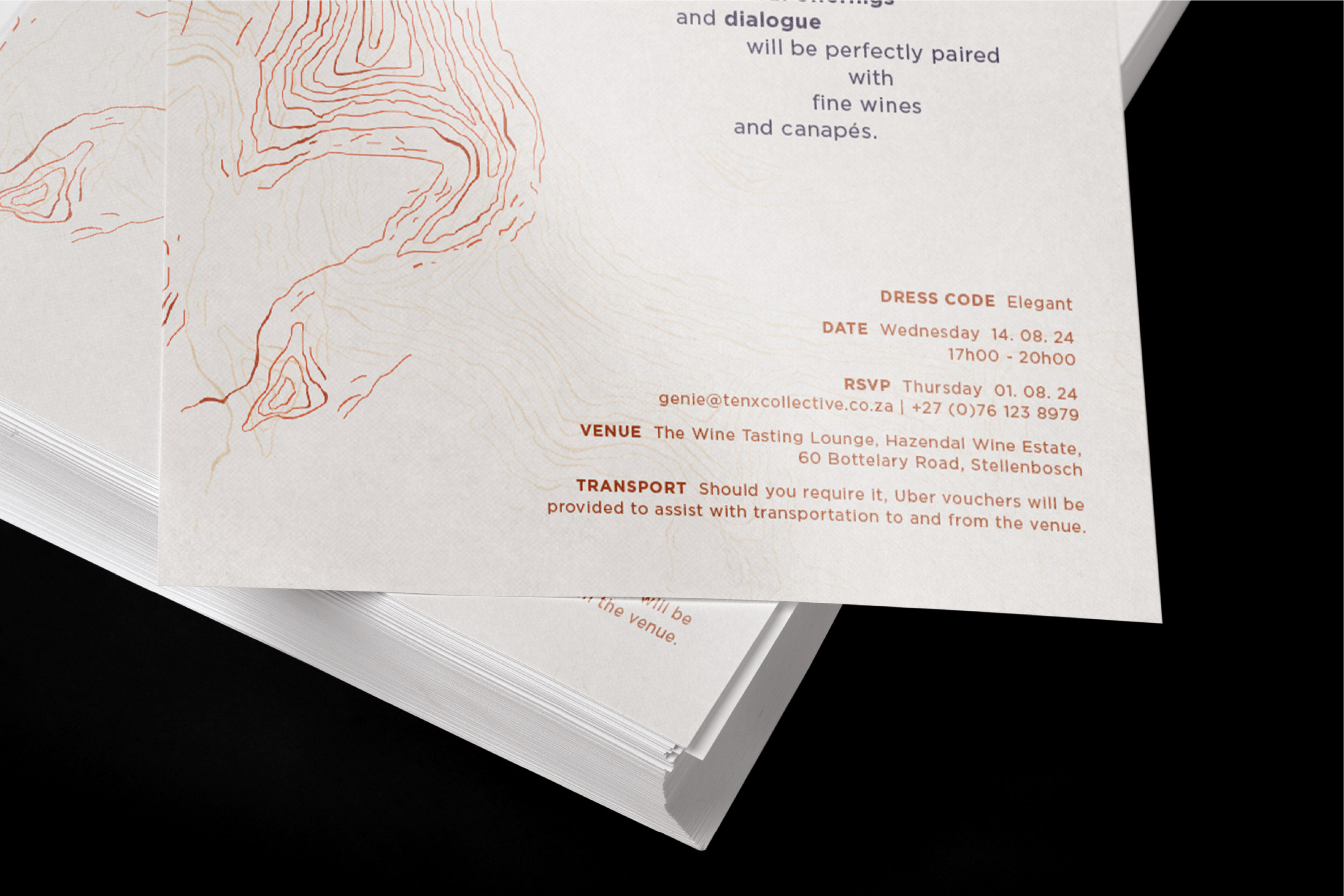
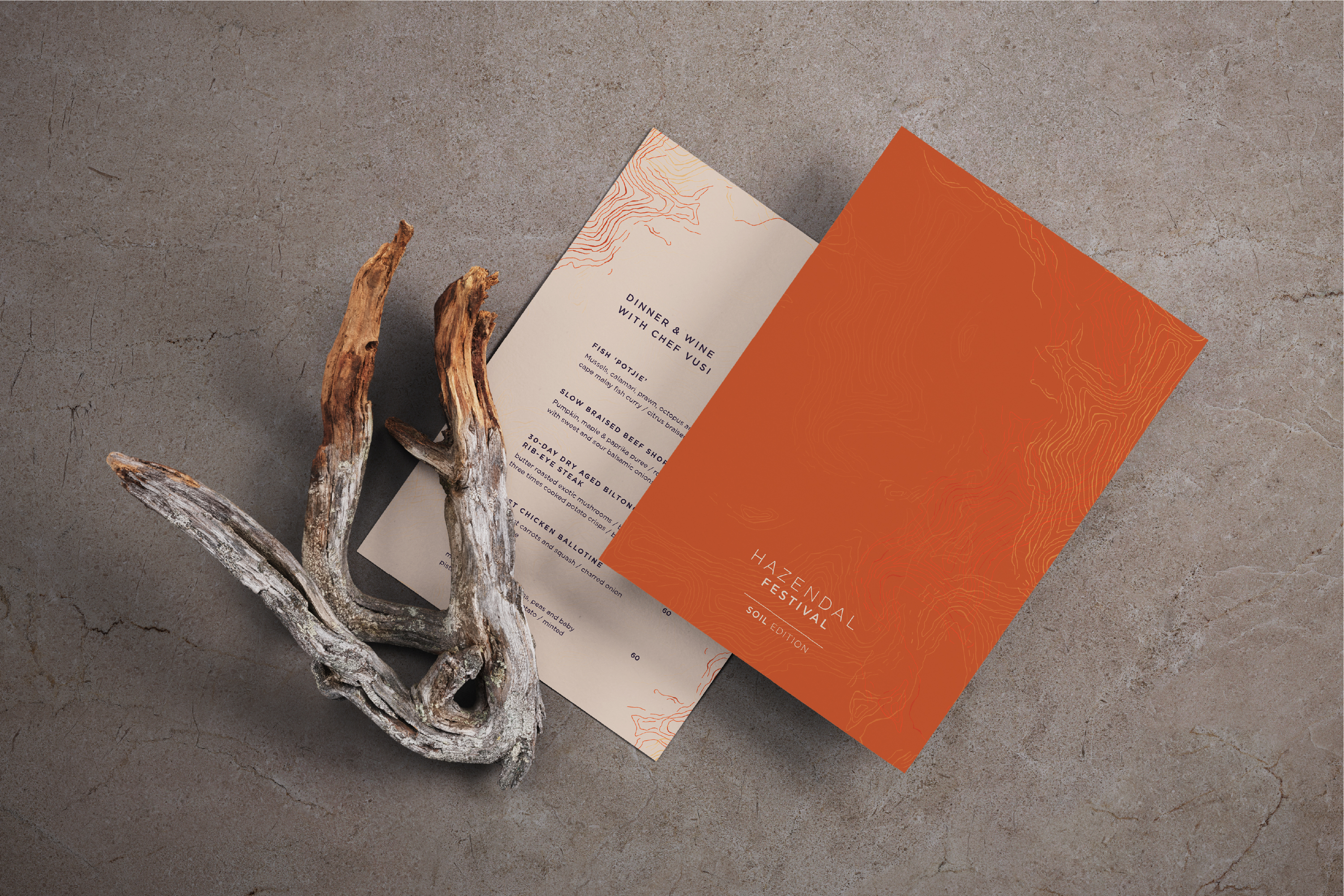
Event identity design
Visual Language Development
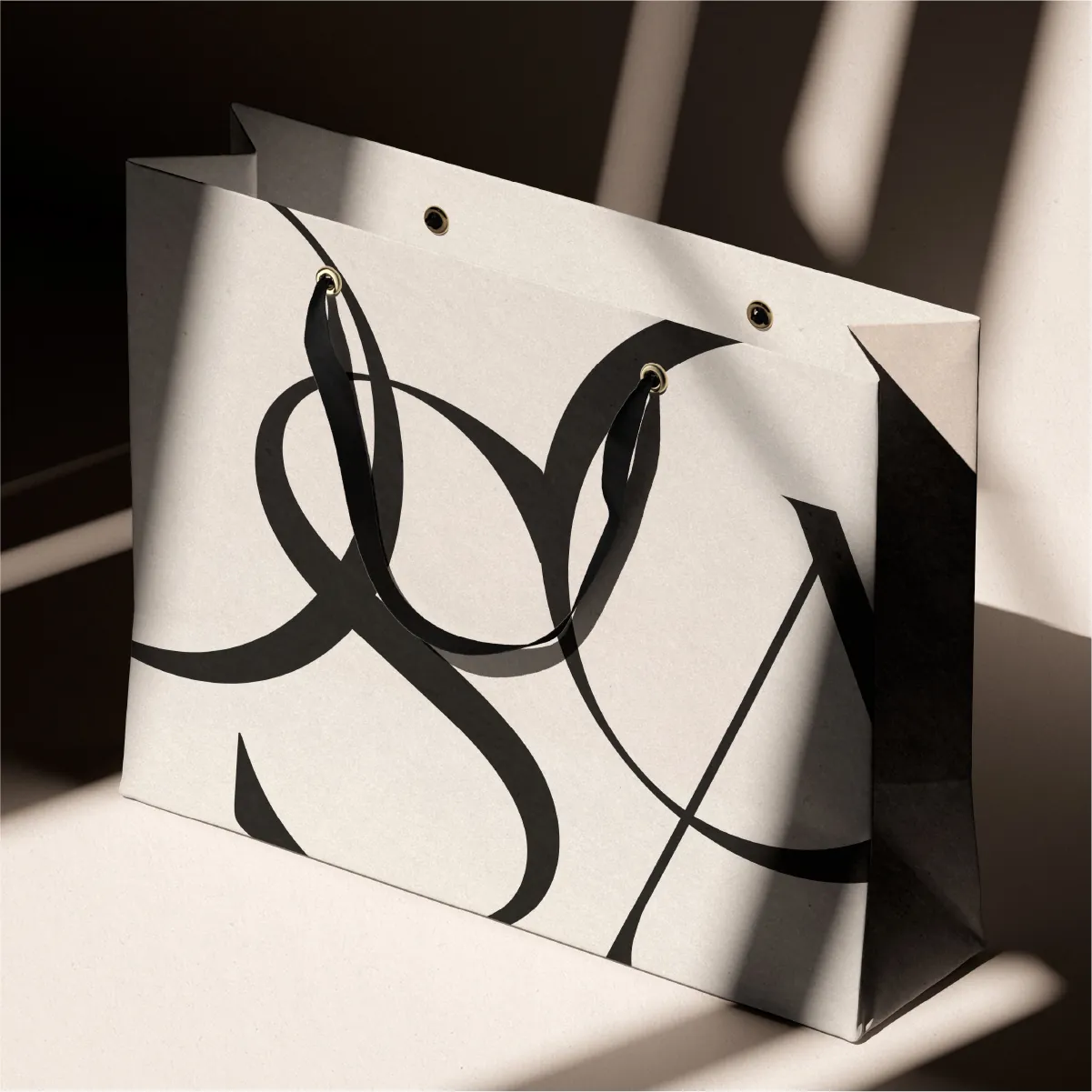
Collateral Design
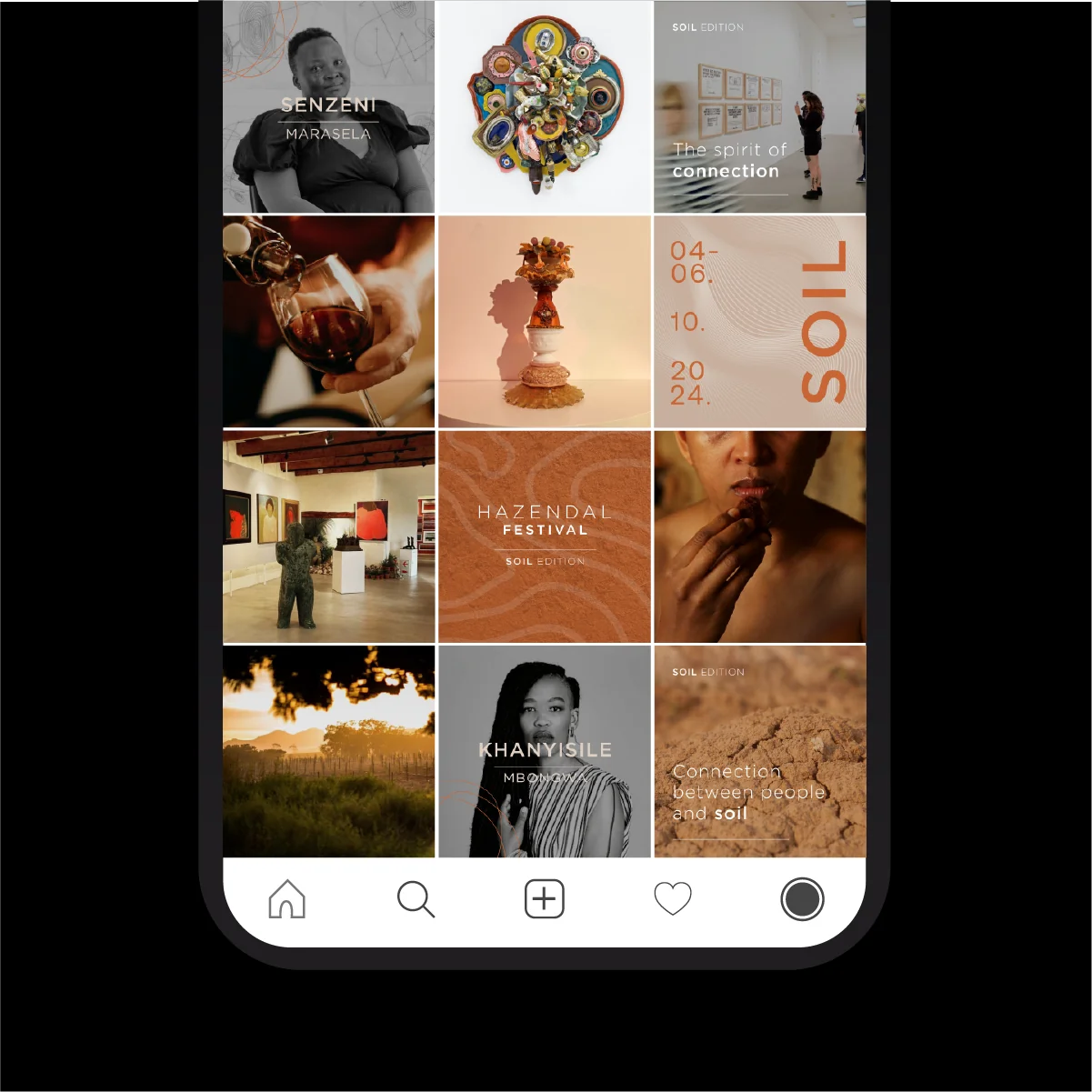
Social Media Templates
motion graphics
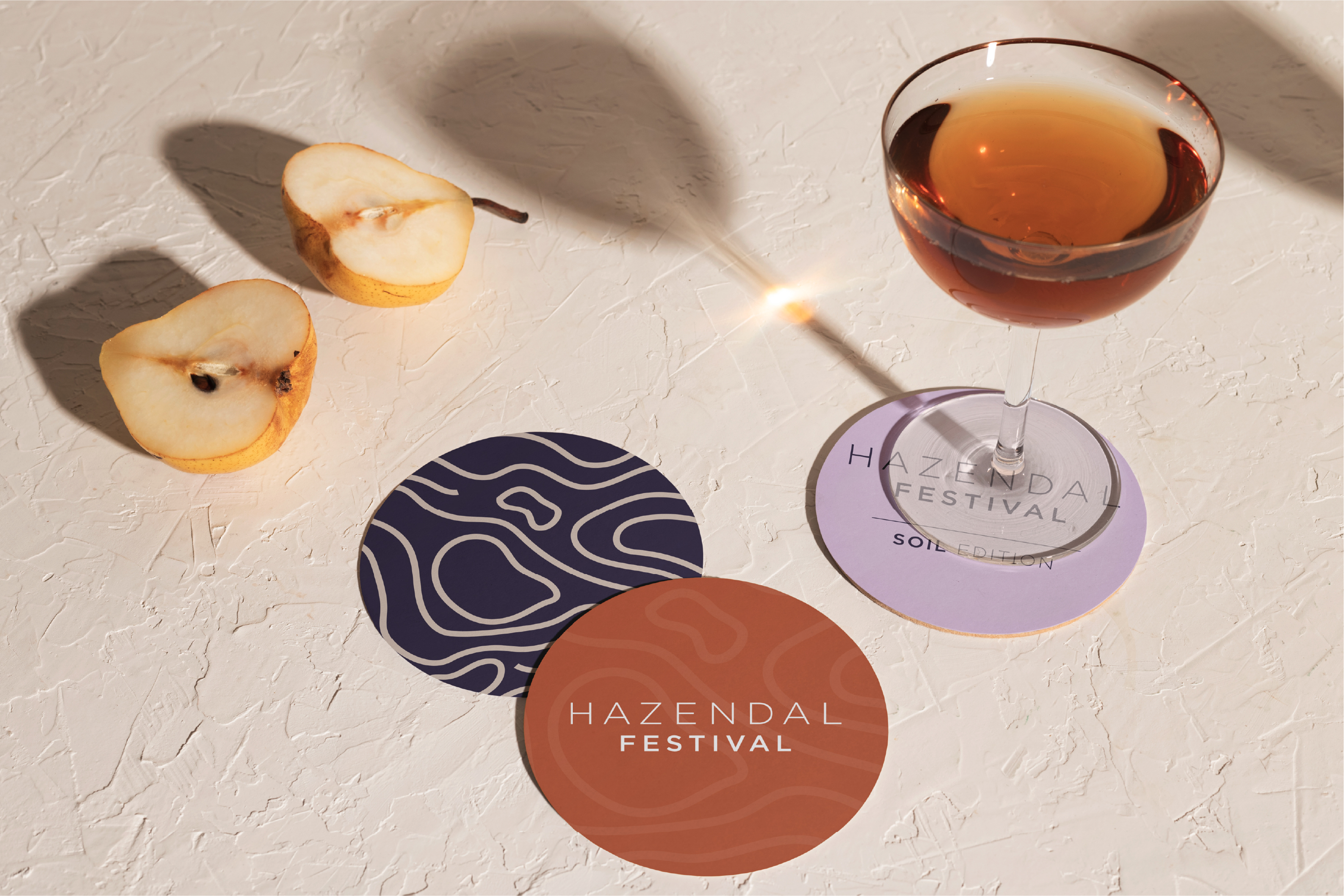
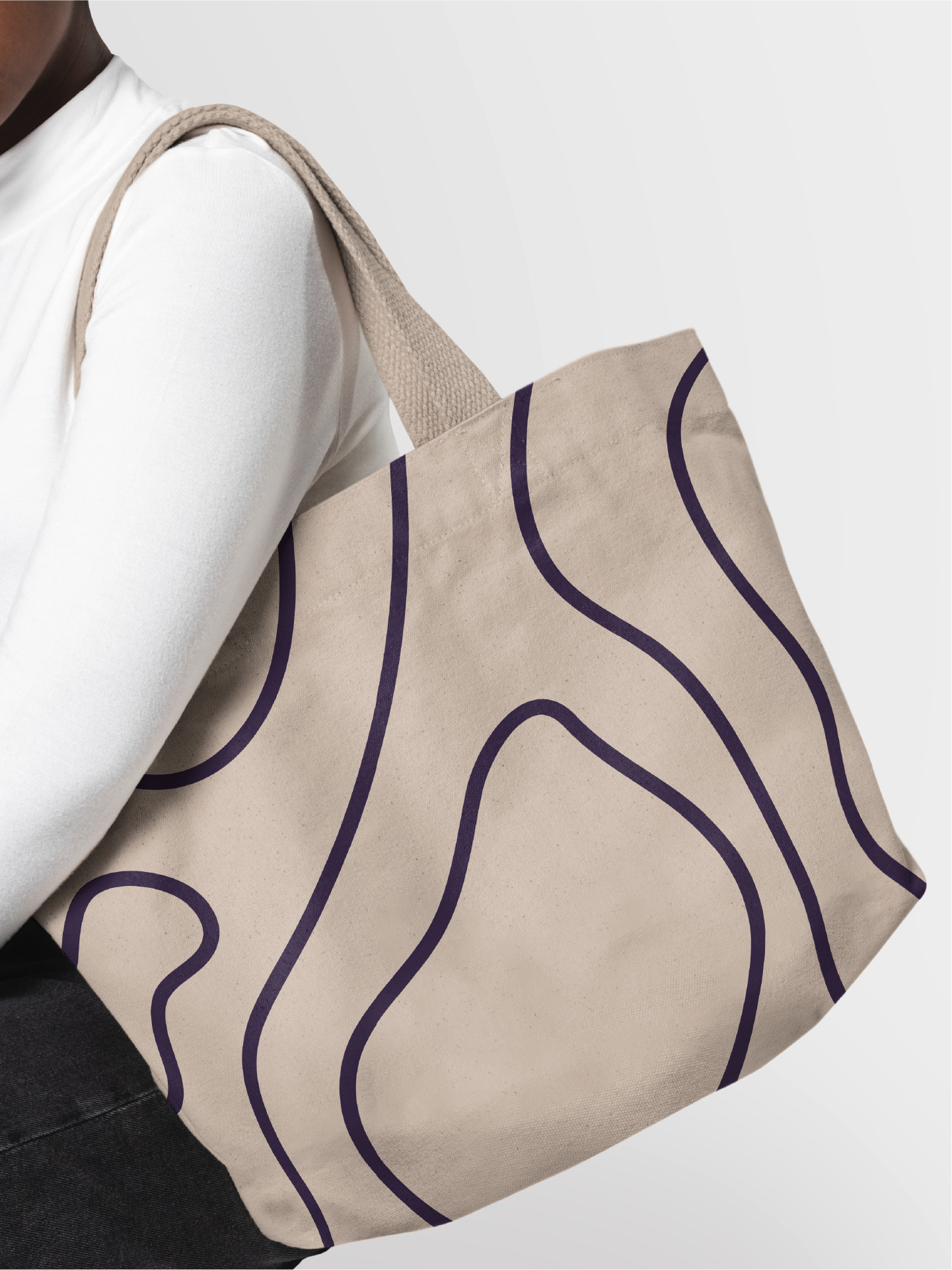
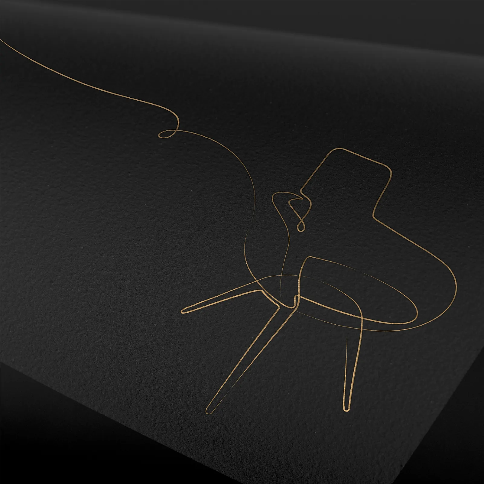
These rounded linear shapes convey progression, upward movement, and interconnectedness, while textures ground the system in tactility and ecological truth.
The combination of type and geometry reflects the universal code of African patterning, resonating with both contemporary design and indigenous symbolism.