Brief
Hazendal, an exceptional winelands destination, offers culinary experiences, cultural delights, sophisticated accommodation, event spaces, golf, and entertainment for young and old. Simplr was tasked to evaluate this unique Stellenbosch estate's brand architecture and to collate its offerings into one cohesive brand.
Solution
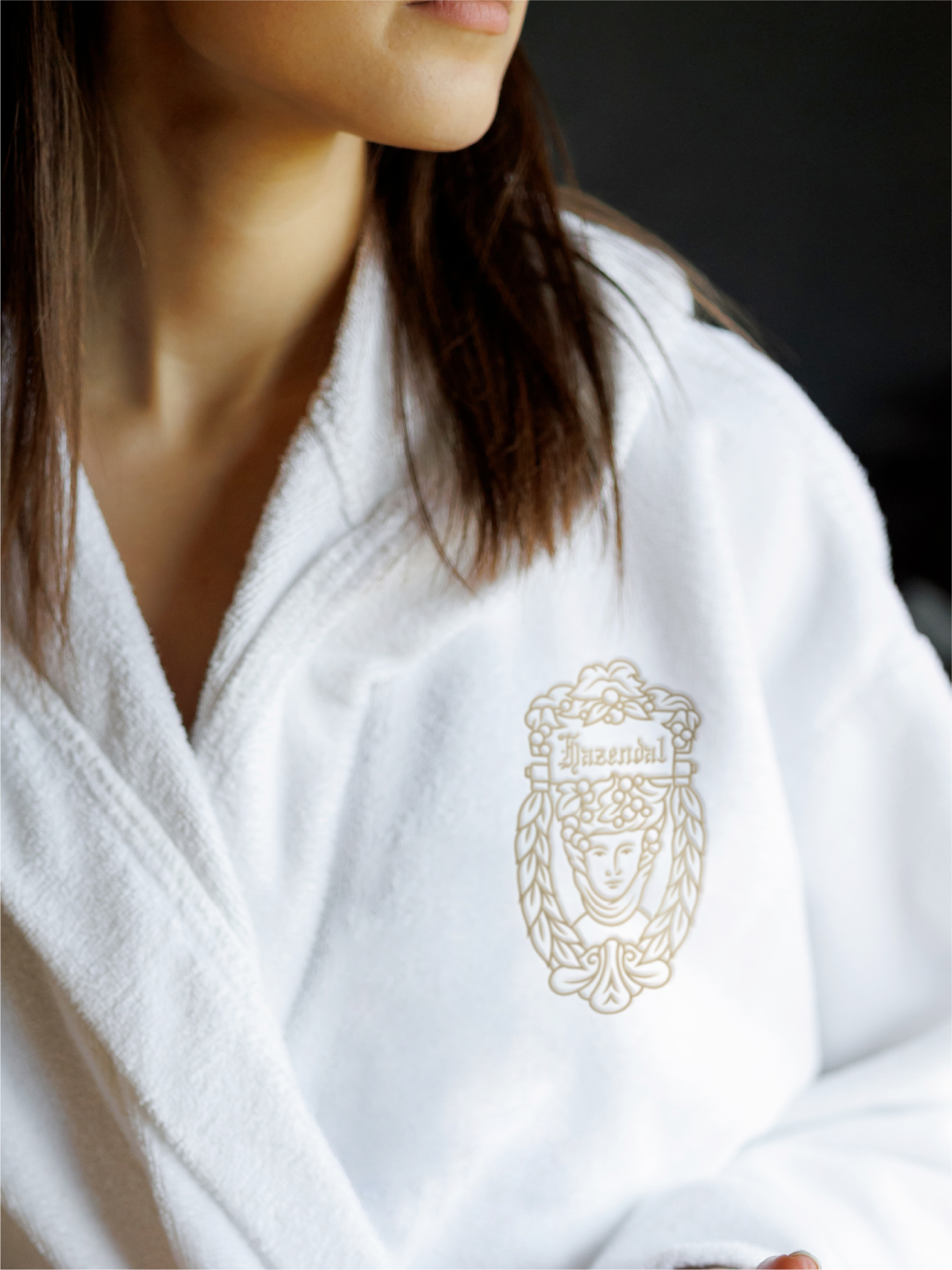
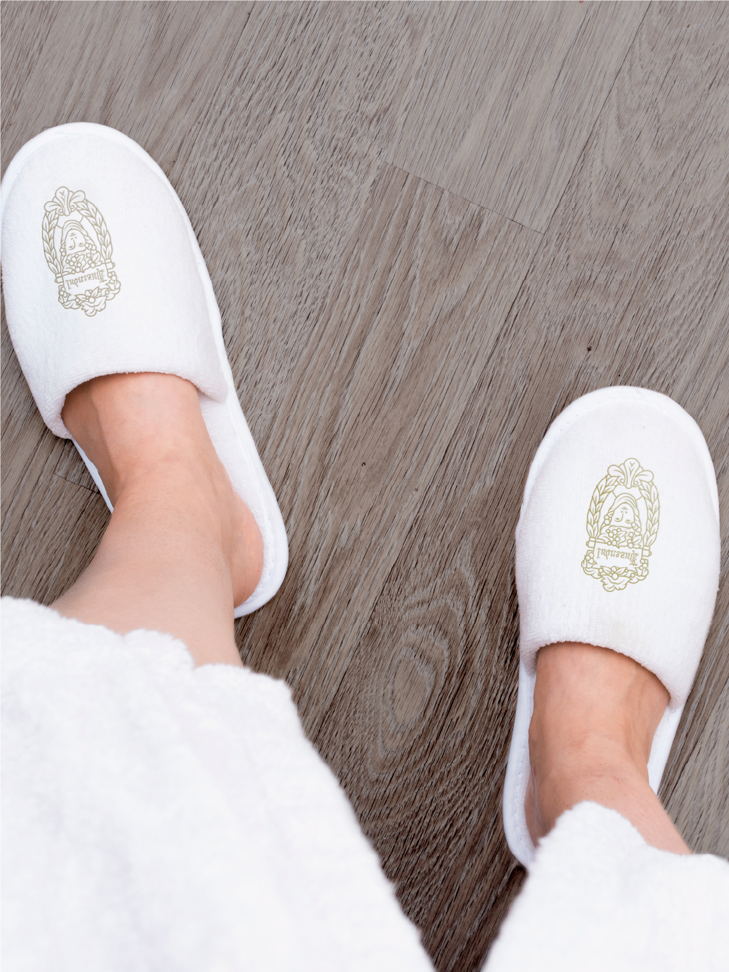
After immersing ourselves in the brand and its offerings, we proposed a brand architecture that defines strategic branding best practices, and establishes a sound structure for all future executions. Simplr's process included simplifying the brand icon, visual language development, identity design and application for their new hotel, The Hazendal.
Estate identity evolution
Visual language development
Hotel identity design
Collateral design
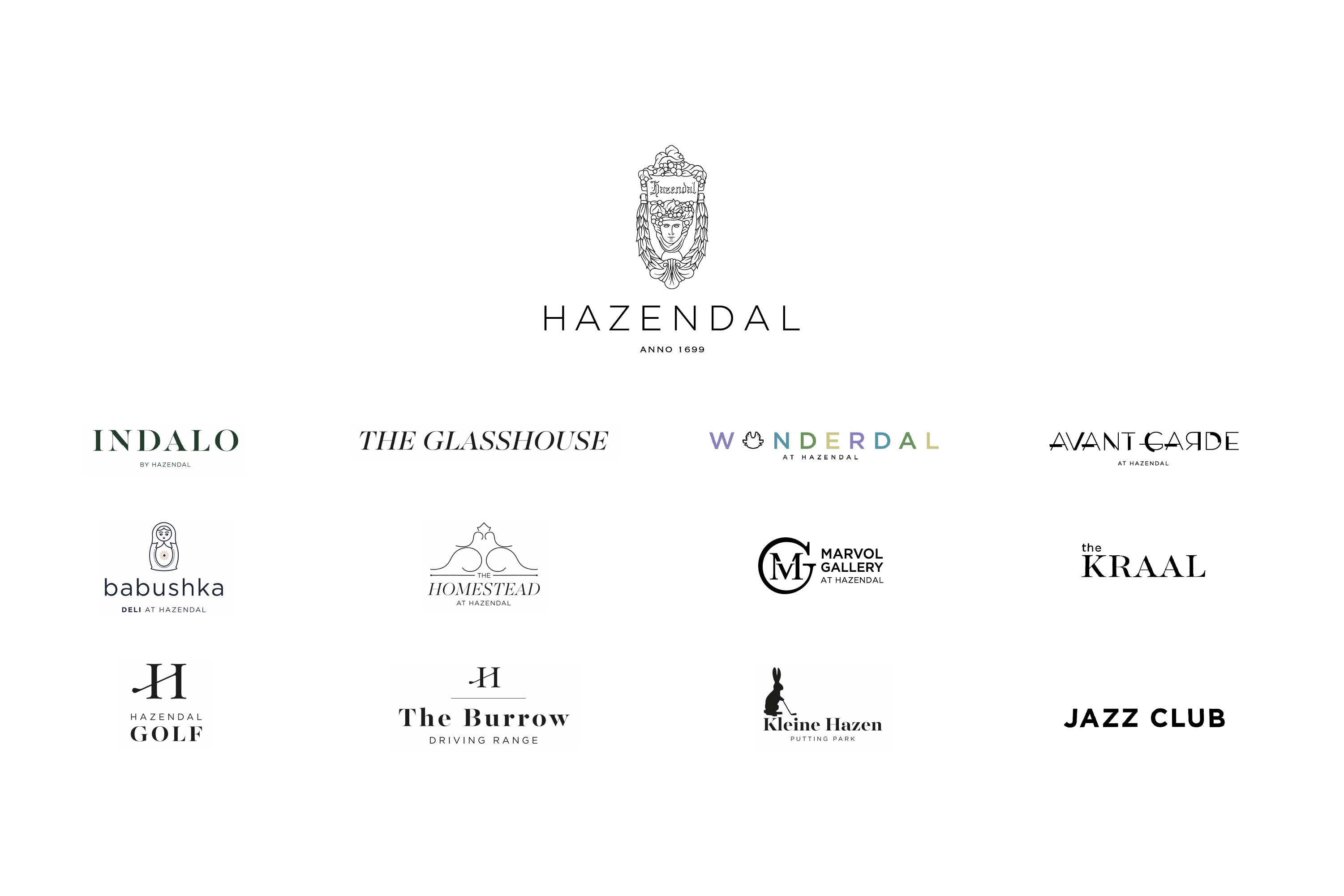
Brand architecture
Visual language
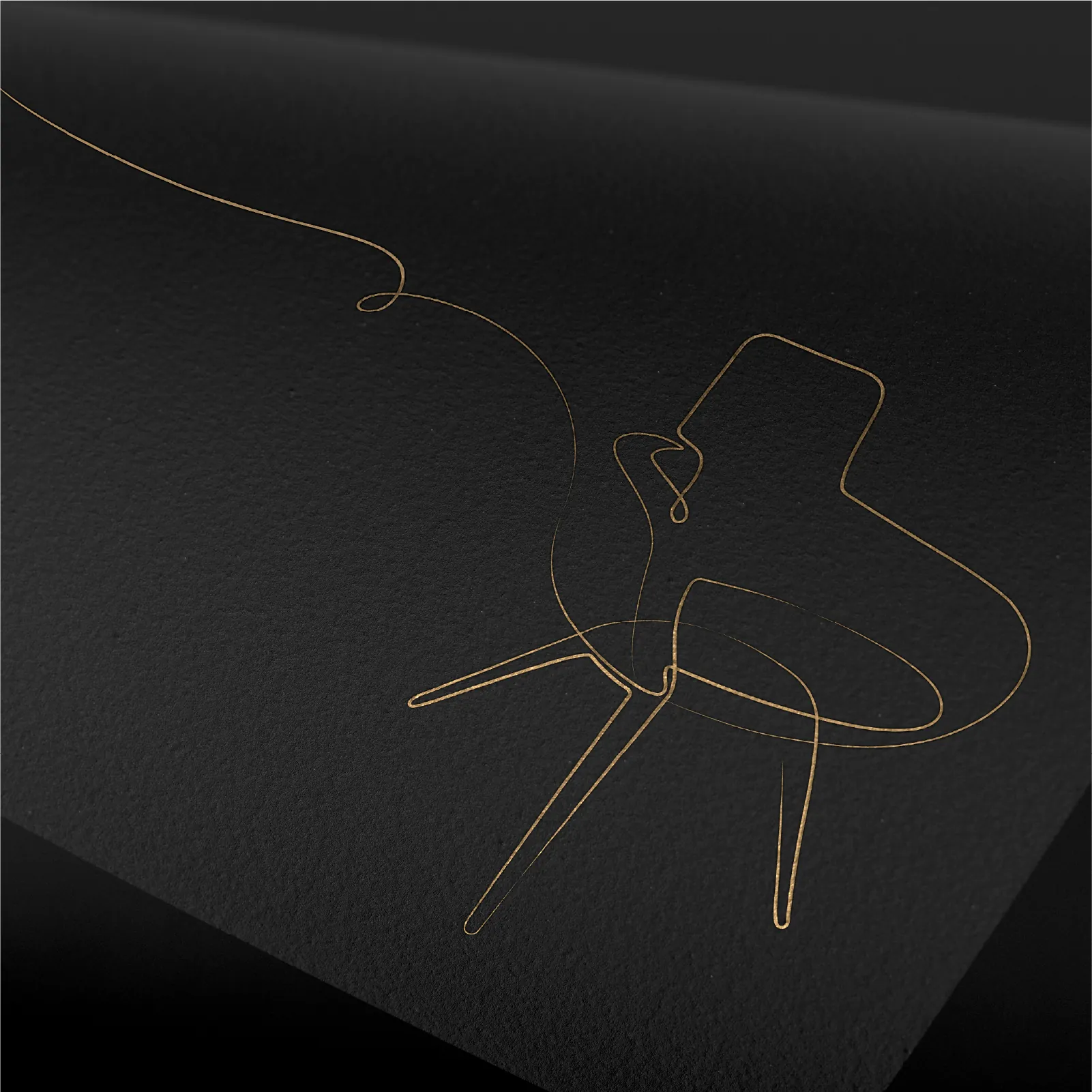
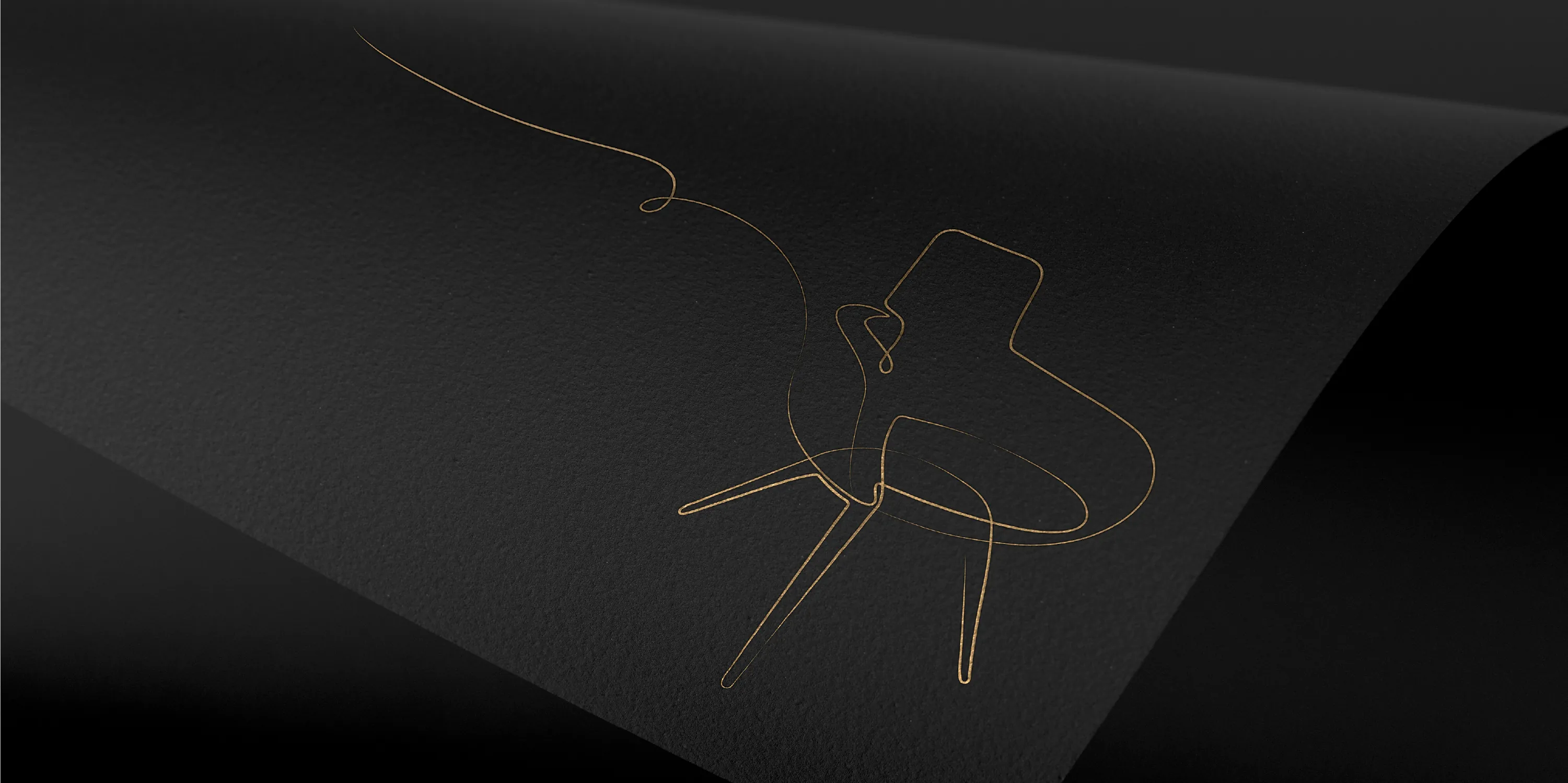
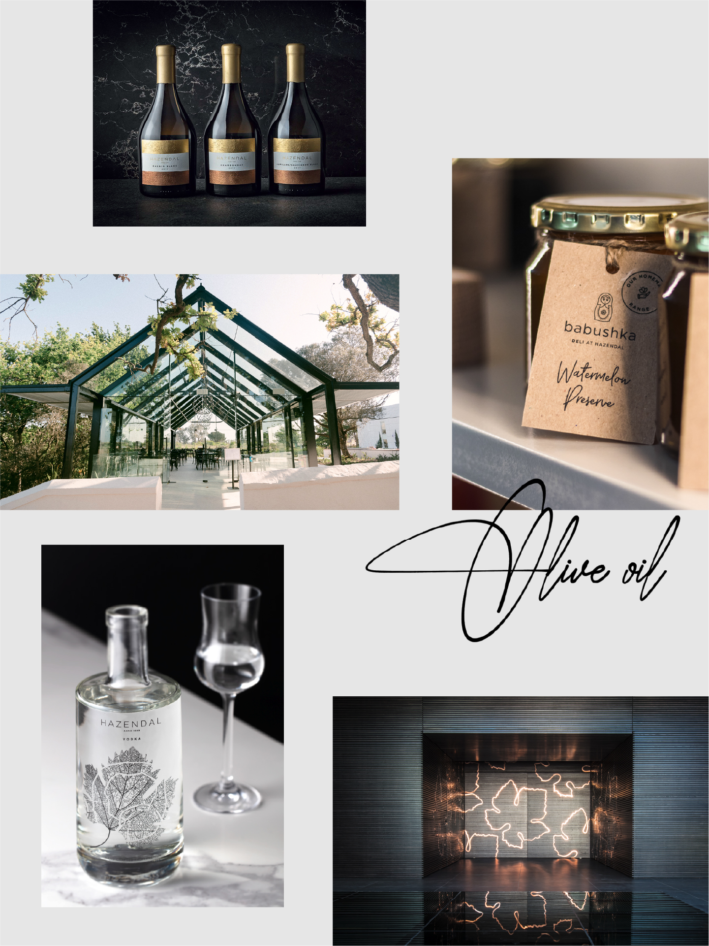
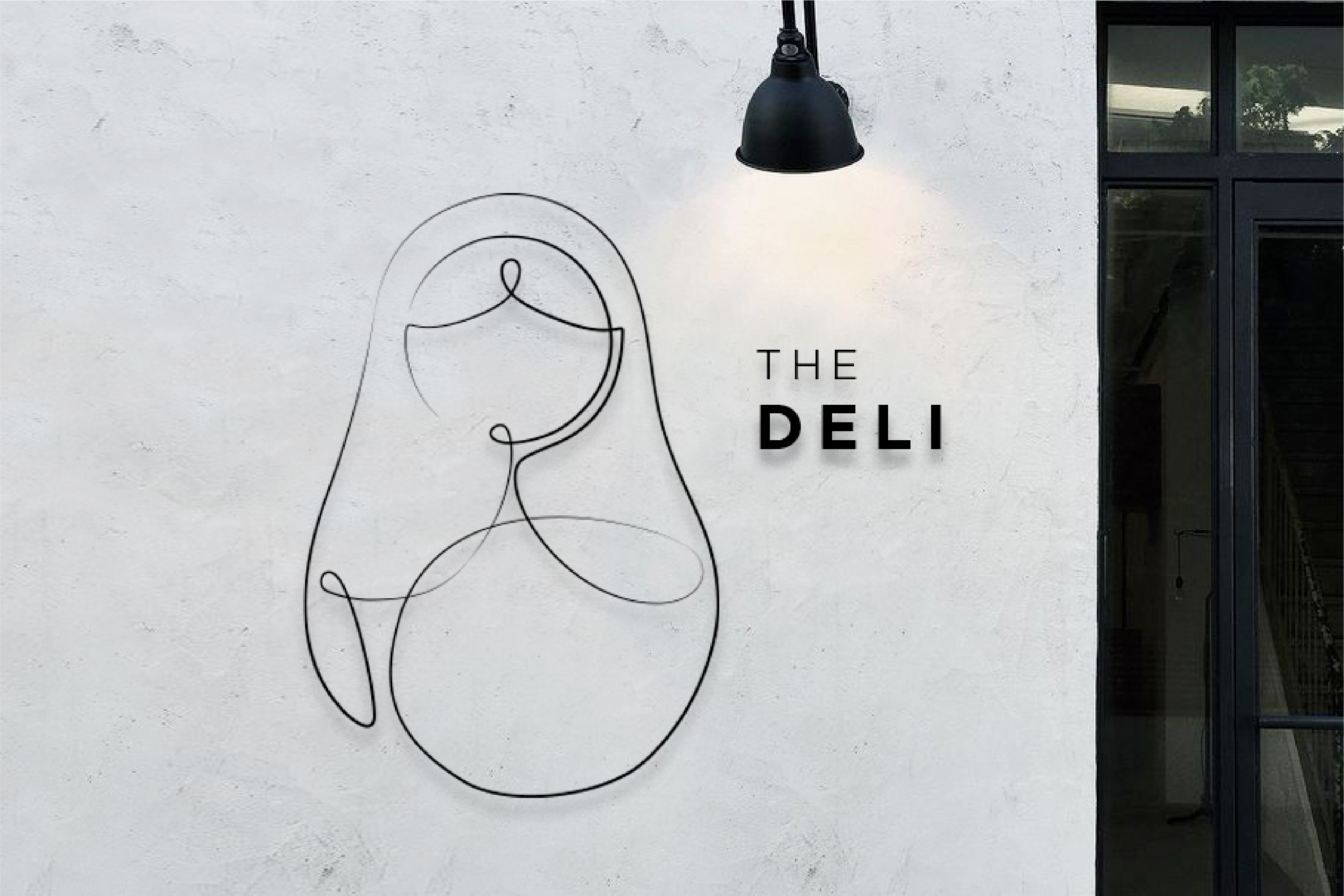
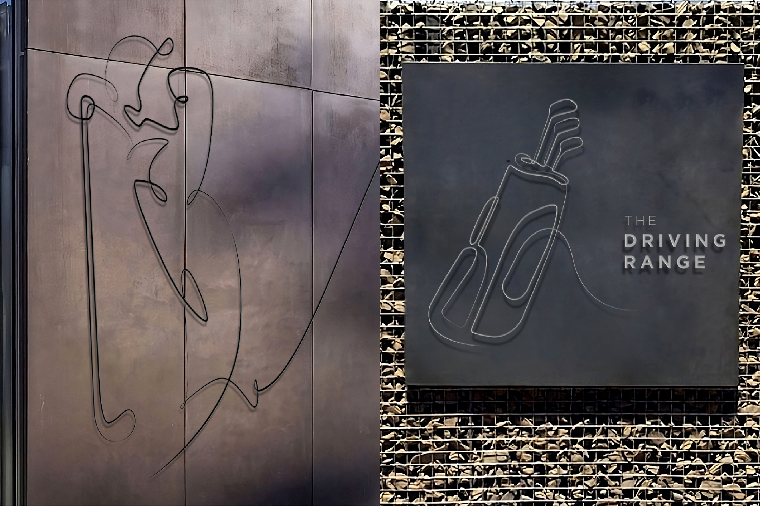
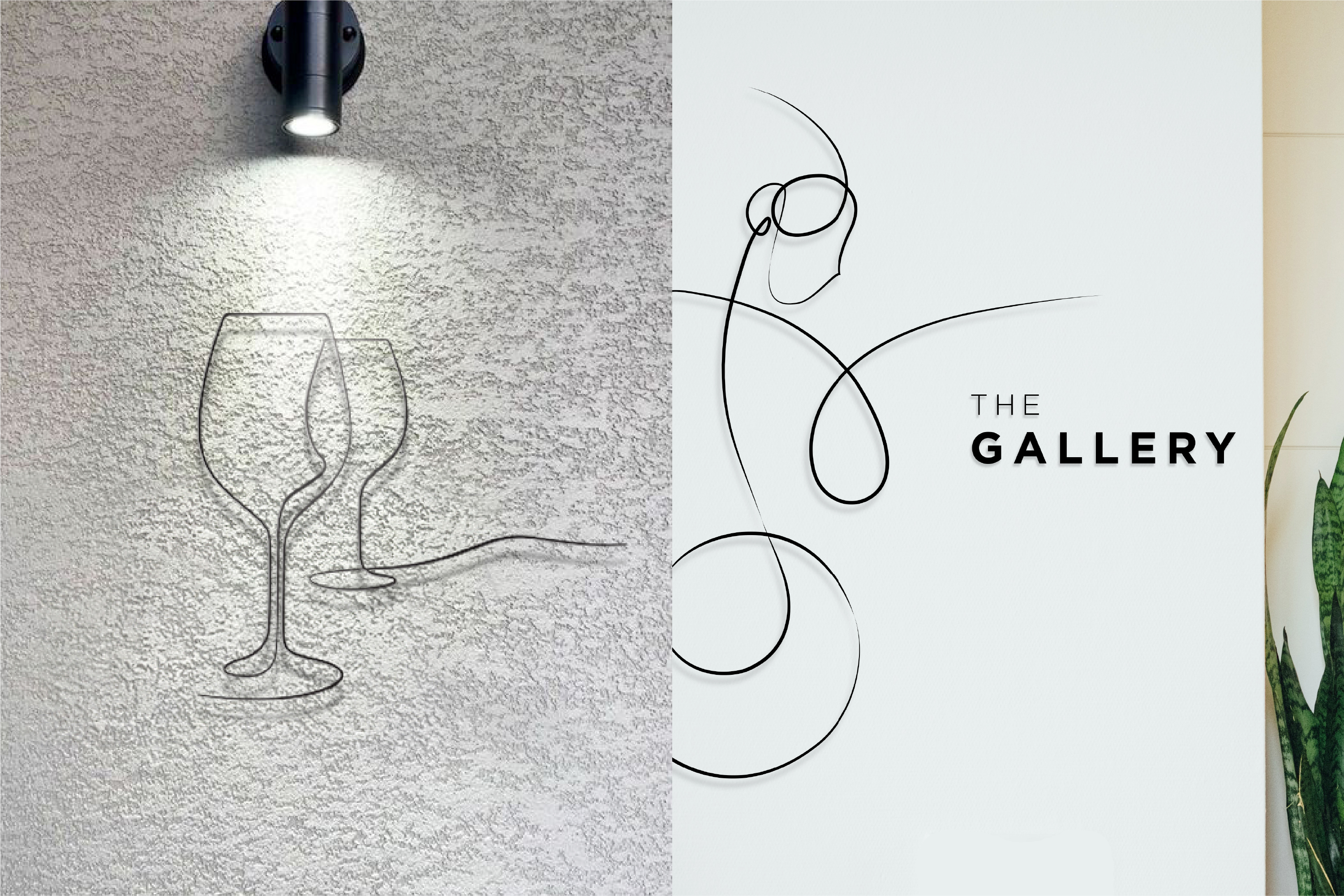
While exploring the estate, we quickly identified a recurring graphic motif: linework. This distinctive element appears throughout Hazendal — in the bold lines of the wine labels, the architectural form of The Glasshouse, the copper-plate leaf pattern at The Ballroom entrance, and the intricate detailing on the Vodka bottles. Together, these lines reflect the interconnectedness of each space and experience, underscoring how every offering forms part of a larger journey.
This discovery inspired a refined visual language that blends elegance with a personal touch. Each Hazendal offering was reimagined with a bespoke illustration that integrates this new aesthetic while honouring existing design cues — creating a cohesive, elevated identity that mirrors the estate’s sophisticated character.
Typography
The classical Majesti Banner typeface paired with the contemporary Gotham font family creates a complementary blend of fonts that work seamlessly in all brand collateral.
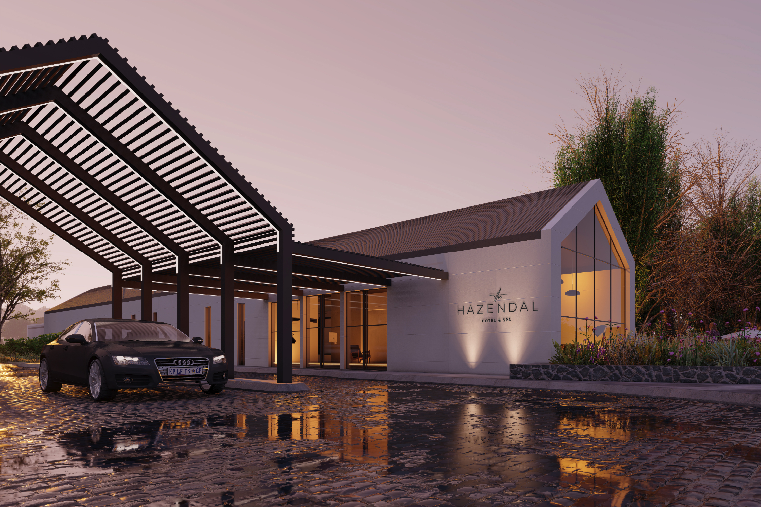
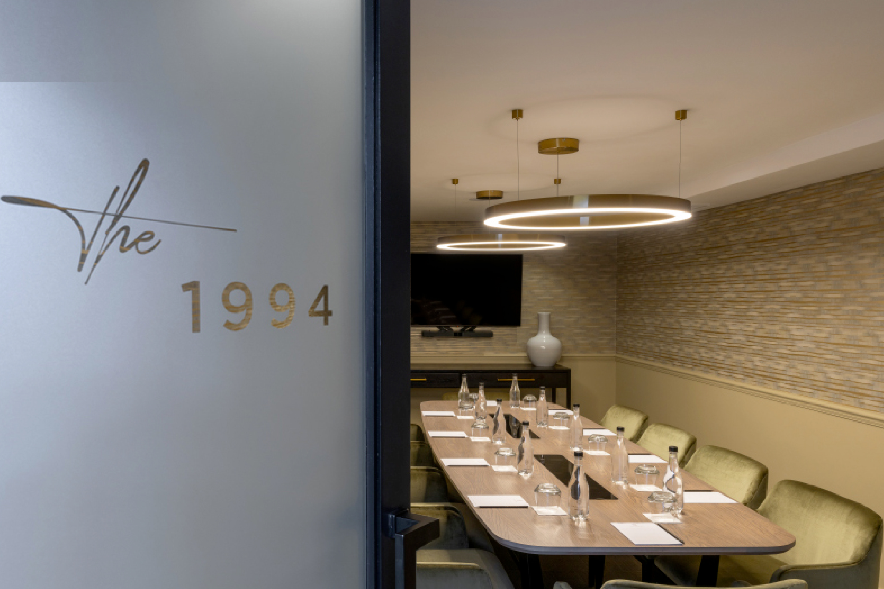
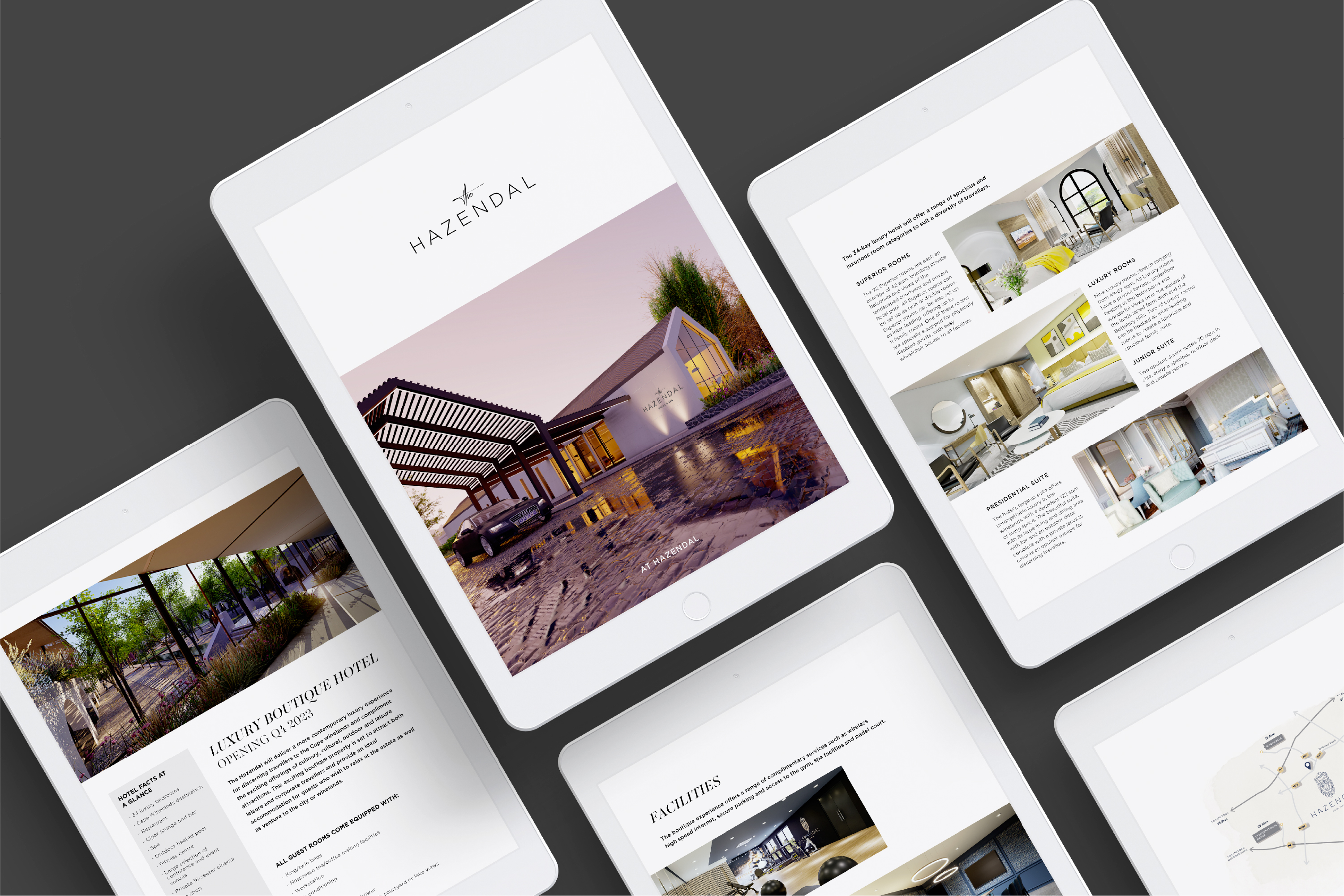
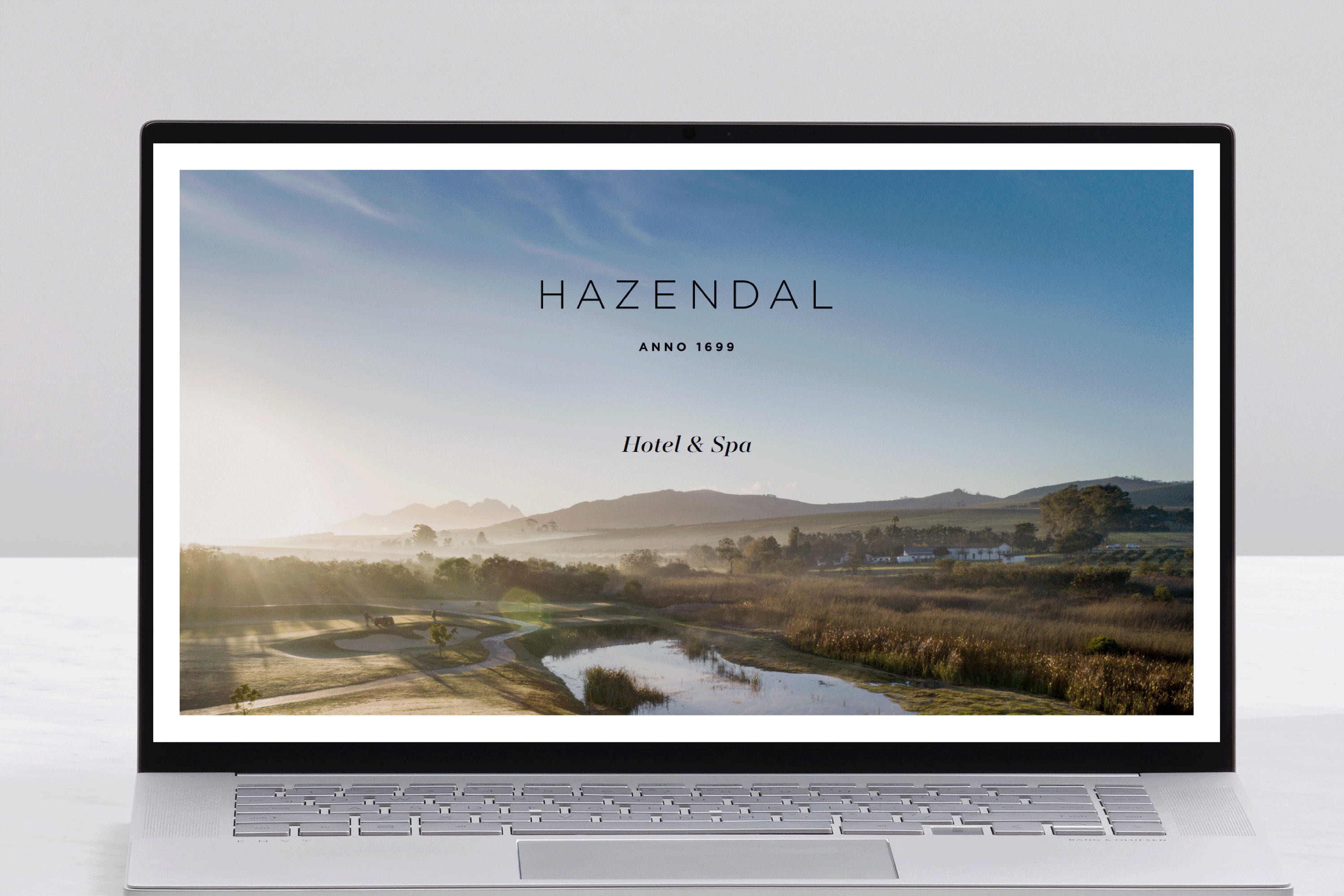
Hotel identity
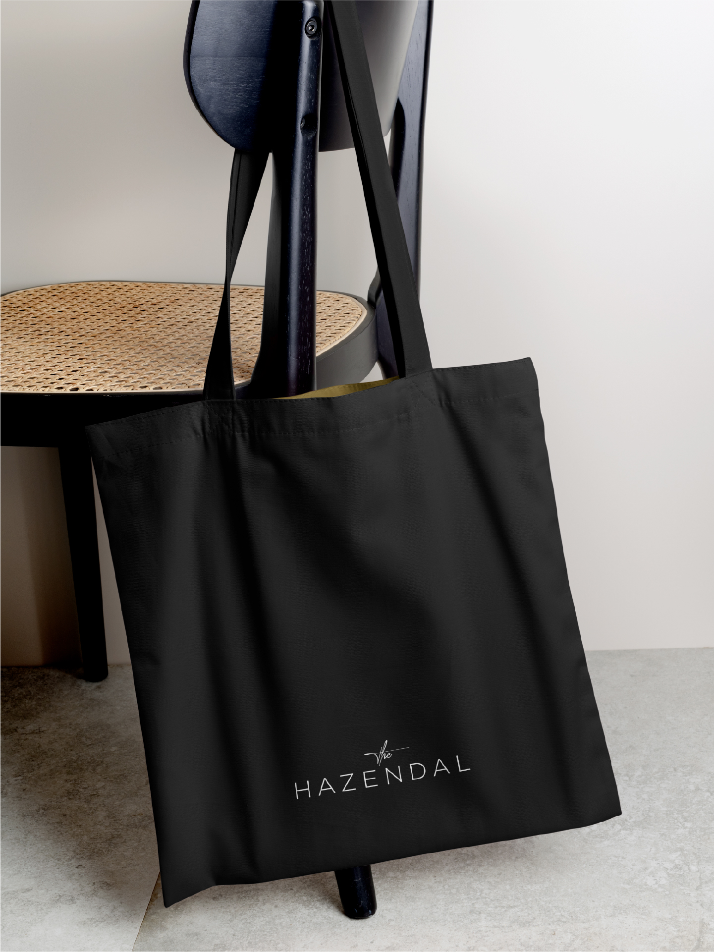
The Hazendal's identity draws inspiration from the current estate's logo type, and incorporates a personal touch. The addition of handwritten text emphasises the personalised, opulent experience guests can expect in this setting, while reflecting on the rich history of the area. Just one of the many elements that make Hazendal a standout destination.

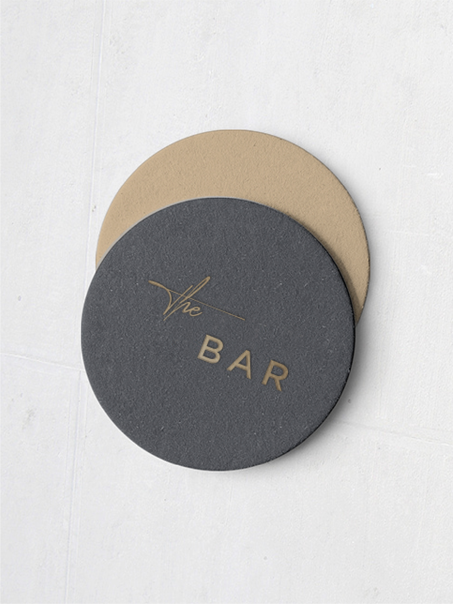
Service offerings
As with the hotel, its various service offerings are elegantly understated, utilising a blend of handwritten typography and a modern sans serif font. This striking look creates a visually appealing synthesis with a classic twist.
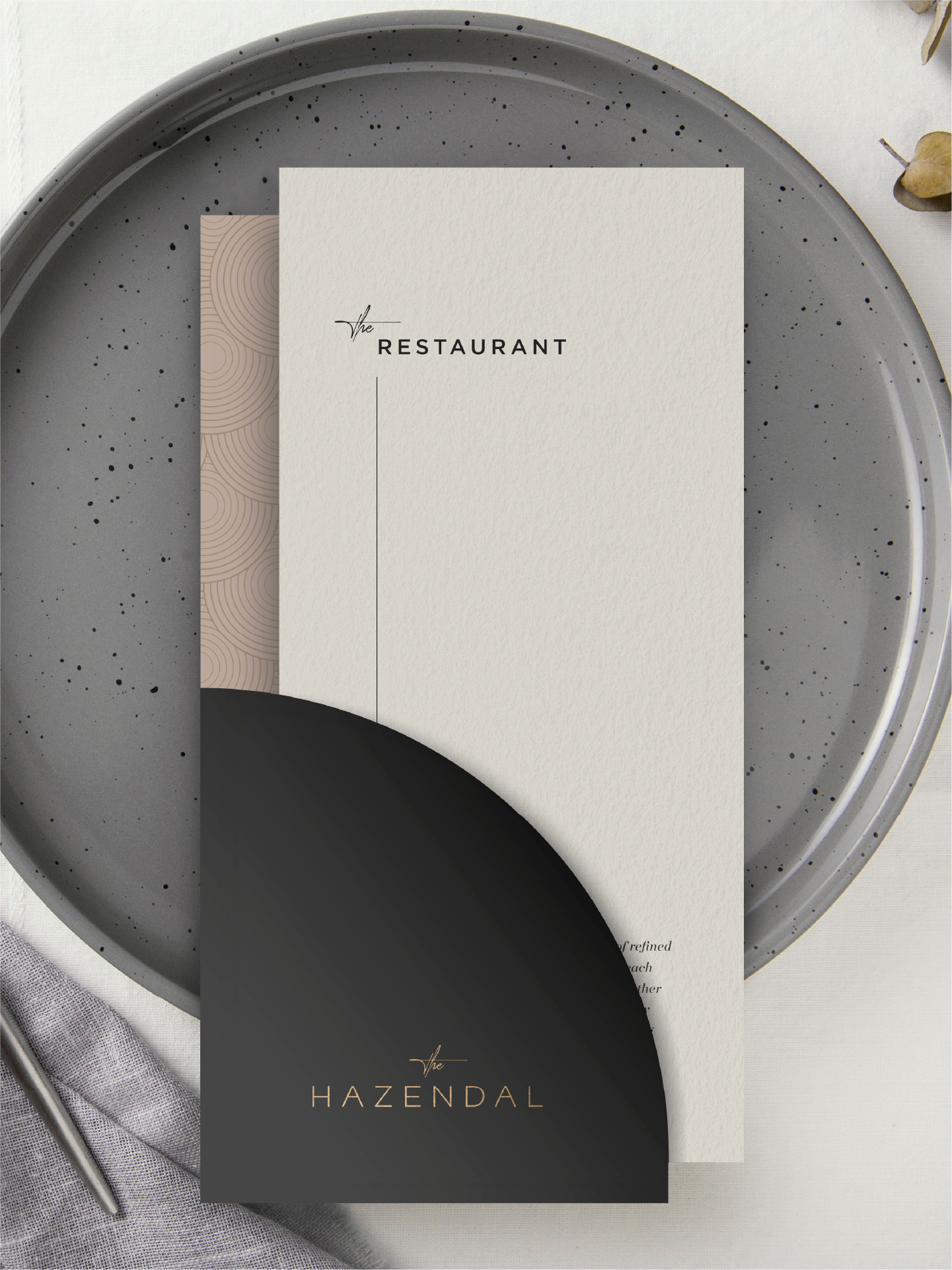
Menu design
When designing the menus, we took inspiration from the hotel's most striking architectural feature: the arch. A symbol of timeless elegance, it reflects the sophistication of the culinary experience at The Hazendal.
This graceful curve is echoed throughout the menu layout — serving as a visual passageway that invites guests on a culinary journey, where each dish becomes a destination in its own right.
The arch also represents unity and harmony, seamlessly bridging tradition and innovation, and blending local flavours with global influences. At The Hazendal, we're proud to offer a dining experience that celebrates this rich fusion.
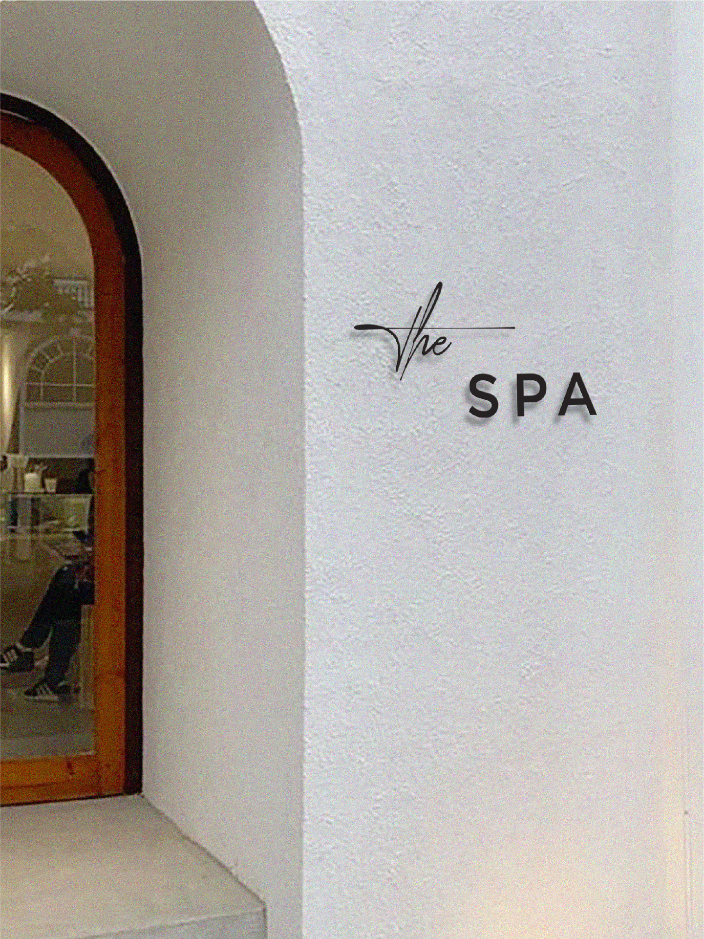
Our design philosophy for The Spa at Hazendal is rooted in refined simplicity and serene clarity. Every element has been meticulously considered to enhance the guest experience, with the space designed to evoke a profound sense of tranquility, rejuvenation, and understated elegance.
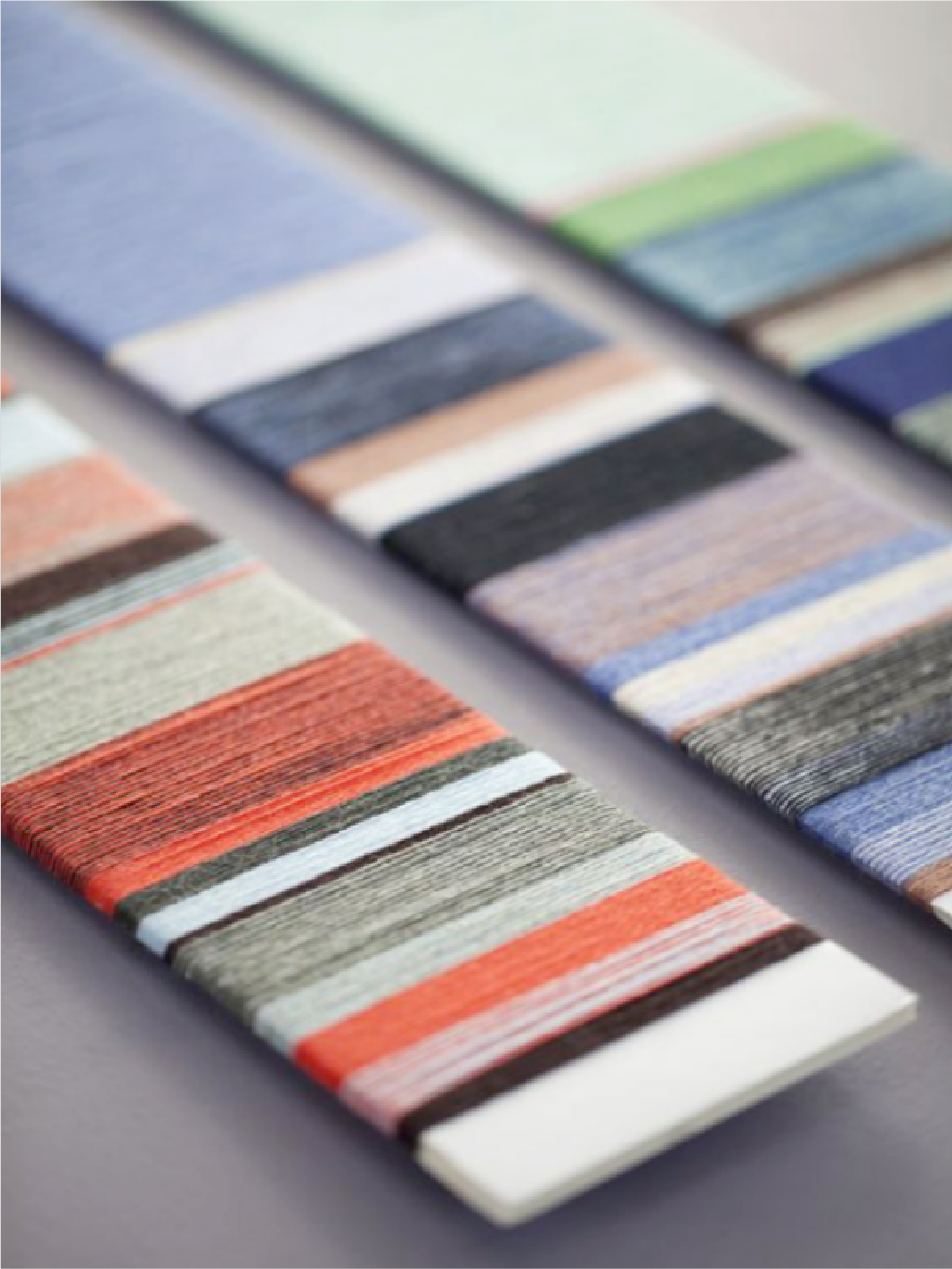
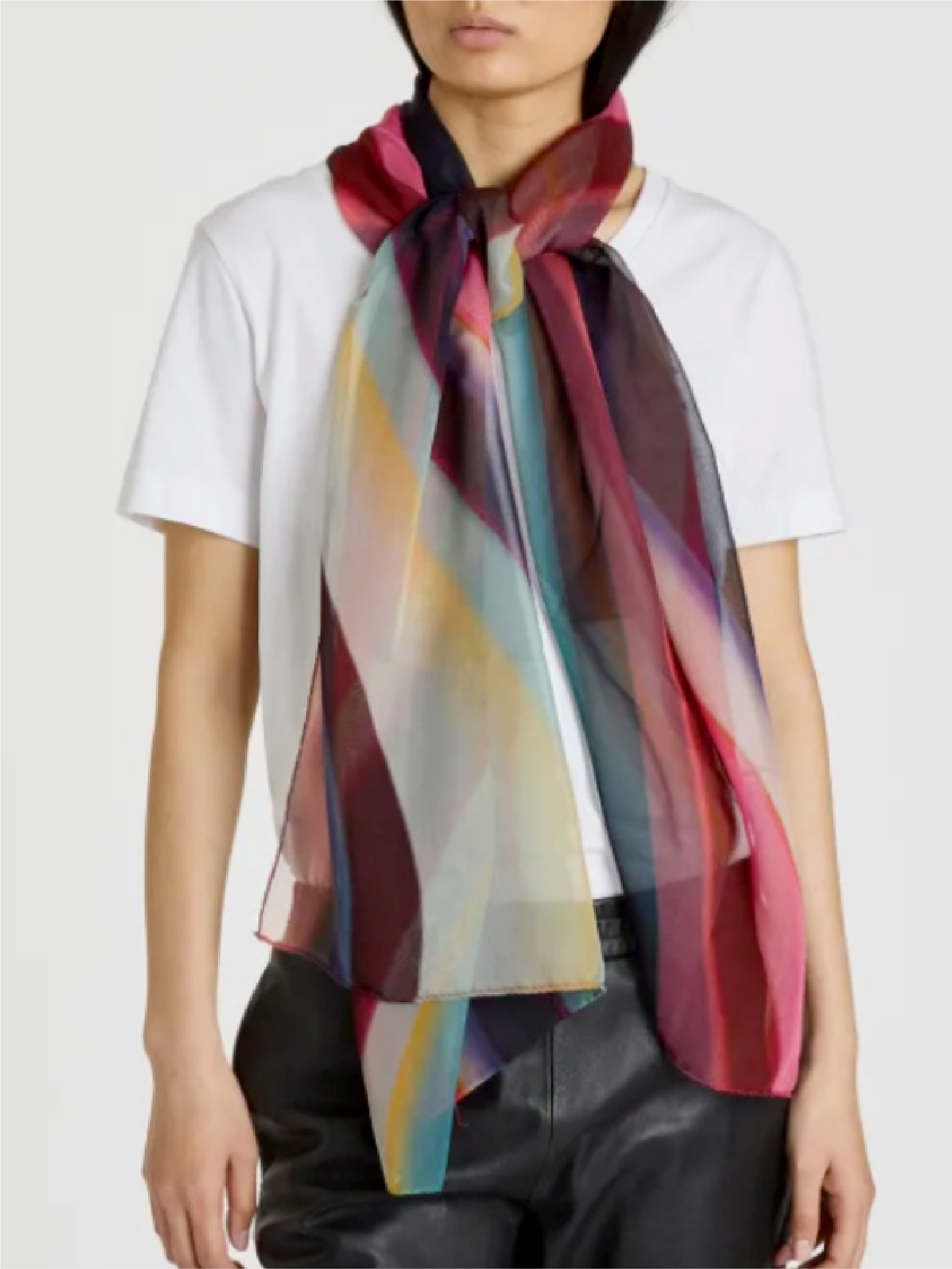
Threading the Narrative
As part of our creative vision, we reimagined the Hazendal uniform as an extension of the estate’s identity, where visual language and craftsmanship converge. The suggestion centres on a bespoke weave, composed from a palette of signature hues that translate Hazendal’s essence into texture. Drawing inspiration from the playfulness of Paul Smith’s tailoring, the pattern weaves linear elements into a unified rhythm, echoing the estate’s diverse and interconnected character. The result is a quietly confident statement, an elegant and contemporary interpretation of Hazendal’s layered spirit.