Brief
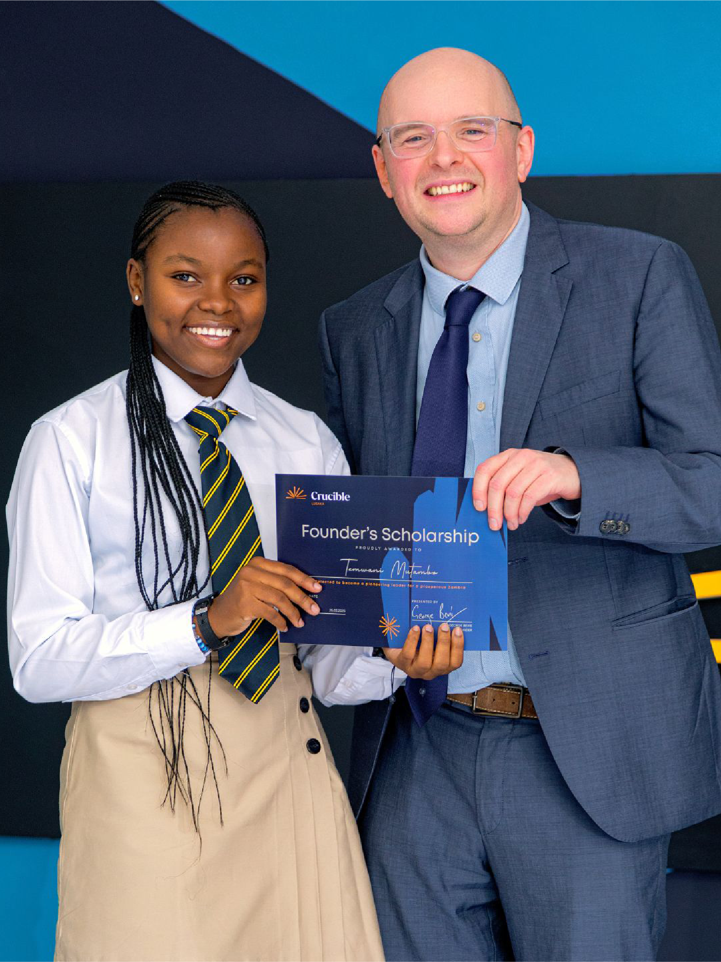
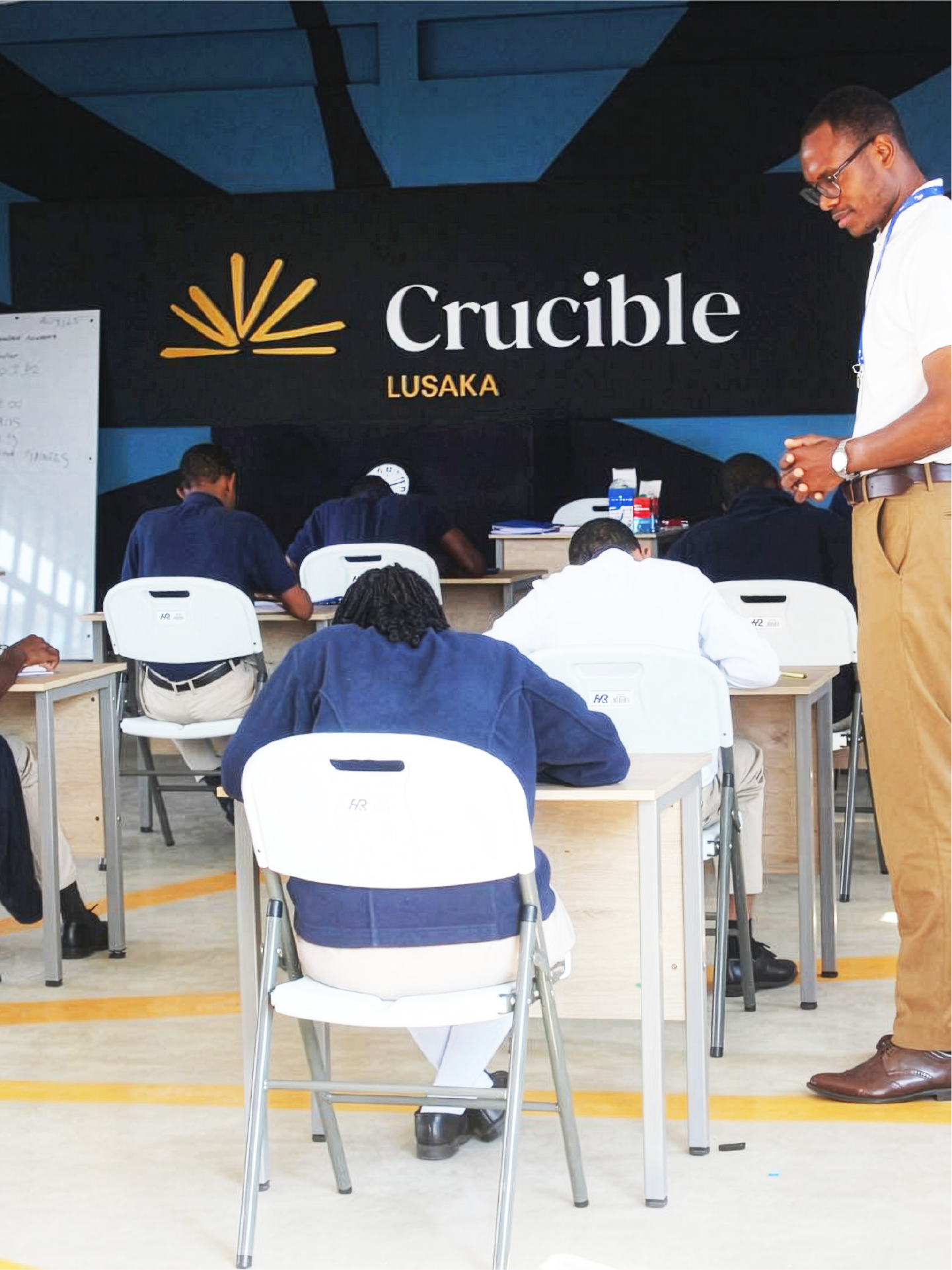
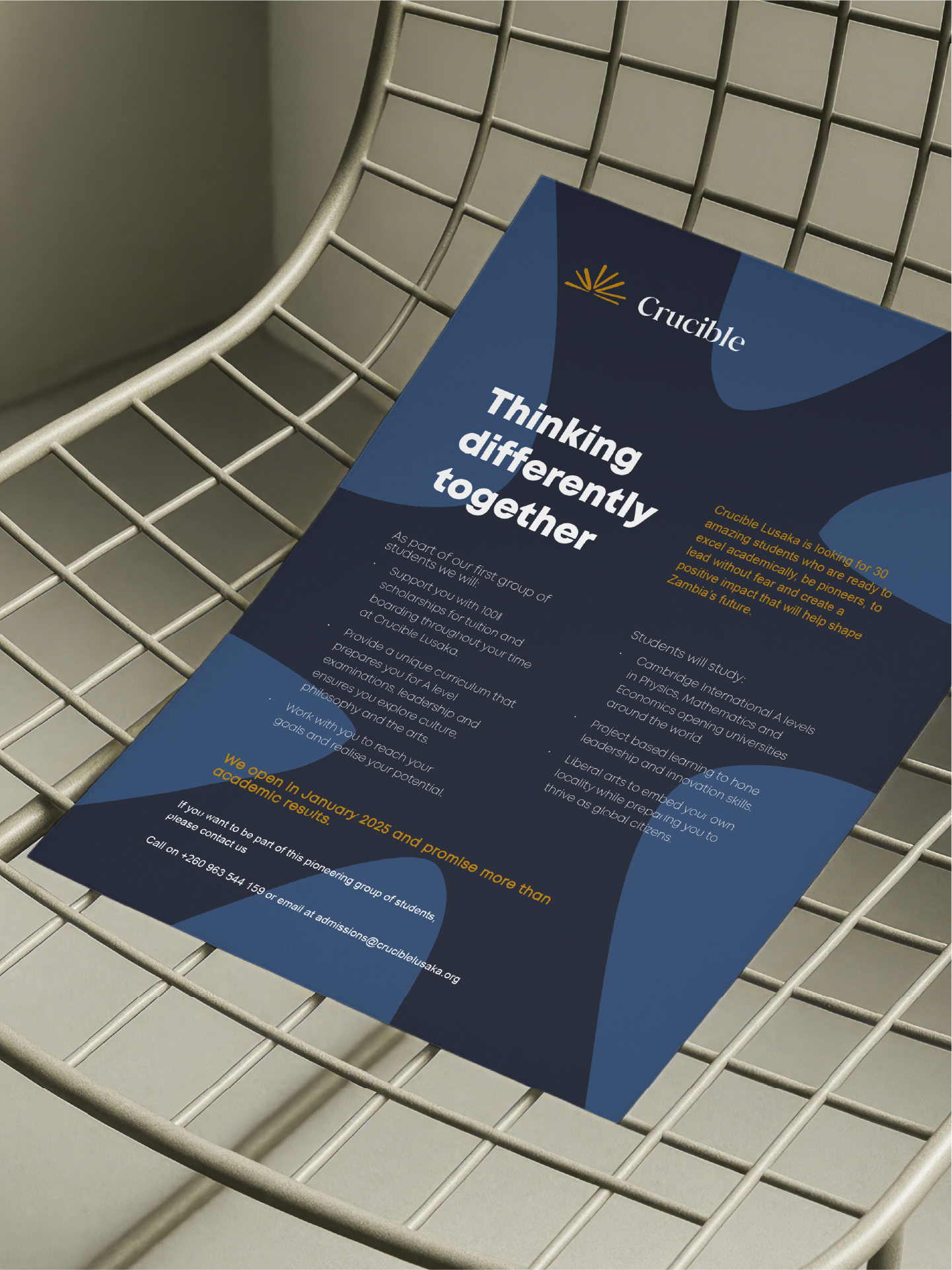
Crucible aims to establish 100 world-class schools for exceptional students across Sub-Saharan Africa by 2045, developing young leaders to shape the continent's economic future. Its first academy opened in Lusaka in 2025, welcoming 28 students chosen from over 400 of Zambia's top performers, with a curriculum that combines Cambridge International A Levels with liberal arts, entrepreneurship and leadership training.
Simplr built the Crucible brand to match that ambition, creating a visual identity that commands prestige, attracts investors and partners, inspires future alumn and is unapologetically African.
Solution
Simplr created a complete brand system that embodies Crucible’s values of excellence, curiosity and leadership. The design blends classical academic cues with a modern approach, grounded in an African context.
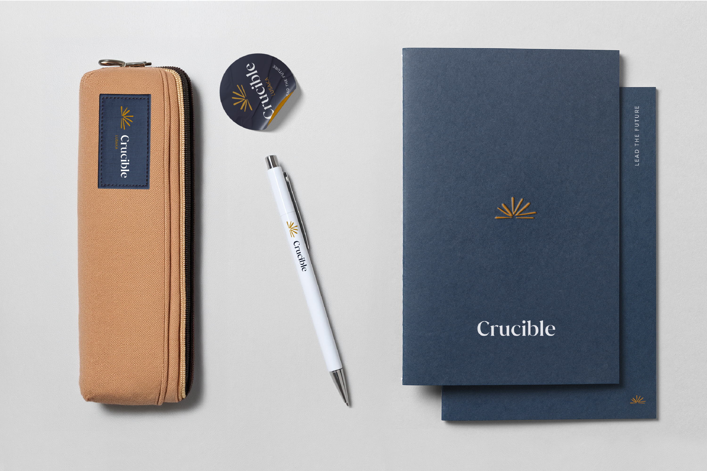
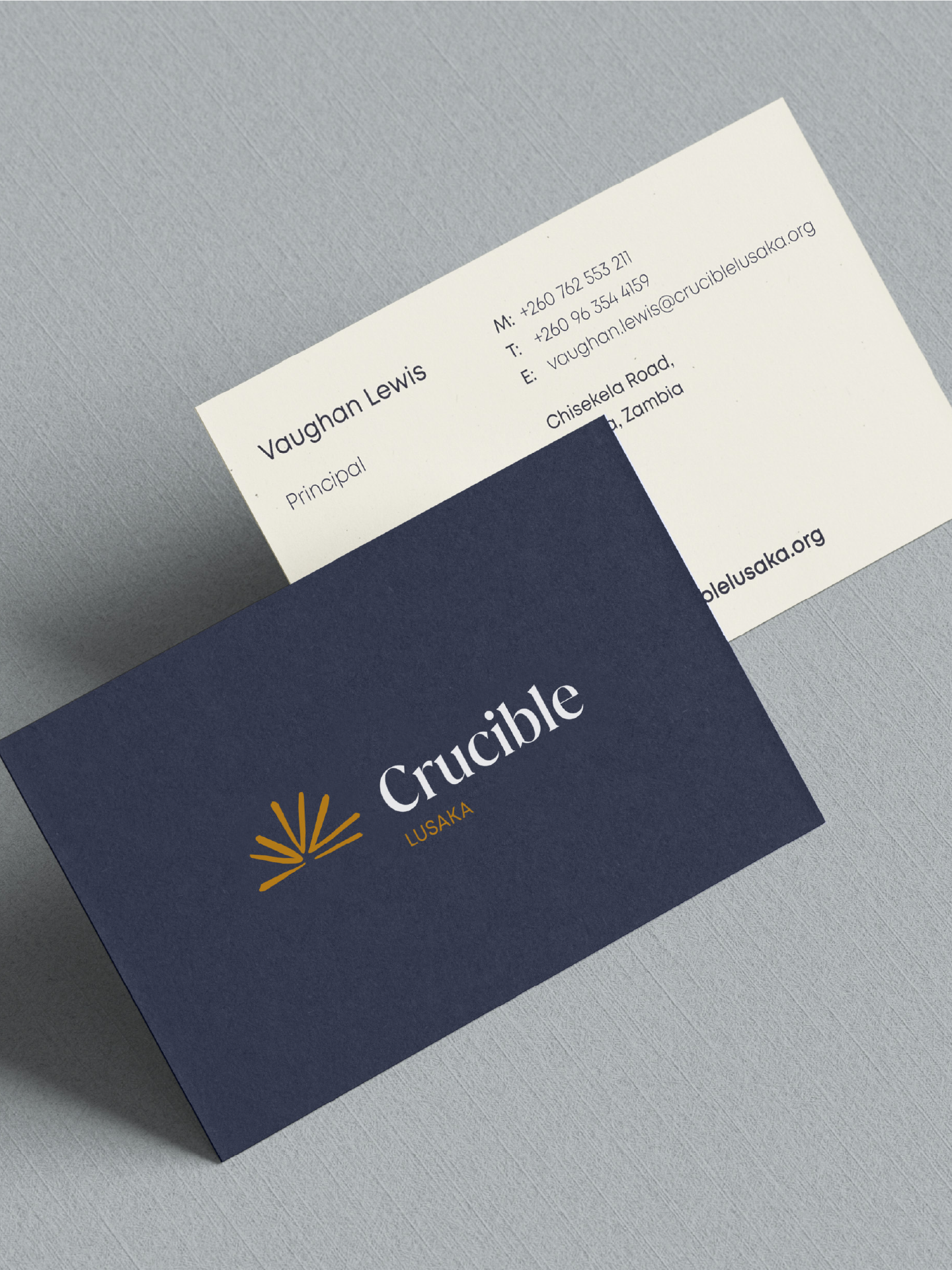
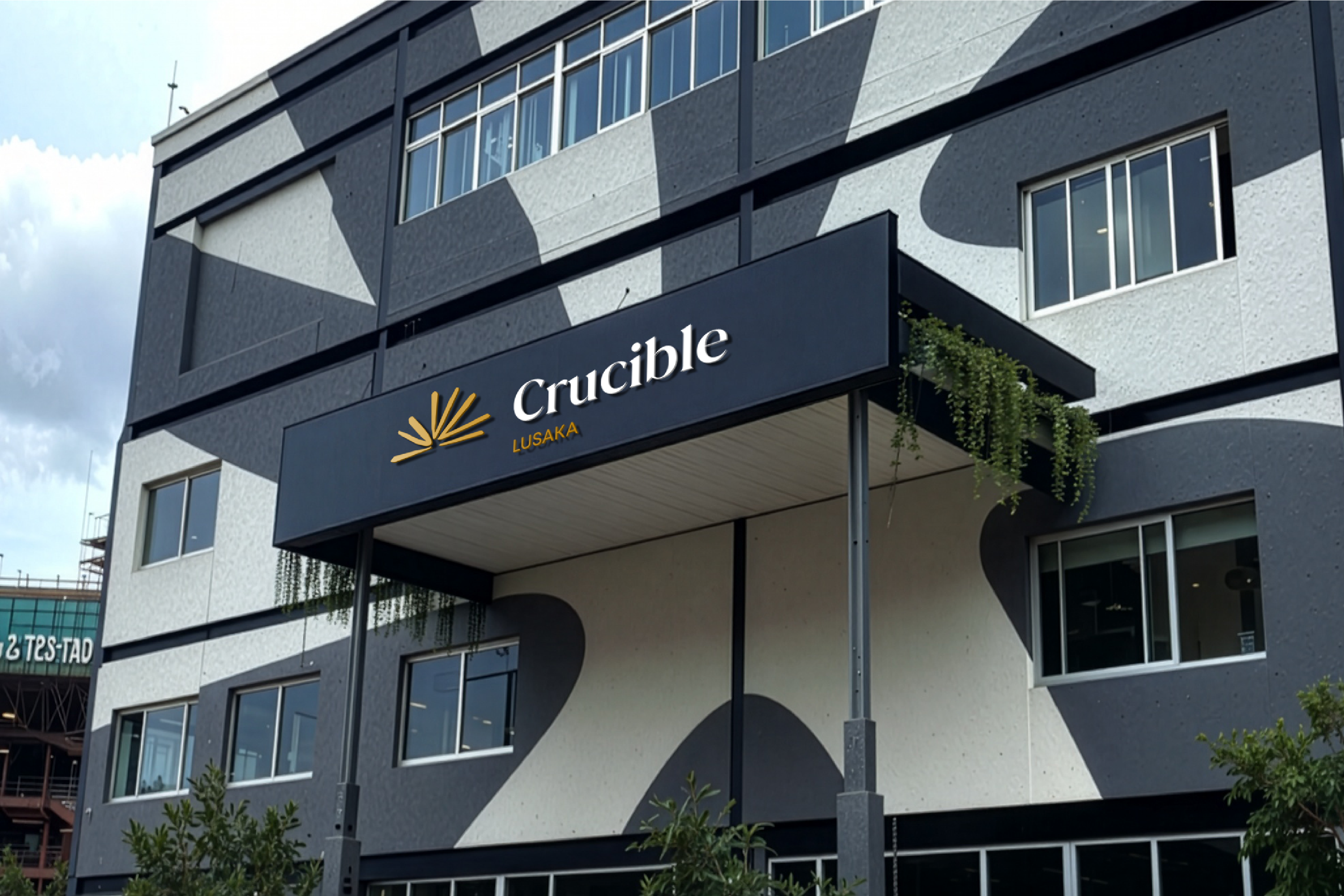
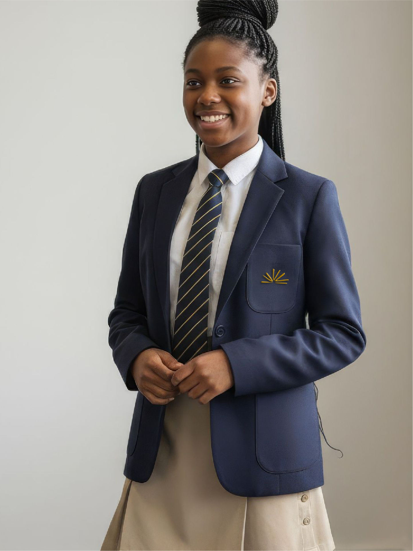
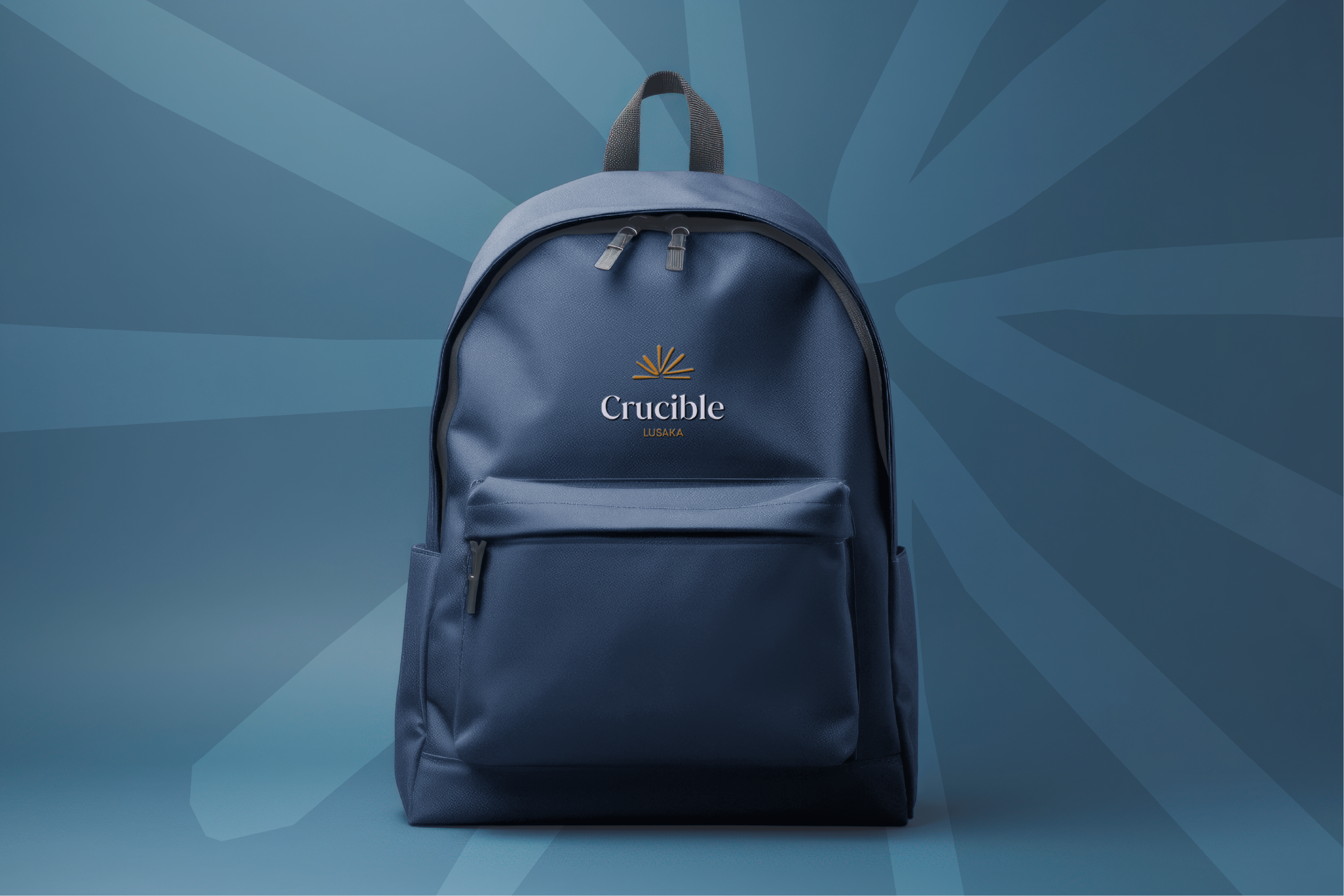
The system includes stationery, templates, iconography, visual guidelines and solutions for uniforms ensuring consistency across every touchpoint. The result is a cohesive, future-focused brand built to support Crucible's growth across the continent.
Logo development
Visual language design
Collateral design
Template design
The identity
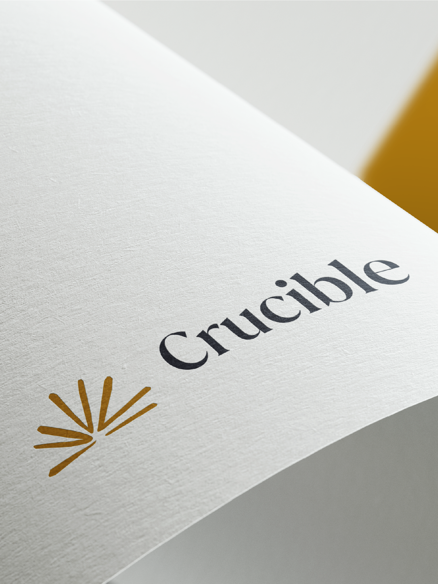
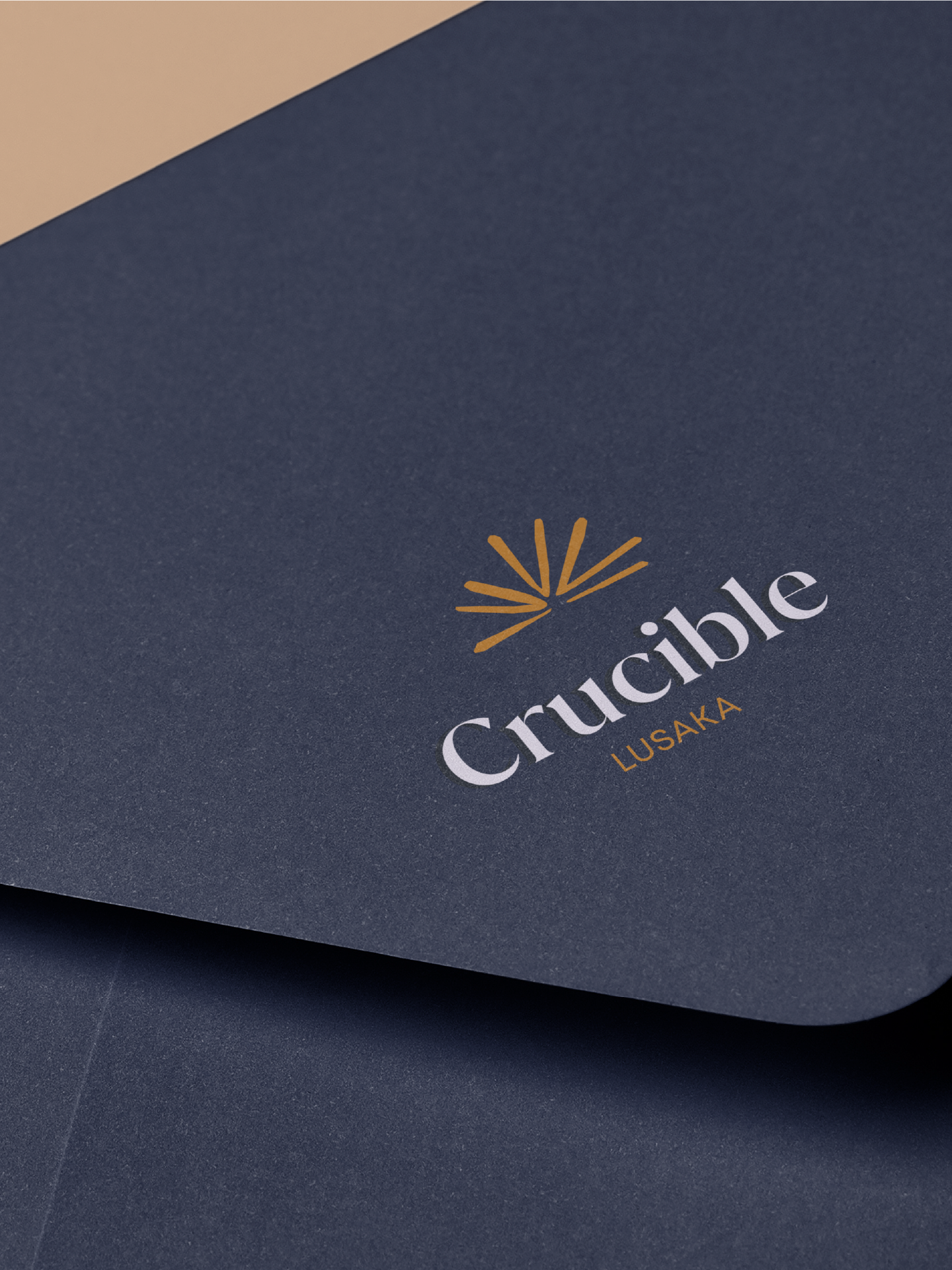
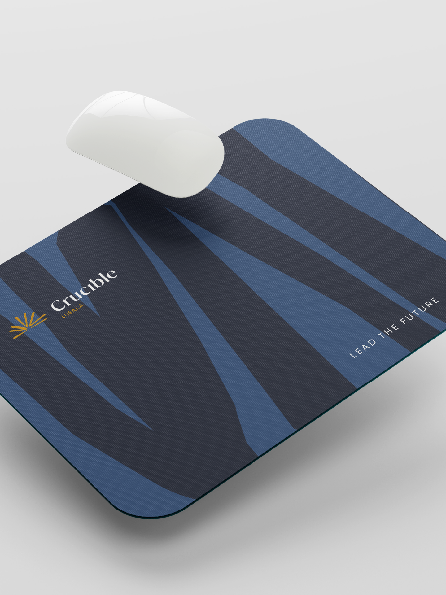
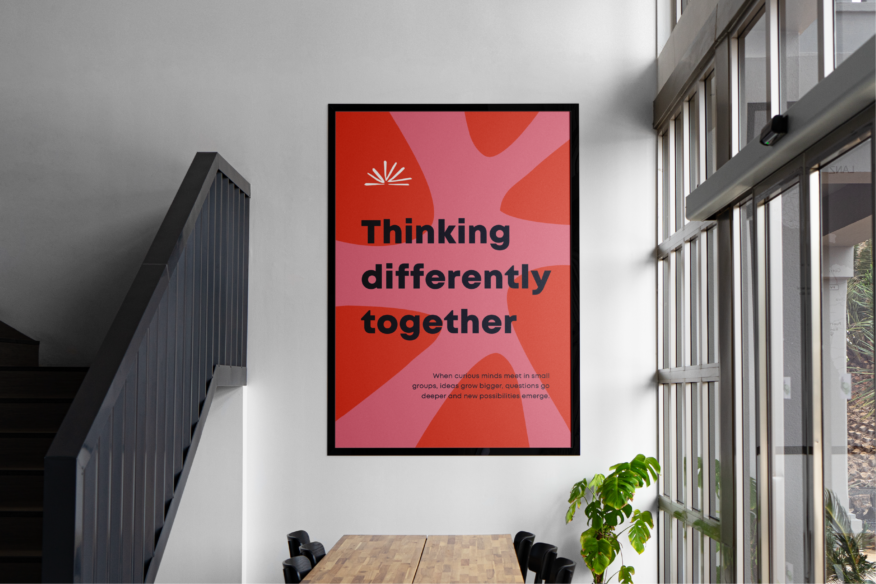
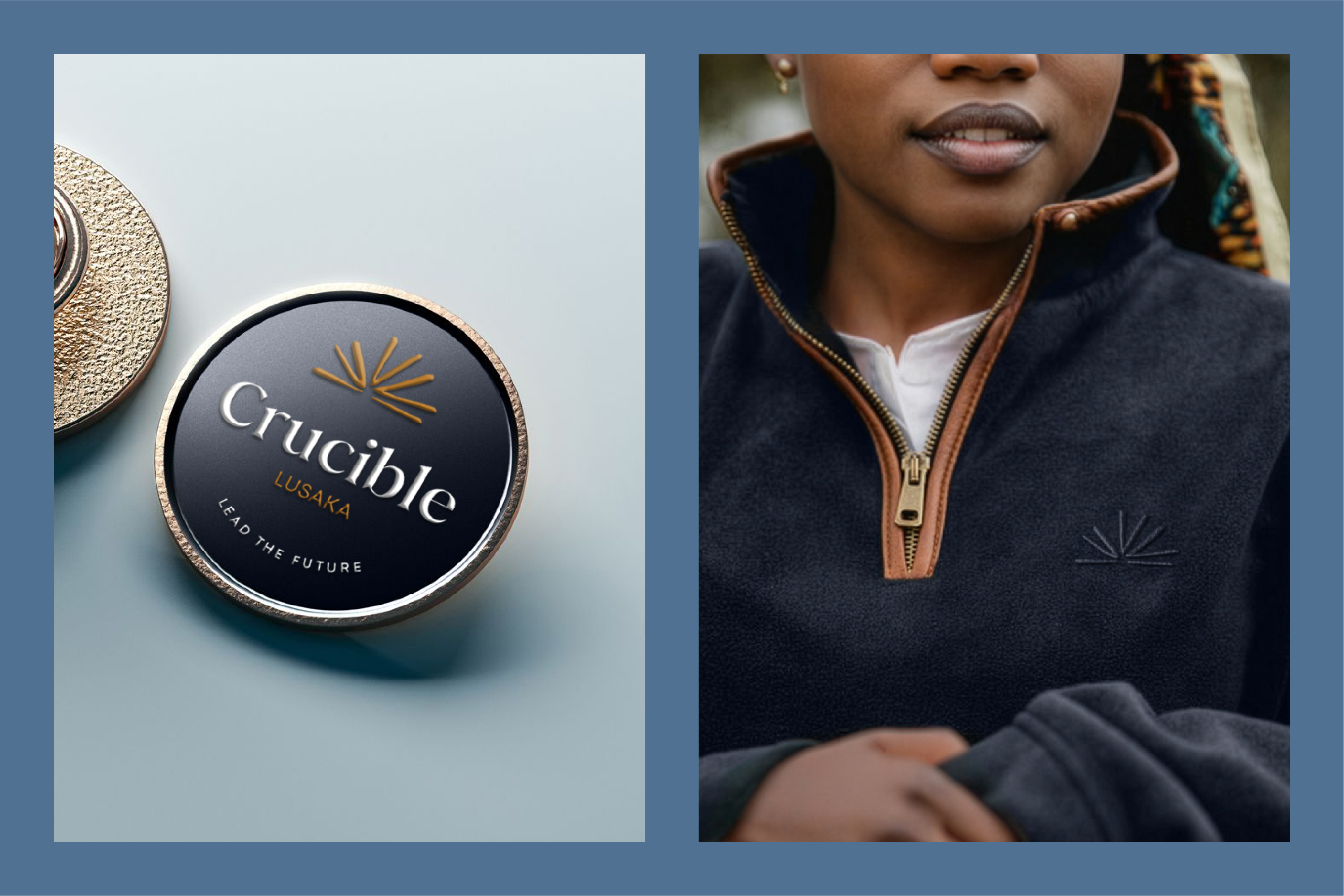
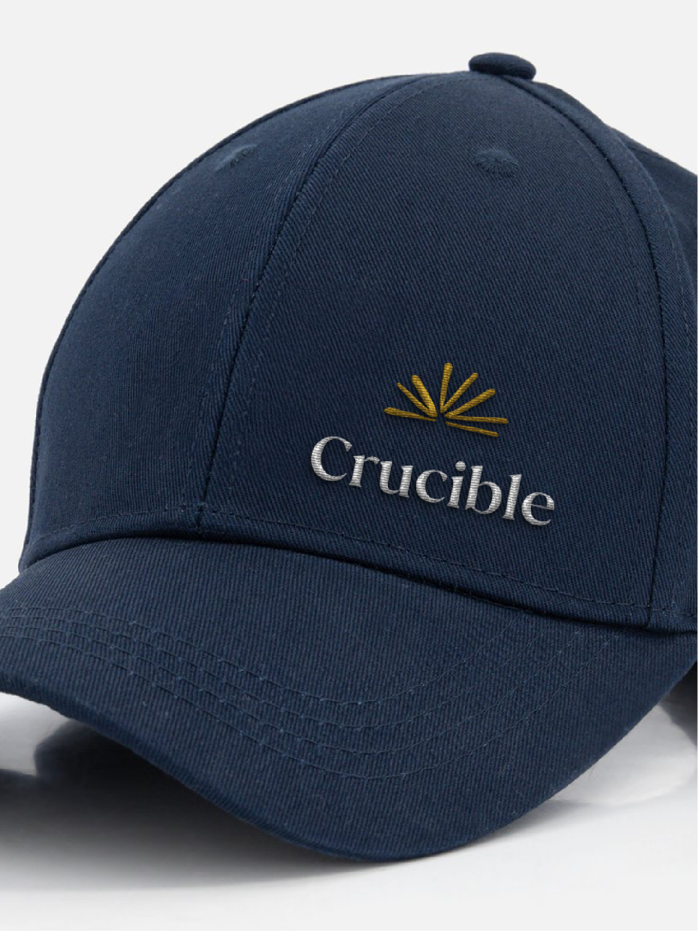
The Crucible logo symbolises intellectual transformation and the forging of future leaders. The bespoke icon represents collaboration and the exchange of knowledge, while also suggesting the pages of an open book and a rising sun, both symbols of learning, growth and new beginnings.
Rendered in a simple paper cut-out style and paired with refined logotype, the logo is elegant, versatile and communicates the ambition at the heart of the brand’s vision.
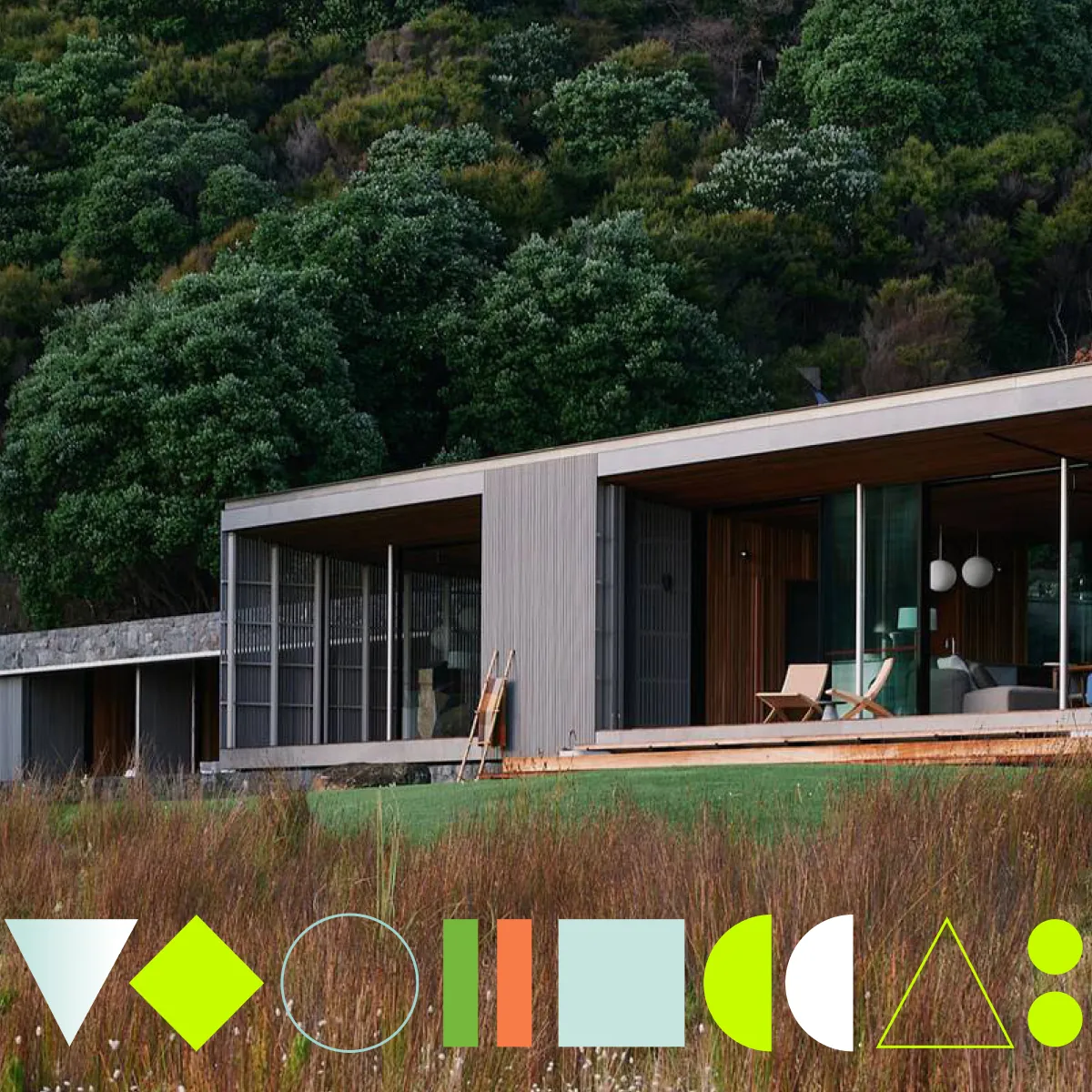
Visual language
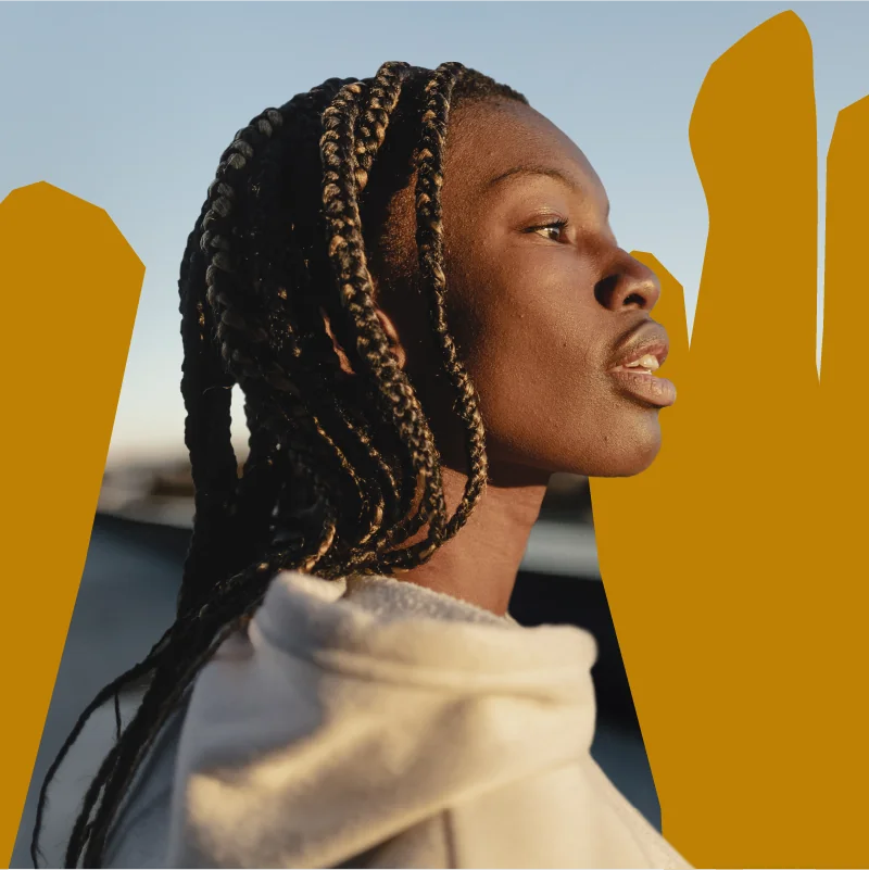
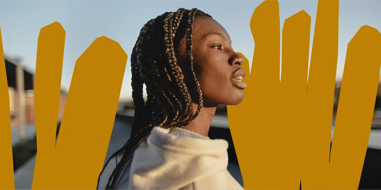
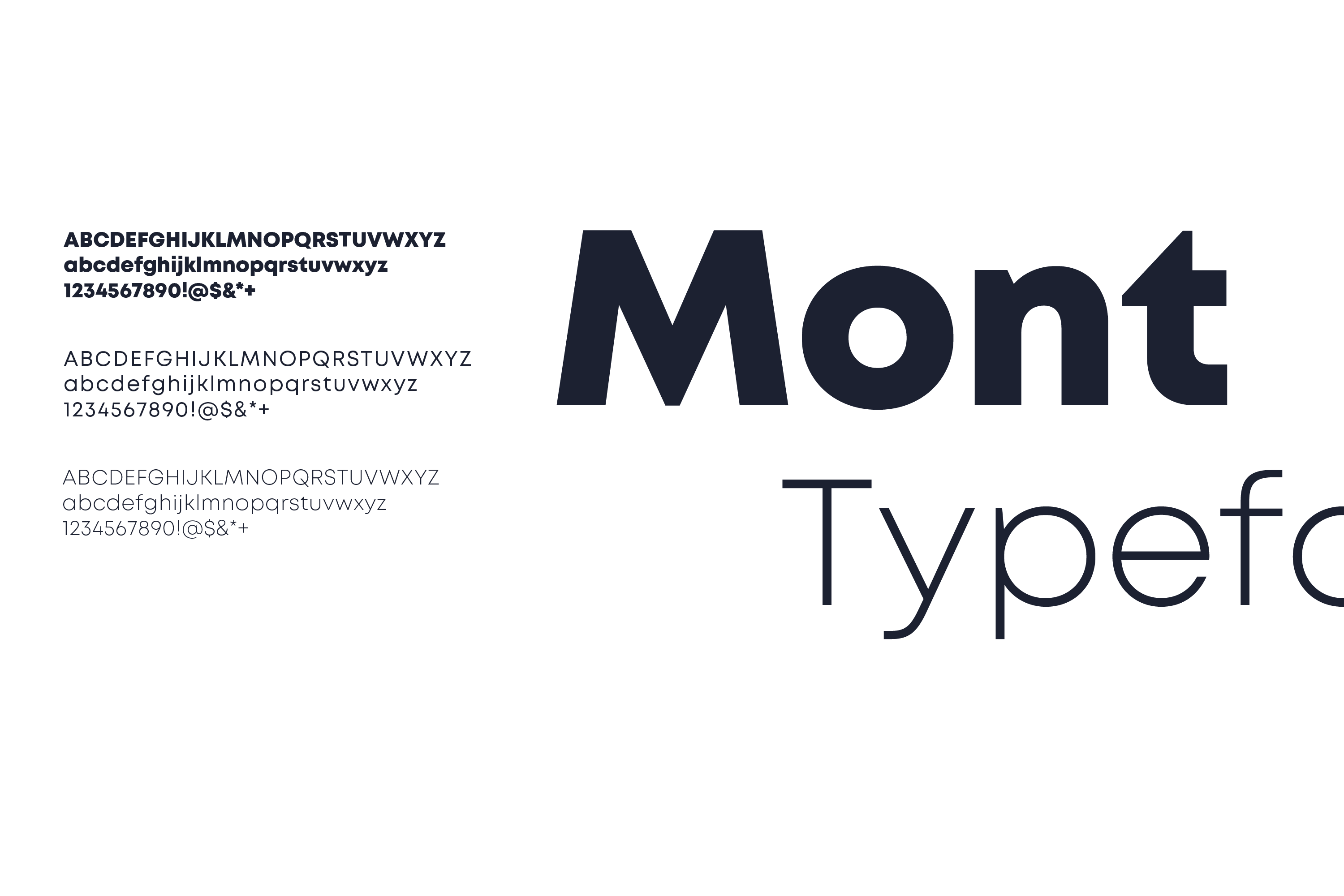
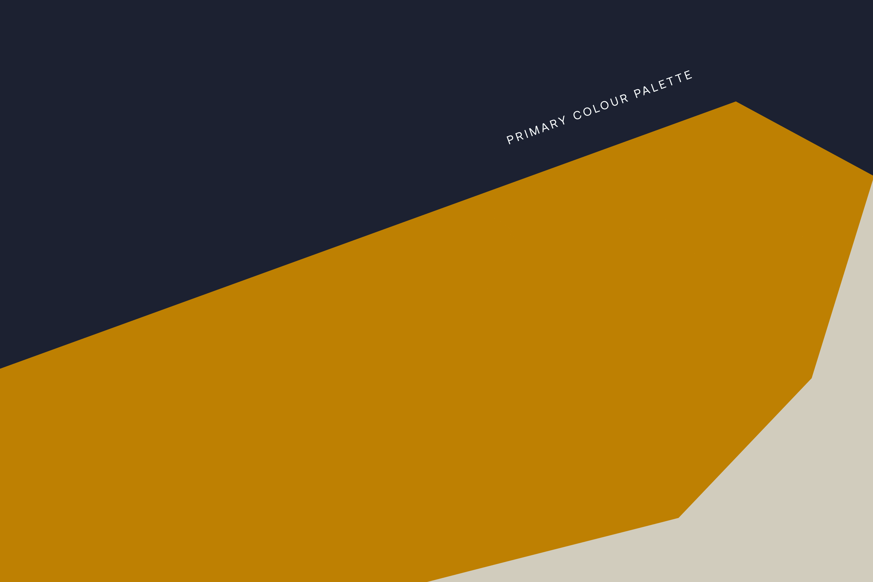
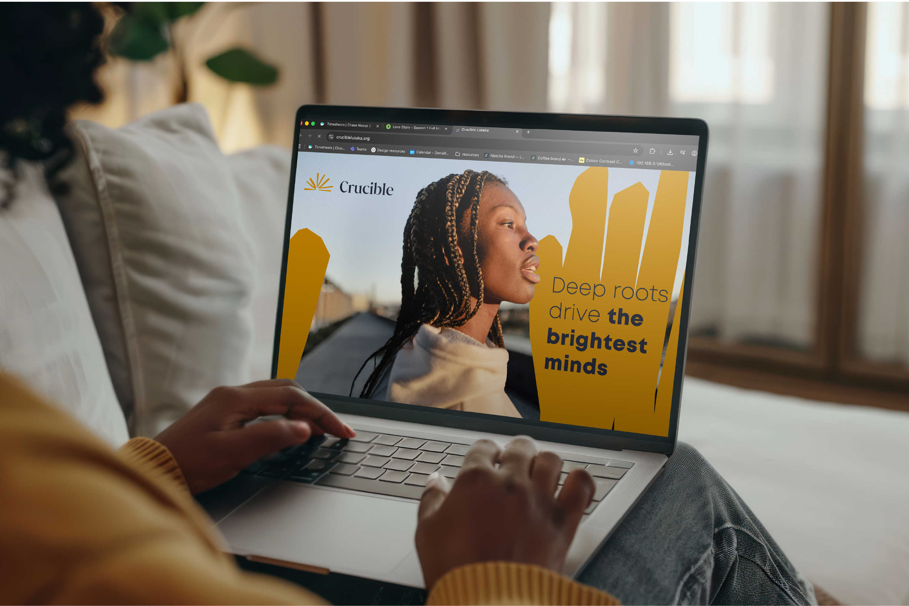
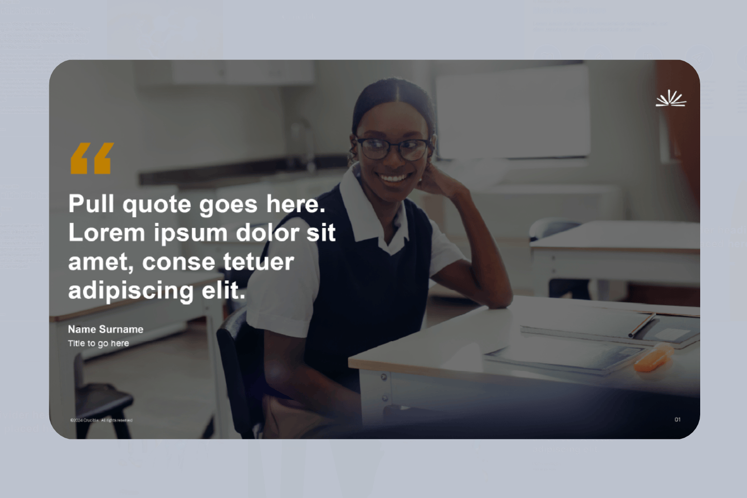
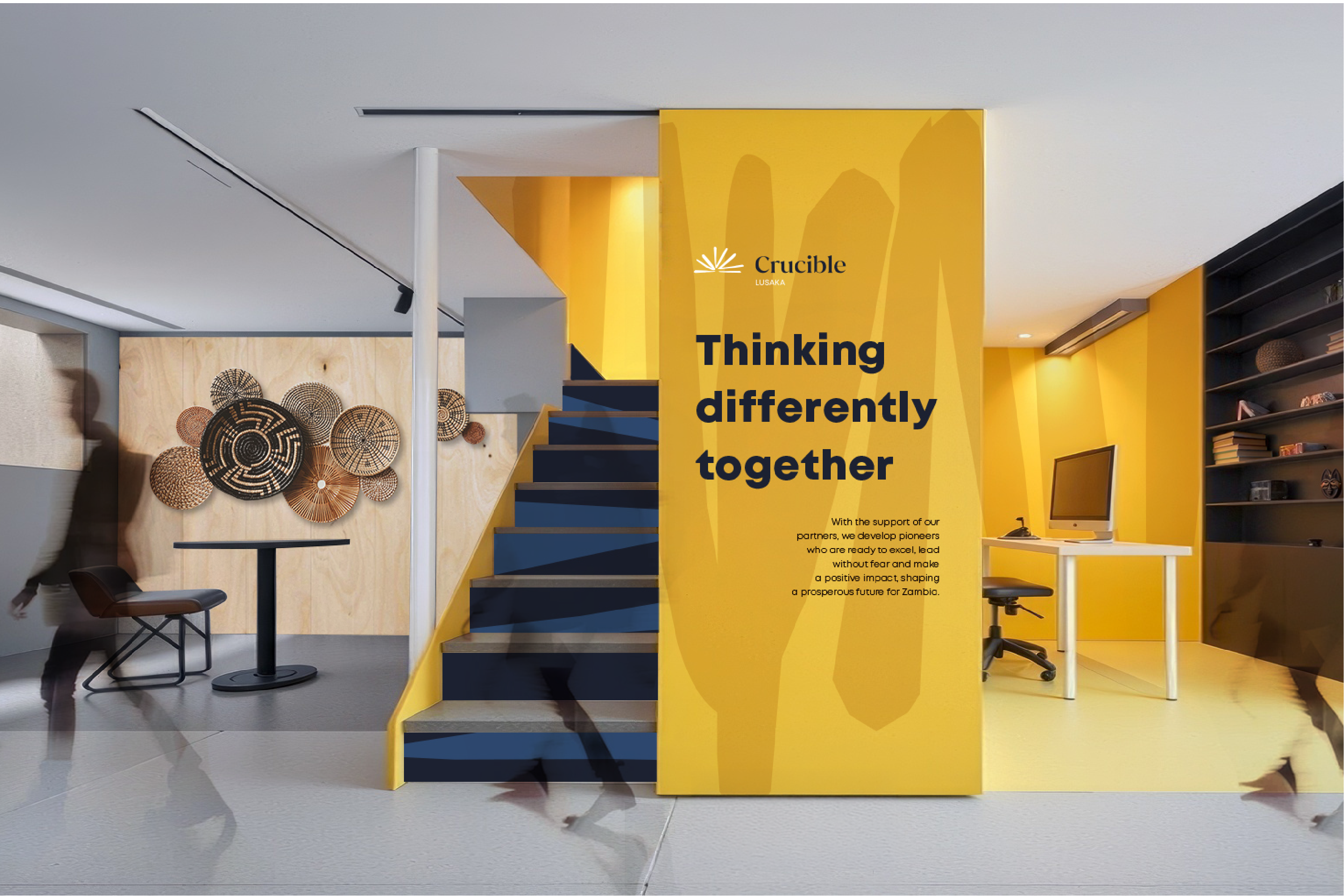
The visual language draws from the brand mark, using overlapping shapes that echo Africa’s tribal communities to express connection and collective strength. A refined palette anchored in deep midnight blue is complemented by golden yellow and soft neutrals, while the Mont typeface provides a versatile foundation known for its readability and modern, approachable tone. Photography focuses on individual students and small groups, capturing moments of curiosity, independence and intellectual potential.


Internal visual style
While the external brand style remains refined and understated, the internal visual language becomes more bold and expressive. Drawing on the secondary and tertiary colour palette, large-scale graphic patterns bring energy to internal environments, reinforcing the idea of knowledge expanding beyond the classroom.
"Working with Simplr on our brand has been a fantastic experience. From the start, they took the time to understand what Crucible is all about and really got to the heart of our vision. They didn’t just create a logo or design; they helped us craft an identity that truly reflects who we are and what we stand for. The process was collaborative, smooth and felt really personalised to our needs, with clear timelines and great organisation that kept us supported and in the loop throughout. Simplr’s team brought fresh ideas while staying focused on what would work best for us. We are already seeing a stronger connection with our audience, and we couldn’t be happier with how everything turned out. If you’re looking to build or refresh your brand, we can’t recommend Simplr enough."